|
| Group |
Round |
C/R |
Comment |
Date |
Image |
| 18 |
Aug 17 |
Comment |
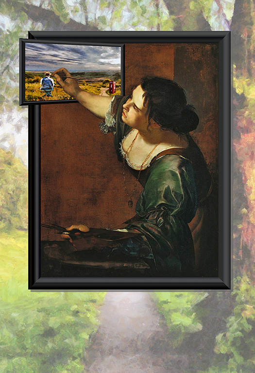
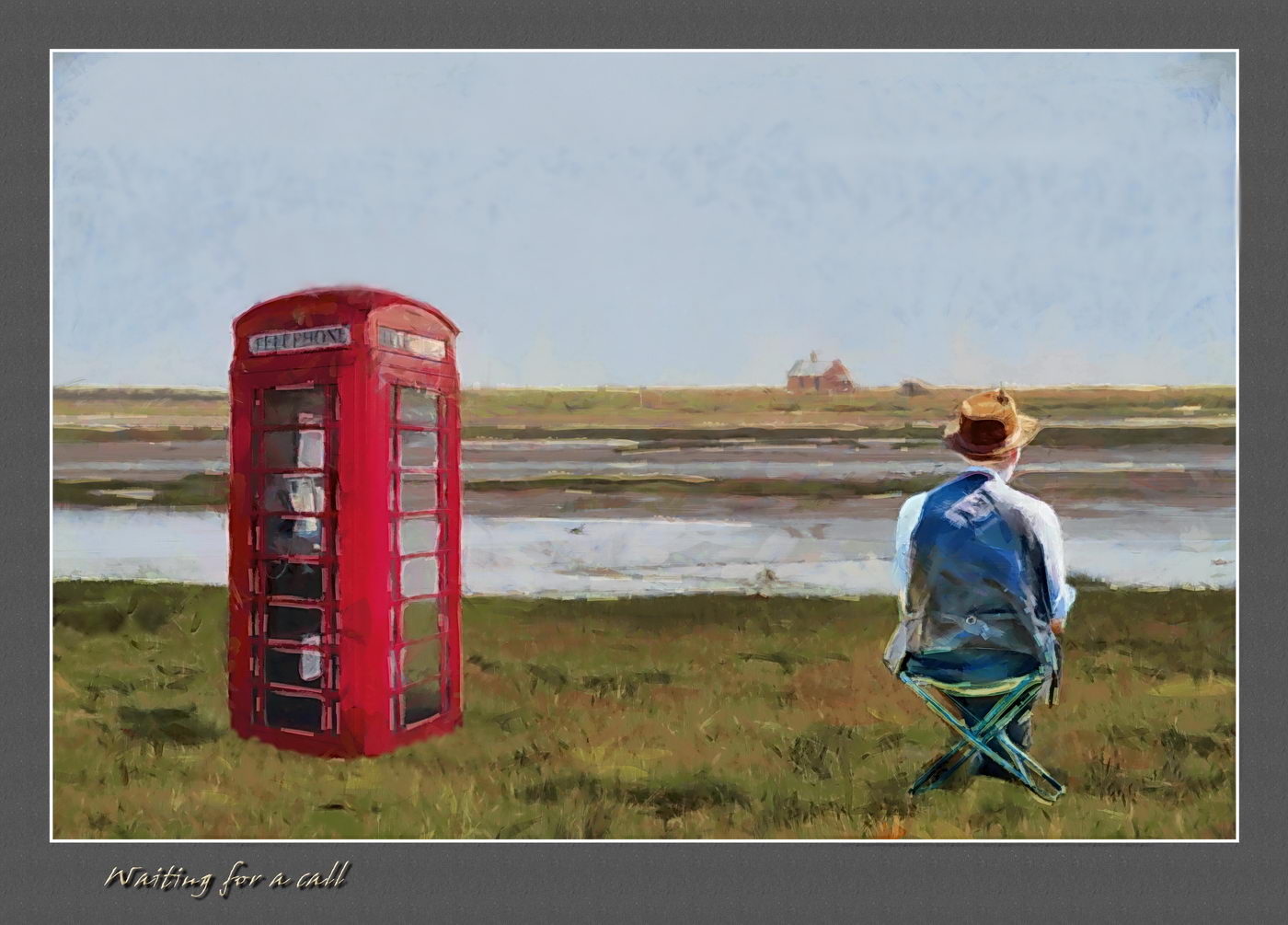
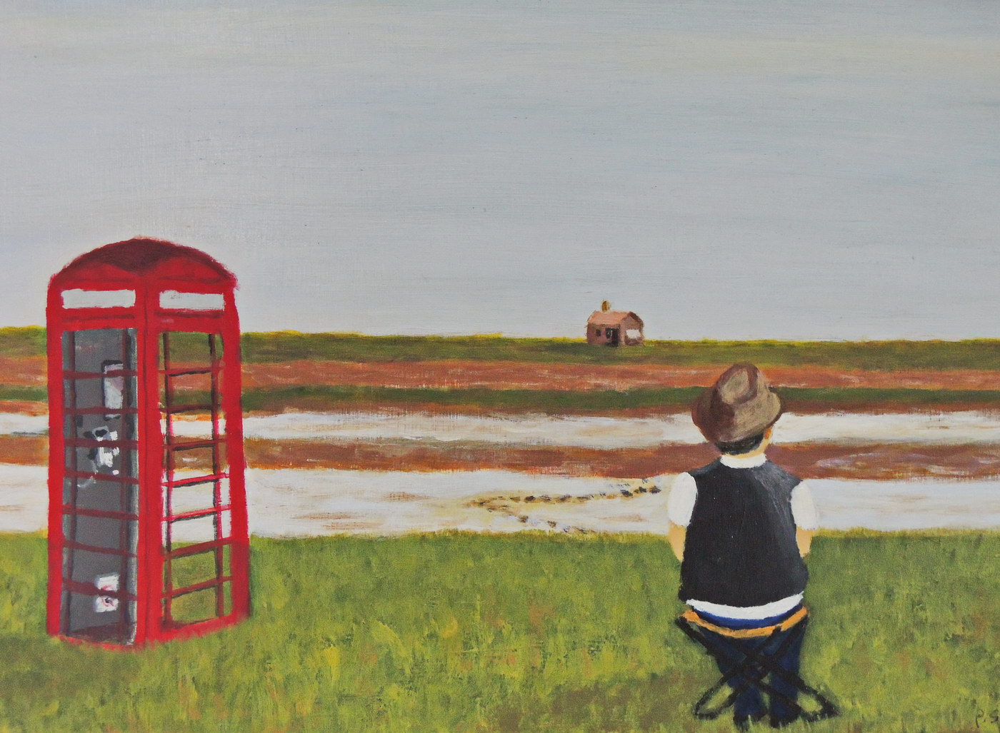
They say that when you want to improve on your painting you should make a second copy of the first, and so on. Then you can compare and see if you like the second plus more, and if you need mix and match. My criticism is that the telephone box is not squared. Therefore a second copy is in order to deal with the critical points raised re that, and darker shadows etc.
|
Aug 10th |
| 18 |
Aug 17 |
Reply |
I tried to bring the man nearer, thus bigger, in the hand painted acrylic version, but it still looks a little out. The phone box is a little drunk too. |
Aug 9th |
 |
| 18 |
Aug 17 |
Comment |
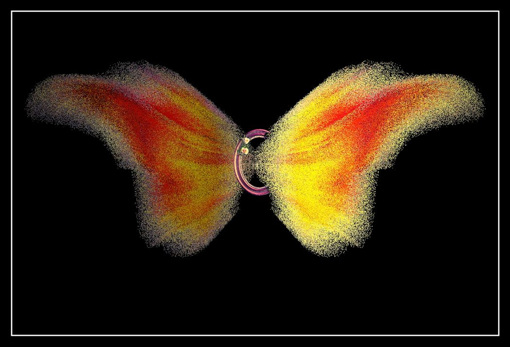
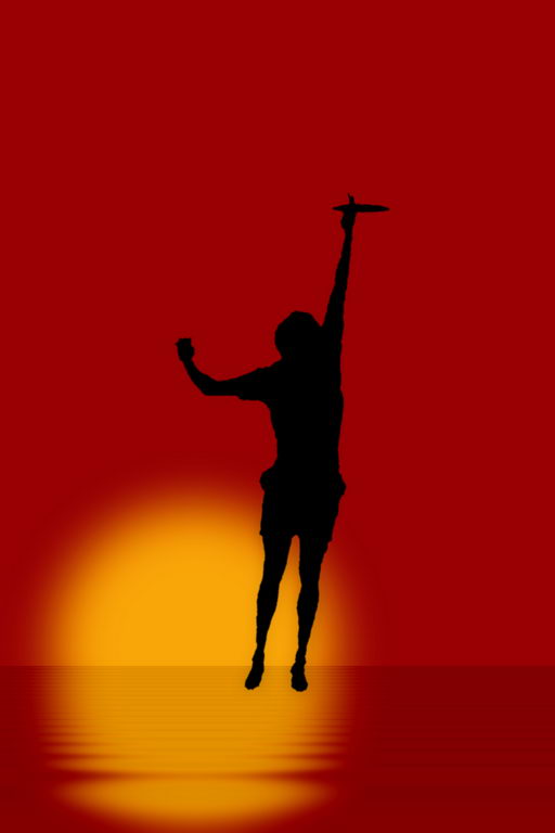
I think you have done a great job in taking a pleasant, limited image of potential, and fulfilling that potential. The blurring and vignette bypass the limited depth of field and lend it that lovely softness. The enhancement of the directional lighting, and that little sparkle on the glass ball work the magic. The butterflies do add, and the "electric field too", which might be a little lighter. For me the circles in the background could be a little more blurred to keep the eye on the ball, so to speak. |
Aug 9th |
| 18 |
Aug 17 |
Comment |
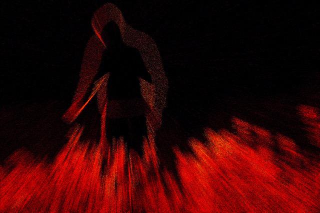
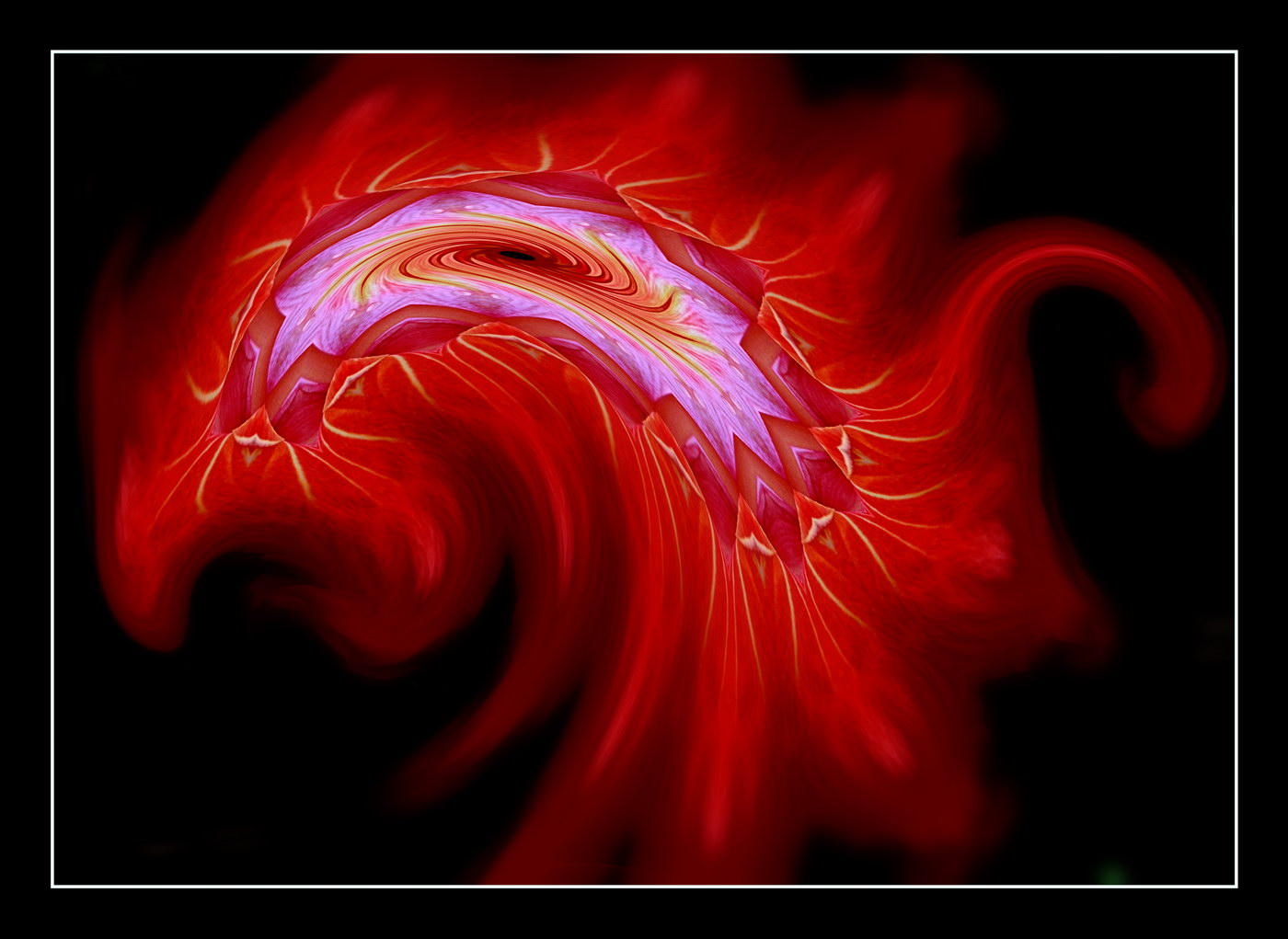
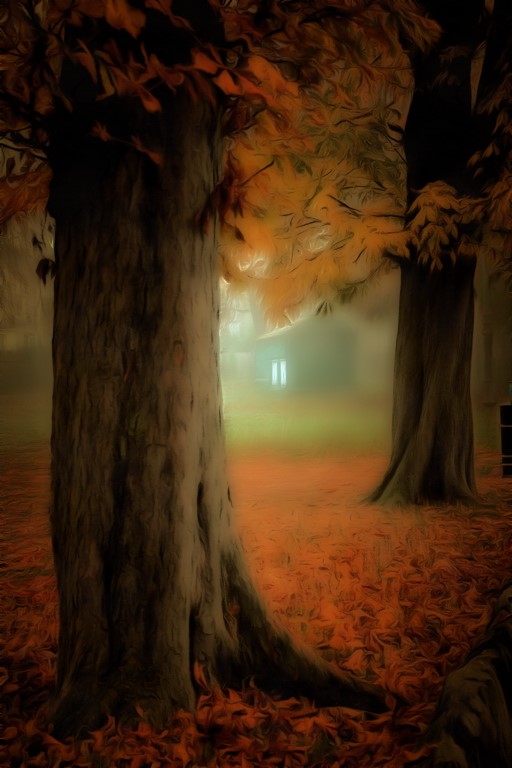
I pondered long over this, wondering if the contour effect was for the better. The overall dark and contrasty look I enjoy, especially the black edges. Some would argue over the right hand edge, especially in bright red. My feeling is that it is okay, given the action is towards that side, and the eye is drawn that way. Maybe a little desaturation. With the left side in deep shadow, I wondered if a degree of soft focus would work, to increase the mystery of the deep shadow, and soften a little the contouring. Local area blurring to the left could be used to emphasize the right side as the train emerges from the smoke. Overall very pleasing to view as it raises the original to a higher level. |
Aug 9th |
3 comments - 1 reply for Group 18
|
3 comments - 1 reply Total
|