|
| Group |
Round |
C/R |
Comment |
Date |
Image |
| 18 |
Jul 17 |
Comment |
looks like the cild is well satisfied. Maybe the last meal was a disagreable adult. I think the lightning would be more effective if the background were darker (which would show off the smoke more too). The "blood" on the right side might be bent to follow the contours of the chin.
But very effective, and a good laugh for the family. |
Jul 11th |
| 18 |
Jul 17 |
Comment |
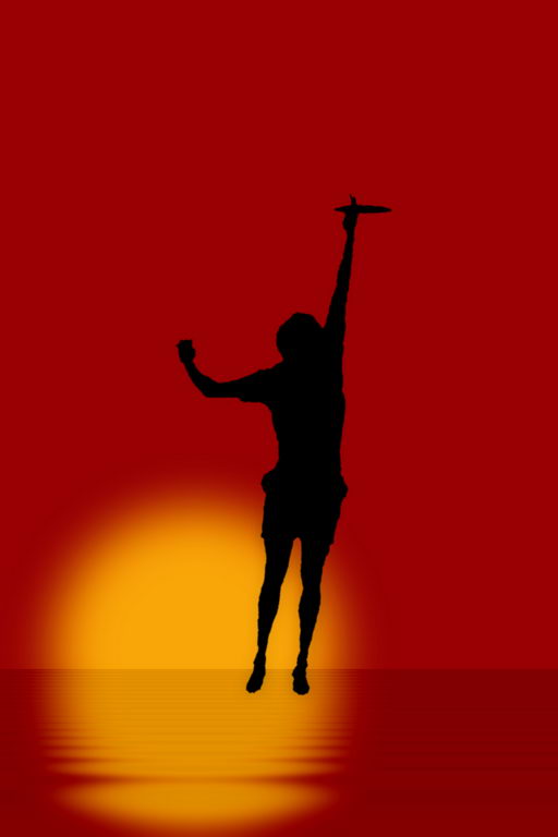
The reduction of the elements to their simplest shapes of featureless colour works very well. The effects of minimalism are very pleasing to the eye and need nothing added or taken away. Much work for much use and much reward in the finished product. Certainly could be one of a coming series.
If I had a tiny niggle it would be the colour of the birds. They would show better for a change in the colour hue or value. |
Jul 11th |
| 18 |
Jul 17 |
Comment |
The scratchy line effect is very post-impressionistic, with even felt tip and line pen effects combined. It lends a van Gogh effect to the boats and the hills. |
Jul 11th |
| 18 |
Jul 17 |
Comment |
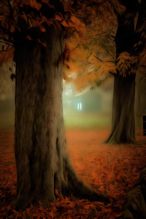
The subject shows promise. The use of contours on the building is fitting for its structure and view point. I would have been inclined to hack out the sky and process building and sky in separate ways for complementarity. |
Jul 11th |
4 comments - 0 replies for Group 18
|
4 comments - 0 replies Total
|
