|
| Group |
Round |
C/R |
Comment |
Date |
Image |
| 18 |
Jan 17 |
Reply |
I agree, Meg. I too would like to see the original. |
Jan 30th |
| 18 |
Jan 17 |
Comment |
For me, it is a very good result. The simplification to outlines leaves the composure and expression to lend the empathy with the subject. The discrete blue eyes are a good understatement. The eyes are the gateway to the soul, and we place great score on the colour (ole blue eyes, big brown eyes, etc.). Ask any cartoonist.
My only niggle is with the rectangular top to the rest on the left. If cloned out down towards the elbow it would be more subtle while leaving the elbow seemingly at rest, while intact. |
Jan 30th |
| 18 |
Jan 17 |
Reply |
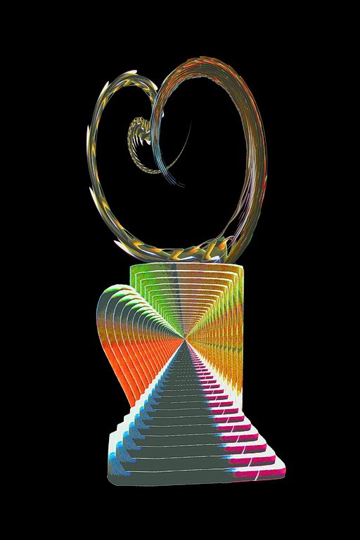
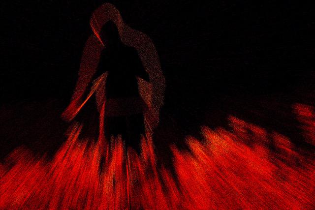
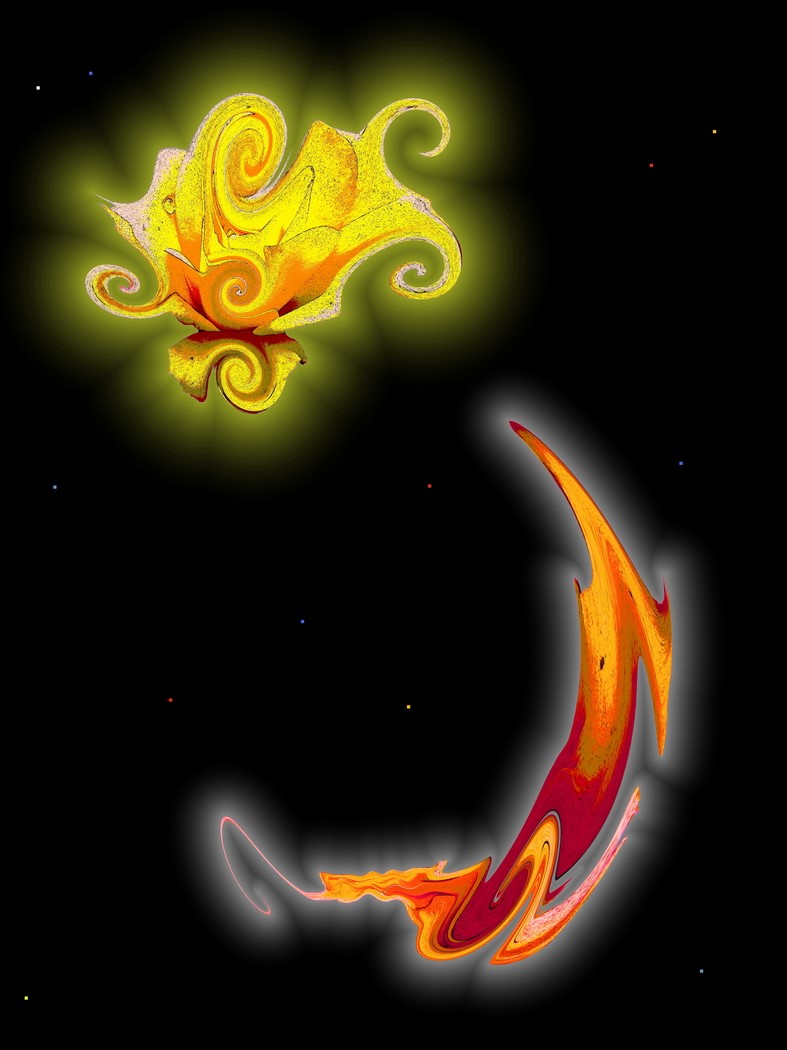
Not for me. It overwhelms the simplicity. The monochrome works better for mood, and leaves room for the subtle colour addition.
|
Jan 30th |
| 18 |
Jan 17 |
Comment |
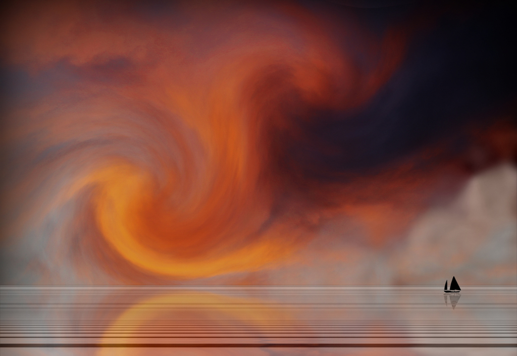
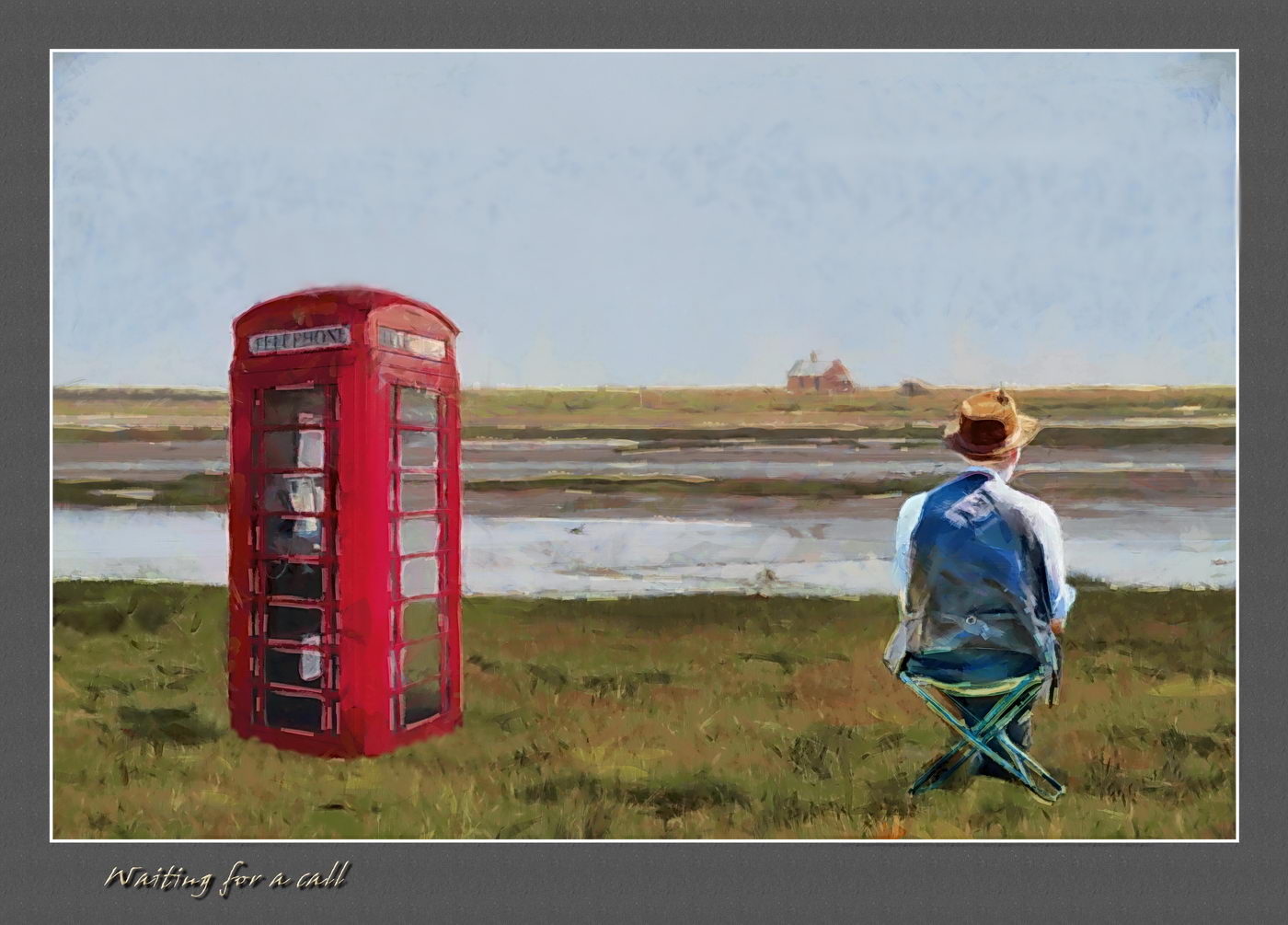
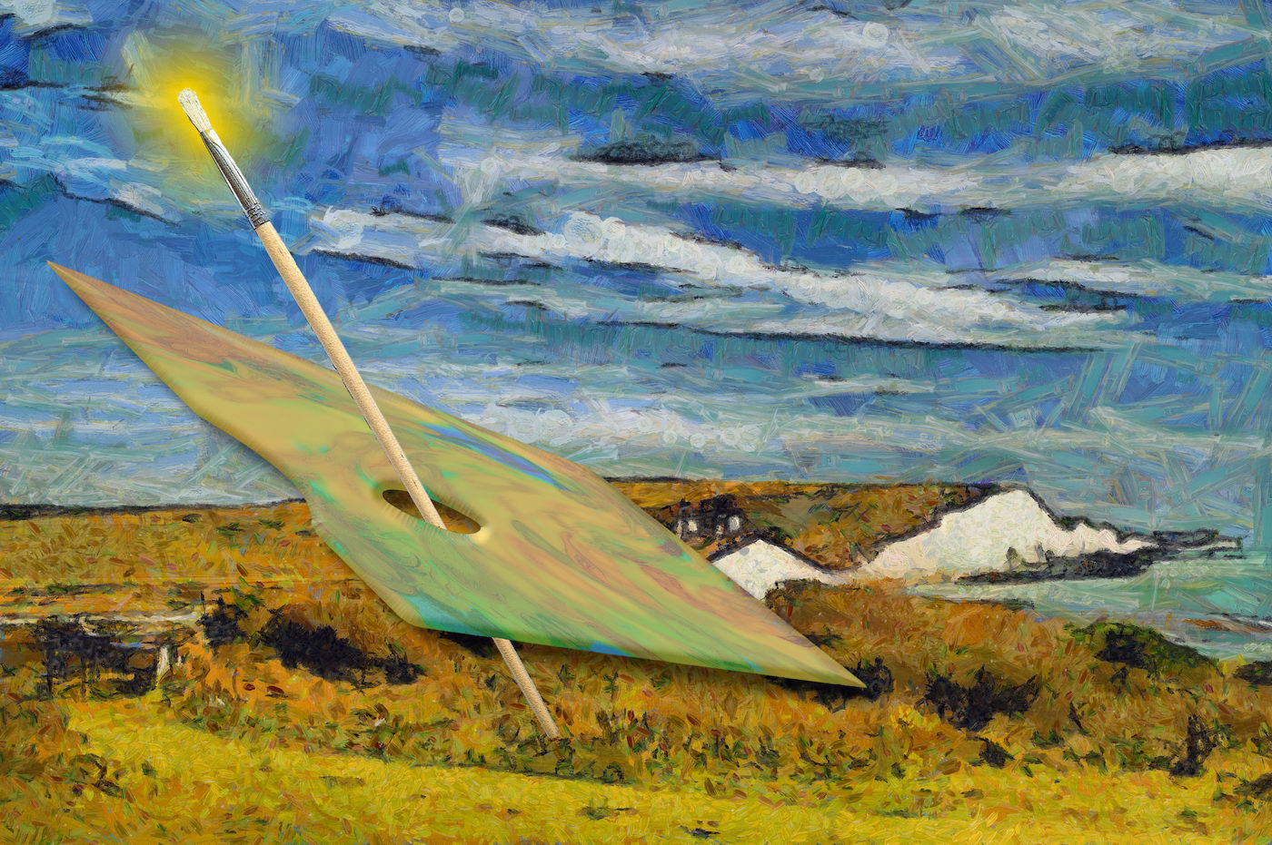
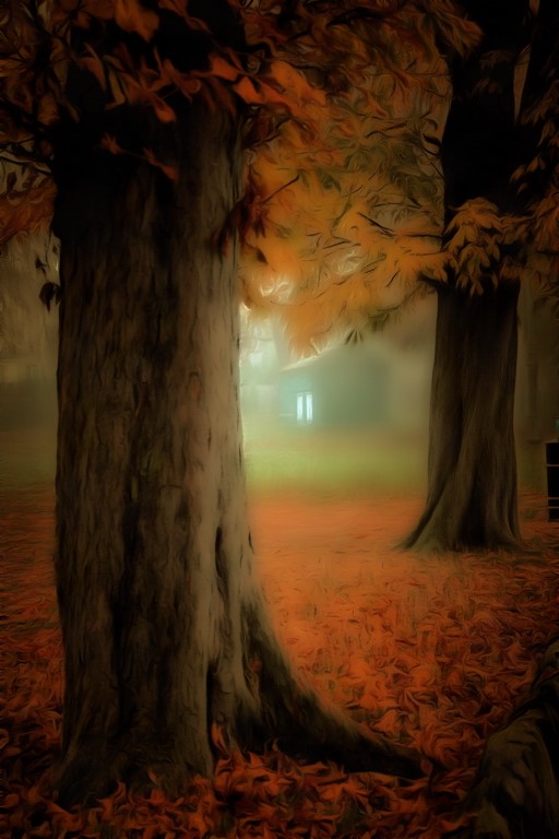
The combination of apposed elements, and the line effects work very well. The "wavy" van Gogh style certainly fits well to augment this. The fence and phone boxes have lovely perspective effects, leaving the eye to centre on the seabird, in particular. Because of these features, the large red component does not overwhelm the whole. |
Jan 30th |
| 18 |
Jan 17 |
Comment |
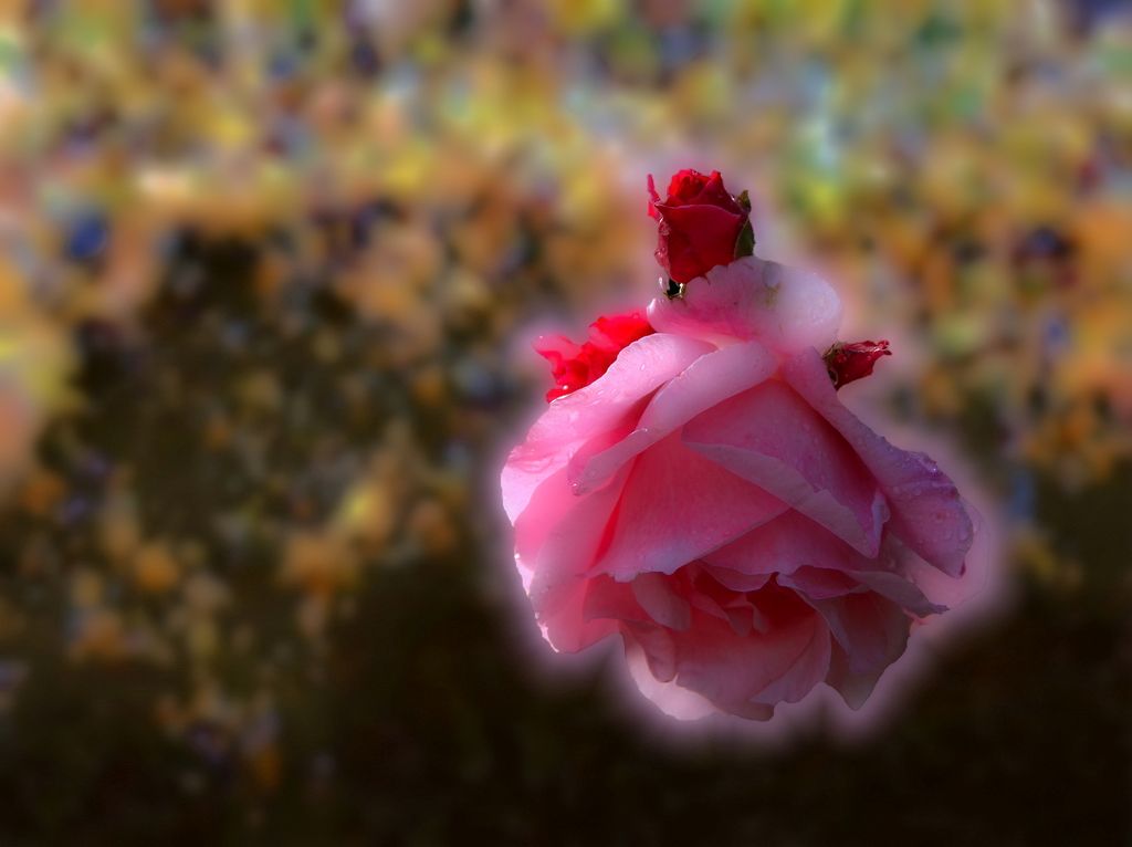
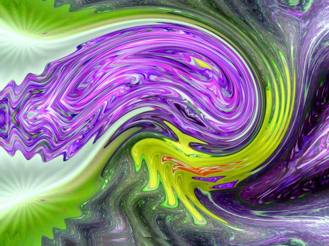
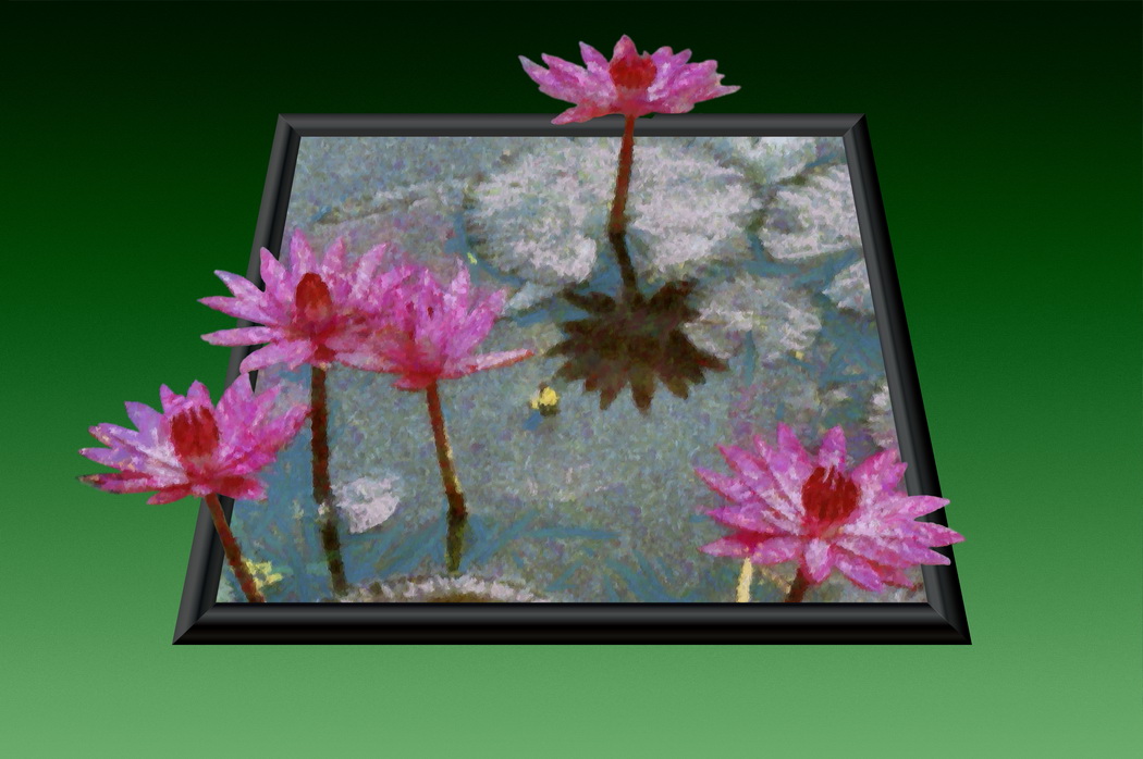
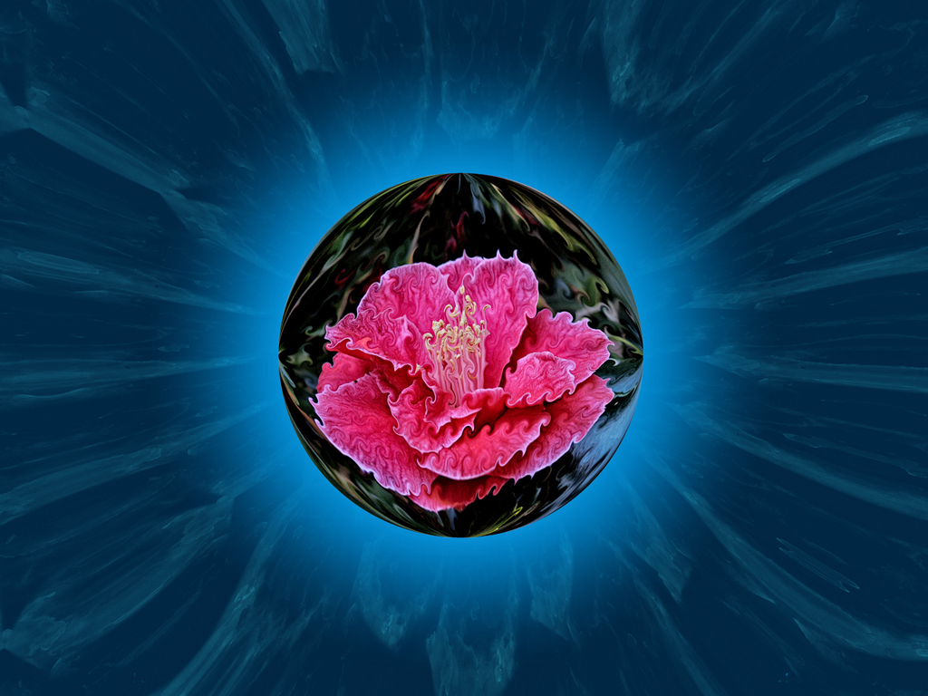
I like the combination of flowers placed into a cutaway nautilus shell. The radial and helical cyclic patterns compliment well. For me, the yellow / orange clashes a bit with the blues, especially against the black. |
Jan 30th |
| 18 |
Jan 17 |
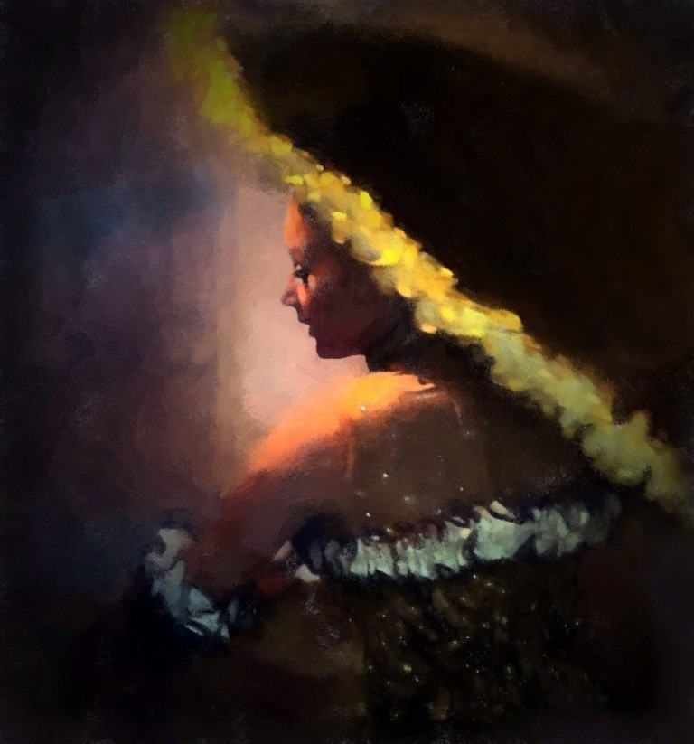
Comment |
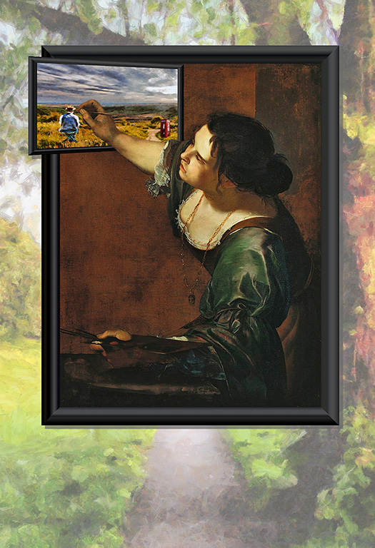
I very much enjoy the achievement made in producing this. Not only in photographic composition of the trim but also the artistic processing. The side and top lighting silhouettes the face and expression very well. The yellow fringe to the umbrella delineates the subject and umbrella well, and forms diagonals well with the fringes of the costume. The highlights on the backdrop nicely become backlighting.
I do not fight to visualize the body of the umbrella, the fringe is more important. With the radial lighting effect the eye moves out from centre (face) to arm and fringes, the left vs. right orientation is of personal preference only.
I have put a little cloning to darken the umbrella, to emphasize the rim.
|
Jan 30th |
 |
| 18 |
Jan 17 |
Comment |
The filter combined with the subject make for a very estetic result. The suggested crop from the rectangular is definitely an improvement.
I am not sure the increasing general vibrancy will improve the result further. Perhaps a little reduction of red (or green and blue increase), to make the greens stronger, might do more to pull out the colour to match the textures. |
Jan 30th |
| 18 |
Jan 17 |
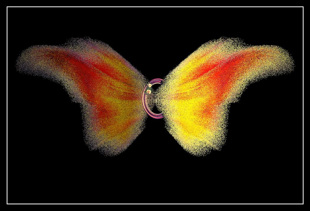
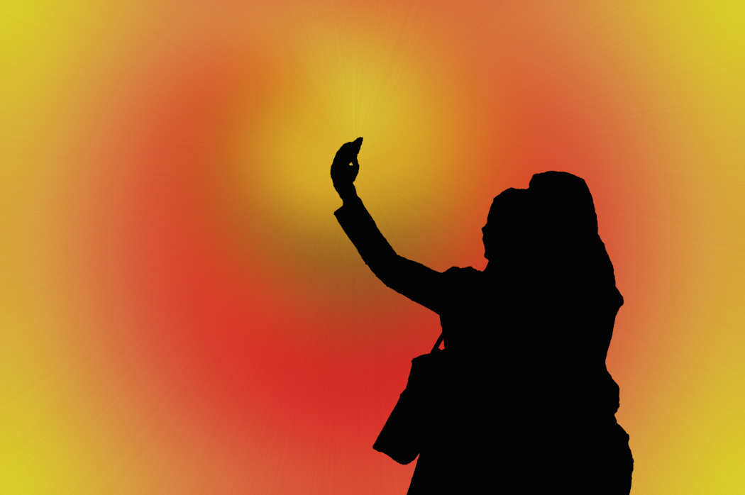
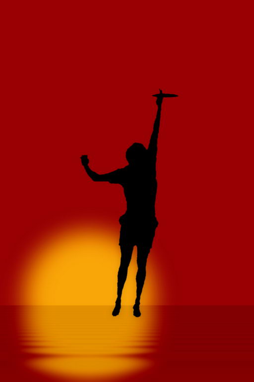
Comment |
I was thinking that in silhouette the ring was not obvious, but decided better an object there to catch than empty space. Maybeit needs removal and another object placed there. |
Jan 13th |
6 comments - 2 replies for Group 18
|
6 comments - 2 replies Total
|