|
| Group |
Round |
C/R |
Comment |
Date |
Image |
| 48 |
Dec 18 |
Reply |
That sounds like a great idea. Thanks. |
Dec 12th |
| 48 |
Dec 18 |
Reply |
I just tried submitting my changed image and don't know how to make it smaller. I also forgot to mention that I had increased the contrast for the whole image, not just the foreground. Is this better? |
Dec 12th |
| 48 |
Dec 18 |
Reply |
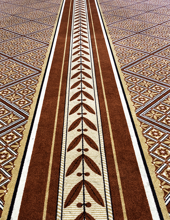
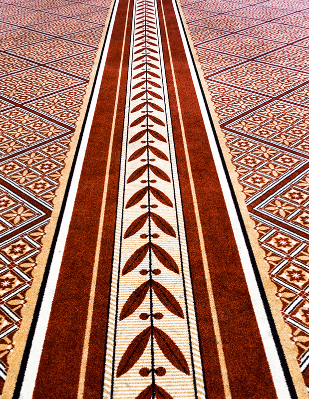
I increased the contrast to 100 (it had been 14) so you were right. To me it looks crisper but I'm not sure I would say sharper because it is still a carpet which is a little rough.
Good suggestion-thanks! I applied the contrast to the whole image though. I've attached the version I just did. What do you think?
|
Dec 12th |
 |
| 48 |
Dec 18 |
Comment |
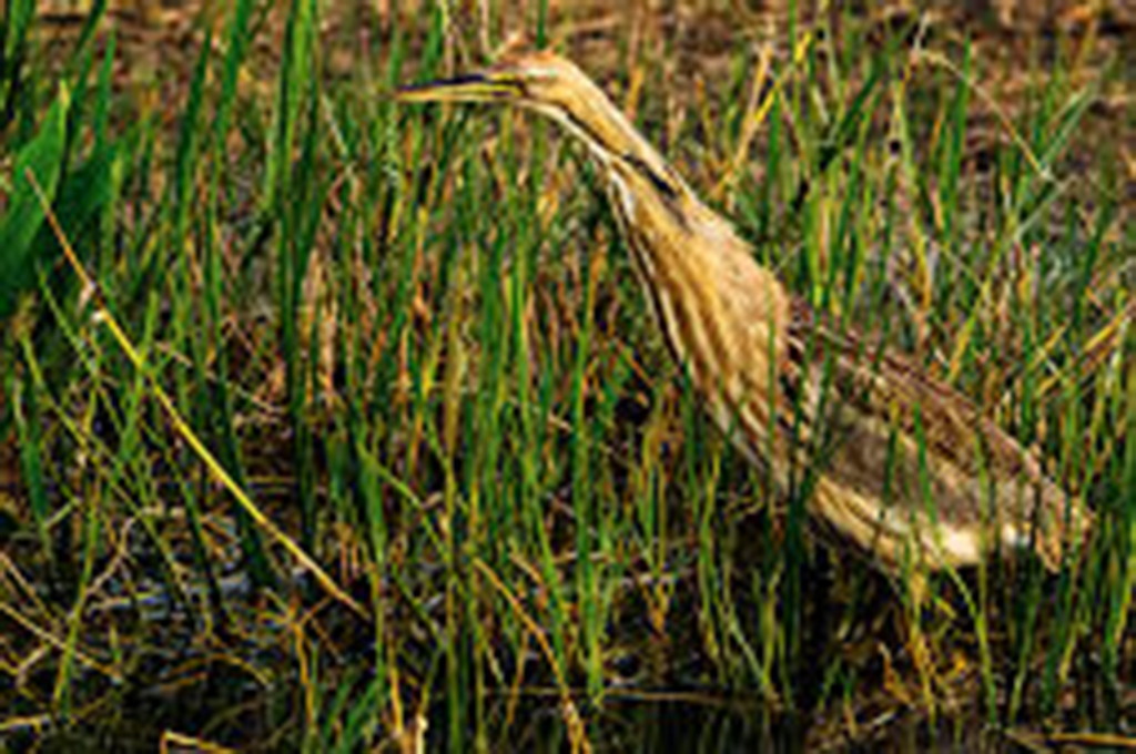
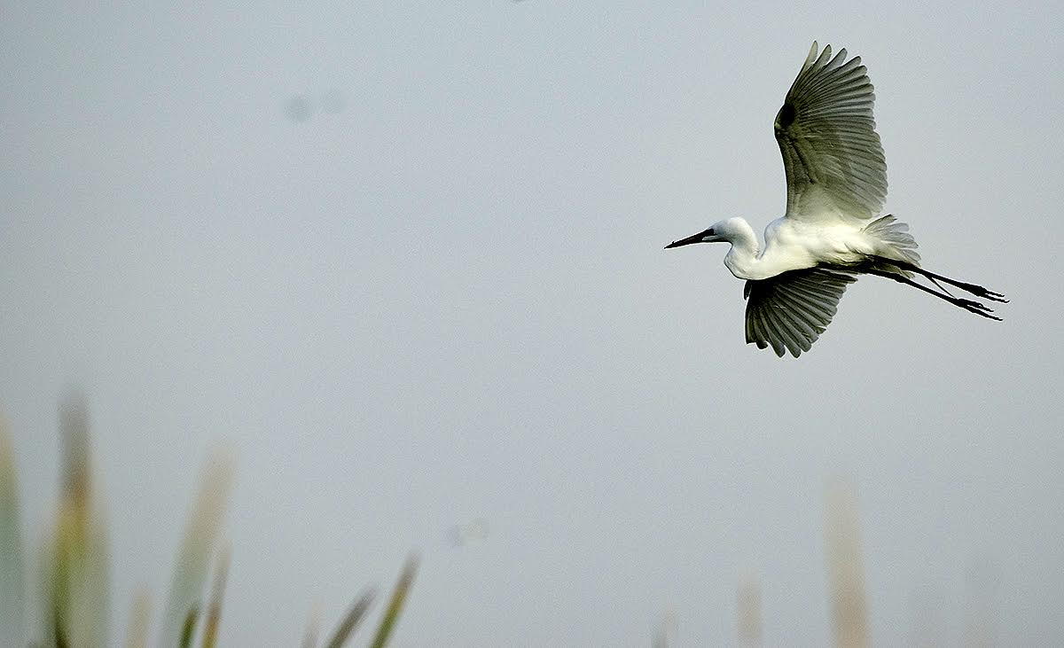
I am an avid birder and would have loved to get such a good shot of a crane. There is no way I can handhold that big a lens so I must set it on a tripod and leave it loose so I can swivel it and raise and lower it which makes it quite difficult to get a shot like this so I am envious. I might like a slightly different background but given the difficulty in getting such a shot, I would take what you got. |
Dec 12th |
| 48 |
Dec 18 |
Comment |
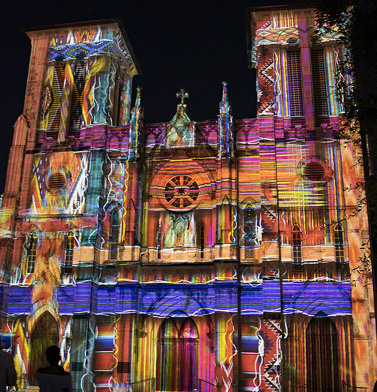
This is not my favorite kind of shot but I do like the colors and the glasses with the reflections in them. I think I would like it much better if the top, bottom and right sides were cropped off, getting rid of those blue areas in the corners and edges. |
Dec 12th |
| 48 |
Dec 18 |
Comment |
Another opinion: I like the cowboy on the left but not the one on the right and I would like a little more space to the left so the horses have someplace to run and then crop some of the sky out. And, maybe you could lighten the face of the cowboy a little. Actually I liked your version when I first looked at it too. |
Dec 12th |
| 48 |
Dec 18 |
Comment |
This is a great first attempt! I assume you used a tripod. I don't mind the brightness at the top right so much but it might be better to be toned down. I think the wide line of light at the bottom bothers me more than that. I might have cropped it out but that might not be what you like which is always what you should do. |
Dec 12th |
| 48 |
Dec 18 |
Comment |
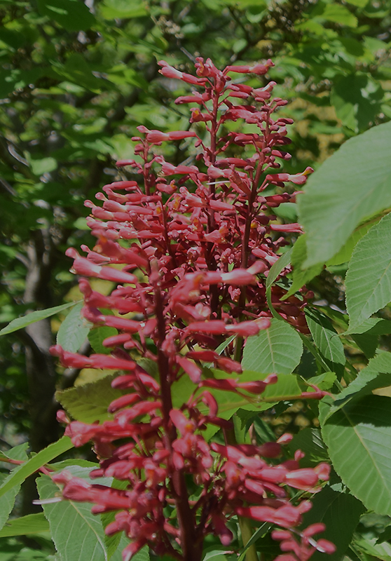
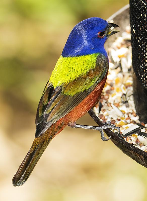
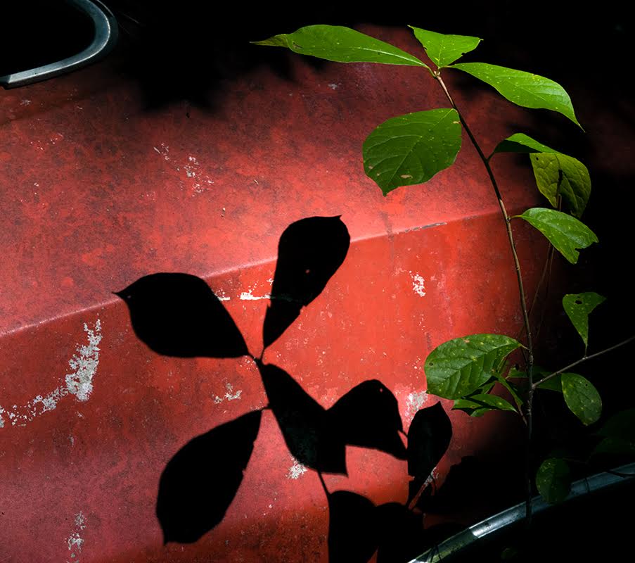
I also can't quite see that it is not sharp so maybe my eyes are going too. I love the main line of orchids and the whole image. If I had to find fault, I might have liked it better if the lone top orchid to the right on the main line had not been chopped off, or could that whole corner be eliminated (not sure how) and maybe the bottom be cropped a little. I would probably not take the time to do all that though. |
Dec 12th |
5 comments - 3 replies for Group 48
|
5 comments - 3 replies Total
|