|
| Group |
Round |
C/R |
Comment |
Date |
Image |
| 4 |
Nov 19 |
Reply |
You are so correct. I often marvel that I missed a dust spot or distracting piece of trash. We zero in on what first engaged us and fail to see many things that grab others. Hence the value of these reviews. |
Nov 20th |
| 4 |
Nov 19 |
Comment |
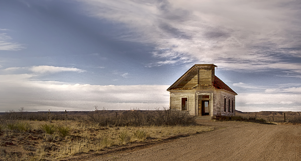
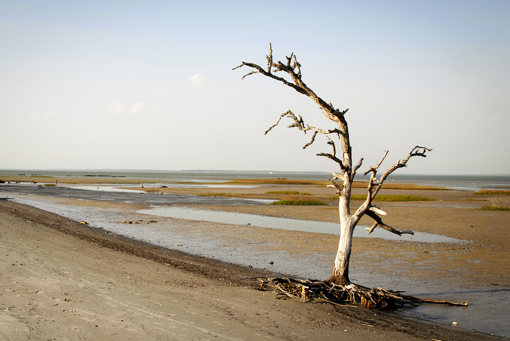
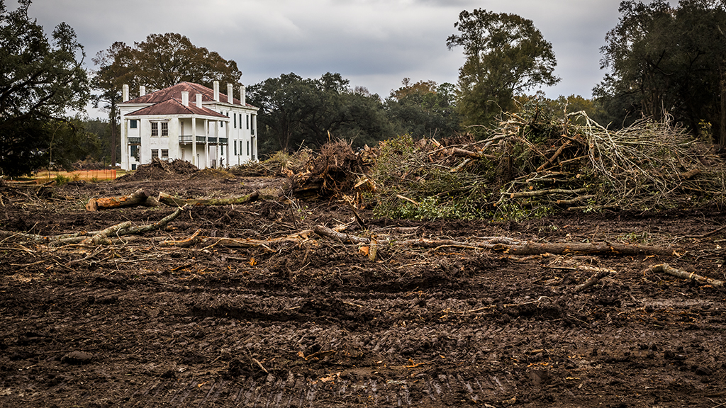
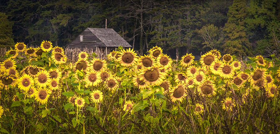
Hi, I am visiting from group 33. I found your exchange of leveling very interesting. I frequently have problems leveling images. I have found that the water needs to be level. Buildings, fences and most other things may lean but water levels itself. I feel that your water is not level. Try leveling the water, if the wood is not level you may want to level it prior to combining the images. Really nice vision and post processing work. |
Nov 18th |
1 comment - 1 reply for Group 4
|
| 33 |
Nov 19 |
Reply |
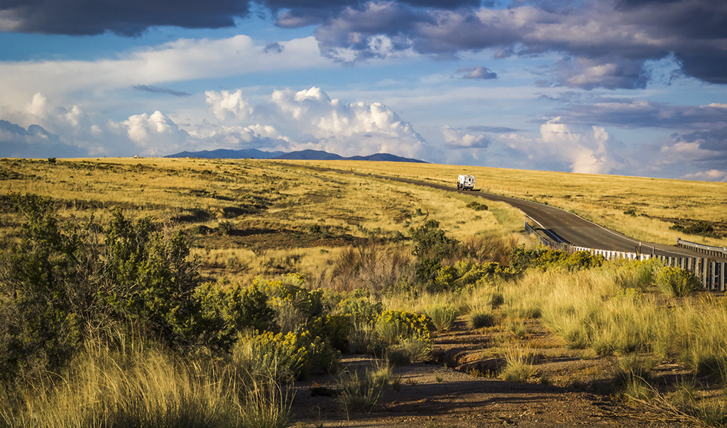
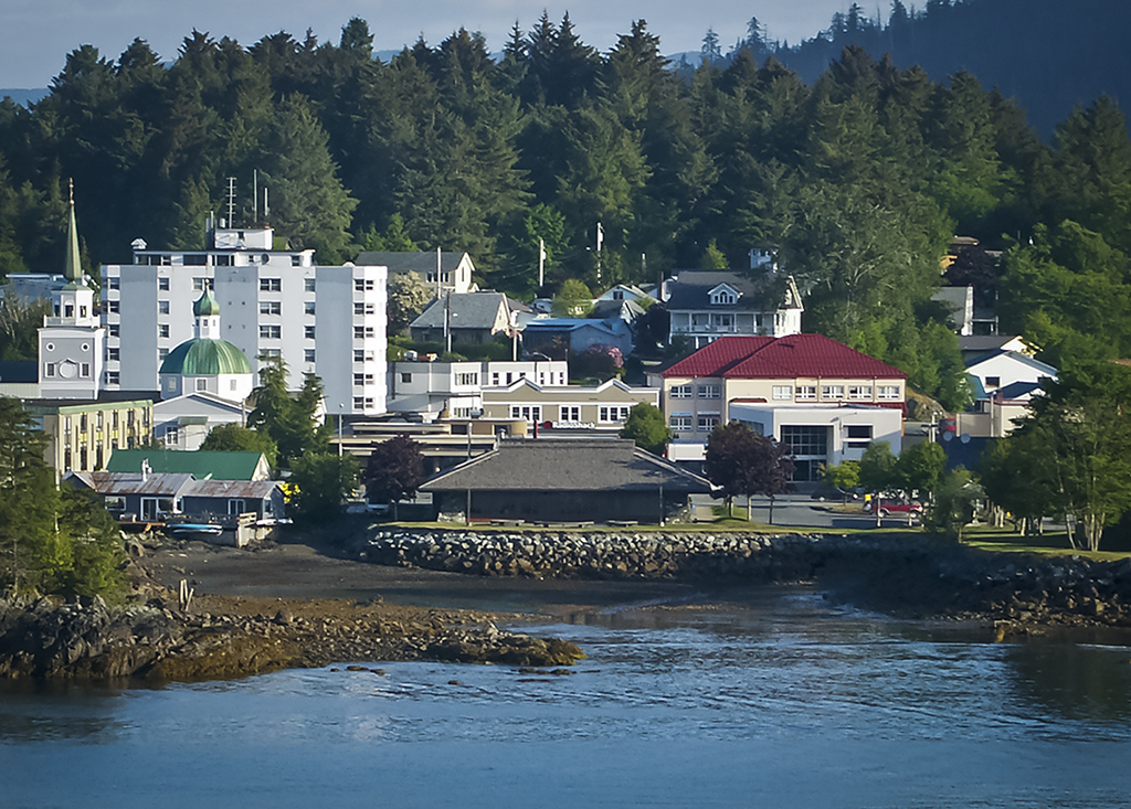
WOW! How I envy you. A friend and I rented a car after our Alaskan cruise and drove from Seattle to Portland. It is one of the most fun things I have ever done. And the scenery is to die for. Count your blessings. |
Nov 20th |
| 33 |
Nov 19 |
Reply |
Thanks. Glad you visited our group. |
Nov 18th |
| 33 |
Nov 19 |
Reply |
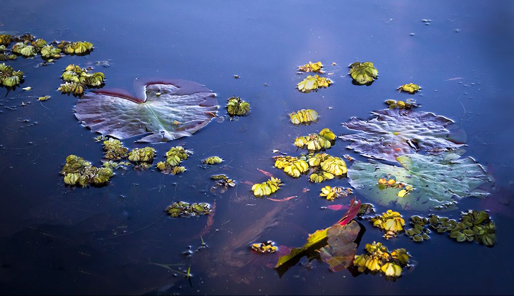
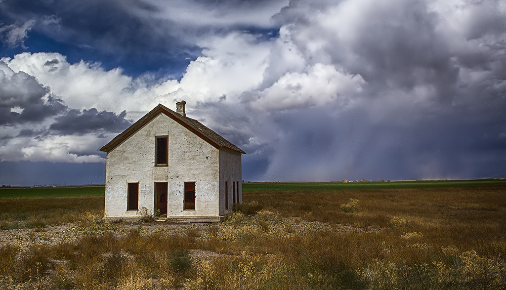
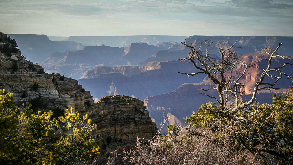
I blew up the RAW file and it is actually a cloud. But you are correct that it looks like a water spot and needs to go. I will work on changing it to look more like a cloud. Thanks.
Do try to go there. It is wonderful. So much could be done with photography there. I wish I had had a longer lens with me. Abstract possibilities are endless. |
Nov 18th |
| 33 |
Nov 19 |
Comment |
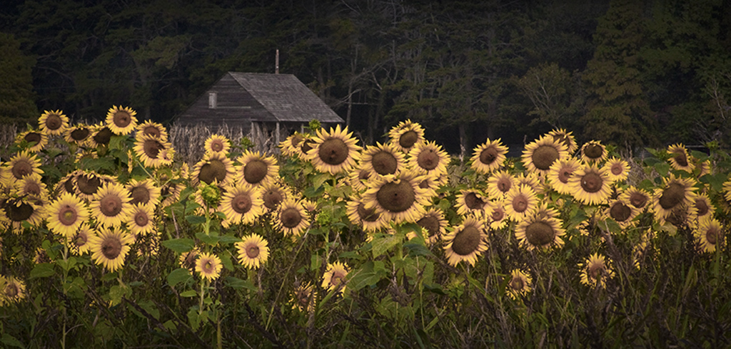
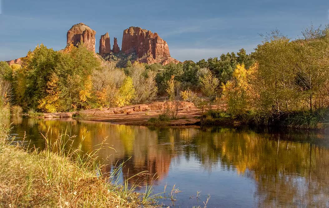
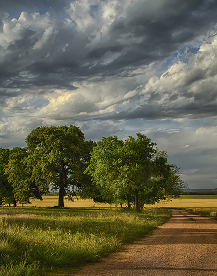
I thought scenes like this only existed in the minds of painters. It is beautiful. Everything that would make a scene like this sing is there - well maybe a little boy in blue overalls and his dog by the creek - but that would be too much. Yes, removing that little tree does help, but other that that it is perfect. Lovely. |
Nov 16th |
| 33 |
Nov 19 |
Comment |
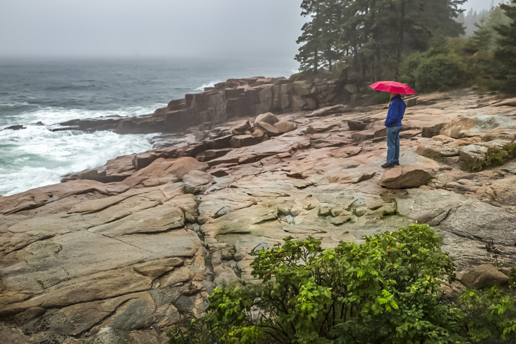
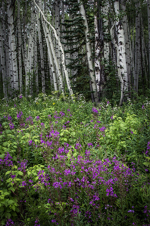
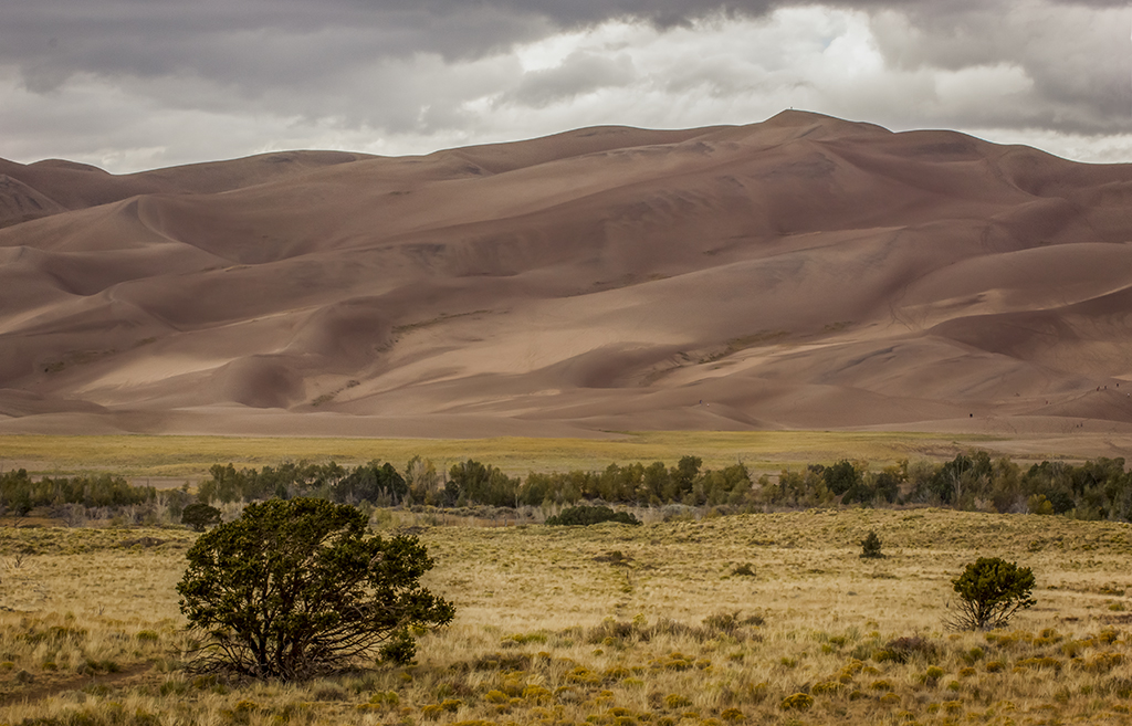
I really like this lines of this image. It seems very peaceful. I agree that it helps to eliminate the green at the bottom. I also would alter the small peak of a hill on the left end - either make it larger or eliminate it. If you eliminate I would move the left side of the frame in a little so that your mountains don't just drop off. I do find it beautiful and very pleasing.
One question: are these the fall color of the bushes or blooms? My blueberry bush has very light pinkish white blooms. So I wonder if there are commercial varieties that have red blooms. |
Nov 16th |
| 33 |
Nov 19 |
Comment |
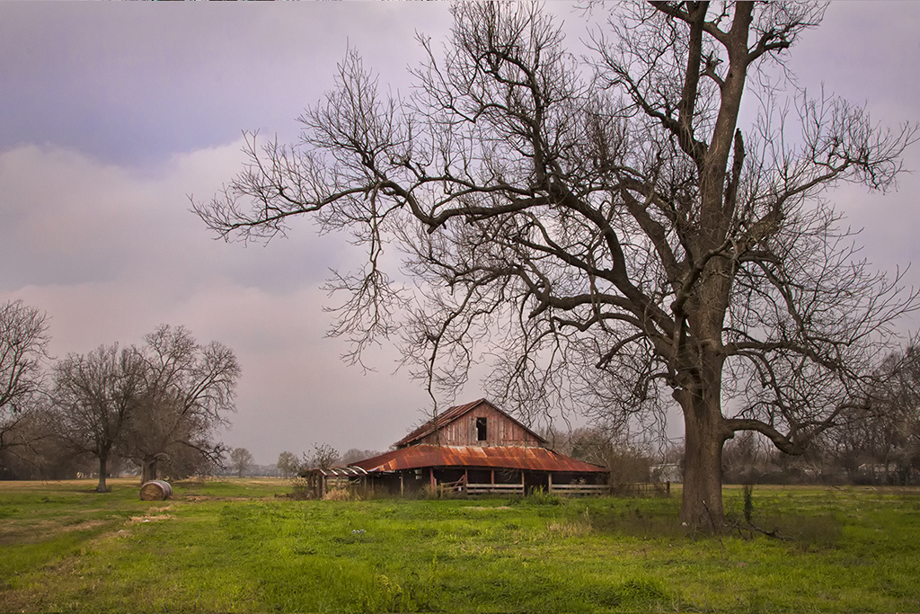
Nice composition of a lovely scene. You are progressing with PS at neck breaking speed. I am excited for you to be learning so fast. I think it a great idea to use the group to help you in places where you run into difficulty. They are a good group and very knowledgeable. Nice work. |
Nov 16th |
| 33 |
Nov 19 |
Comment |
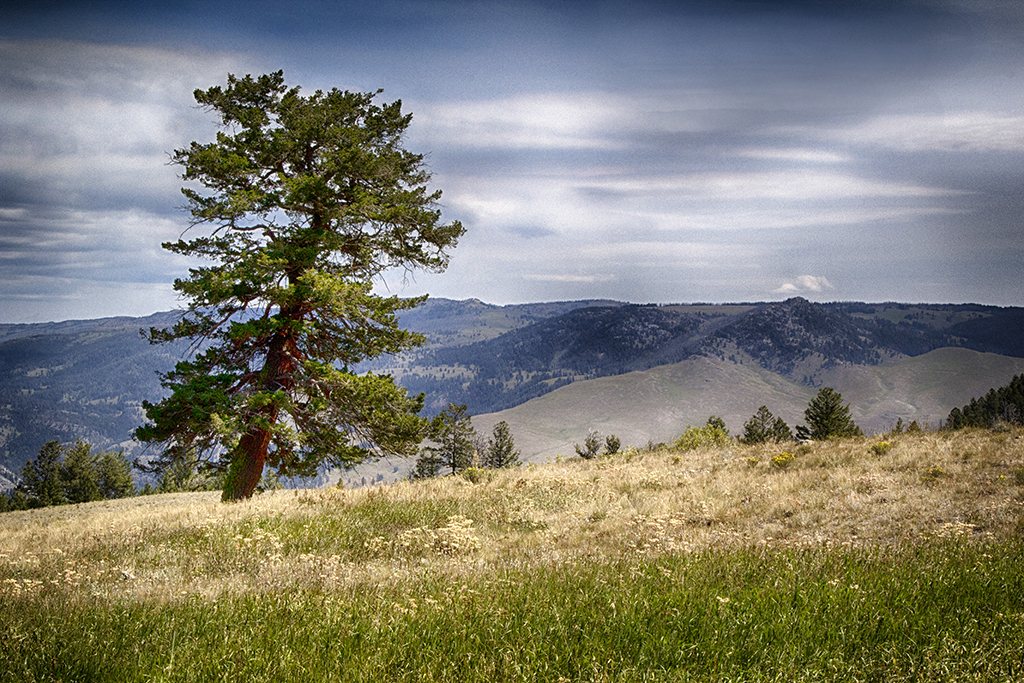
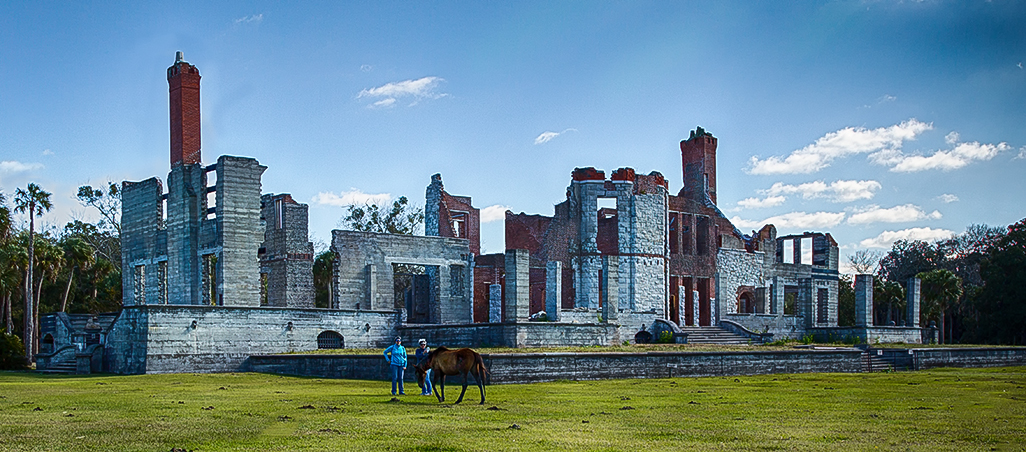
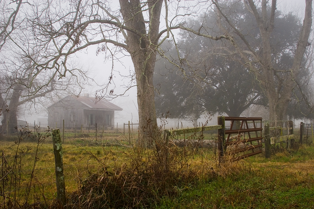
This is a wonderful capture of a great scene. I like the darker foreground because it is less cluttered. My eye comes down from the left upper corner to the valley and across to the village the up the right ridges to the bright mountain tops. Love that composition. It might work to leave the dark mountains a little lighter for some detail, but I would not lightenen the foreground. Good job. |
Nov 16th |
| 33 |
Nov 19 |
Comment |
I had not noticed that line before. I checked the tif and it appears to be some darker soil turned up. None the less, I thank you for pointing it out. It does need to go. |
Nov 15th |
| 33 |
Nov 19 |
Comment |
BTW, friends, when I wrote the comments I forgot which shot I chose and thought it was the one with mountains behind it. Sorry. All else applies to this scene. I debated on which to send and just included the big mountains in my mind. Getting old is difficult. |
Nov 10th |
| 33 |
Nov 19 |
Reply |
Here is the color image. I felt the foreeground was too bright and was distracting. I could have darkened it but felt it would not darken in good tones. See what you think. Also I intender to convert to monotone when I took these photos, A few look good in color, but for the most part I like the black and white. Just a matter of preference, I think |
Nov 10th |
 |
| 33 |
Nov 19 |
Reply |
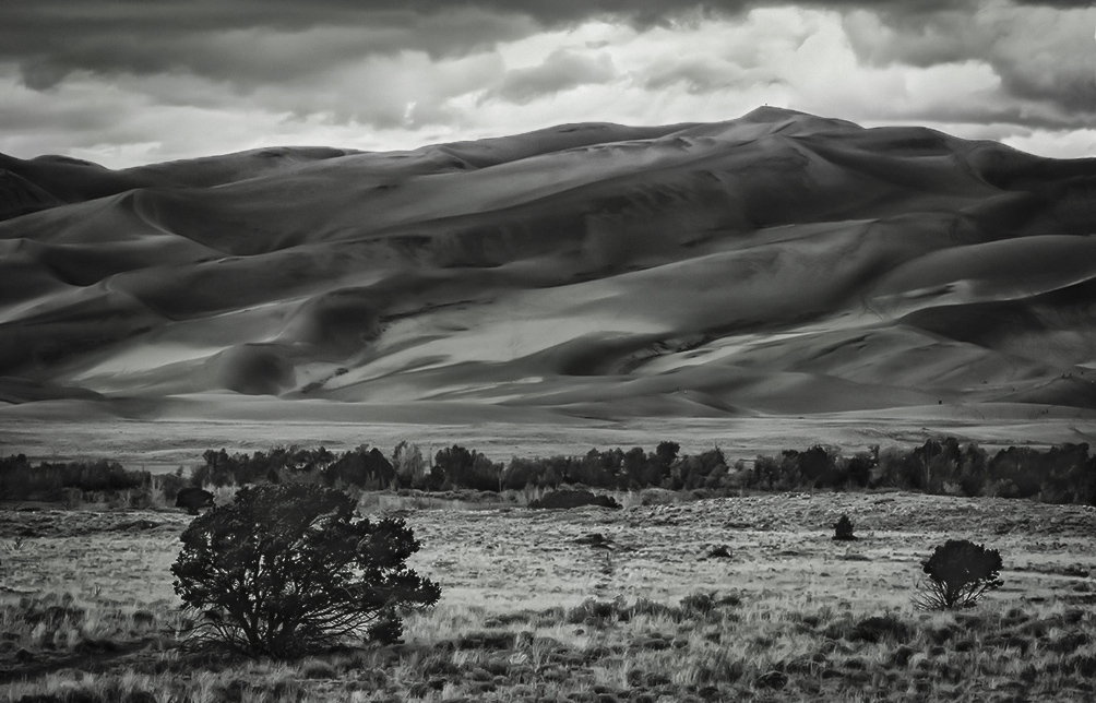
I planned for the edges to be sharp. The softness is due to the wind and sand moving. I am not sure if the rain was still draining, if so, I think it added to the softness. I like the variation. I think it adds interest. I did not do any noise reduction. These things make the dunes more interesting to me because you can never get the same photo twice. It is alive wit movement. |
Nov 10th |
6 comments - 5 replies for Group 33
|
7 comments - 6 replies Total
|