|
| Group |
Round |
C/R |
Comment |
Date |
Image |
| 33 |
Sep 19 |
Comment |
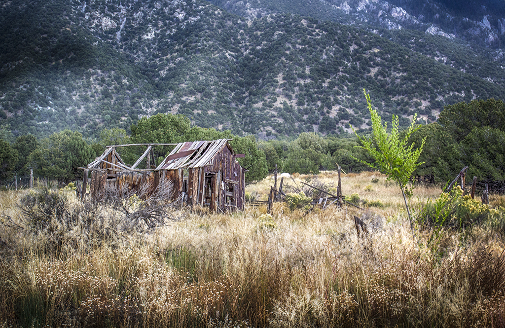
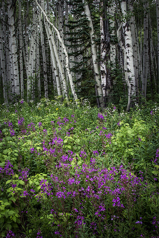
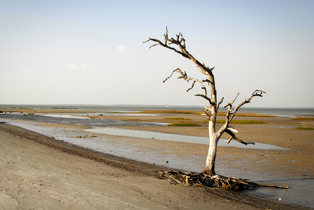
It does simplify the image to cut out the big tree. I feel that the towers need just a little more space at the top. The most interesting thing to me, other than the tree, is the textures of the grasses growing in the foreground. I wonder how it would look if you had gotten near the ground and "looked" up at the tree and towers. I don't know about you, but I sometimes find gardens difficult to photograph. I don't know why, but maybe it is overload. |
Sep 15th |
| 33 |
Sep 19 |
Comment |
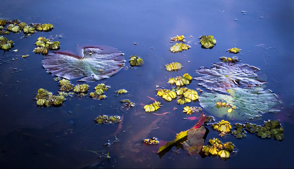
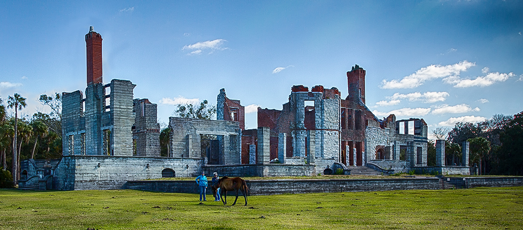
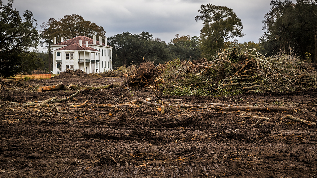
I like the composition on the photo that you submitted better than the second one because the empty space compared to the plot tells the viewer that life is brief, so make the best of it now. Because of that I like your image and see it as art. The neatly mowed grass and the well cared for cemetery show respect of those who struggled to make this land what it was and is. I also like the high, high horizon line. Nice. Simple, but a great life lesson. |
Sep 15th |
| 33 |
Sep 19 |
Comment |
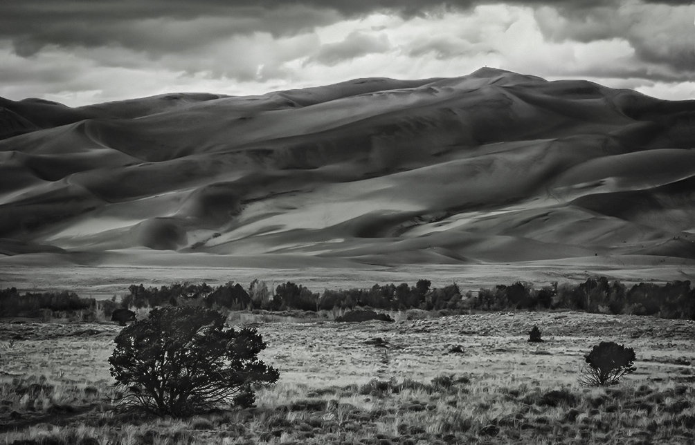
Very nice image, Ken. I would like to see just a little texture on at least a couple of areas of the cave walls. The bird is the touch that makes this your image as opposed to all others of such scenes.
Wonderful. |
Sep 15th |
| 33 |
Sep 19 |
Comment |
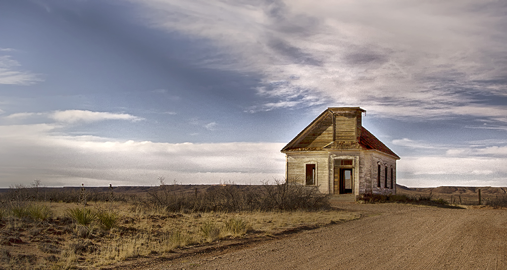
Marilyn, I wish you lots of luck in learning PS. It is a wonderful tool, can do endless wonders. But that learning curve is something else. When I was first learning (and I am still learning) 25 years ago, I was working but would come home and work on learning one little thing until 2 a.m. Crazy, but it pulls you in. They should offer PhD in PS. And back to your wonderful photo. The contrasts are marvelous and well captured. I do think it might help to darken the sky a little and make the church stand out more. An easy way to do that is to click on the adjustment brush at the top of the ACR page and reduce the brightness and exposure. Then brush over the sky. Good balance, composition, and story. Well done. |
Sep 15th |
| 33 |
Sep 19 |
Comment |
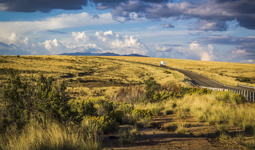
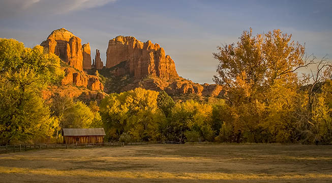
I would call this 100% perfect image. I understand why Bob says to crop the sky out, but I feel that it if you did the horizon would be dead center and not as effective. I ove the strong diagonals that lead to the chapel along with the other strong lines and textures. The placement of the chapel is perfect. The contrast of the size to the mountains really makes me see man compared to those mountains. Inspirational and beautiful.
By the way, folks, I had lots of computer problems this last month so could not get a submission ready. Sorry. I love the feedback. |
Sep 15th |
5 comments - 0 replies for Group 33
|
5 comments - 0 replies Total
|