|
| Group |
Round |
C/R |
Comment |
Date |
Image |
| 65 |
Sep 18 |
Reply |
Hi Lynne
Yes, I should have cloned out that white dot in the black area. I did others, somehow I missed that one.
Next time, I'll pick the flower, bring it inside and set up the tripod. (better start now!) |
Sep 26th |
| 65 |
Sep 18 |
Comment |
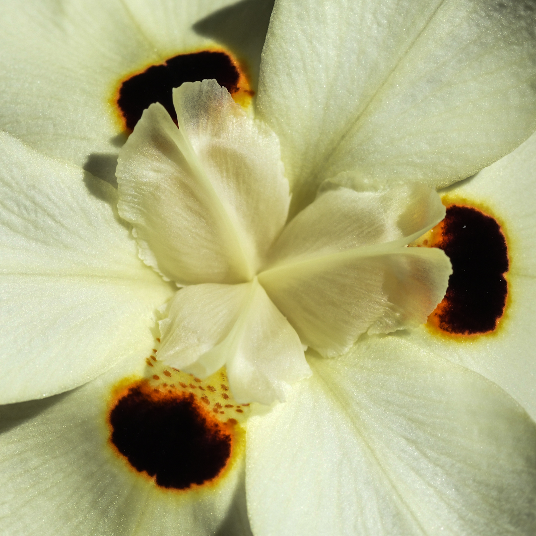
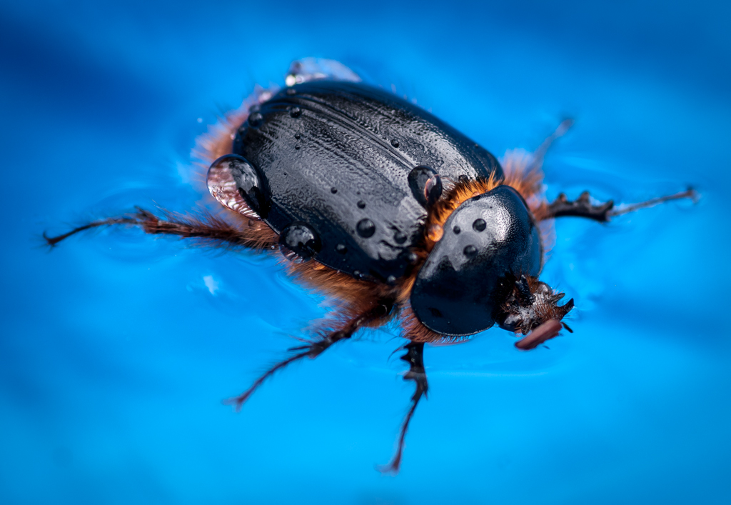
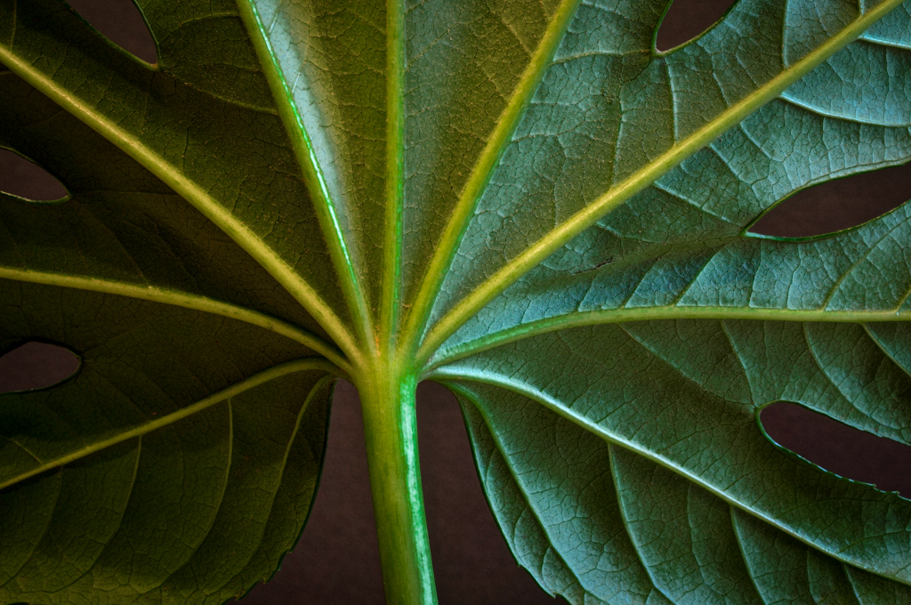
Very lovely photo Angela. The center of your mum is very sharp and full of detail including the detail within the water droplets. I really like that.
Your composition with the closed buds in the 11, 3 and 7 o'clock positions was well done. It gives the image a very balanced feel. Having the lighter bud in the upper left, again keeps your eye within the frame. The whole image is well exposed without any hot spots.
If I were to suggest anything, it would be to try and get the outermost petals in the upper left quadrant of the flower in focus. I mention this only to throw out the challenge to see if you could do this. Of course, I could push myself to accomplish the same thing too.
|
Sep 26th |
| 65 |
Sep 18 |
Comment |
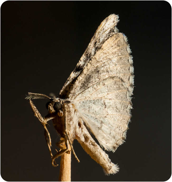
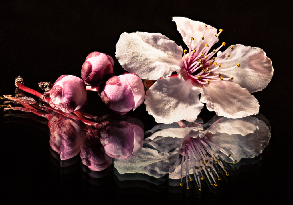
Very pleasing colors. Here is an example of the comment I made in Lynne's image about having the lighter background in the upper left which keeps our eyes in the frame. Having the orientation of the blossom in the same direction reinforces that approach.
I have never used Lightroom to focus stack so I'm not sure how well it works. I would like to see more of the blossom in focus. It appears that your slices have very shallow depth of field so you may have needed more slices to get more of the image in focus. What you did capture in focus is very nice. I like seeing all of the little hairs/fibers on the surface. It gives a nice textured feeling. |
Sep 26th |
| 65 |
Sep 18 |
Comment |
Lovely, lovely photo Charles!
Question: I assume you were over at Filoli. Was this flower in an arrangement against the green wall or out in the garden? I'm trying to figure out how you got the background. It gives the image a very nice painter-ly quality.
I see a little softness in the petals in front of the center bud only because I have my nose about 6 inches from the screen. I also note a very thin bright yellow edge to the petal on the far right which may be an artifact of focus stacking process.
Regardless, your photo is a worthy addition to your portfolio. |
Sep 26th |
| 65 |
Sep 18 |
Comment |
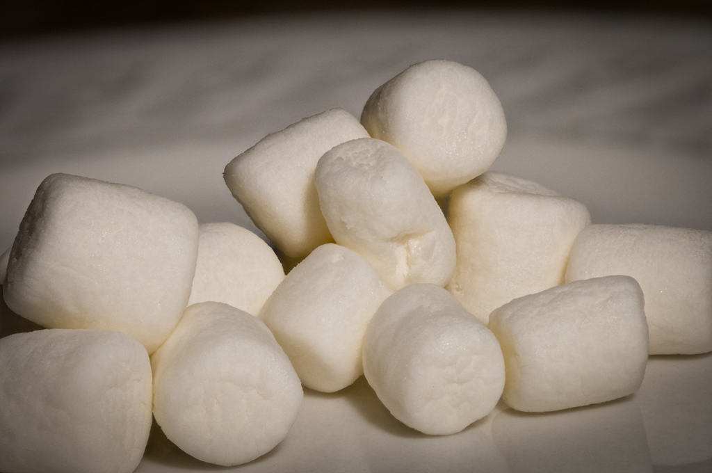
I'm with Lynne here! I'm not sure I could get up "close and personal" with such a spider! Although my curiosity might have gotten the best of me.
I like your composition and the effect of "floating". You did a good job of exposing the image without blowing out the white.
The baby at the top looks a little soft to me.
I think the image could use some more contrast to sharpen up the details. I would like to see more detail in the riding babies.
|
Sep 26th |
| 65 |
Sep 18 |
Comment |
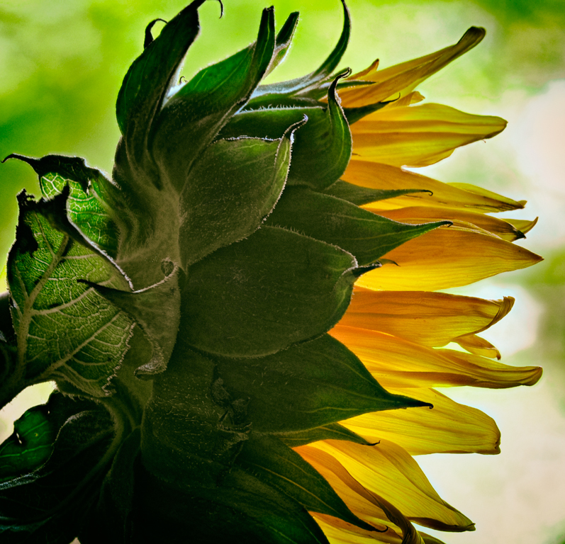
My first impression when I brought up your photo was that the subject was heart-shaped and would be perfect for Valentine's day. I like the use of the oil painting filter. I am not distracted by the background because I think you have darkened it sufficiently so that it doesn't compete with the bud. I also think that seeing some of the patterns in the background add to balance the image and avoid the feeling that your bud is too centered. I like the sweeping of the tail down and to the right.
One thought to consider; in my last camera club meeting the judge mentioned that the light spot of the photo should be on the upper left because that is what is natural for us (reading top-down left-to-right). You mentioned that you darkened that down. I would be interested to see what the effect would have been if you didn't bring it down as much. I would also be interested to see what the other members think about this concept of keeping the upper left corner of the frame lighter than the other three corners. |
Sep 26th |
5 comments - 1 reply for Group 65
|
5 comments - 1 reply Total
|