|
| Group |
Round |
C/R |
Comment |
Date |
Image |
| 65 |
May 18 |
Comment |
I also enjoy the choice of color for the background, it is a nice contrast to the color of the coin. All of the scratches in the coin along with the texture in the felt add interest. I am intrigued by how you got the coin to stand up. It does look like your perspective was a little to the right given that we can see some of the ridges on the coin's edge on that side which confirms Charles' observation. I like that angle personally.
Nicely done. |
May 14th |
| 65 |
May 18 |
Comment |
I like your use of making one coin different than the rest by color; making it stand out. Your dime is nice and sharp and although it is pretty close to being right in the center of the image; the arrangement of the background pennies make it work. I noticed the fabric pattern in your base which complements nicely with the ridges on the side of the dime. You have good exposure with no hot spots.
My only suggestions for improvement would be to "clone" out the couple of larger white dots on the fabric that are to the right of the dime which are probably part of the fabric but come across as specks of lint and, as Charles suggested, bring back the rest of the coins at the top and remove some of the space at the bottom (its the thing I have been reminded to do several times). |
May 14th |
| 65 |
May 18 |
Comment |
I definitely like your final image so much more than the single coin. I like the way you arranged the coins with the layering of the background coins and the centerpiece; front and center (I know; redundant use of the word "center"). I also like your arrangement alternating shiny and tarnished. I think your choice of the gray base is a nice contrast to the orange subjects. Your decision to angle the writing of the primary coin also adds to the overall pleasing effect. Your signature in the lower right conjures up images of the writing in the Declaration of Independence in my mind.
I'm at a loss for any suggestions for improvement; just too good.
|
May 14th |
| 65 |
May 18 |
Comment |
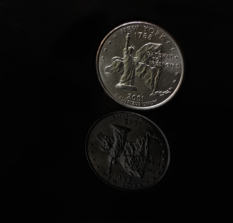
I love the detail and sharpness of this image. As Charles mentioned, the wear-and-tear add so much interest. I also enjoy seeing a coin that we don't see around here everyday. It makes you appreciate the thought that goes into the design of our currency. I too like the pure black background. I don't have any suggestions for improvement. Its perfect as is. |
May 14th |
| 65 |
May 18 |
Comment |
I really like your choice using a stack of coins and the "haphazard" arrangement (as Charles mentioned). I like the diminishing sharpness as you go down the pile. The sharpness and detail in the top penny is well done.
The one thing I would suggest for improvement is to eliminate the variation of the gray/black in the background. I'm guessing that this is the result of the arrangement of lights creating a two-tone background with a triangular pattern.
Aside from that, you have a wonderful creative image. Nice job! |
May 14th |
5 comments - 0 replies for Group 65
|
5 comments - 0 replies Total
|
