|
| Group |
Round |
C/R |
Comment |
Date |
Image |
| 65 |
Apr 18 |
Comment |
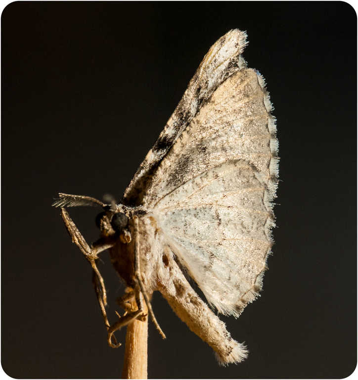
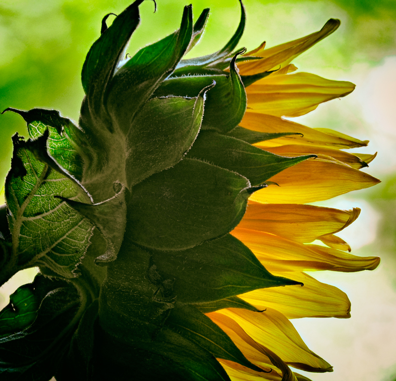
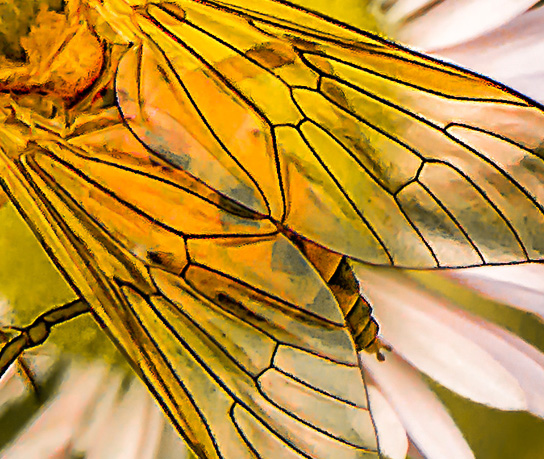
I love the the wings in this image. I don't know how you did this but it is a very nice effect.
I agree with the others that the effect of the rest of the image is distracting.
My suggestion would be to crop down so that you capture just the wings which are the best part of the photo and tone down the rest. Here is an example of what I'm talking about.
|
Apr 21st |
 |
| 65 |
Apr 18 |
Comment |
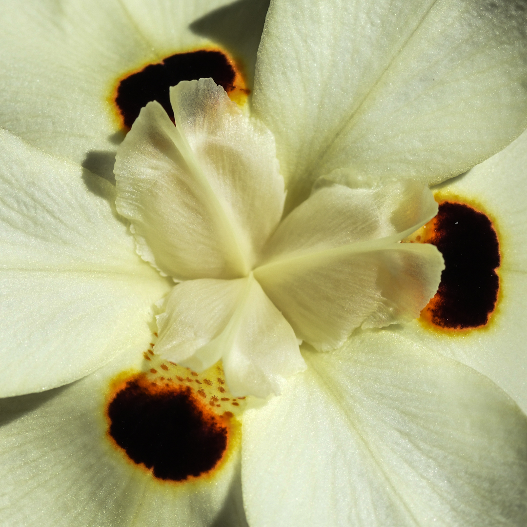
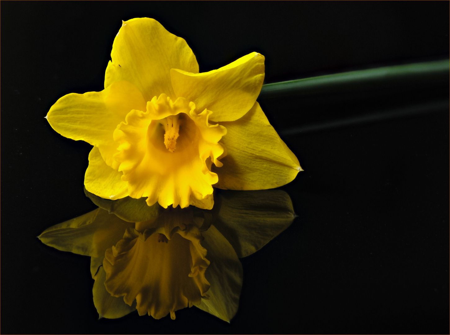
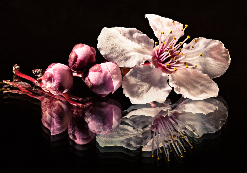
I love this photo Charles. Your composition is exquisite! I like the little offset of the center portion of the flower so that you see center post holding up the lovely pale pink tiny petals. This looks like a hibiscus bloom to me and am amazed at the combination of colors that nature provided here and how well they work together! The texture and detail of the orange and underlying green petals was captured very well in your focus slices.
If I had to nitpick about anything (and believe me, this is nitpicking); I would clone out the little damaged edge of the petal in the upper left side of the frame. Otherwise a perfect image to me.
I'll have to check out this Helicon Focus stacking app now. Hard to keep up with advances in technology and software! |
Apr 21st |
| 65 |
Apr 18 |
Comment |
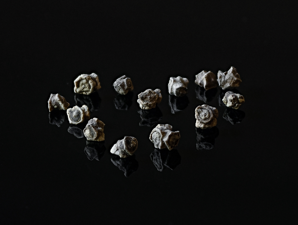
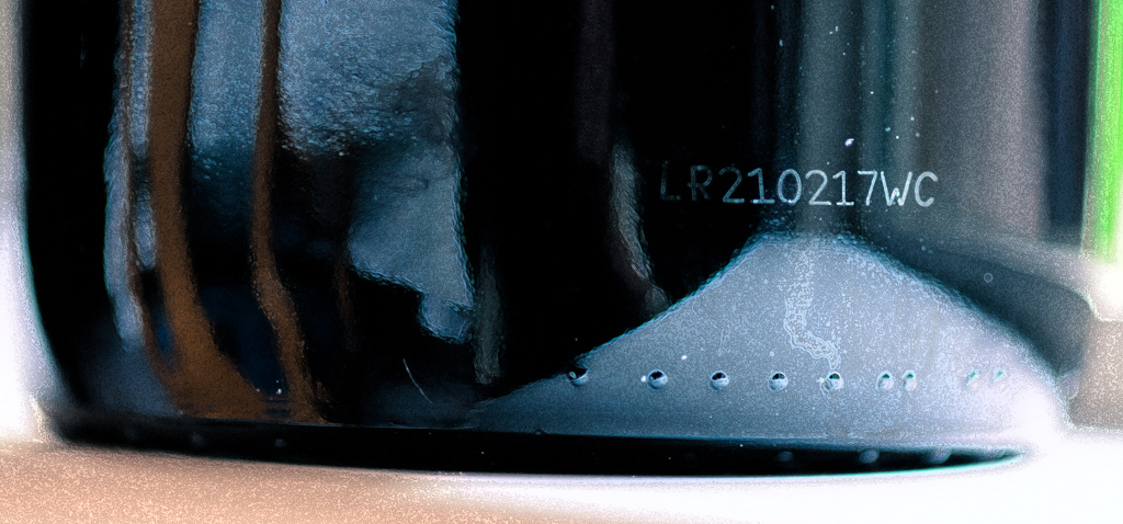
I love the textures of this photo with the peeling paint and rust.
The feeling of unbalance for me is coming more from a sense of dipping a bit on the right side. It could be from the curve of the line at the top; I want to pick the right side up a bit.
I like the colors; the blue portion doesn't bother me as it appears to be the original color of the object worn down over time and is visible in other areas of the photo.
I would suggest lowering the brightness of the right side so that your attention is kept on the handle. |
Apr 21st |
| 65 |
Apr 18 |
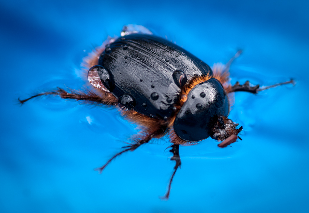
Comment |
I thought I was looking at the eye of a lizard at first. We have lots of wild turkeys wandering around here but their coloring is different.
Your composition is excellent. The diagonal lines primarily from top left to bottom right flow nicely.
There is a nice balance of color with the lighter portions of the lower left balancing the upper right of the frame.
The texture is wonderful.
As the others have mentioned; it would have been nice to see more clarity and detail in the eye. I would also remove that small white spot at the lower right corner.
|
Apr 21st |
| 65 |
Apr 18 |
Reply |
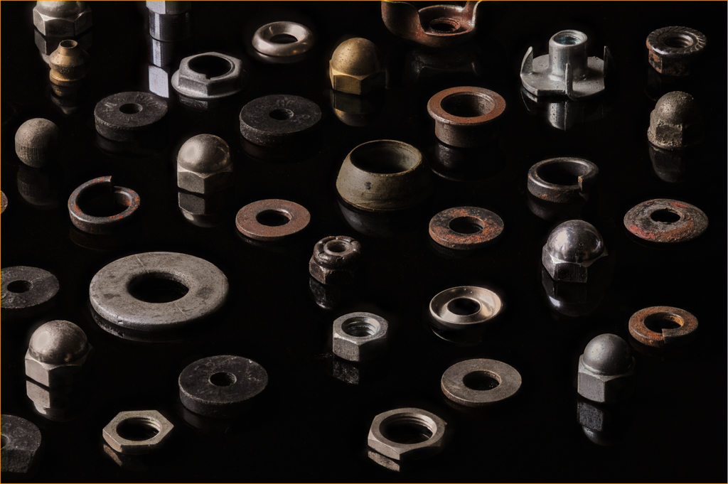
Thank you for such an insightful critique. I agree that the addition of space around all of the objects was a better decision. It reminds me when taking the photo that I need to keep the space around the subject using the frame as a "container" to hold my image with enough space so as not to spill over the edges. I can always crop in later in post processing. Adding the space afterwards can be too complicated as in this image. Expanding the canvas is easy, but removing and filling in the missing parts not so easy.
Sometimes I don't see the forest for the trees (as they say). |
Apr 21st |
4 comments - 1 reply for Group 65
|
4 comments - 1 reply Total
|