|
| Group |
Round |
C/R |
Comment |
Date |
Image |
| 65 |
Mar 18 |
Comment |
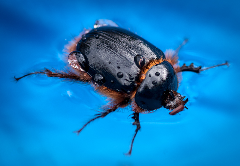
Beautiful image of a wasp aka hornet. The colors are fantastic!
Unlike the previous comments, I am not bothered by the washing out of color on the top side of the insect. It add an element of reality to the subject (just as we would see it in nature).
I do agree with the comments regarding the placement of the subject within the frame. It would have been nice to see the rest of the daisy within the frame. Of course, we don't know what else was there so this may have been the better shot anyway.
You have wonderful detail in the legs and antlers.
Very nice photo. |
Mar 15th |
| 65 |
Mar 18 |
Reply |
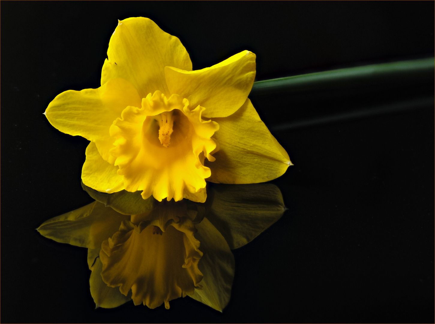
I did not know the definition for the daffodil. Thank you for that.
You are right about that black speck. It happened to be a hole in the petal. I initially planned to remove it and then forgot when I got caught up cleaning up the background.
The stem is an issue. In retrospect, I think it would have been better to have the whole stem in focus and darken it down as you suggest.
The border is an interesting topic. Since this website uses a black background, I feel the border contains the picture otherwise the subject is lost in this mass of black. At our local camera club, the images are presented with a gray background and I don't need the border. So I guess the lesson here is to be aware of the background where the image will be projected (something we address with mat boards with prints). |
Mar 15th |
| 65 |
Mar 18 |
Reply |
I agree with your observation regarding the cramped feeling at the top. I should have left more space. I'll watch out for that next time.
Funny you mention the color of the border. I started with a yellow border and thought it was too distracting so I went with one of the tones (using the color picker) deeper within the flower. What I learn from this is that you can go brighter if the border is very thin. Thanks Charles! |
Mar 15th |
| 65 |
Mar 18 |
Comment |
Wonderful image Anika! I can see our group is divided with regard to the background fabric "to wrinkle or not wrinkle". I, personally, would prefer a smooth background. The wrinkles are distracting to me. I love the texture though.
I agree with the previous comments regarding the highlights. LuAnn's suggestions to eliminate these are good ones. Another thought would be to hang the pendant (as they do in jewelry displays) so that you are photographing vertically instead of a horizontal image
I, too, would like to see a bit more of the black string on top. Moving your camera a little to the left and back a bit would improve the composition.
A very nice piece of jewelry! |
Mar 15th |
| 65 |
Mar 18 |
Comment |
(after my eloquent commentary, the website decided to hiccup so I'm starting over :-(
My first reaction was "did he clean it before the shot or in post processing?" I don't think I want to see my clippers up that close (yuck).
I was not bothered by the background because it is out of focus, but I can appreciate LuAnn's comment. Making the background one color would simplify the image.
Instead I noted that the table appeared not to be level (lower right corner). That may have been your intention in order to change the angle of the clippers. Its neither good or bad; not like the horizon line.
I like the reflection of the purple (I actually thought it was part of the clippers). It highlights the brand name very well.
I thought your subject is well positioned within the frame; plenty of room around it to "breath". I also like the touch of pulling out the file a bit for another point of interest.
Tethering to a laptop is a wonderful benefit for those of us with "old" eyes. |
Mar 15th |
| 65 |
Mar 18 |
Comment |
I love this image Janos! My initial reaction was that I was looking at a constellation in the sky. I'm impressed that you have access to these different elements and put them together in one photo. I wish I had that kind of imagination.
I feel your pain regarding the issue of trying to do focus stacking manually. I, personally, was not successful doing this and it gave me a headache peering through the viewfinder and taking incremental shots. That is why I purchased "Controlmynikon" software. It take the "slices" for me once I set up all of the parameters. Your bio says you have a Canon so I googled the product and it appears that they make the same product for Canons. Check out their website https://www.tether.com/controlmycanon-buy/. $40 for the standard version gave me enough to serve my needs.
I agree with the comments posted by Charles and wanted to add that your exposure will nicely done so as not to blow out the highlights. |
Mar 15th |
| 65 |
Mar 18 |
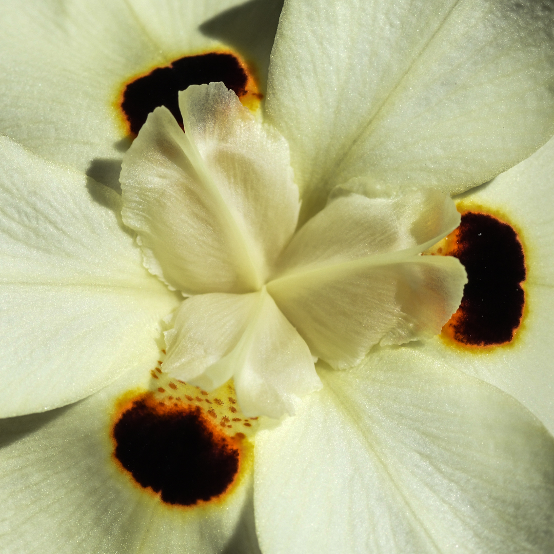
Comment |
Beautiful flower, Lynne. I'm pleased to see that some nurseries allow you to take photos. The local nurseries in my area do not allow it (no idea why).
I like that the "anthers" are sharp for the most part. I am not bothered by the softness further back in the flower. Your exposure was nicely done in order to capture the vascularity (not sure that is a word) in the petals.
I agree with LuAnn regarding the need to brighten up the image a bit. I think it adds to the sense of 'delicate' and 'pink'.
Your composition is very nice as well as the use of the black background.
Nice job! |
Mar 15th |
| 65 |
Mar 18 |
Comment |
LuAnn, I love your choice of subject. I like this particular type of flower because each component is well defined in color and symmetry. They offer a lot of detail to enjoy and as such, make a good subject for macro photography.
Your image is well exposed providing a lot of detail without any overexposure. Red is such a difficult color to accomplish this!
I appreciate your forethought in softening the focus in your image, but I would have chosen, at minimum, to keep the yellow center, the pale pink petals surrounding the yellow along with a few rows working outward sharp and then soften those petals that fall further back. It helps to keep the focus on your intended area.
I also learned something new today from your response to Charles that you can go back and "paint" in an area from a layer after focus stacking in Photoshop. Zyrene provides that tool, I didn't know Photoshop did too. Thank you for the tip.
Please know that all of our comments are provided in the spirit of helping each other learn the skills of macro photography.
Thank you for participating! |
Mar 15th |
6 comments - 2 replies for Group 65
|
6 comments - 2 replies Total
|