|
| Group |
Round |
C/R |
Comment |
Date |
Image |
| 65 |
Feb 18 |
Comment |
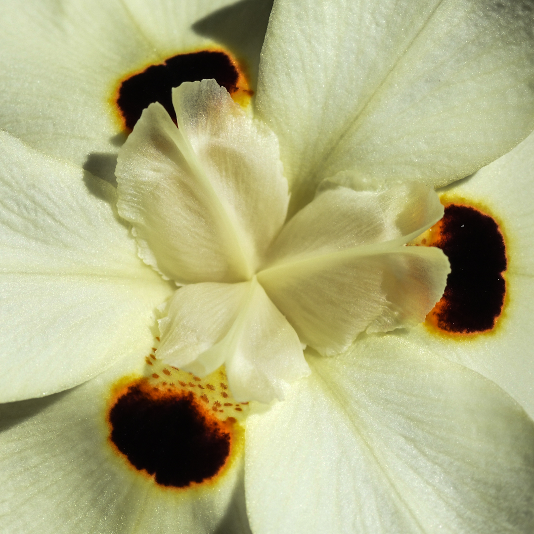
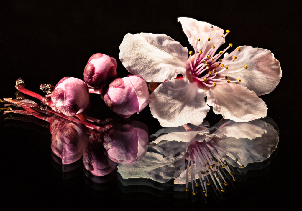
Welcome Anika! You have a very nice image here and I, too, was amazed at how different one flower could look with a different color background! I agree with Charles' comment regarding the softness. I bit more sharpness would help the image.
I look forward to seeing more of your work in the months to come! |
Feb 18th |
| 65 |
Feb 18 |
Comment |
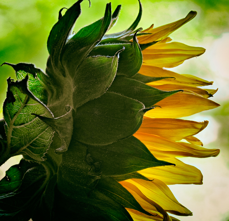
Ha! Charles, I got a kick seeing your "back of the flower" image! I did the same back in October 2015 (check out that month's entries)! I think it is a wonderful perspective and can be more interesting at times. My favorite aspects of this photo are the textures that are almost wax like in appearance and details, e.g., the veins in the petals and green leaves/petals of the stem. The richness of the colors are so happy and bright! Not everything is tack sharp but that works in this image.
Nicely done! |
Feb 18th |
| 65 |
Feb 18 |
Comment |
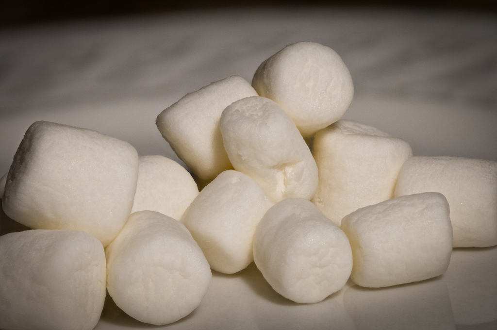
Good idea for a macro project. I'm not sure how one would handle the movement of the feathers though unless it is a feather with less down.
My favorite part of this photo is the lower portion where the individual feather lengths (not sure what you call each strand) is backlit so that one can see the detail. I think that portion with the spine included would make a good macro photo.
I find photographing red to be one of the most difficult. It always looks blown out. May I suggest converting this to a black and white. That would eliminate the distraction of the color and bring the focus to the details.
As a side note; I, too, was experimenting with a new subject matter this month, but mine was not worth submitting. Hopefully I will have a better image to submit for March. |
Feb 18th |
| 65 |
Feb 18 |
Comment |
I really enjoy the color and tone of this photo. I think having all of the corks adjacent to the "focal point" cork blurred helps me appreciate the diagonal line pattern without the distraction of the text on each cork. I'm neutral whether or not too much blur was used; it doesn't bother me.
One observation I did note was the sharpness of the lower edge of the bottle opening being equal in sharpness with the "focal point" cork. It doesn't look like a DOF factor given the distance between the cork and the bottle and they also do not look like they were on the same plane, so it confused me as to whether the blur tool or the lens created the phenomena. That is where my eyes kept landing.
Your decision not to add vignetting was a good one. |
Feb 18th |
4 comments - 0 replies for Group 65
|
4 comments - 0 replies Total
|
