|
| Group |
Round |
C/R |
Comment |
Date |
Image |
| 65 |
Dec 17 |
Reply |
Thank you for the feedback on the table brightness. I think that is a good suggestion that I'll apply next time. I will need to "hire" someone to clean those windshields! Ha! |
Dec 31st |
| 65 |
Dec 17 |
Comment |
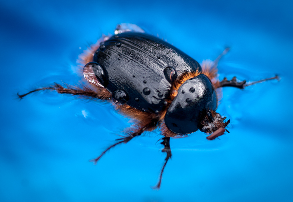
Angela, this is a very nice photo. Your in-focus of the bee is well done. Your composition is also very good.
I would recommend pulling down the brightness a bit and to create a little more vignetting around the border to keep one's eyes on your subject. |
Dec 31st |
| 65 |
Dec 17 |
Comment |
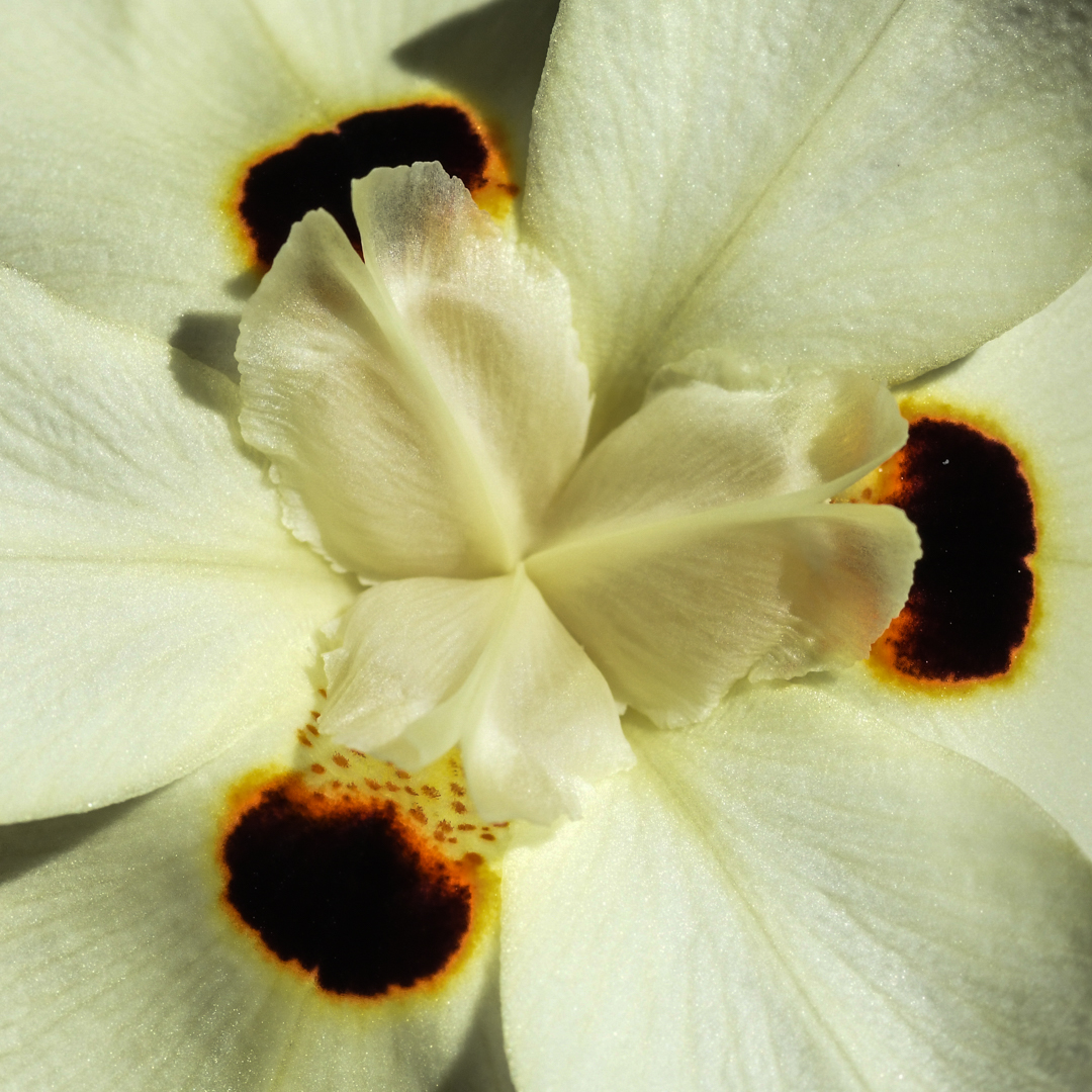
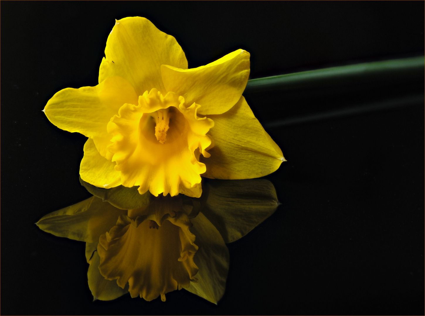
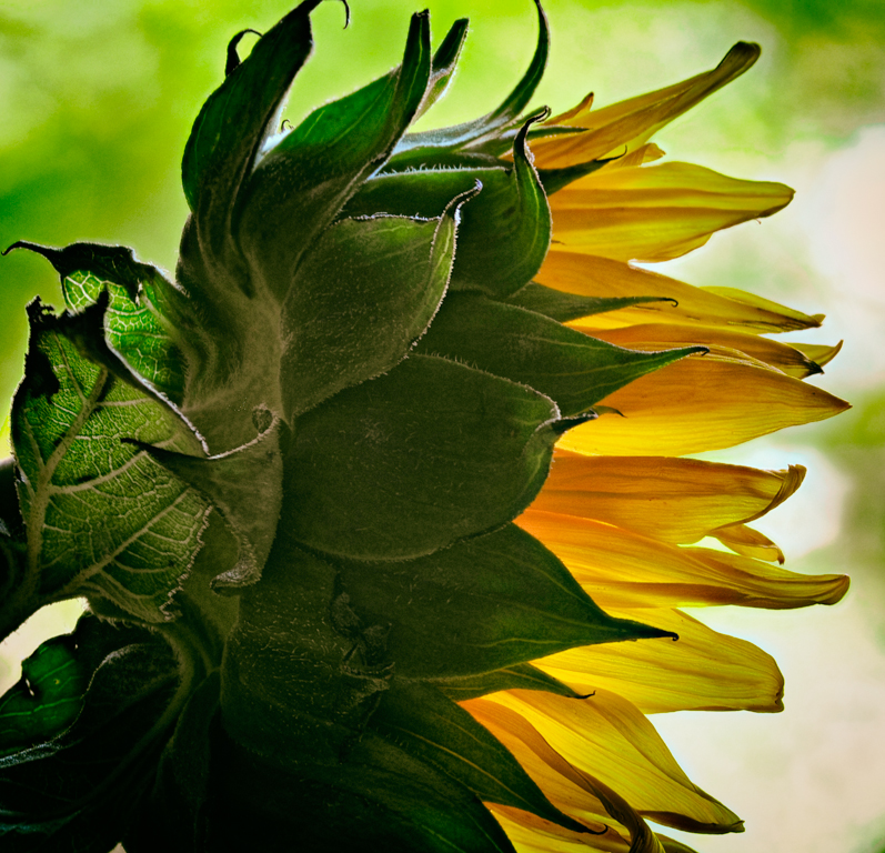
I love the mood you set in this photo. The colors of the petals are very pleasing and the focus created wonderful texture.
I think your signature adds that touch of "Professional" in a classy way.
My only nit-pik is the brightness of the blue petal coming down from the bottom. It competes with the main portion of the flower for me. I'm torn with the solution though; tone it down? remove it? I don't know.
Regardless, you are achieving your goal of creating the mood. Nicely done (as always). |
Dec 31st |
| 65 |
Dec 17 |
Comment |
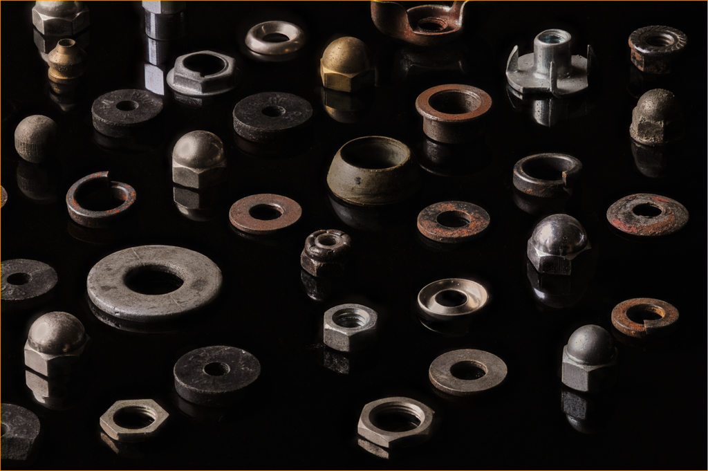
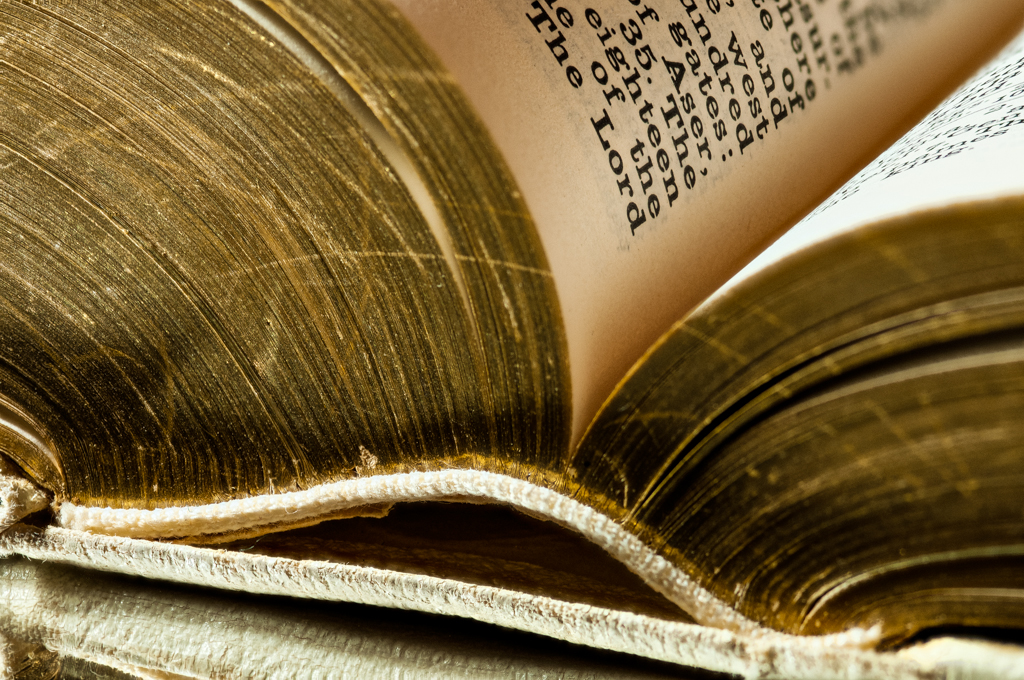
Janos, I am writing this without looking at the prior comments just to see if I "see" what others see.
I like the gold tones of the subject in this photo. I think the composition is well done. Having the lock off to one side instead of smack dab in the center was a good choice. The depth of field focus is excellent; everything in the lock and key is in focus with the background out of focus. Well done!
If I had to recommend something to improve the photo, I would suggest toning down some of the brighter areas of the lock. |
Dec 31st |
| 65 |
Dec 17 |
Comment |
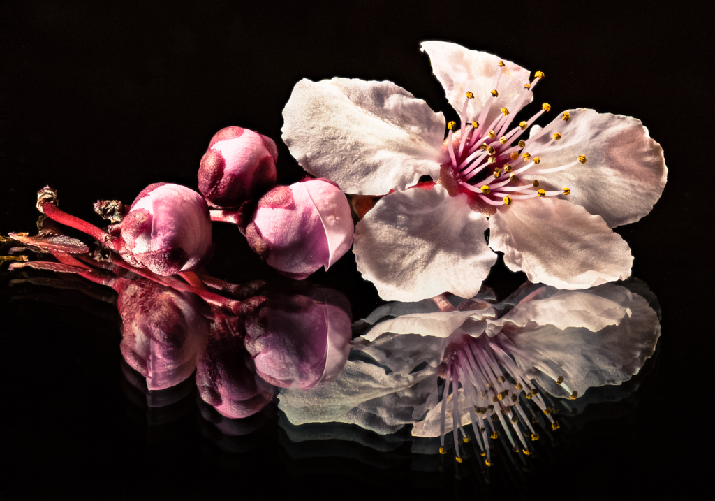
This is a beautiful photo and even more impressive given that you took the photo in the environment! I would not venture into a pond not knowing what is lurking under the surface.
As mentioned by the others, I like that some of the flower is out of focus. It keeps my eye on the centerpiece of the flower which is beautiful on its own. If I'm forced to make a suggestion for improvement, it would be to darken the front petal a bit, but that is nitpicking from me. |
Dec 31st |
| 65 |
Dec 17 |
Comment |
This is a beautiful photo and even more impressive given that you took the photo in the environment! I would not venture into a pond not knowing what is lurking under the surface.
As mentioned by the others, I like that some of the flower is out of focus. It keeps my eye on the centerpiece of the flower which is beautiful on its own. If I'm forced to make a suggestion for improvement, it would be to darken the front petal a bit, but that is nitpicking from me. |
Dec 31st |
5 comments - 1 reply for Group 65
|
5 comments - 1 reply Total
|