|
| Group |
Round |
C/R |
Comment |
Date |
Image |
| 65 |
May 17 |
Comment |
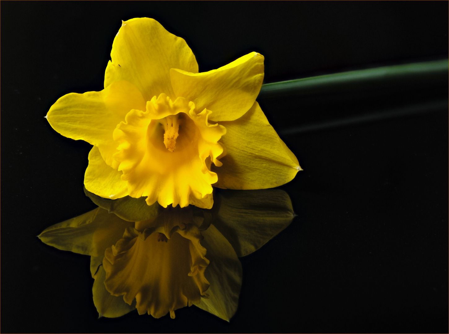
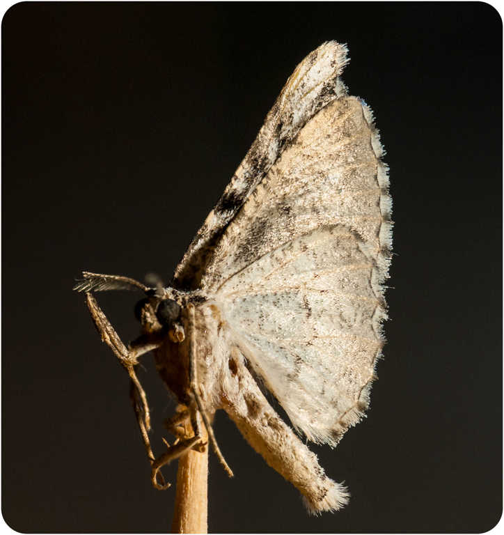
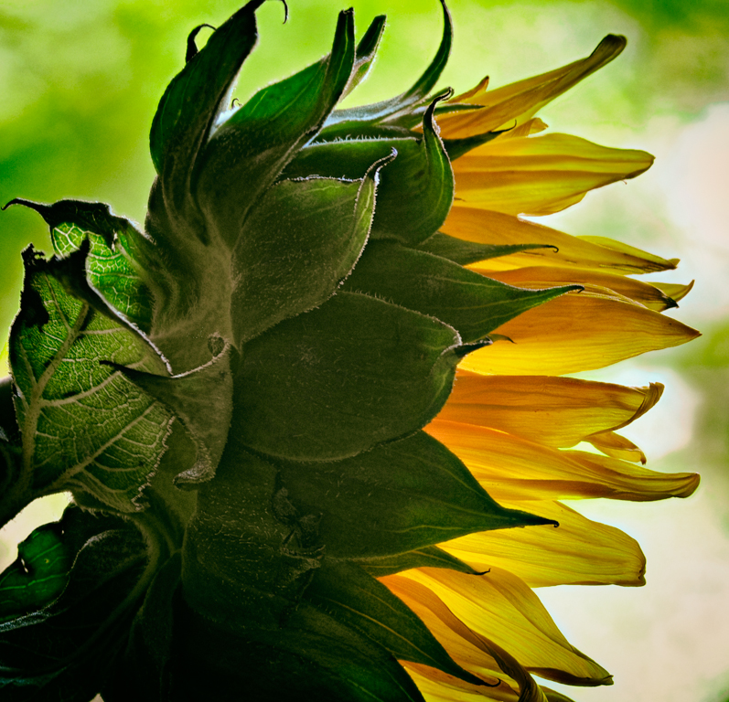
Hi Charles, I like the composition of this image with the narrow end of the plant starting at the upper left and sweeping to the wider portion of the plant in the lower right. It feels natural that way.
Your water drop was a good idea. I think you are the black form bent over in the middle of the drop. I like the green leaf encircling the upper edge of the drop. It creates a nice framing.
There is a grainy quality to the image which is fine with me.
I would like to see more of the forward leaves and stem in focus. It is a bit soft. Do you think you needed more slices of the front edge of the subject or was there some movement of the camera because of the looseness of the bracket as described in the You tube video?
I also wonder if some of the softness and graininess is the result of the extension tube. What do you think?
Thank you for another idea to explore!
|
May 16th |
| 65 |
May 17 |
Comment |
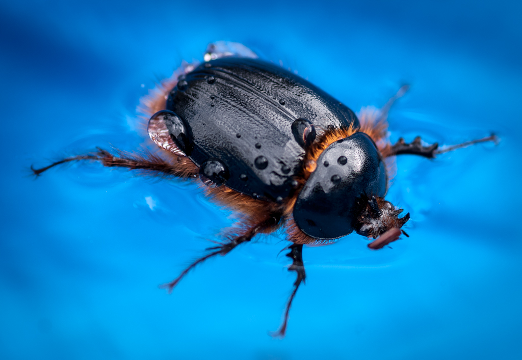
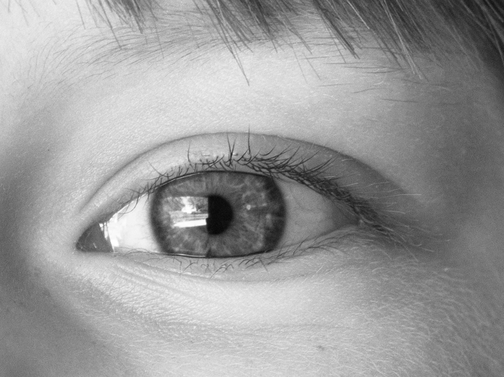
My goodness Janos. If this is the same fellow as last month, you are correct that they move slowly.
All kidding aside. I agree with Lynne's assessment. I love all of those little hairs,warts,debris, etc., that he has collected. The white outline of the left eyeball is fantastic. He really is a beauty up close.
I also like the background colors which are a perfect replication of the lizard's own colors.
Your composition, tones, and exposure are perfect.
If I had to nitpick, I would suggest getting the tip of its snout just a bit sharper. It looks slightly blurry to me, but that is a nitpick. There is nothing else I would change.
Nicely done, once again! |
May 16th |
| 65 |
May 17 |
Comment |
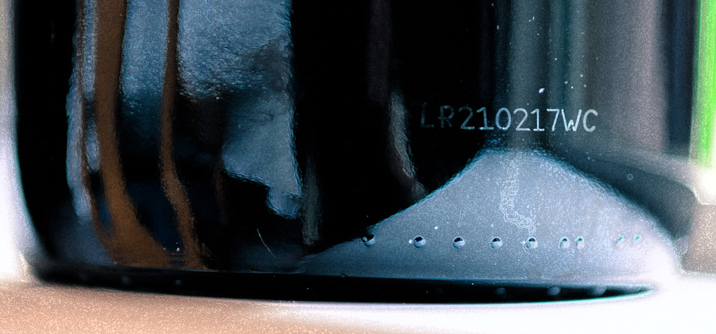
Hi Lynne, I like the composition of your image. The cropping of the large heart at the top and right side feels purposeful. I like that you didn't feel it necessary to include the complete heart. I would suggest including the rest of the lower edge of the heart just as you have done with the smaller heart. There just isn't enough of the point to make it feel that it was an intentional crop.
The straight line on the upper left creates a nice balance for the overall image.
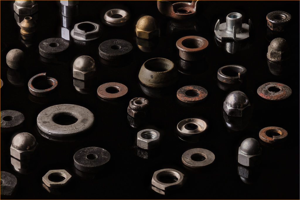
I appreciate the very narrow depth of field because of the close-up. It might be nice to try to increase the depth of field by using a smaller aperture or focus stacking just to make more of the internal operations of the watch sharp. Just out of curiosity,were any of the parts moving when you took the shot?
I also think that your exposure is good. There is detail in the shadow and very minuscule hot spots which add but do not detract from the image.
Nice find Lynne. |
May 16th |
| 65 |
May 17 |
Comment |
Hi Lynne, I think you are referring to that little light triangle along the edge in the lower left corner. I didn't even notice that. Cloning it out is an easy fix. I could easily add more vignetting to resolve some of the brightness on the lower right. Thank you for your suggestions.
|
May 16th |
4 comments - 0 replies for Group 65
|
4 comments - 0 replies Total
|