|
| Group |
Round |
C/R |
Comment |
Date |
Image |
| 65 |
Jan 17 |
Reply |
I learned something new today; ribs. Thank you. |
Jan 19th |
| 65 |
Jan 17 |
Comment |
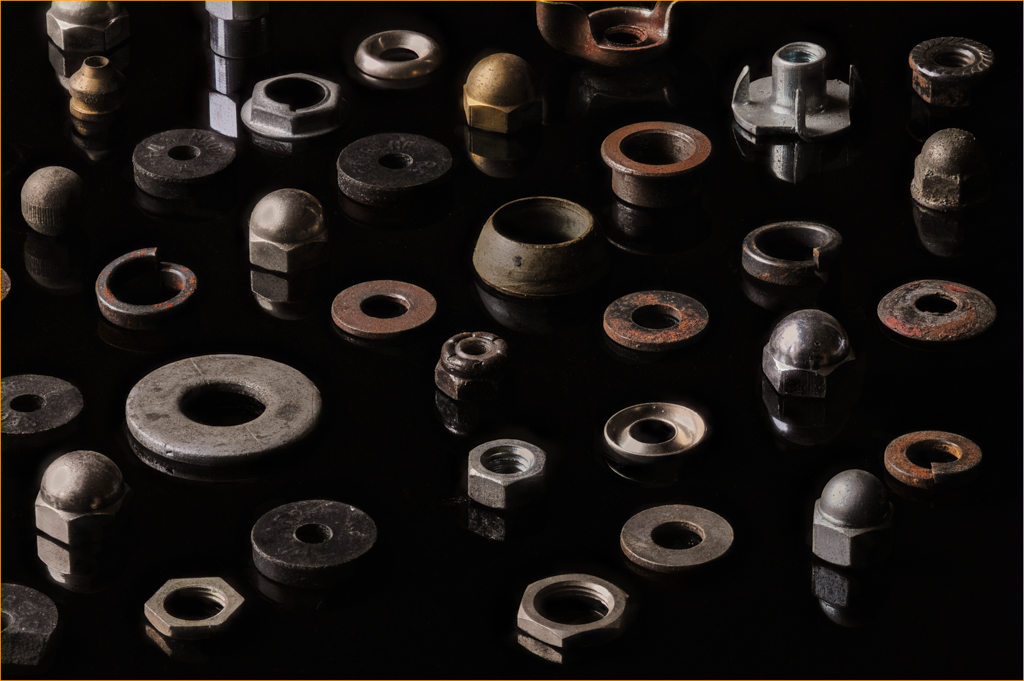
Erick, this is a very lovely bottle. I sense that the colors in the photo are true. I would like to suggest three things that I think would improve your image. Use a tripod so that you can lower the ISO. That should help to eliminate the noise. I would also lower the perspective so that your camera is a eye level with the bottle. That would help to focus my attention on the painting and change the position of the table edge in the background which is distracting. The 3rd suggestion is to add a bit of vignetting to darken up the background so that it isn't competing with the subject for attention.
I must say you do have an interesting collection historical artifacts. |
Jan 18th |
| 65 |
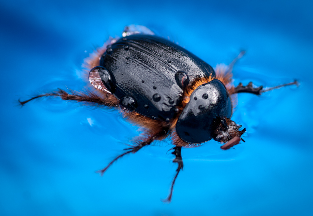
Jan 17 |
Comment |
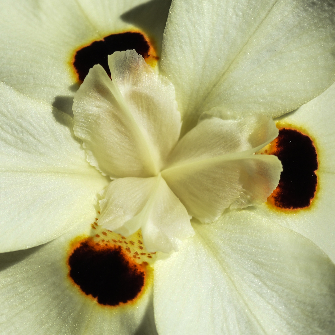
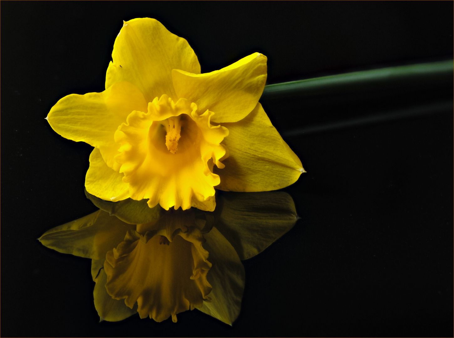
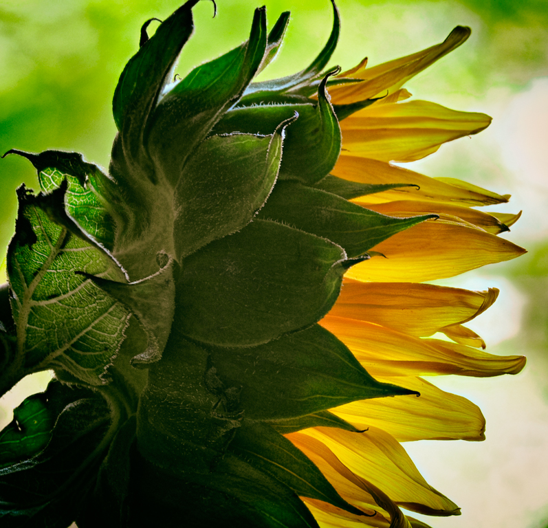
This is a wonderful picture Charles. There are two things that caught my attention immediately. The black at the tips of the yellow stamens (don't hold me to the correct term for the parts of the flower) and the ridging along the white petals. This photo is full of texture. What would look soft and delicate in real life is really covered with spikes and thorns. That is what I love about macro photography. Your composition, cropping, and simple background are excellent. I like that you took the time to create a background that compliments your subject. The only area for improvement would be that leaf in the lower left. It would have been nice to get rid of that,but it may not have been possible.
As always, nice job! I would hang this on my wall. |
Jan 18th |
| 65 |
Jan 17 |
Comment |
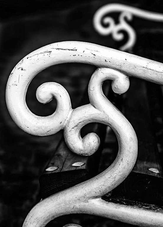
My first impression was also trying to understand your intention in the photo. I think it is the shapes of the armrests that caught your attention. I have to compliment you on the composition. I don't know if you intentionally lined up the armrests so that the back one just touches the front one, creating that repeating pattern. Regardless, I like that you "arranged" them as you did. I think this type of image is improved by removing the colors which can be distracting from the shapes. Once the color is gone, you start to focus on shapes and texture. I did a quick conversion to demonstrate what I'm suggesting. |
Jan 18th |
 |
| 65 |
Jan 17 |
Comment |
I enjoy the composition of your photo. The selective use of color draws your eye to the focal points. I agree with Charles' suggestion about darkening the shadow of the wine glass. Doing so, makes the colors more realistic. Adding the color to the tables in the background, helped me notice the detail. I would have colored the third table also for consistency. Otherwise, I think you made good choices in where to add color. It would not have made sense to colorize the umbrella or any other elements on the other side of the water. Your photo tells a nice story. |
Jan 18th |
| 65 |
Jan 17 |
Comment |
I forgot to mention that I used 20 photos for the above image.
|
Jan 12th |
5 comments - 1 reply for Group 65
|
5 comments - 1 reply Total
|