|
| Group |
Round |
C/R |
Comment |
Date |
Image |
| 65 |
Oct 23 |
Reply |
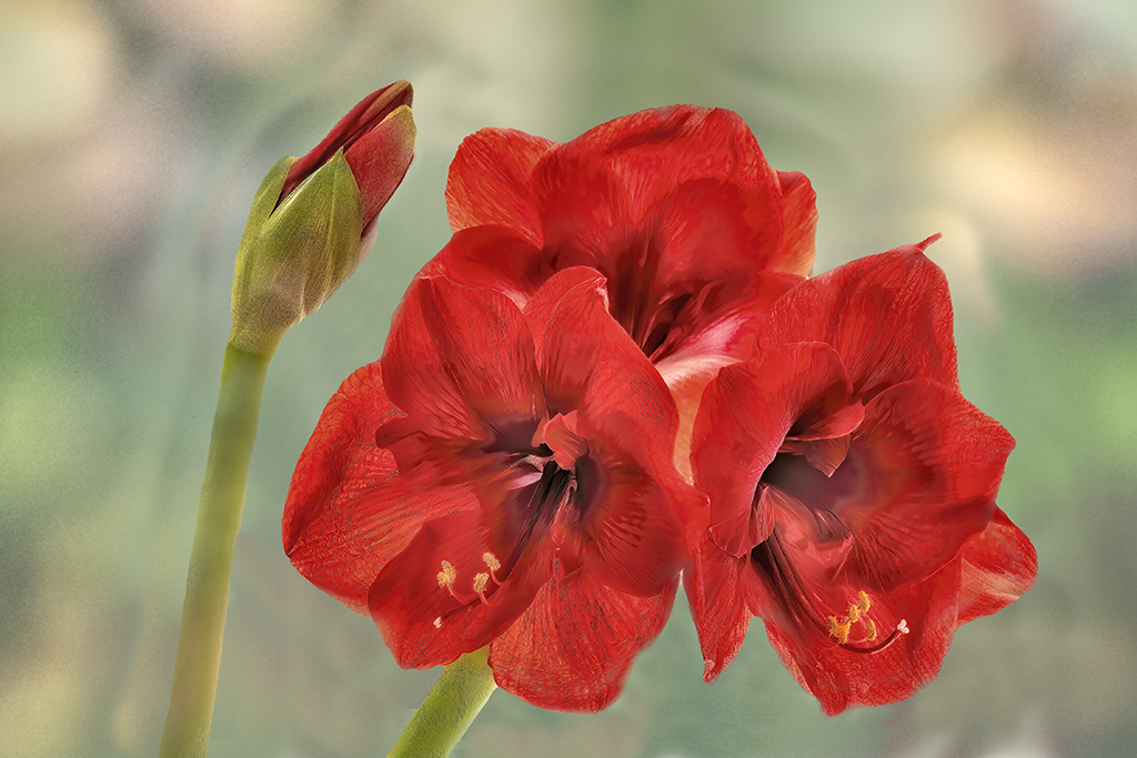
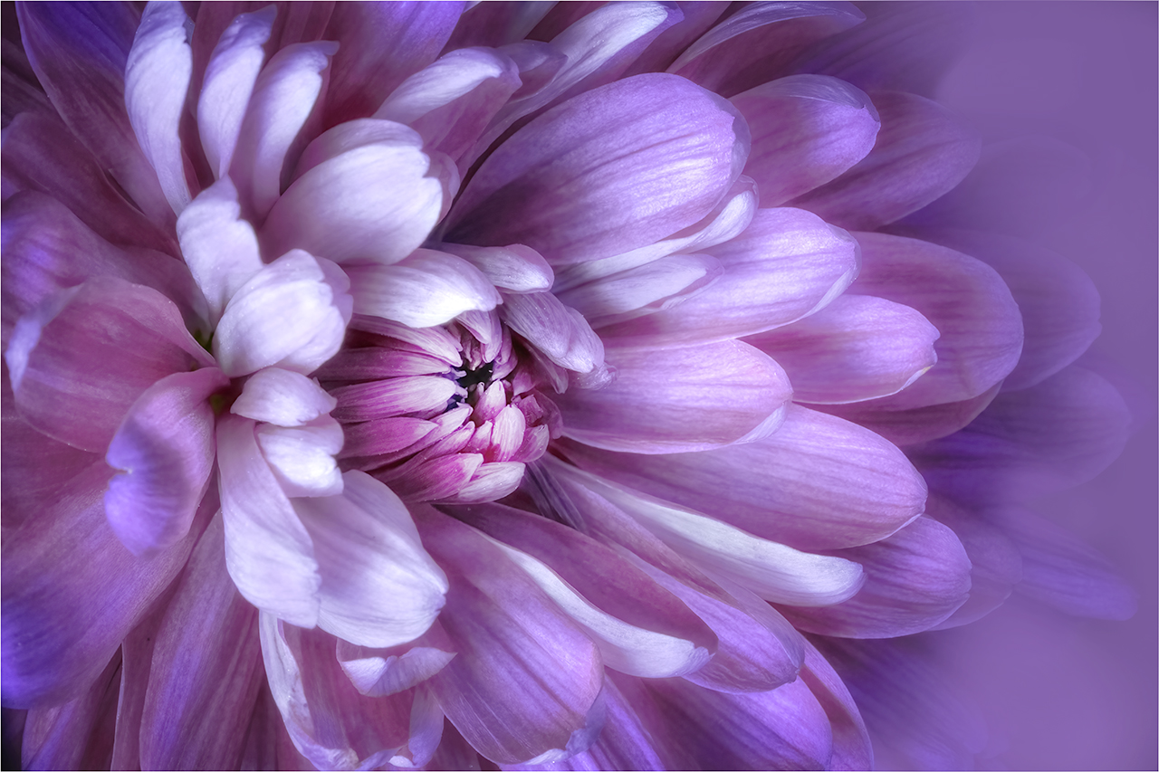
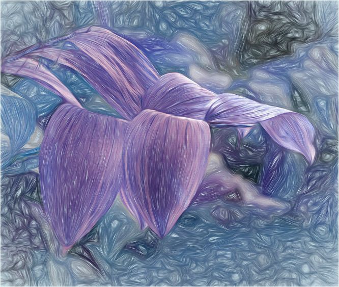
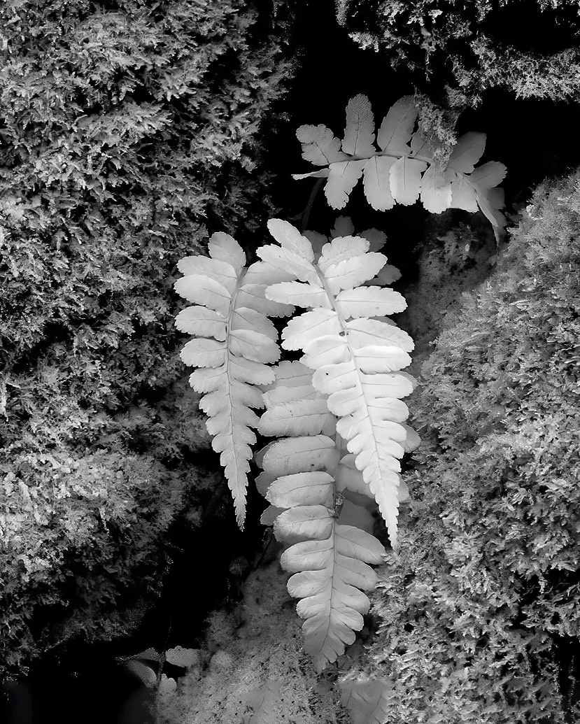
I like it without the bud |
Oct 28th |
| 65 |
Oct 23 |
Reply |
Jodi, Sorry for not replying before. I've been out of the country. I'm happy to share how I make the textures I use. It would be easier to tell you over the phone and guide you through it. It's a lot to write. How about you contact me by email and we can work out a good time to connect.
mbhurwitz55@gmail.com |
Oct 28th |
| 65 |
Oct 23 |
Comment |
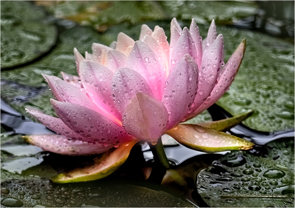
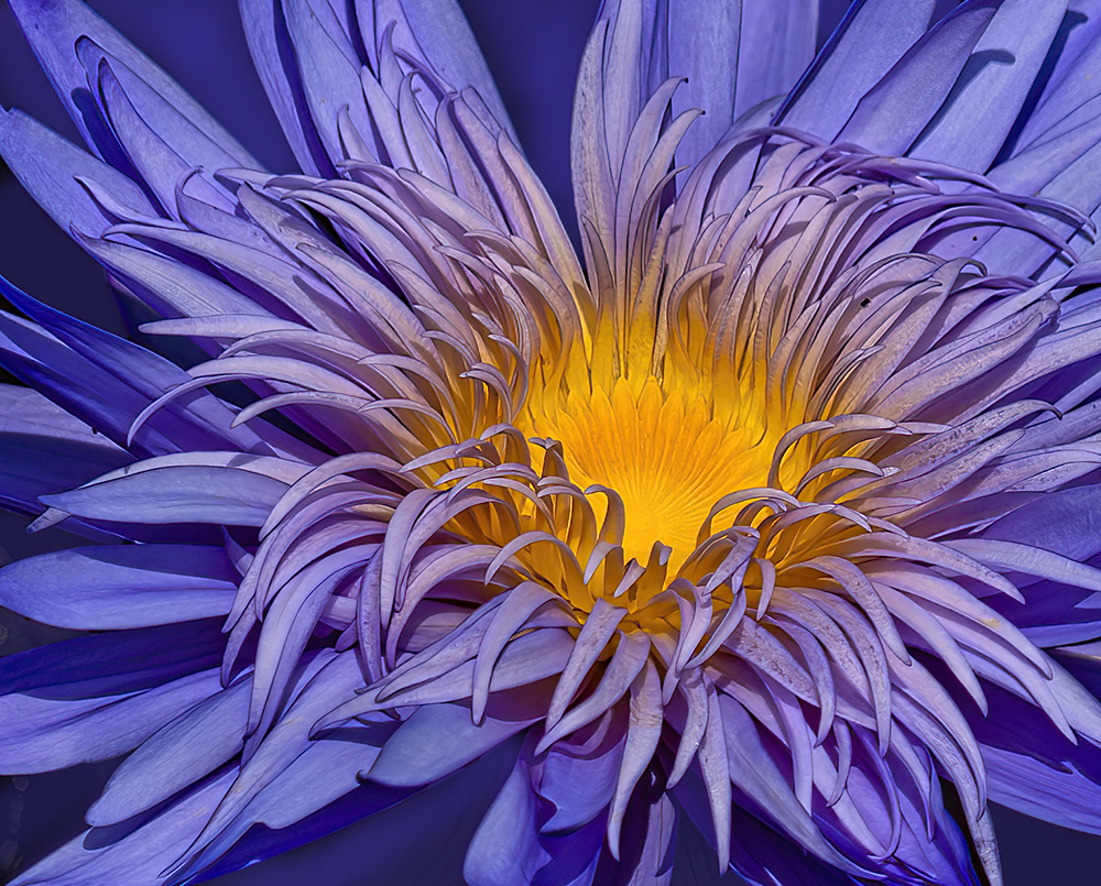
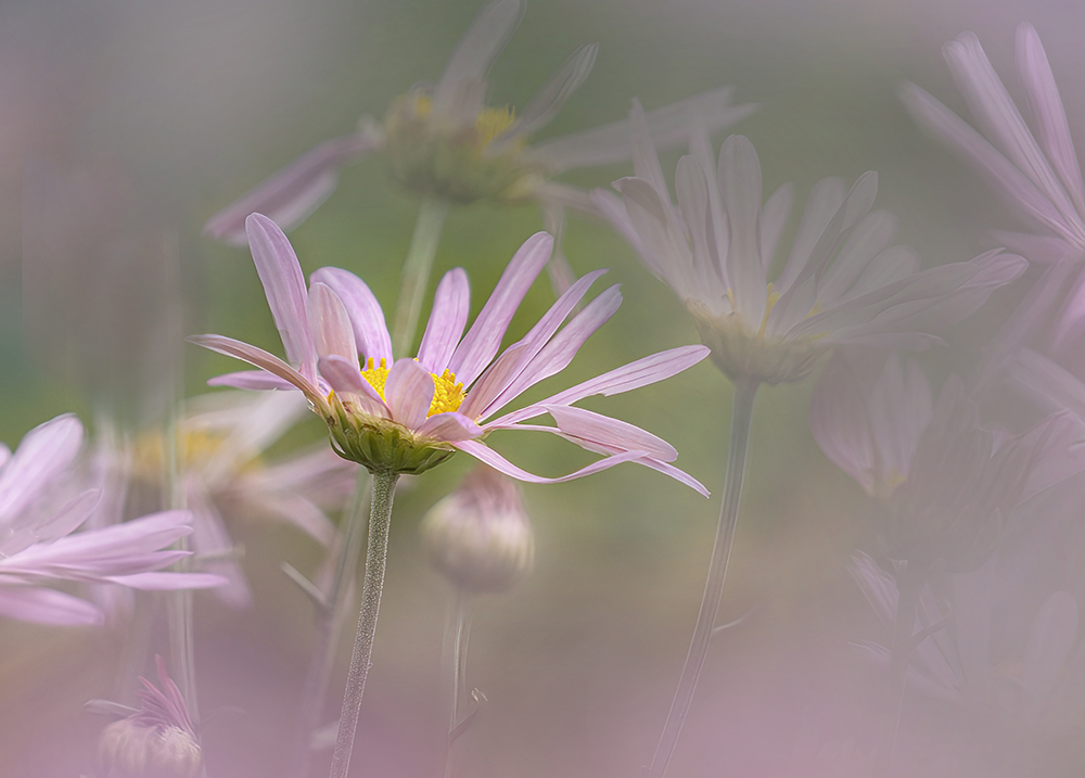
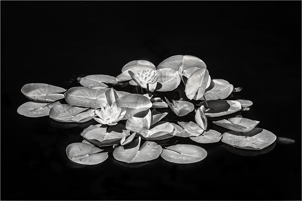
Hi Rebecca, water lilies are always so inviting to photograph, but often difficult. I find that best results are taken in shade as the water reflections brighten everything. I would crop it even more and concentrate on sharpening the center which would enhance the lovely colors. |
Oct 17th |
| 65 |
Oct 23 |
Comment |
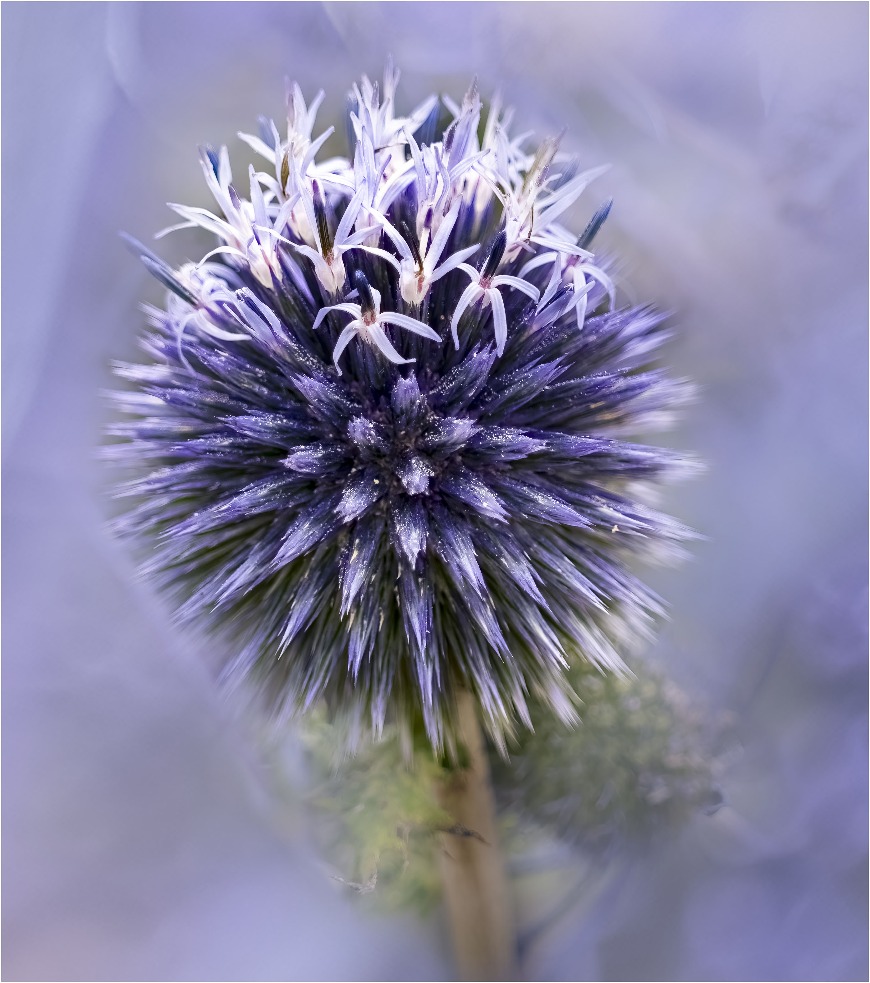
Hi Maria, I have an affinity for proteas as they are the National flower of South Africa, where I was born. I have seldom seen one this pink. You have managed to make this very prickly flower look soft and gentle with your depth of field I would crop it on the bottom to near where the red stem begins. Thanks for sharing. |
Oct 17th |
| 65 |
Oct 23 |
Comment |
The phlox is lovely Jodi. But there is too much that is extraneous here. I think that Dick's crop is too tight I would crop to below the leaf on the bottom and just below the out of focus bud on the top. I really like the colors and don't mind that some of the buds are out of focus. |
Oct 17th |
| 65 |
Oct 23 |
Comment |
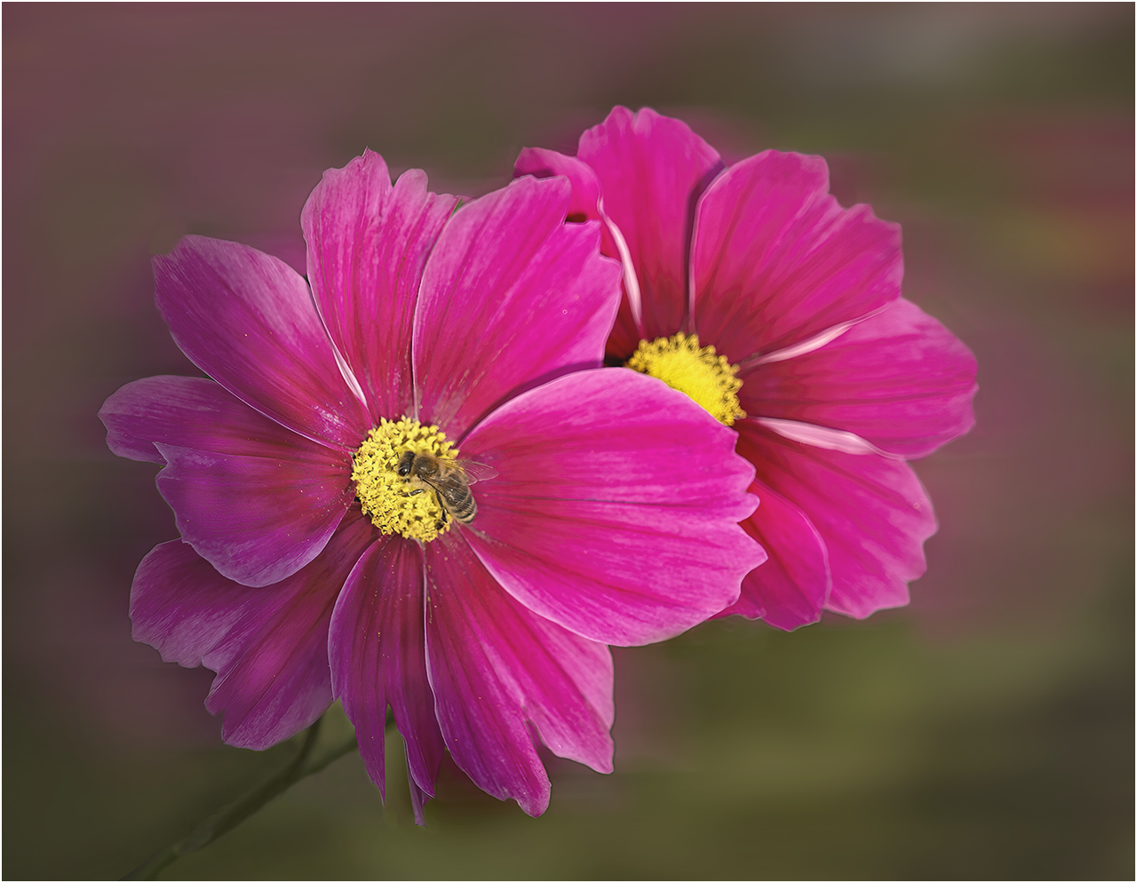
Hi Diana, a simple, but attractive placing of the cosmos. It does appear rather flat and I wonder if reducing the tone of the background would allow it to stand out. |
Oct 17th |
| 65 |
Oct 23 |
Comment |
Hi Diana, a simple, but attractive placing of the cosmos. It does appear rather flat and I wonder if reducing the tone of the background would allow it to stand out. |
Oct 17th |
| 65 |
Oct 23 |
Comment |
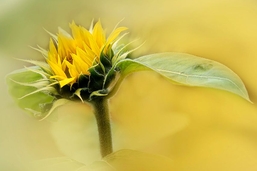
Well done Fran. There has been a lot of work that has gone into creating this image and it is more than worth it. Composition and colors are lovely. Background is entirely complementary. I agree that without the bud, it is a stronger image. |
Oct 17th |
| 65 |
Oct 23 |
Comment |
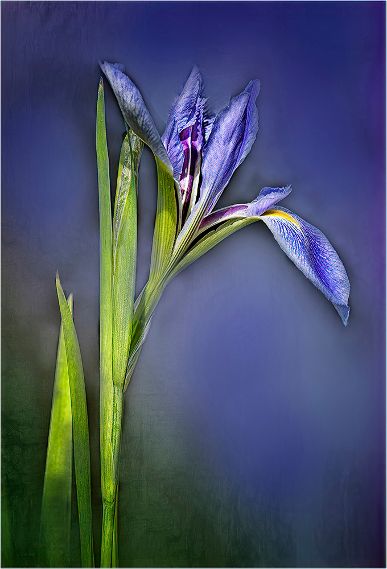
Beautifully seen Dick. Not only are the colors gorgeous, but the angle used has created a 3 d look with a graphic design. Simple and works well |
Oct 17th |
| 65 |
Oct 23 |
Comment |
Thank you Maria. I certainly will do some more work on this. Also, thanks for giving me the name. |
Oct 17th |
| 65 |
Oct 23 |
Reply |
Thanks for identifying Dick, and for the helpful comment |
Oct 17th |
| 65 |
Oct 23 |
Reply |
Thanks Fran. I must admit that I am in two minds about the crop. |
Oct 17th |
10 comments - 4 replies for Group 65
|
| 66 |
Oct 23 |
Reply |
Great! |
Oct 4th |
| 66 |
Oct 23 |
Reply |
|
Oct 4th |
 |
| 66 |
Oct 23 |
Reply |
whoops |
Oct 4th |
| 66 |
Oct 23 |
Reply |
Thanks Chuck, I have become a disciple of Arik's street work and am trying to use IR more there. |
Oct 4th |
| 66 |
Oct 23 |
Reply |
Thanks Arik, Of our entire group, you understand Street photography best. See my reply to Gary and I wonder if you have an answer. |
Oct 4th |
| 66 |
Oct 23 |
Reply |
Thanks Palli, I love this too. |
Oct 4th |
| 66 |
Oct 23 |
Reply |
Thanks Jack, I will work on the tones. See my reply to Gary re the lack of a waxy look. |
Oct 4th |
| 66 |
Oct 23 |
Reply |
It's interesting. I did this entire shoot in IR and most of my shots include people. There is no porcelain look in any of them. I wonder if dark skin tones do not react in the same way. Or if that day was magical! |
Oct 4th |
| 66 |
Oct 23 |
Comment |
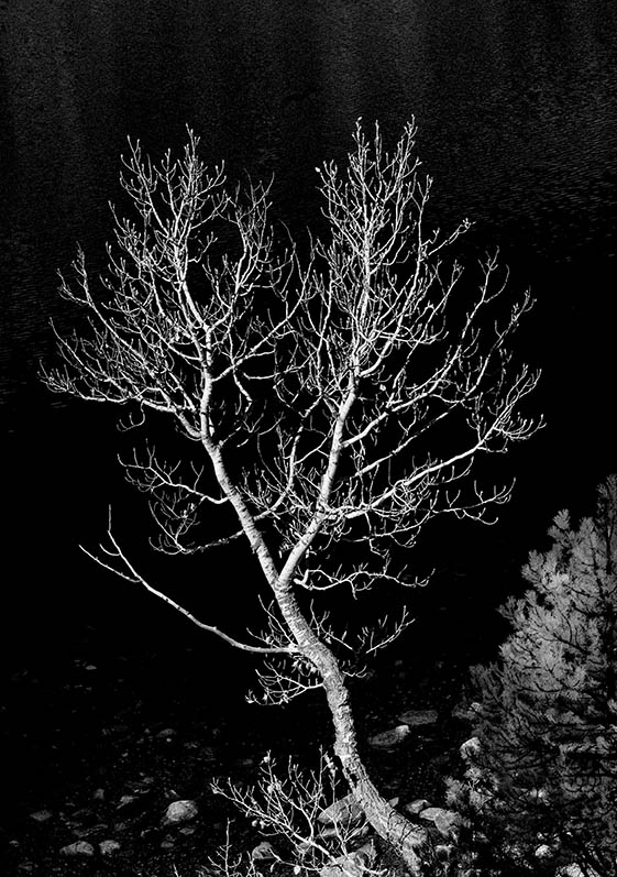
Hi Henry, I am really enjoying the great lead i lines. You have told the story in a beautiful way. Processing is wonderful. |
Oct 4th |
| 66 |
Oct 23 |
Comment |
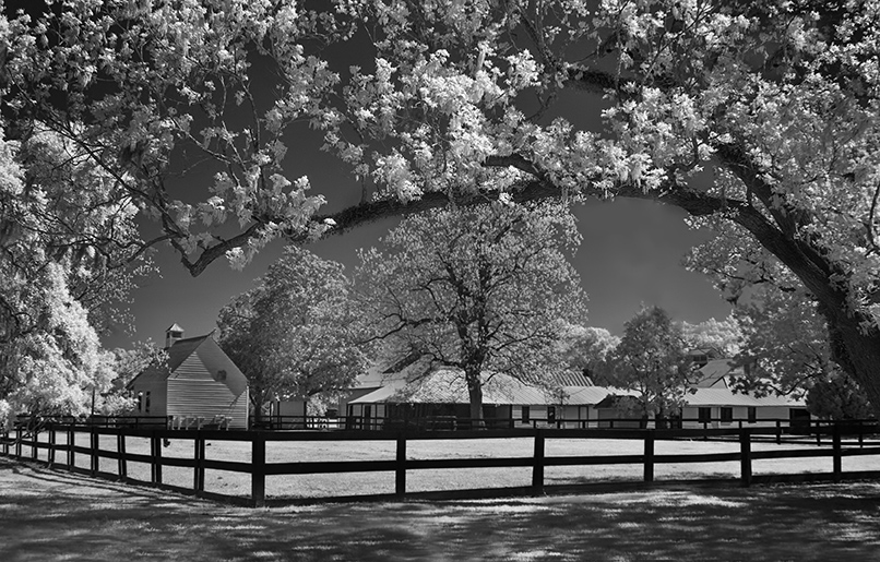
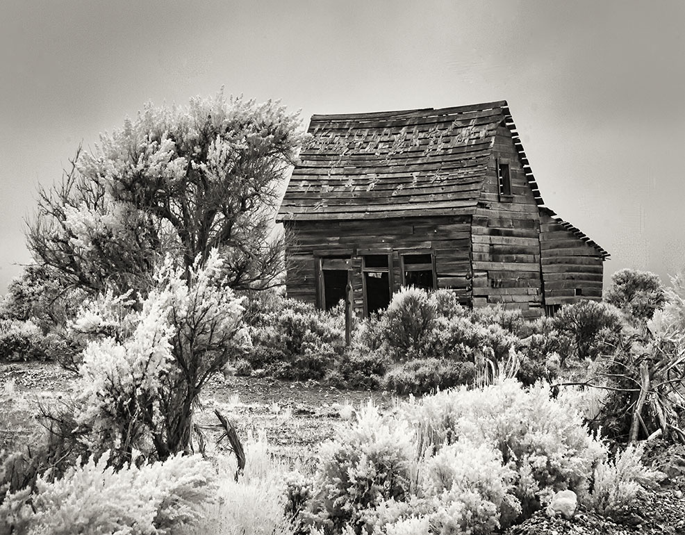
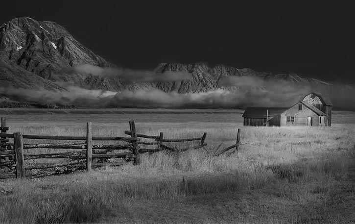
Hi Emil, Another great perspective of a barn. I think the sky is great except near the base, where the tones are similar to the barn. I might lighten that area. Great shot! |
Oct 4th |
| 66 |
Oct 23 |
Comment |
Hi Palli, You have such a good seeing eye. Most would have just walked psst this scene. Of course your processing takes it out of the ordinary and up to extraordinary. |
Oct 4th |
| 66 |
Oct 23 |
Comment |
Fun result from a fairly simple image. I love the neon result and the blue give a finish.Continue to play. You always give us something to think about. |
Oct 4th |
| 66 |
Oct 23 |
Comment |
Different and interesting view of the barn. All well handled. Beautiful. |
Oct 4th |
| 66 |
Oct 23 |
Comment |
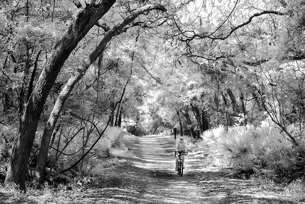
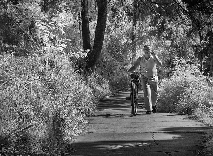
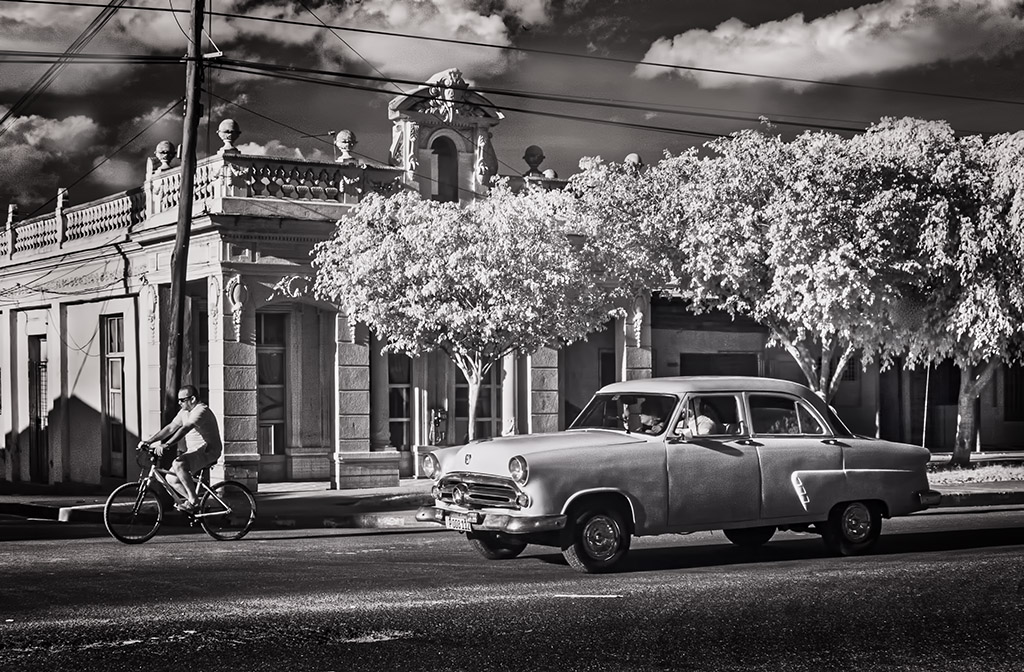
I also am enjoying as is, besides the trees which you removed in your updated version. I think that the biker riding in the opposite direction finishes the story. |
Oct 4th |
| 66 |
Oct 23 |
Comment |
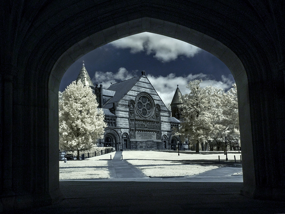
Hi Arik. Apologies, I just noticed that none of your details were uploaded.Fixed.
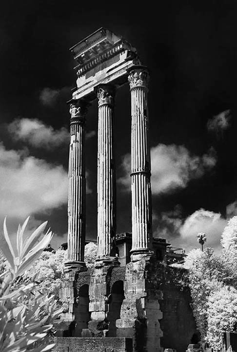
This is fascinating. I really like the color profile, and the use of the arch makes the picture.
I'm undecided by the perspective. Your view was to make the arch straight, and I wonder how you feel about having the building straight Here is my view.
|
Oct 4th |
 |
7 comments - 8 replies for Group 66
|
17 comments - 12 replies Total
|