|
| Group |
Round |
C/R |
Comment |
Date |
Image |
| 65 |
Jul 23 |
Comment |
Wow Maria! Thanks for taking the time to work on my image. You have created a totally different look and it works beautifully |
Jul 18th |
| 65 |
Jul 23 |
Reply |
Thanks Rebecca |
Jul 18th |
| 65 |
Jul 23 |
Reply |
Thanks Fran for you comments. I too try to find flowers I'd good condition and if not, try to repair them. Honestly I think I just missed the repair part this time. |
Jul 18th |
| 65 |
Jul 23 |
Comment |
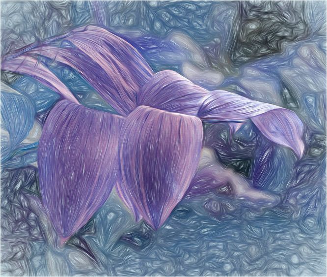
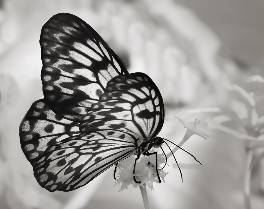
Hi Maria
As soon as I saw your image I felt that it was out of a botanical book. You more than achieved your goal. This is gorgeous All the work you have put into this image has paid off. Well done |
Jul 18th |
| 65 |
Jul 23 |
Comment |
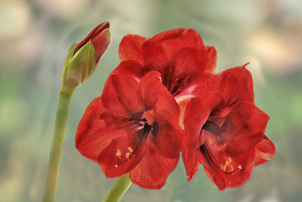
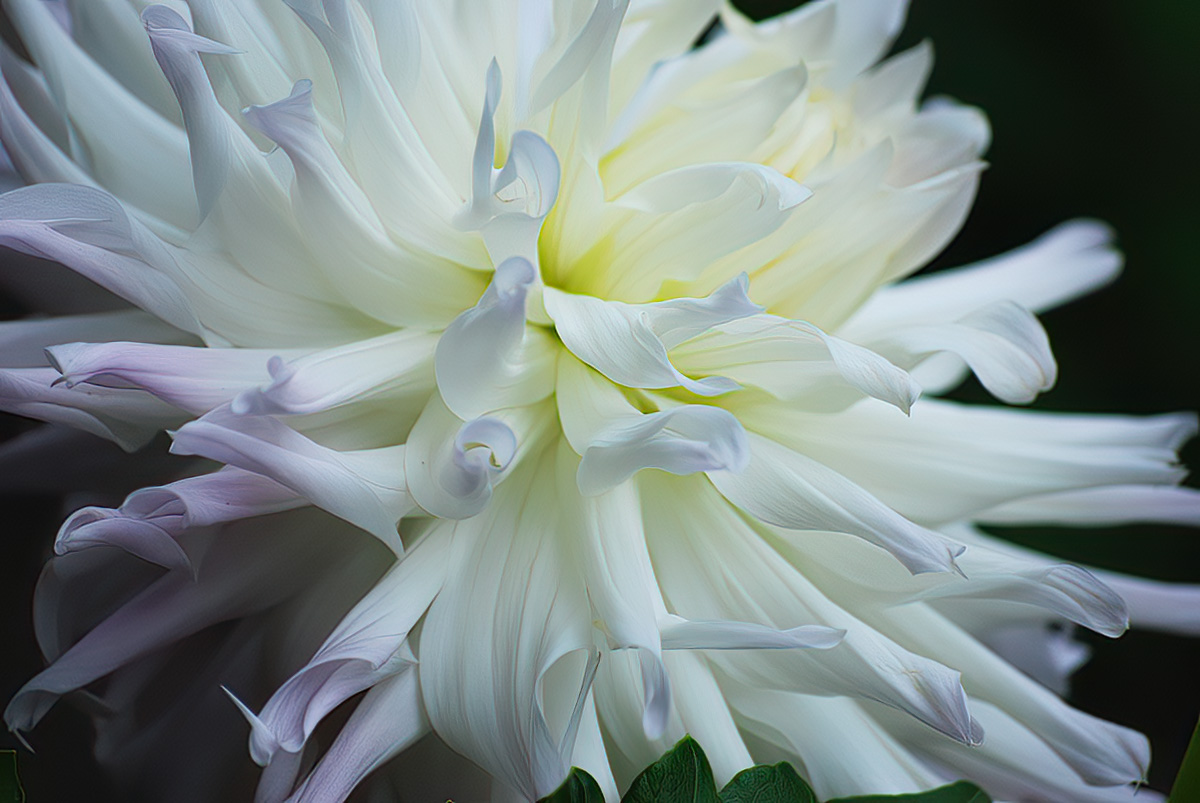
Hi Rebecca, Welcome to our lovely group. We do have fun.
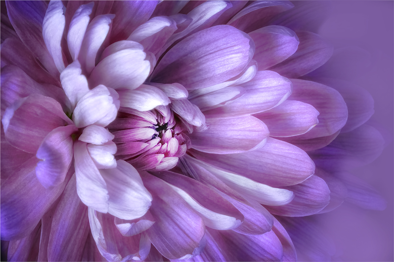
Dahlias are just such great flowers to shoot as the always offer interesting pattern design. I do like that you have presented such a cropped view. As I have said on Jodi's image Topas Sharpening does such a great job. Let me know what you think. |
Jul 6th |
 |
| 65 |
Jul 23 |
Comment |
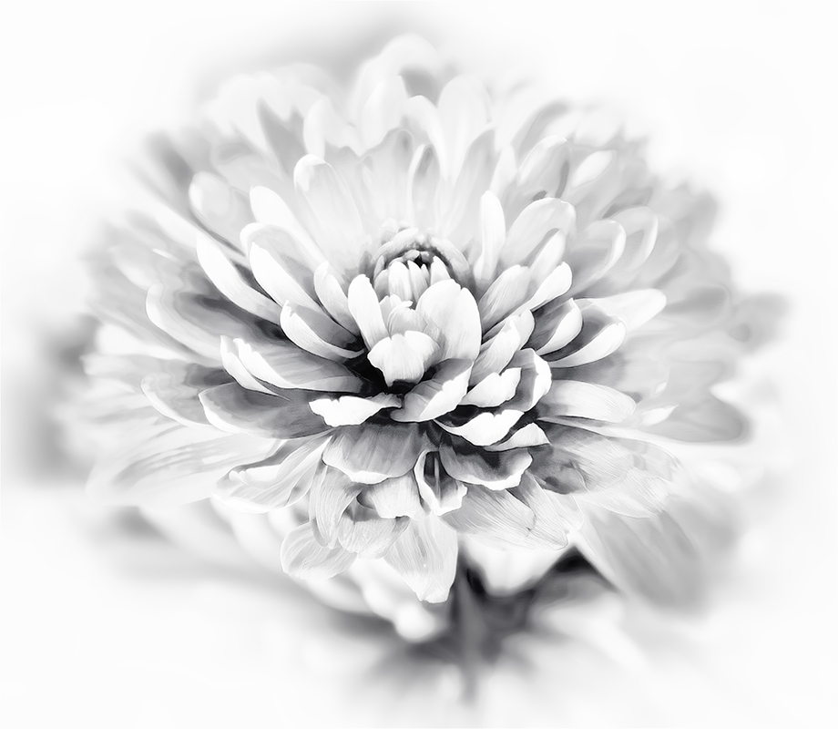
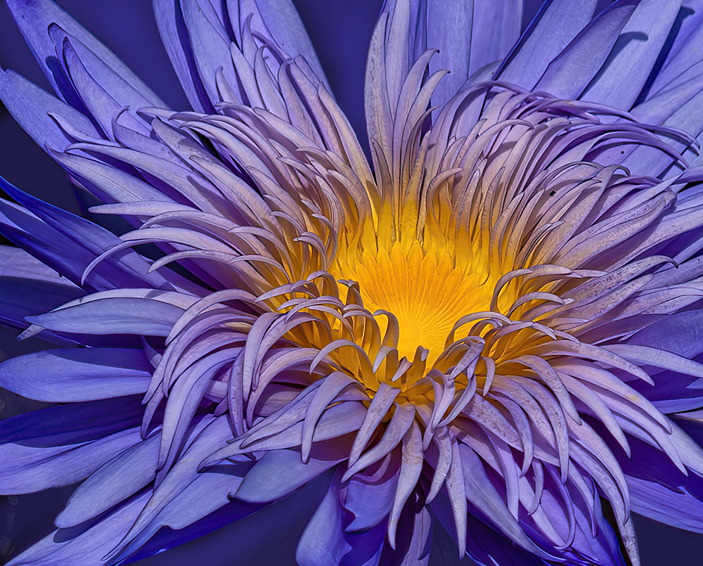
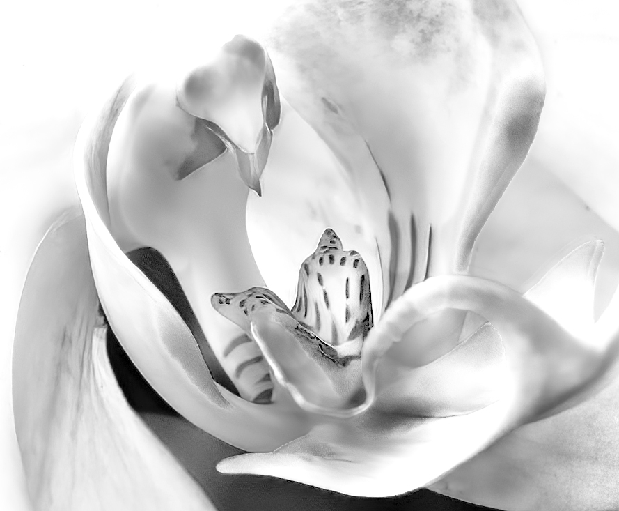
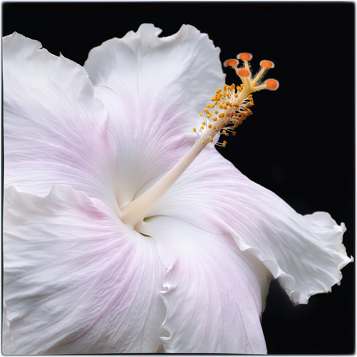
Hi Jodi, You have done a wonderful job with your crop and processing. The placement in the frame and the black background is very artistic. I have found that flowers can be sharpened very easily and usually are enhanced. I sharpened you hibiscus using Topas (which I think is a wonderful product) and wonder what you think? |
Jul 6th |
 |
| 65 |
Jul 23 |
Comment |
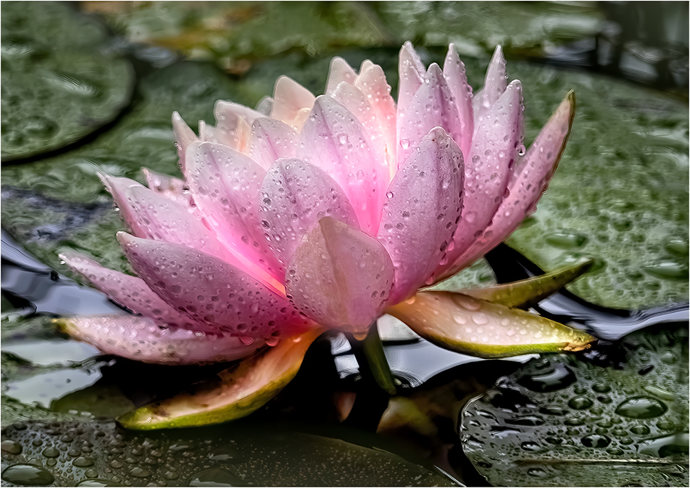
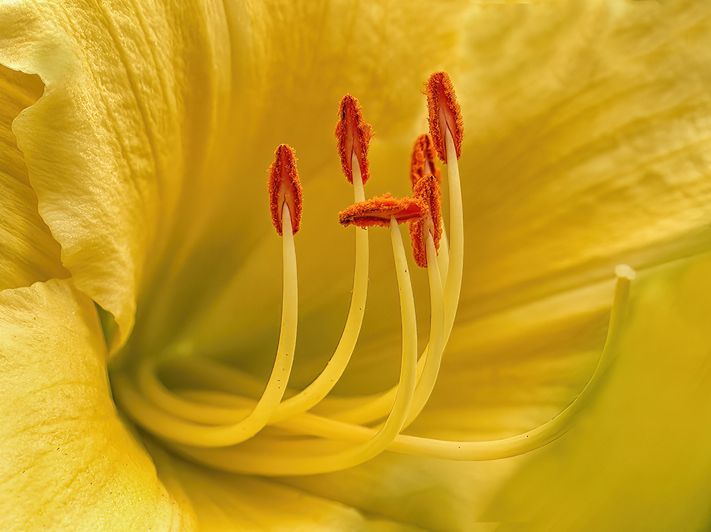
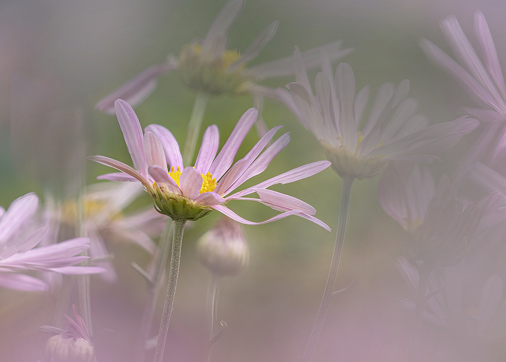
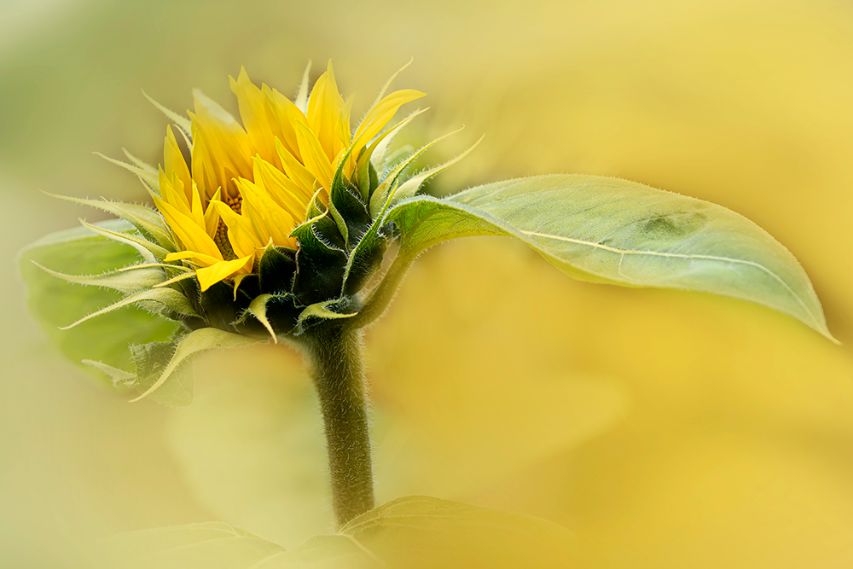
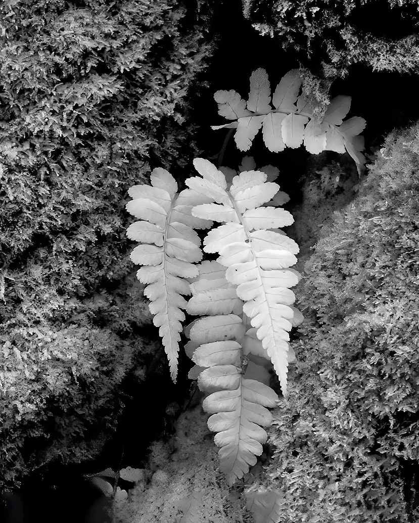
Hi Diana, The color combination is just so pleasing. You chose well with soft light and the Cezanne look. I do think that the sharpest focal point is on the sepals. You may well have wanted the soft look of the petals? I would also crop a little off the top. |
Jul 6th |
| 65 |
Jul 23 |
Comment |
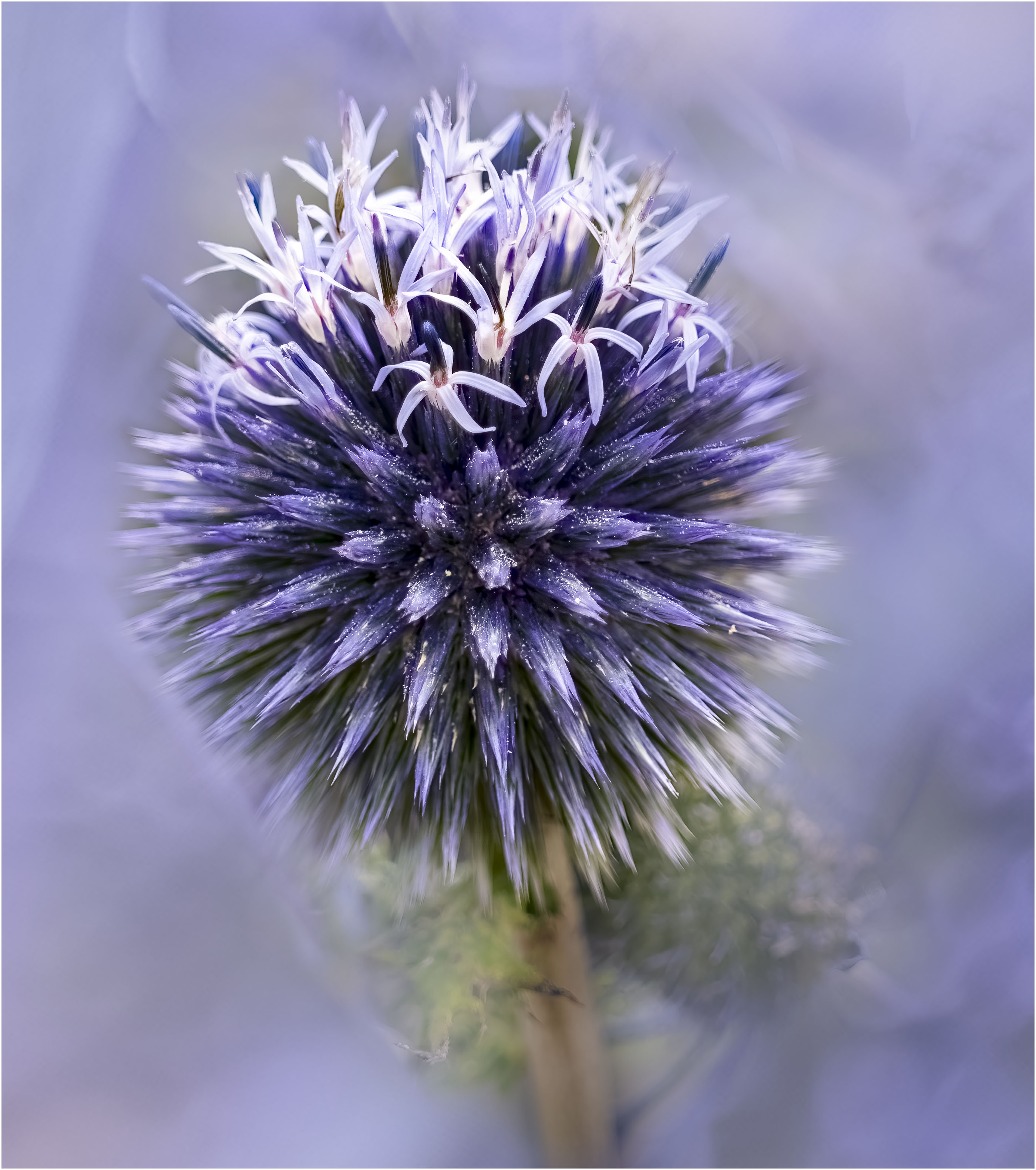
Oh Fran this Alium capture is beautiful. The light on the front blooms gives a lovely 3D effect, enhanced by their color. Background is well done and the fog is well thought out. I do think that a little less fog on the right bloom edges is needed. One for the wall! |
Jul 6th |
| 65 |
Jul 23 |
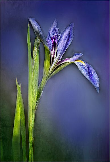
Comment |
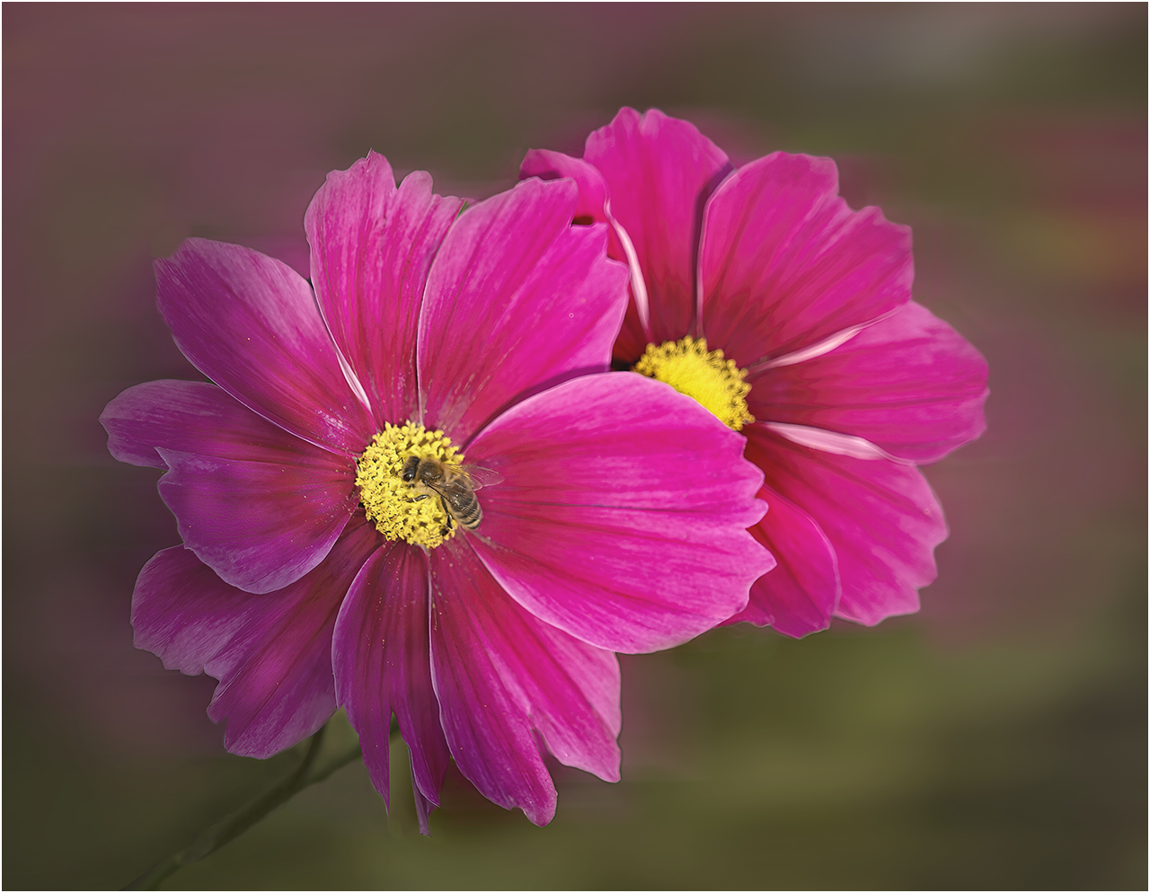
Hi Dick, As usual you have a winner. The flower placement is very pleasing. The colors just pop. The out of focus background is just right. I really like how the tones are dark at the bottom as lighten as my eye goes through the image. My very small quibble is that the leaf is a little too close to the top. |
Jul 6th |
7 comments - 2 replies for Group 65
|
| 66 |
Jul 23 |
Reply |
Thanks Henry, I really appreciate your comments. I tend to agree that my images have too much contrast. I'm going to work on that. It may be that I'm wanting to please the group as contrast is well liked. |
Jul 10th |
| 66 |
Jul 23 |
Reply |
Sorry Arik, I did not post my crop as I'm sure that al of you men will not be impressed. But with some trepidation here it is. |
Jul 10th |
 |
| 66 |
Jul 23 |
Reply |
Thanks Emil, I wanted to hear opinions on the upper left and it is clear that they should be removed. |
Jul 5th |
| 66 |
Jul 23 |
Reply |
Thanks Jack, The leave must go! |
Jul 5th |
| 66 |
Jul 23 |
Reply |
Thanks Arik, I think the group opinion is to remove the leaves and will do. |
Jul 5th |
| 66 |
Jul 23 |
Reply |
Thanks Gary for your kind comments. I was in two minds about the upper left and wanted to hear everyone's opinions. |
Jul 5th |
| 66 |
Jul 23 |
Reply |
Thanks Palli, You seem to be the only one who likes the top left. |
Jul 5th |
| 66 |
Jul 23 |
Comment |
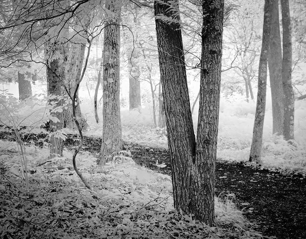
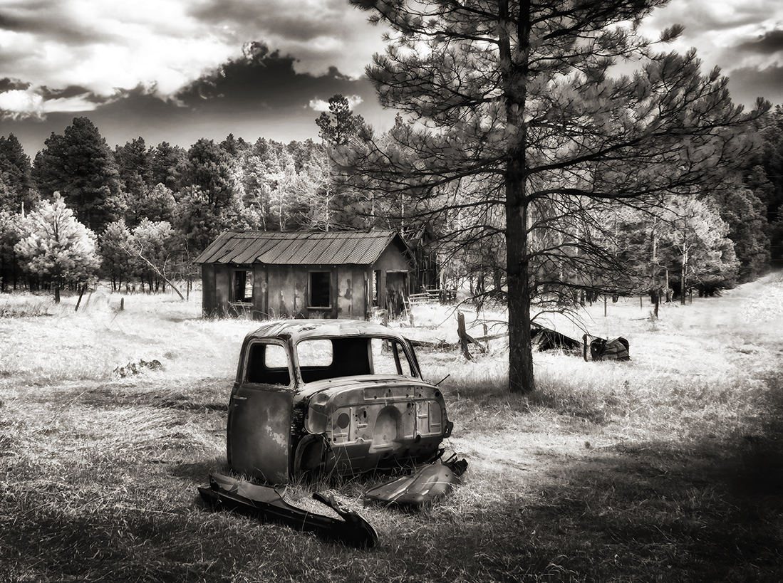
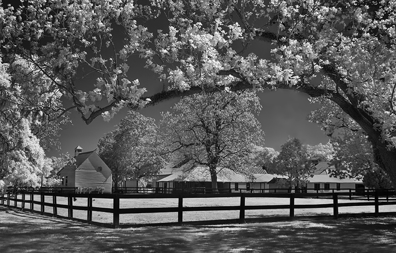
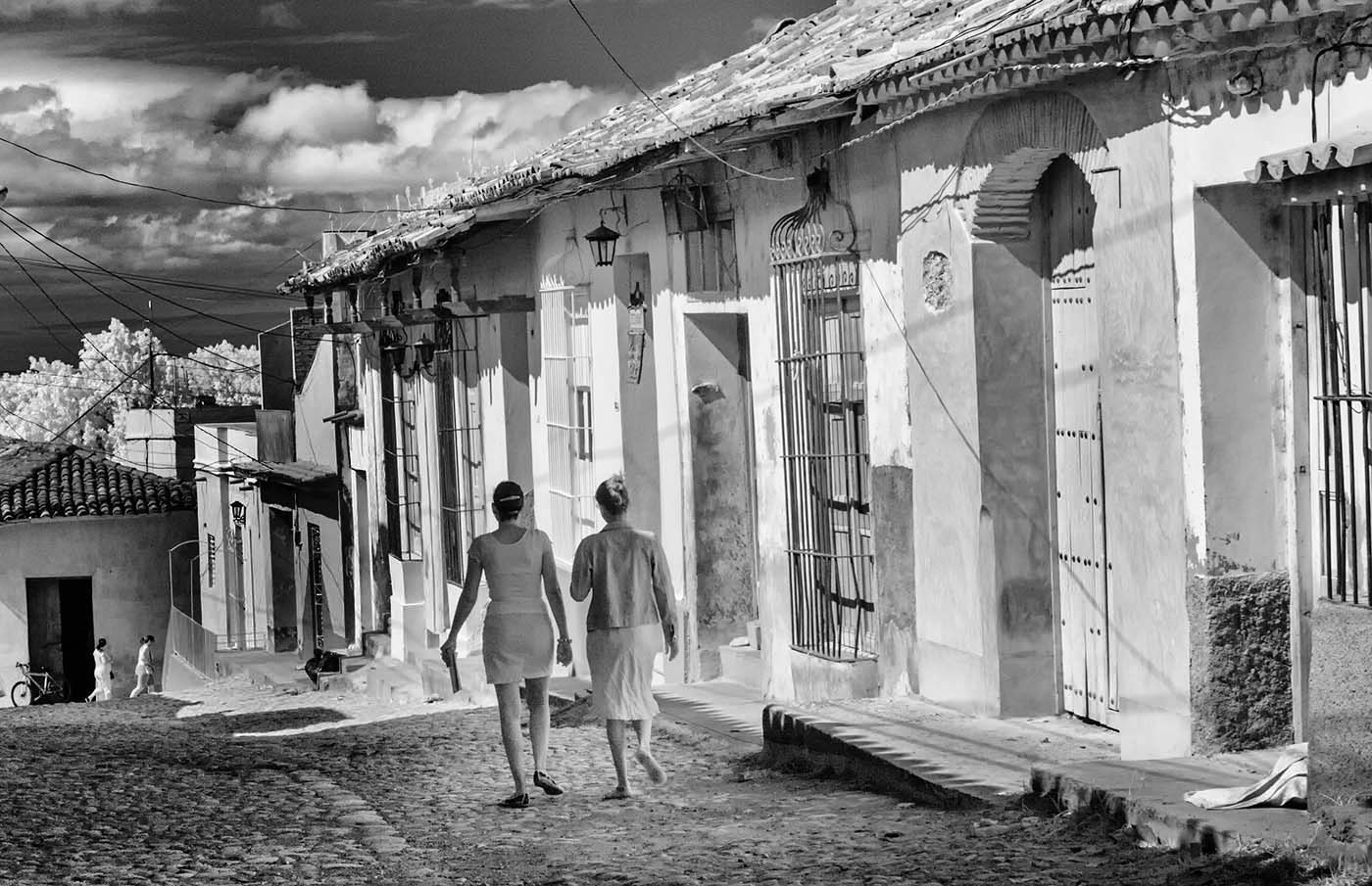
Hi Henry, Well you found the perfect angle for this photograph. It shows off the place so well The owners certainly understand how placement works. It makes me want to know more about these old trucks. Very interesting processing which works here. Well done! |
Jul 5th |
| 66 |
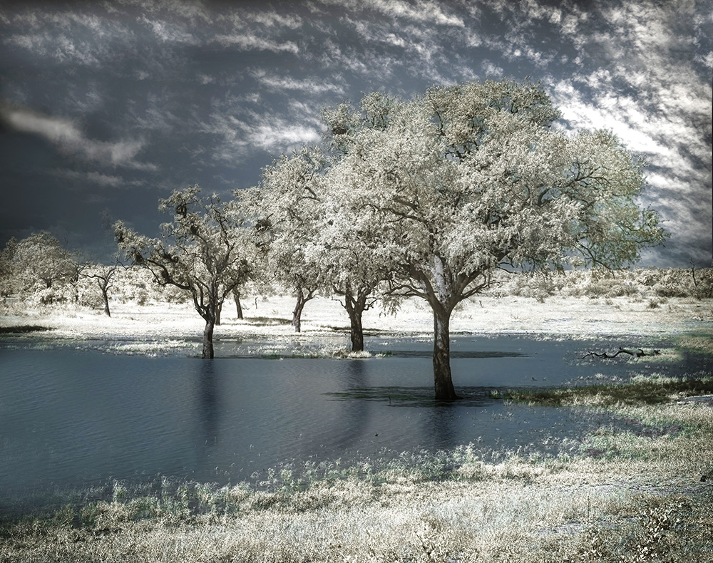
Jul 23 |
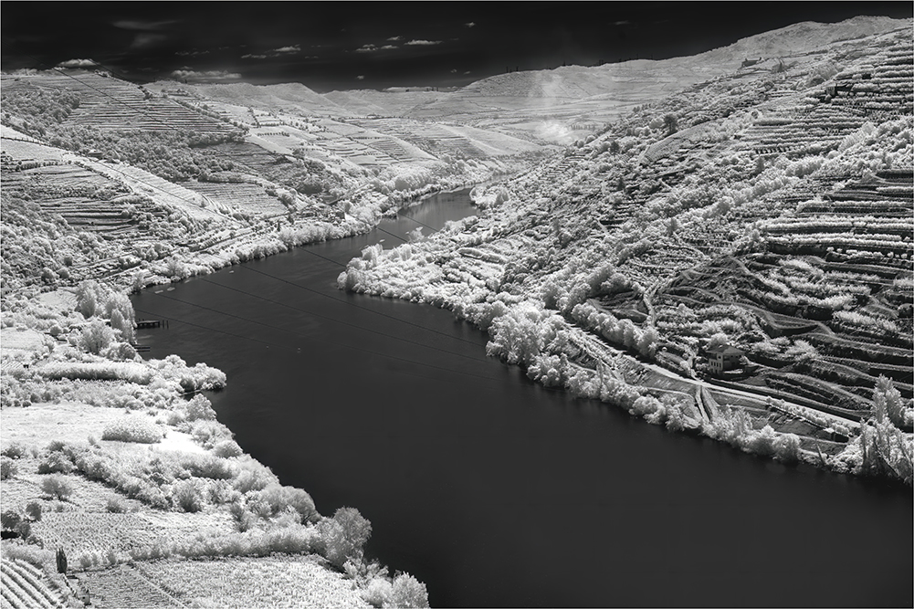
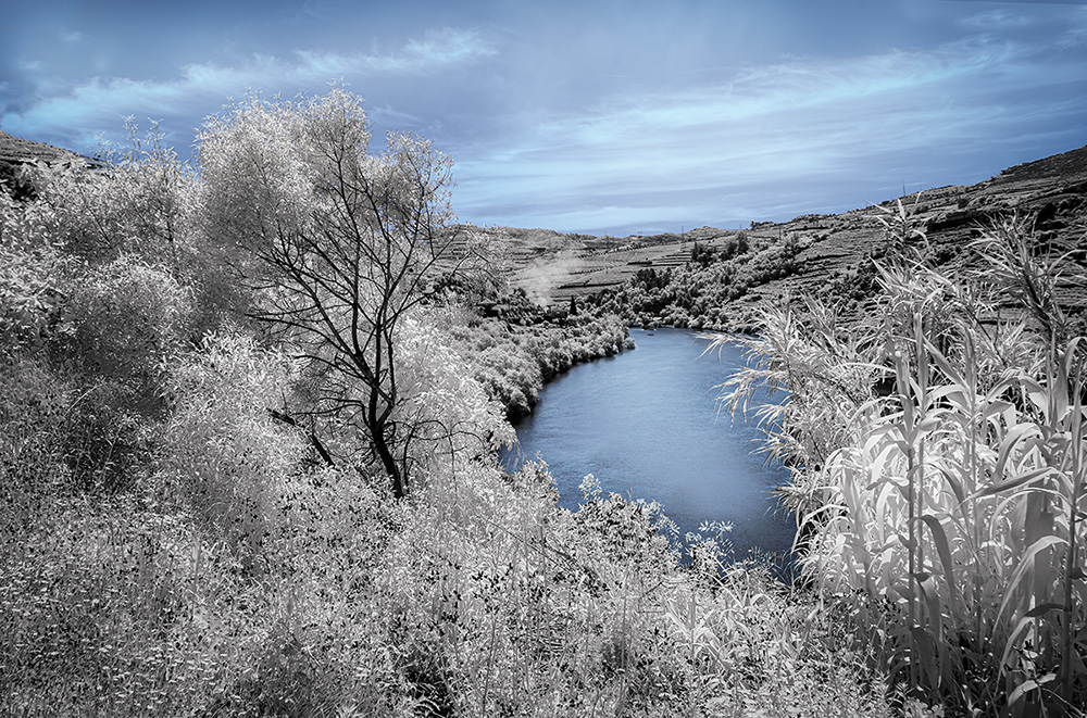
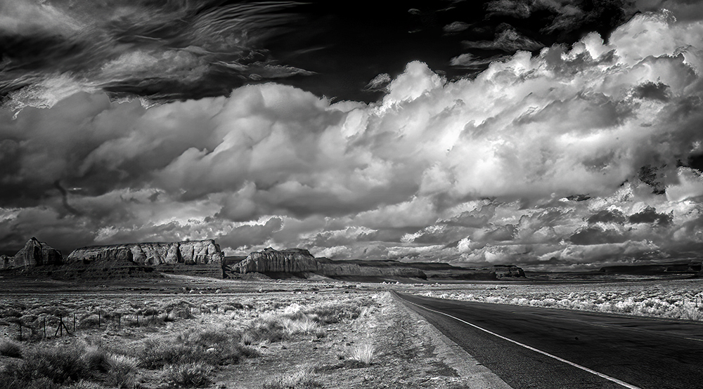
Comment |
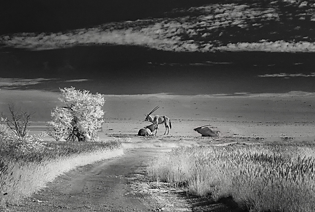
Well seen Emil, Its a lovely landscape and I'm pleased you revisited it. You have done well with the processing but I think that increasing the contrast and reducing the brightness will make it pop. Dust spots are our enemy! |
Jul 5th |
| 66 |
Jul 23 |
Comment |
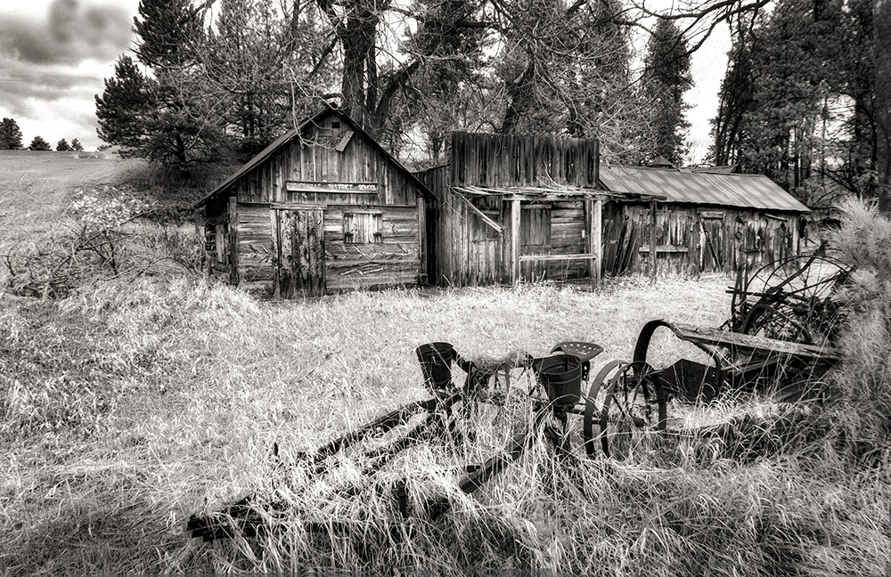
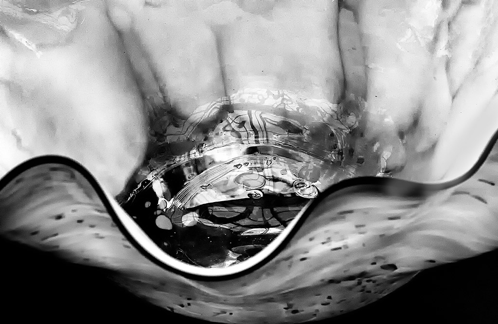
Hi Palli, You are always a surprise with the interesting things you photograph. Enjoyed the history and had a smile - Australia has made it's footprint!
Post processing is in keeping with the subject. Detail is exceptional, and I love the layers leading down into the borehole. I am not a fan of fancy borders, as I feel they detract from the image. I guess I like simple. |
Jul 5th |
| 66 |
Jul 23 |
Comment |
Hi Gary, Even though you are using new on old, one has to start with a good image. The angle with wonderful S curves taking us through the image is so well thought out. Your Post processing is always great, the detail exceptional. My very small quibble is about the sky, I might have pulled back a little on it. The lighter sky seems to suit it better. |
Jul 5th |
| 66 |
Jul 23 |
Comment |
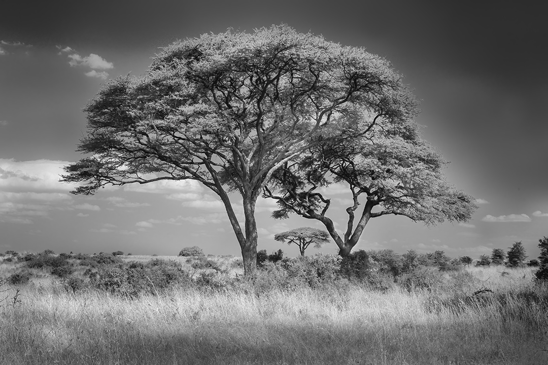
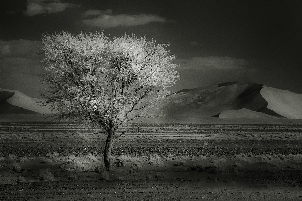
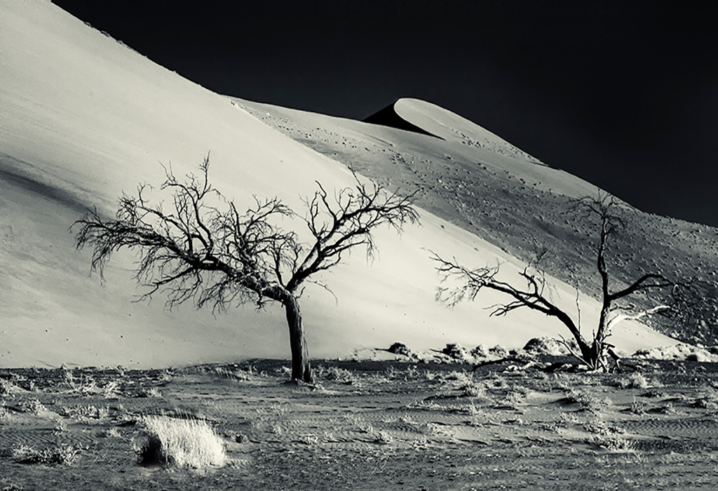
Hi Chuck, Bravo on finding the perfect lone tree. I think we all have this in mind. Lovely post processing. As others have said looks like a drawing and certainly is art.
|
Jul 5th |
| 66 |
Jul 23 |
Comment |
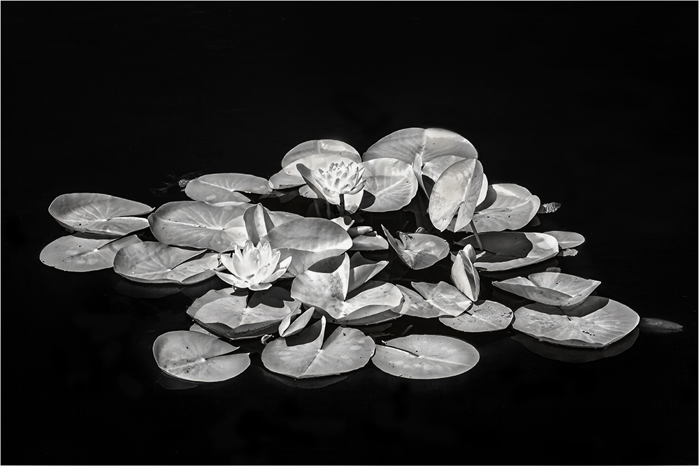
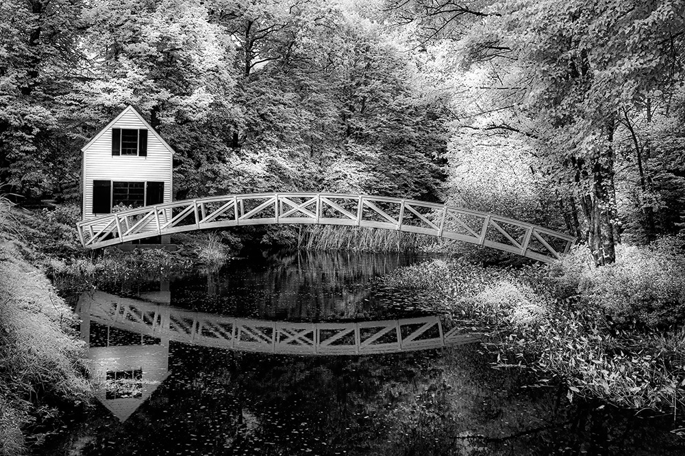
Hi Jack, You have taken the pond from a great angle which is compelling to the viewer. Like everyone else I agree that more contrast will find the details missing, especially in the foreground.
|
Jul 5th |
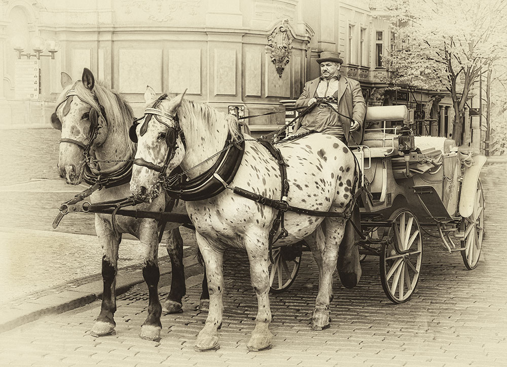
| 66 |
Jul 23 |
Comment |
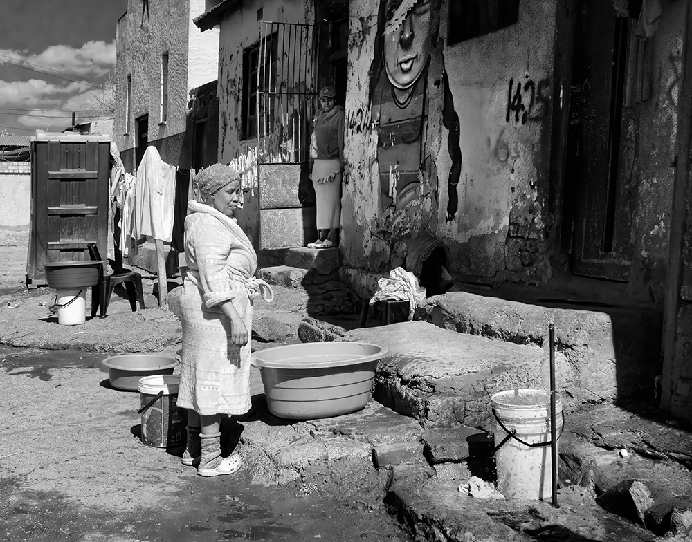
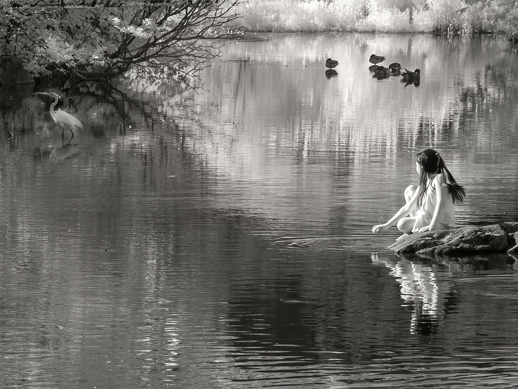
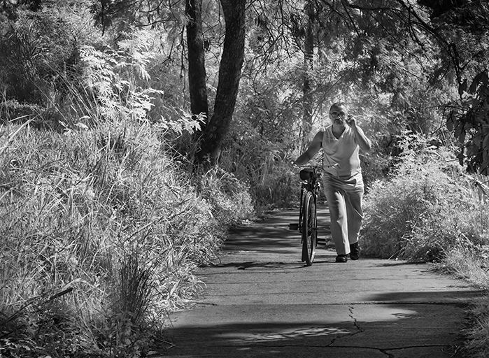
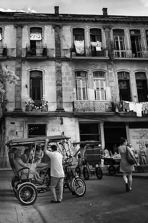
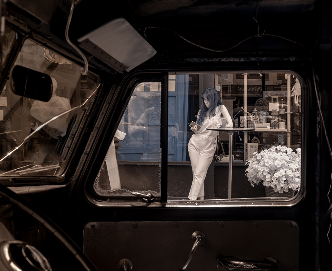
Hi Arik, I'm a big fan of street photography and here really like the porcelain feel that comes with IR. The post processing is wonderful, especially with the crack. I'm in the camp of of blue, but think that you B/W version is also great.
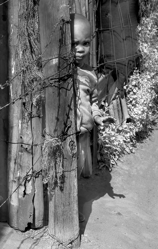
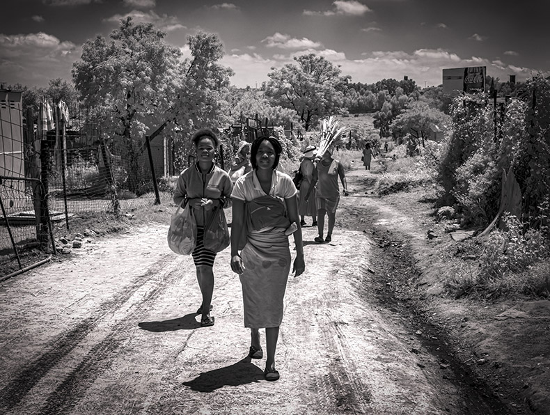
The following may entirely be because I'm not as fascinated with cars as others. I cropped the image, taking away the bottom and right side the near the front window, concentrating more on the girl and wonder what you may think. I do so wish that we did not have to contend with phones that are just always there! |
Jul 5th |
7 comments - 7 replies for Group 66
|
14 comments - 9 replies Total
|