|
| Group |
Round |
C/R |
Comment |
Date |
Image |
| 65 |
Jun 23 |
Reply |
Thanks so much Diana |
Jun 25th |
| 65 |
Jun 23 |
Reply |
Thank you Rebecca. your comment is much appreciated. Please look at my reply to Dick. |
Jun 25th |
| 65 |
Jun 23 |
Reply |
Very Good idea Maria. It works well |
Jun 25th |
| 65 |
Jun 23 |
Reply |
Thank you Bev. You are always so kind to visit. |
Jun 25th |
| 65 |
Jun 23 |
Reply |
Thanks Fran. That is certainly something to try. |
Jun 25th |
| 65 |
Jun 23 |
Reply |
Thanks Jodi. Pleas see my reply to Dick. |
Jun 25th |
| 65 |
Jun 23 |
Reply |
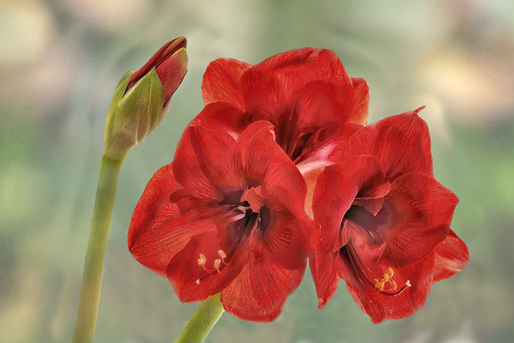
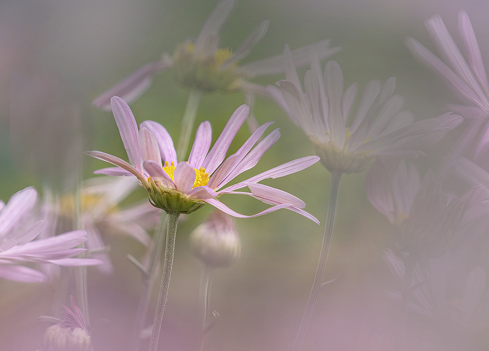
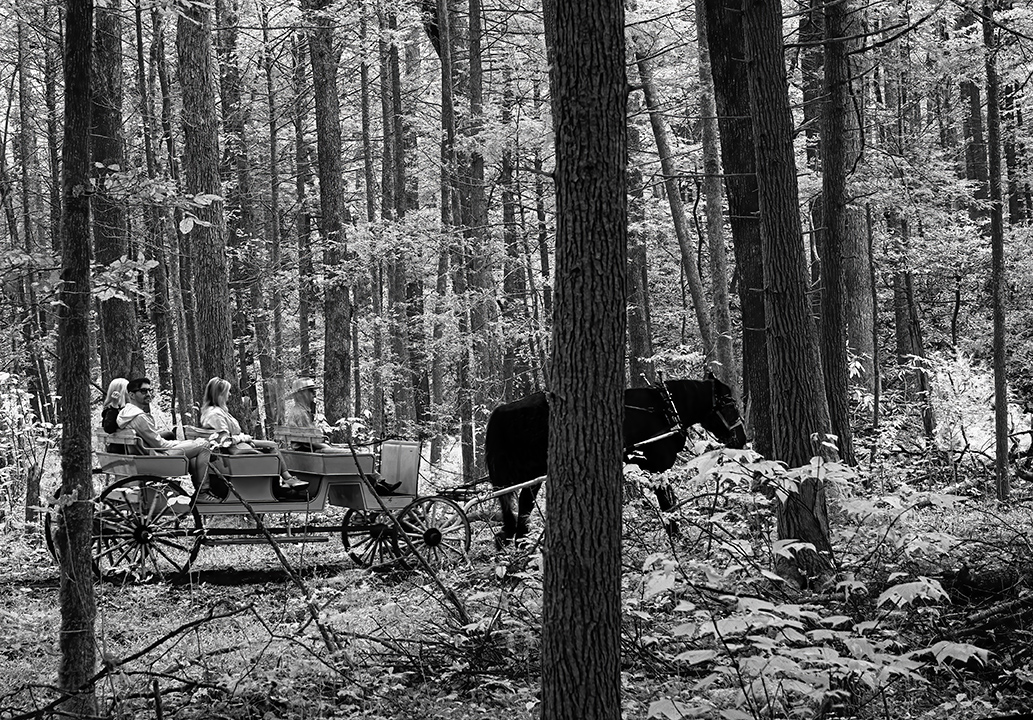
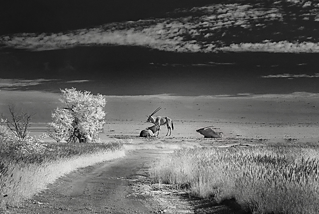
Thanks Dick for your always insightful comments. Who knew that when I was "recording" this bloom that I would think it good enough to work on. I too wish I had moved just a smidge. |
Jun 25th |
| 65 |
Jun 23 |
Comment |
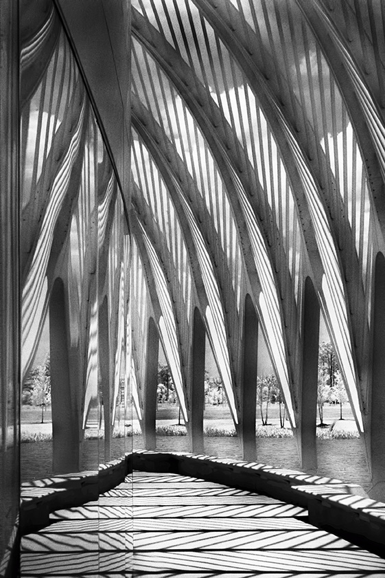
Great image in the showcase this month. Well done Jodi. |
Jun 25th |
| 65 |
Jun 23 |
Comment |
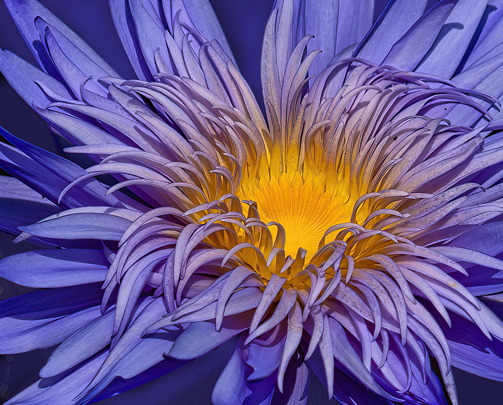
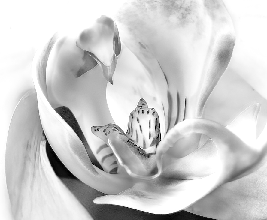
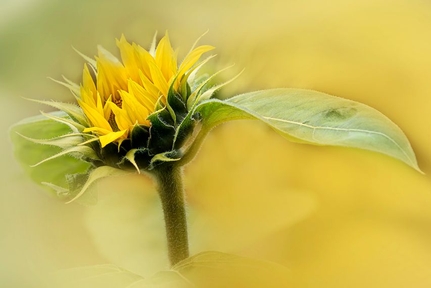
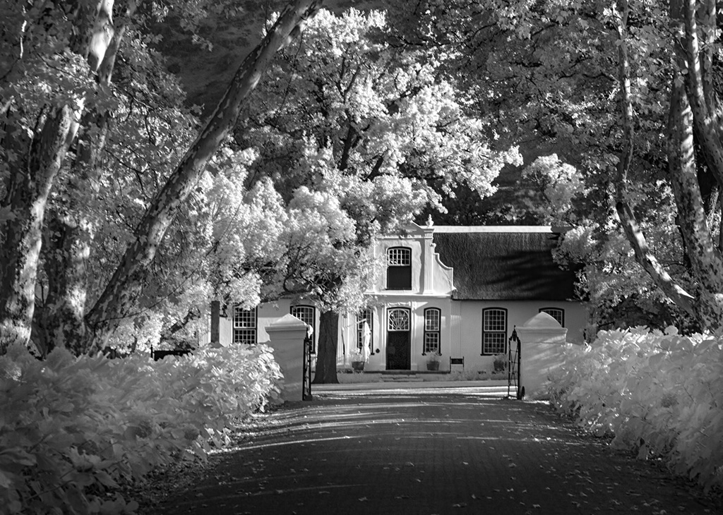
Hi Maria, Enjoy your visit to Spain. So lovely at this time of year and best to be with family.
The use of a long lens has made the depth of field so very interesting. I love that it's so sharp in the front and fades off so quickly at the back of the orchid. The out of focus yellow flowers add beautifully to the design, but I'm not so sure about the purple in the upper left. The background in your original seems to have more green in it, which I do prefer to the more yellow tones you have presented. Would you consider a small crop off the top? |
Jun 7th |
| 65 |
Jun 23 |
Comment |
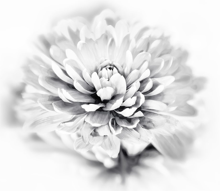
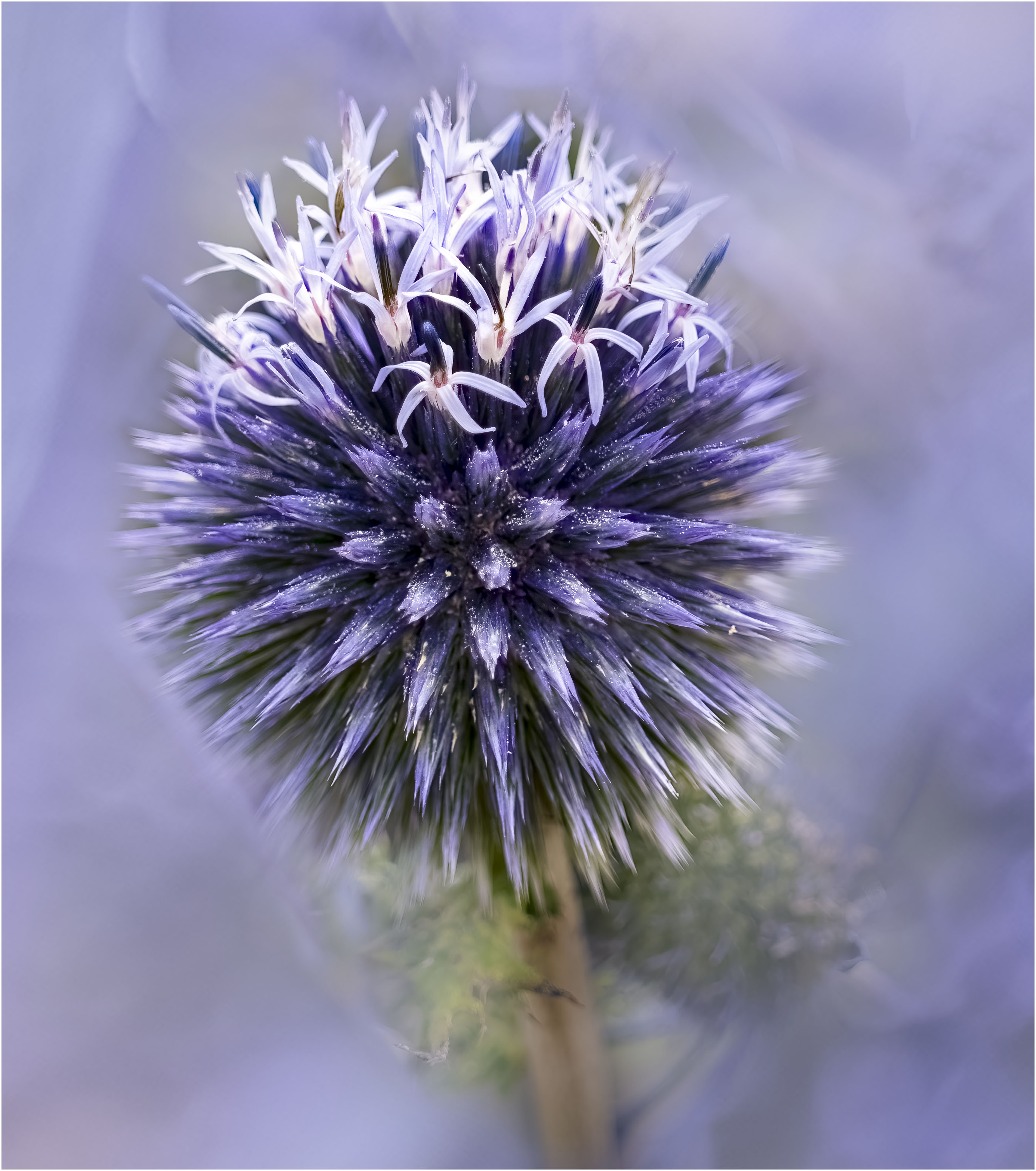
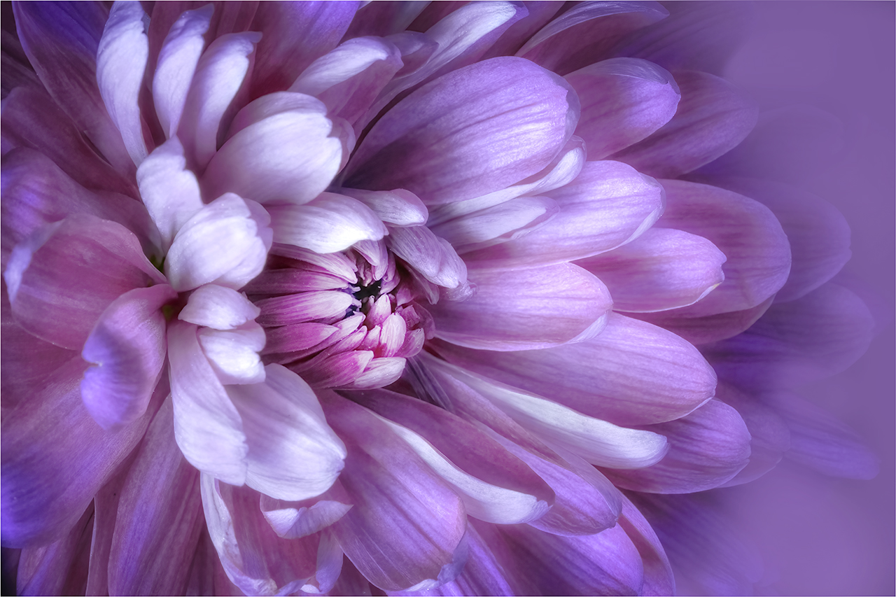
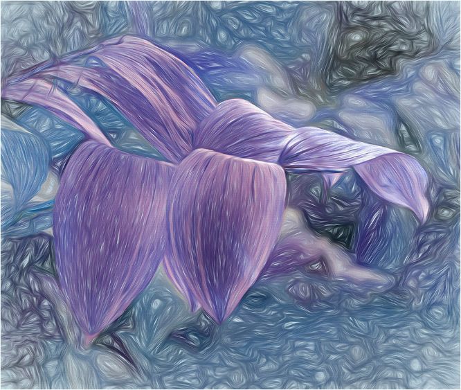
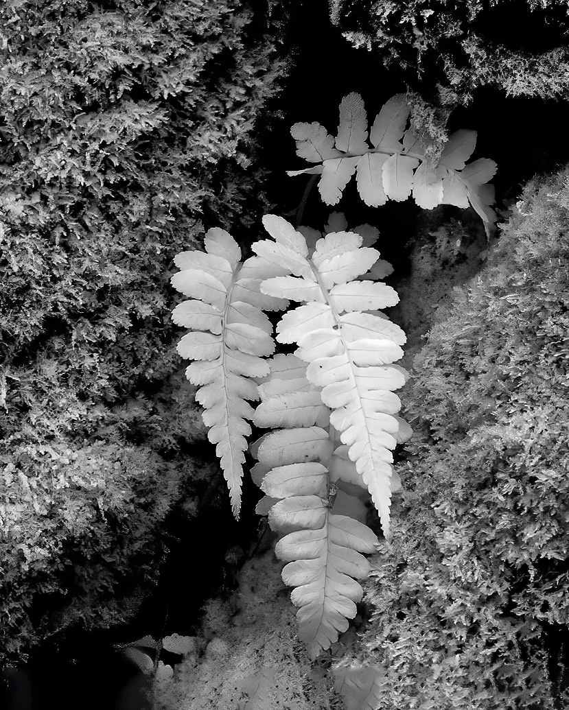
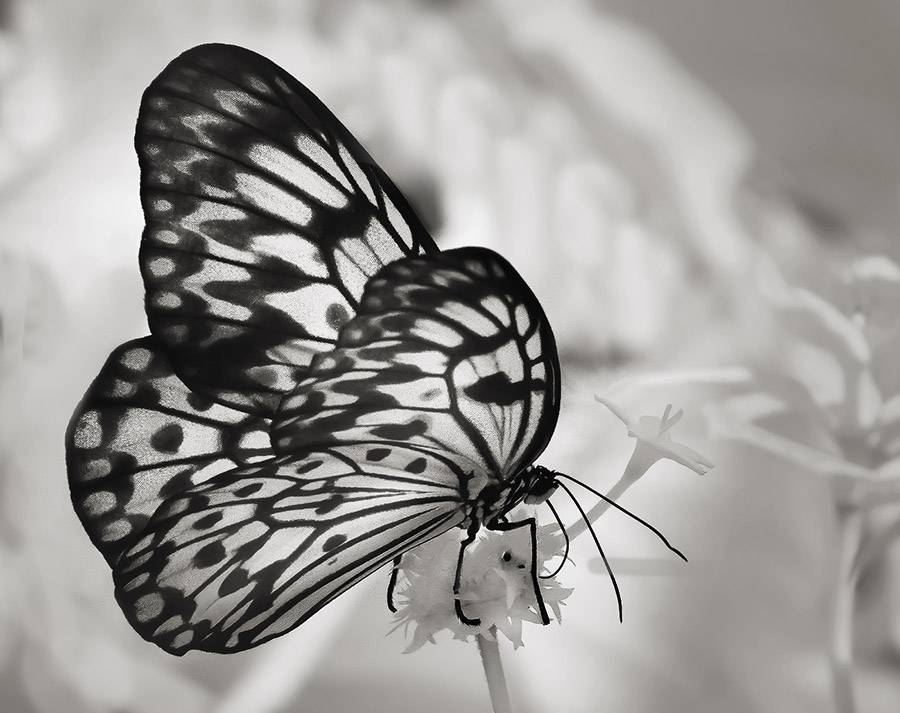
Hi Jodi, As far as I'm concerned, all flowers are exciting. Your masking and background texture is entirely in keeping with the presentation and well done. Your image is sharp, but I thick you may have brightened it, and in doing so have lost some detail in the whites around the center. |
Jun 7th |
| 65 |
Jun 23 |
Comment |
Forgot to add that the focus stacking is very well done. |
Jun 7th |
| 65 |
Jun 23 |
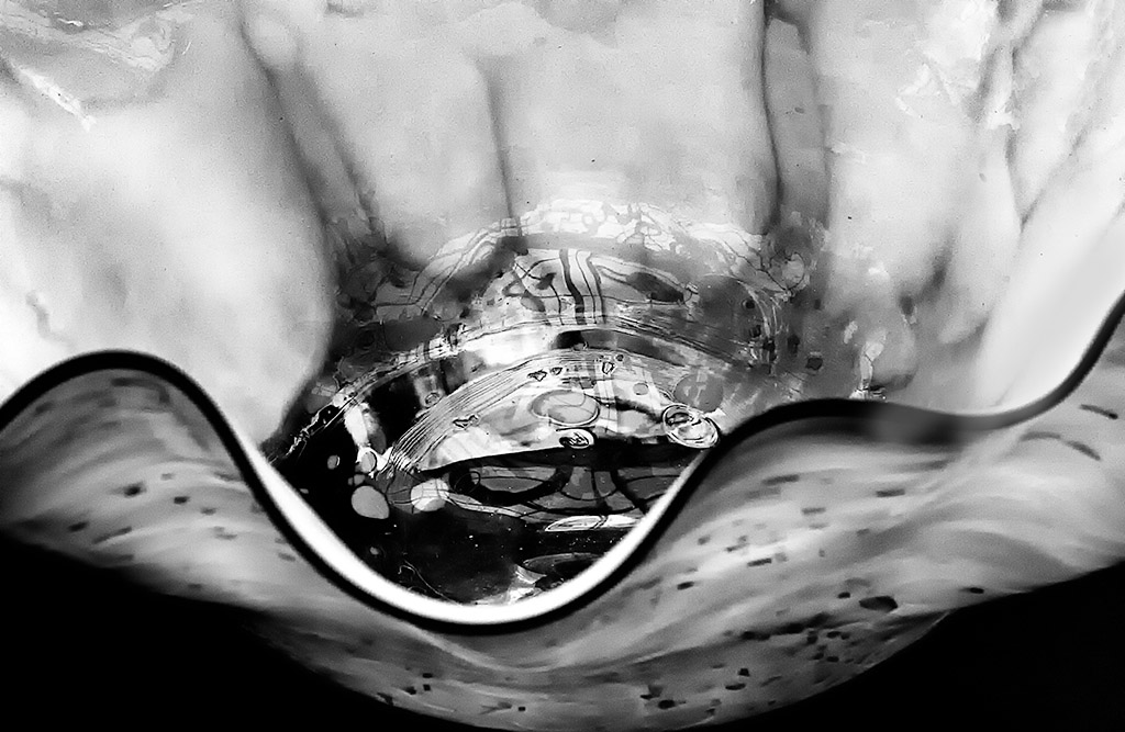
Comment |
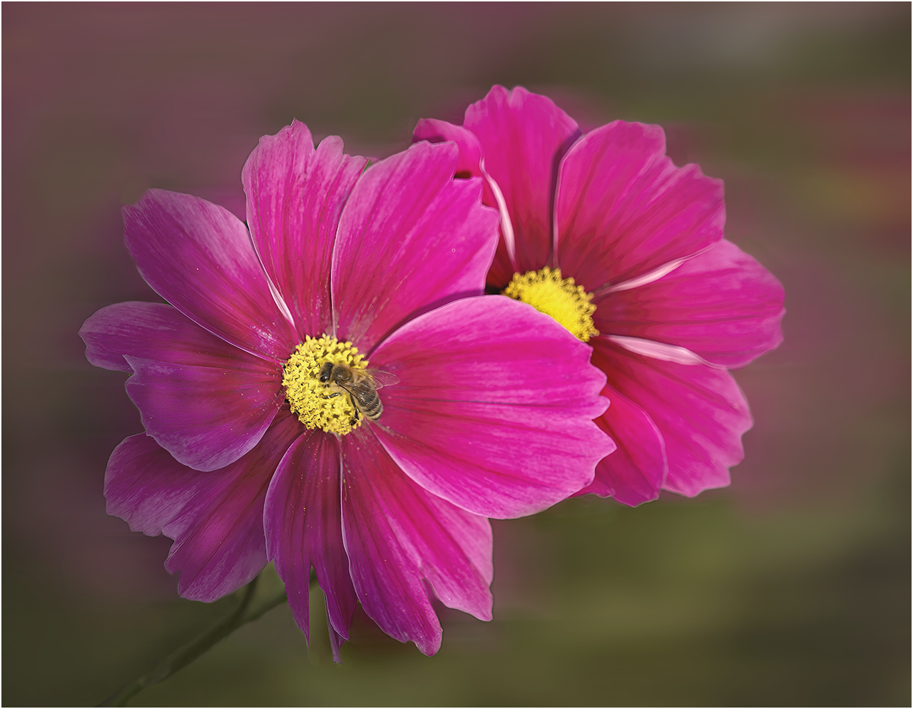
Fran, So topical. Even though this is unusual for you, it is truly lovely. Those droplets are such a bonus. What I love is the design. Blooms are perfectly placed and the red against the out focus blue and green works so well. There is the right amount of background green in the upper third. I keep coming back to enjoy it. |
Jun 7th |
| 65 |
Jun 23 |
Comment |
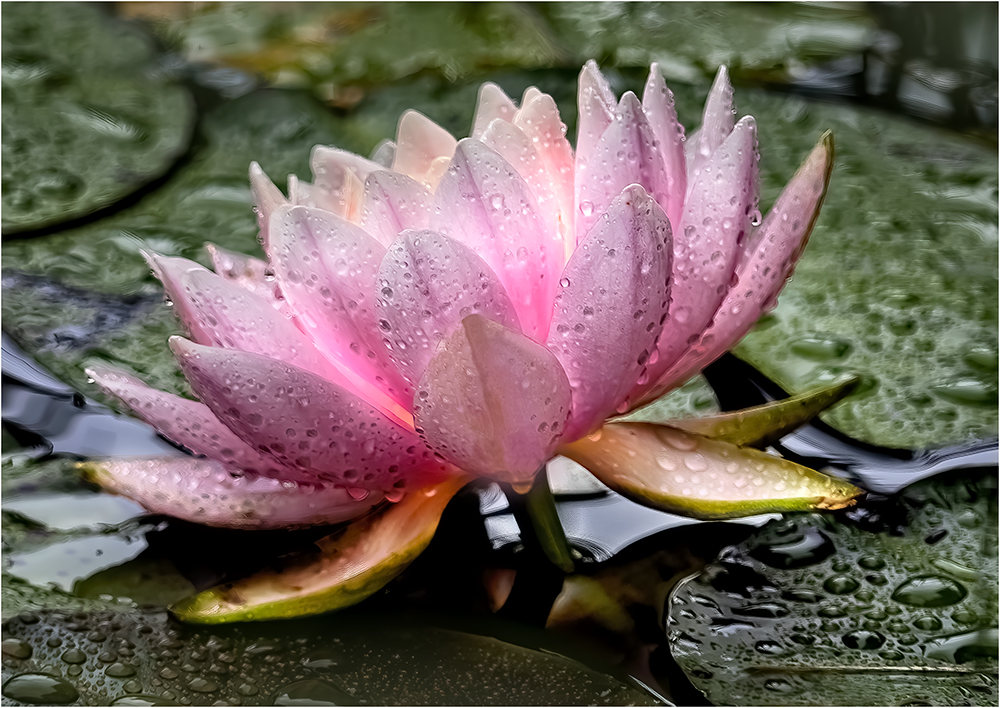
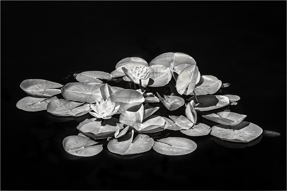
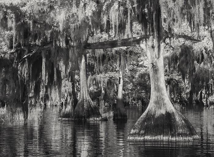
Hi Dick, It's a wonderful waterliy. Your depth of field makes everything sharp and crisp. The placement between the pads really adds to this beauty. Polarizing makes the water look so good. Thanks for sharing. |
Jun 7th |
6 comments - 7 replies for Group 65
|
| 66 |
Jun 23 |
Reply |
Thanks Chuck, I'm pleased this image invoked some discussion with many different ideas. |
Jun 25th |
| 66 |
Jun 23 |
Reply |
Thanks Henry, Many Different views on this image and each one has value. |
Jun 25th |
| 66 |
Jun 23 |
Reply |
Wow Emil! I think you have successfully done what I could not, and what a difference it makes. Thank you so much for taking the time to work on my image. |
Jun 7th |
| 66 |
Jun 23 |
Reply |
Thanks Jack, As I have noted I'm not quite sure about this image. I think it has a lot to do with my processing. But I am pleased that I made you think! |
Jun 7th |
| 66 |
Jun 23 |
Reply |
Thanks so much Palli. I really appreciate the positive feedback The black and white image is mine. Gary challenged me to do better, and do I reworked the image. |
Jun 3rd |
| 66 |
Jun 23 |
Comment |
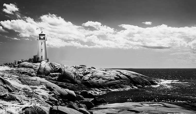
Hi Henry, Not just another capture of another lighthouse, as your conversion is so well done. I think the muted sky really helped the lighthouse to stand out with lovely detail. Great for the collection of lighthouses from around the country. |
Jun 3rd |
| 66 |
Jun 23 |
Comment |
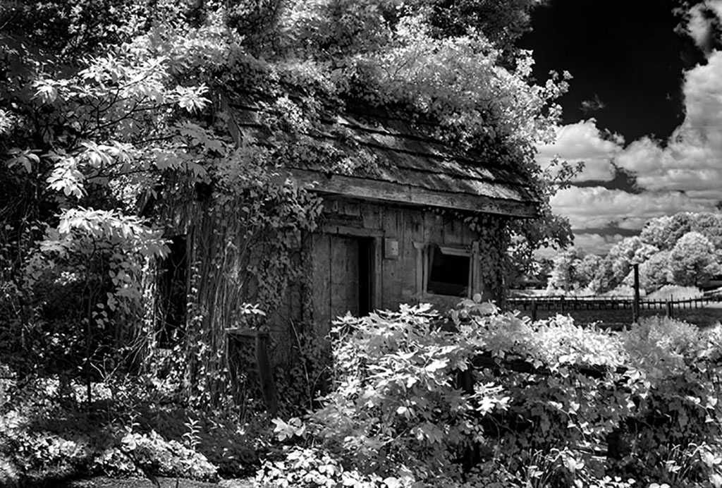
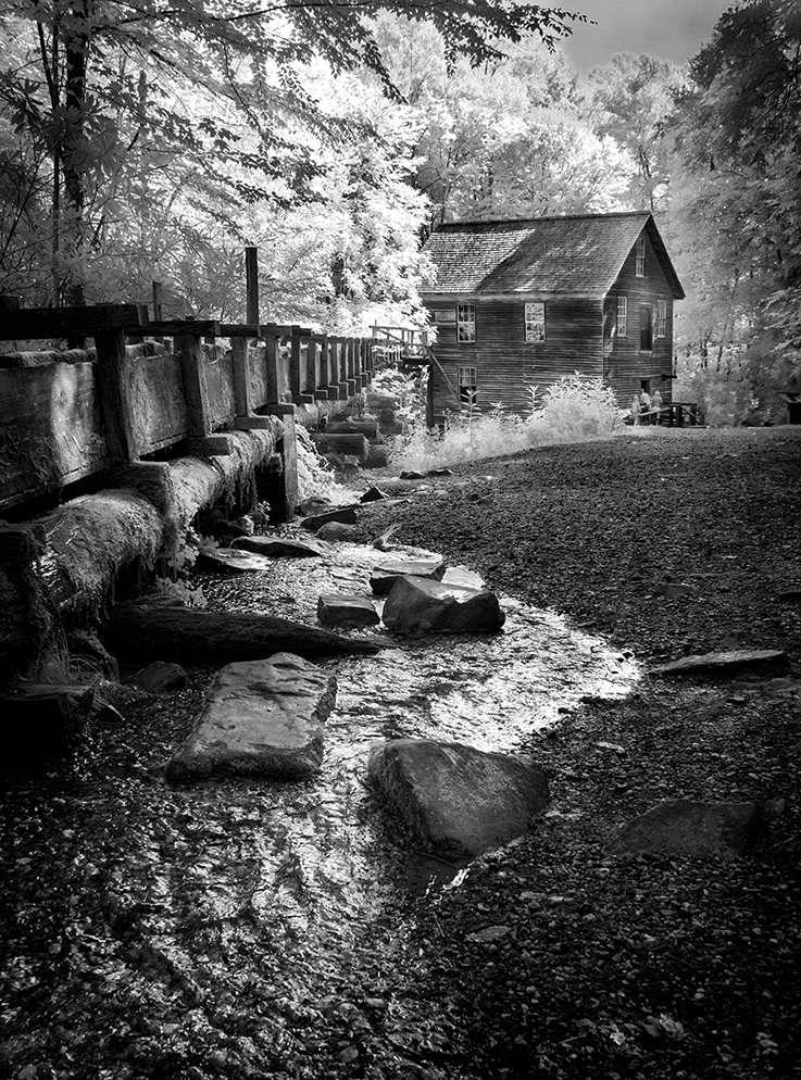
Hi Emil, Worth the work it took get to and to capture the mill. Your post processing has made this a fine submission more than worthy of our group. Well done. |
Jun 3rd |
| 66 |
Jun 23 |
Comment |
Hi Palli, I'm pleased your model stayed long enough and that you were ready to shoot. It's a lovely story. I do like your processing, but think it could be a little less saturated and still be compelling. |
Jun 3rd |
| 66 |
Jun 23 |
Comment |
Hi Gary, I am always impressed that you think and find something topical. This is a very powerful presentation and tells the story. The use of muted color is well thought out as it does not overpower the image. I really like the tiny cloud breaking up the black sky. |
Jun 3rd |
| 66 |
Jun 23 |
Comment |
Hi Chuck, Well, I'm a girl and my favorite color is pink, so what's not to love. I do wish you had used more of it, even while not to make it too obvious. Painting often makes our images into art. Your soft and dreamy conversion is spot on for this scene. Well seen and well processed. |
Jun 3rd |
| 66 |
Jun 23 |
Comment |
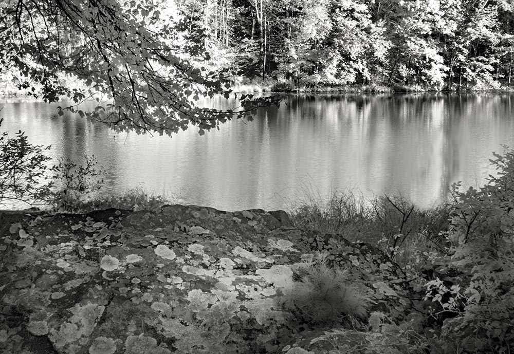
Hi Jack,
Your capture of the pond makes it look like a vast expanse, which i really enjoy. It does seem a little flat though. Gary is onto something as his version makes the lily pads glow. I think that It could be done more locally as I would not darken the water, but would work on the sky as well. |
Jun 3rd |
| 66 |
Jun 23 |
Comment |
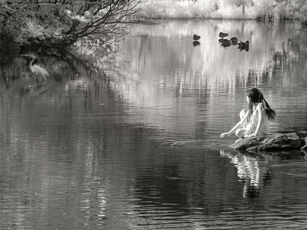
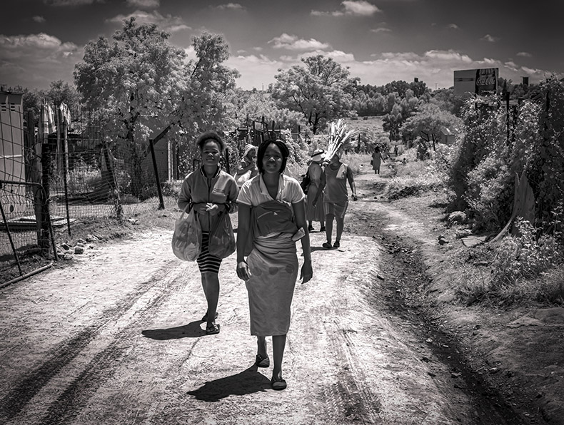
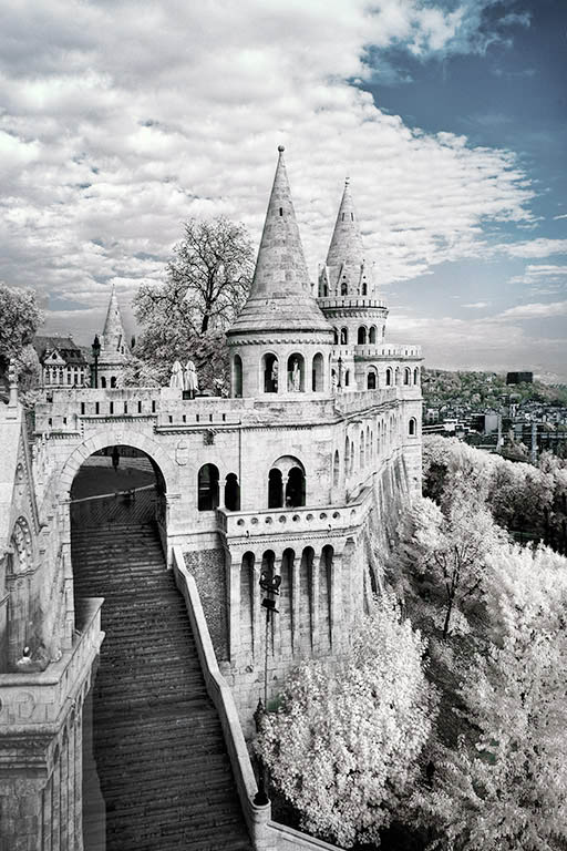
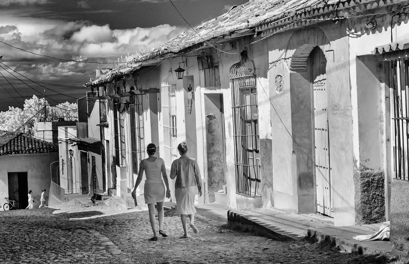
Hi Arik, You took a "nice" picture of this scene and have managed to converted it into art with your processing. I am also drawn to brand arch in the perfect position above the people. |
Jun 3rd |
| 66 |
Jun 23 |
Reply |
Hi Gary, I knew you would not like my image! So I'm up for the challenge. Let me know if this is is more pleasing to your eye.
Your conversation with Arik on your image makes my head spin a bit. I really am not using all the new tools in PS and need to try and understand them. |
Jun 3rd |
 |
| 66 |
Jun 23 |
Reply |
Thanks Arik For helping me to make some improvements here. I have posted a new image on Gary's reply, so let me know if that works. |
Jun 3rd |
7 comments - 7 replies for Group 66
|
13 comments - 14 replies Total
|