|
| Group |
Round |
C/R |
Comment |
Date |
Image |
| 65 |
Feb 23 |
Reply |
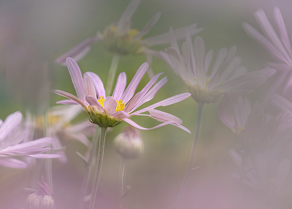
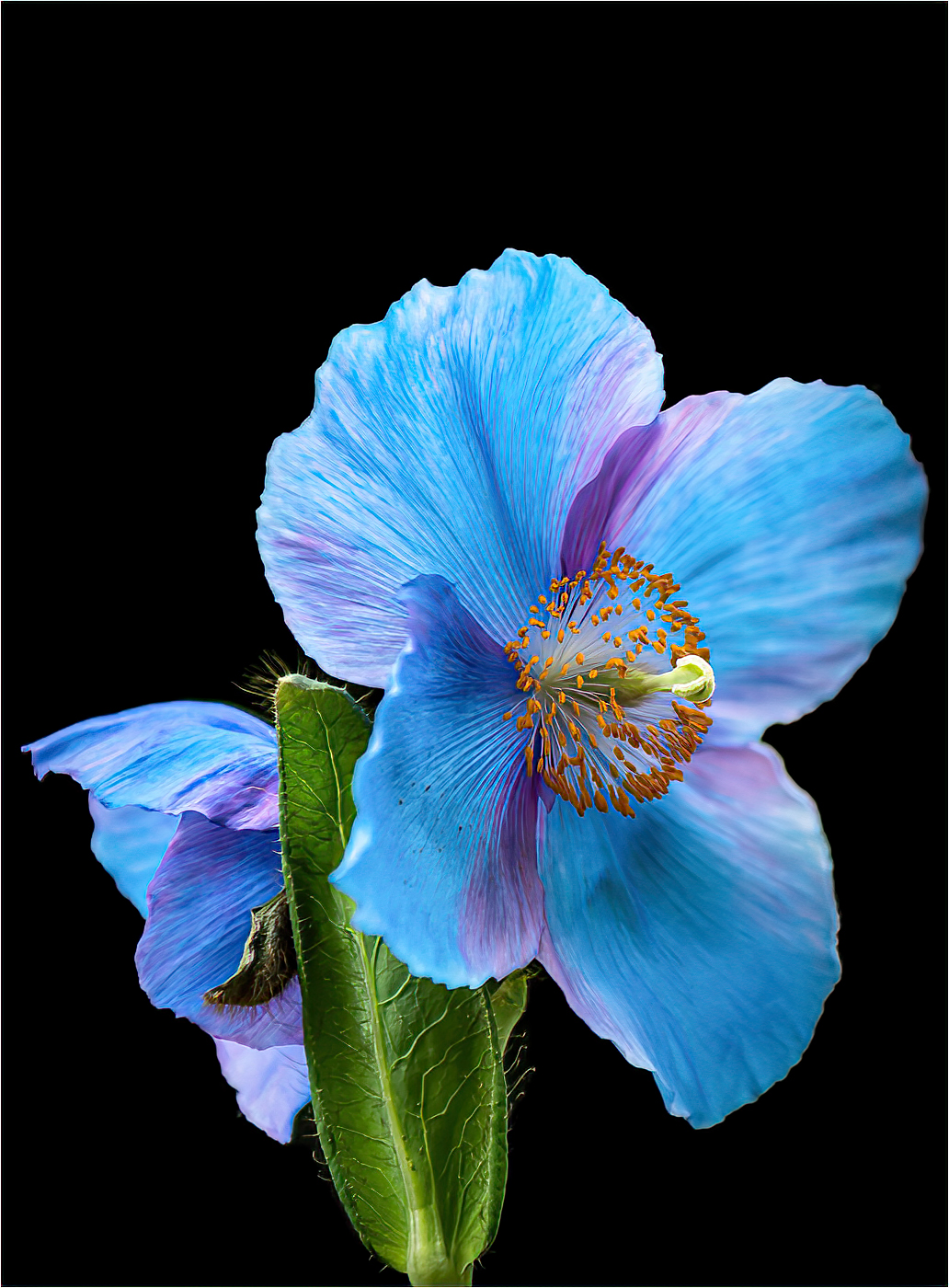
Thanks Jodi for your intuitive and kind comments. I really appreciate them. Jury may be out on the foreground blur. |
Feb 11th |
| 65 |
Feb 23 |
Reply |
Thank you Fran, Your imagination is right up there with me. I was really surprise to see that I had taken this at F 11 when I looked at info details. And yes the blur is a problem. If I had know I was going to crop this right down, I may have done things differently! |
Feb 11th |
| 65 |
Feb 23 |
Reply |
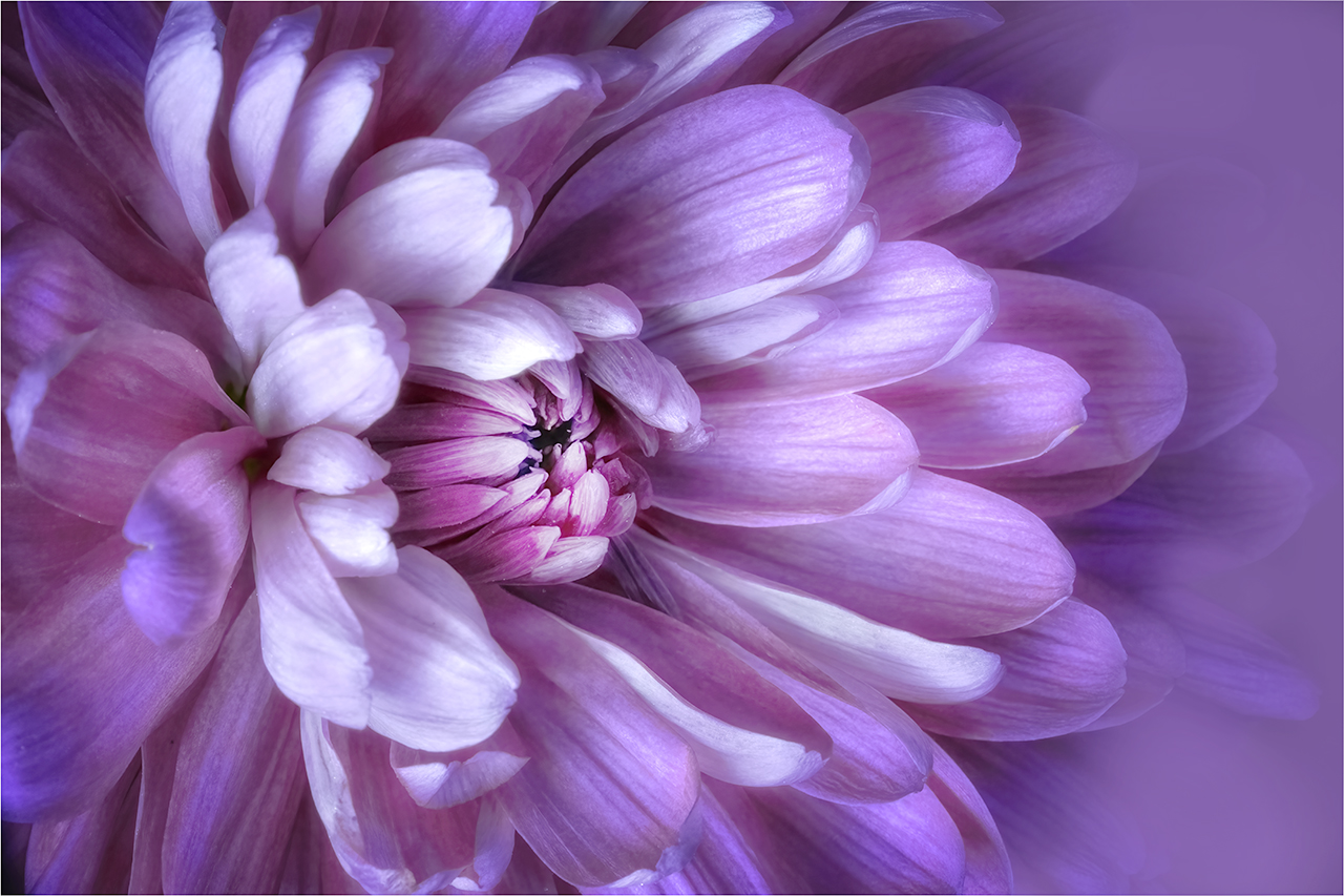
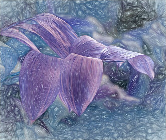
Thanks Maria. I agree that the front petal is a problem. There is quite a lot of noise, which prevented me from trying to sharpen that area. |
Feb 11th |
| 65 |
Feb 23 |
Comment |
Hi Russel,
What a beautiful bouquet. The colors are charming. I think you could have reduced the brightness a little. If it were mine, I would change the crop. Either to include more of the piano and maybe be able to show a reflection, or the crop it right down and concentrate on the central white rose, using the pink as a frame. Never the less, its lovely to look at. |
Feb 11th |
| 65 |
Feb 23 |
Comment |
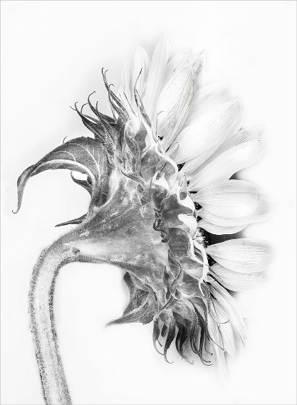
Hi Maria,
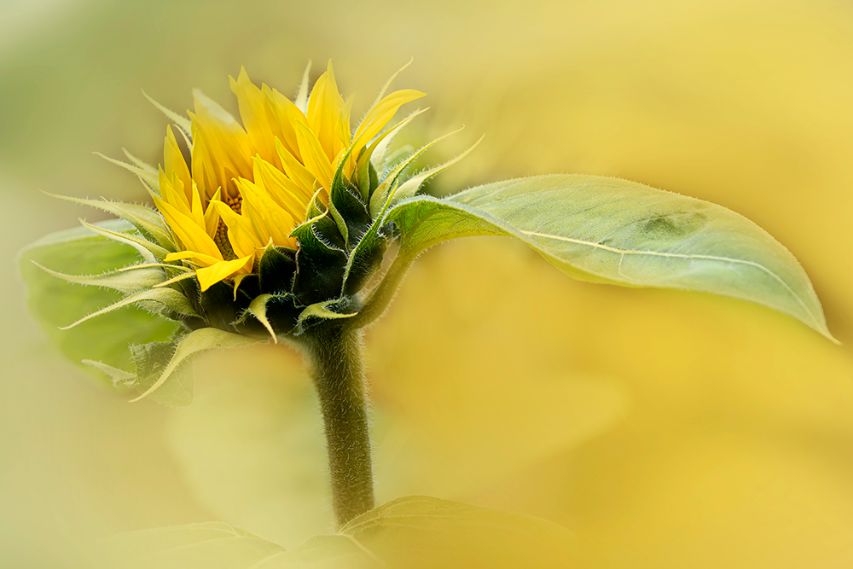
I'm an absolute fan of portrait style when shooting flowers. This gentle processing is just so well done. The muted background suits the sunflowers perfectly, especially with all the little hairs on the leaves and stem. Great job! |
Feb 11th |
| 65 |
Feb 23 |
Comment |
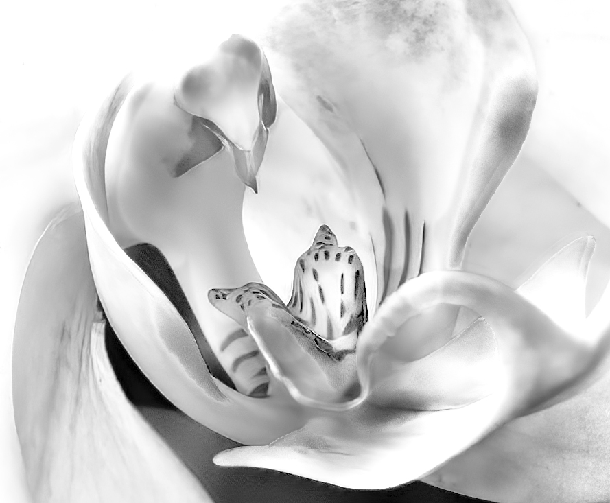
Hi Jodi,
So lovely to have you joins our great group. I know you are going to enjoy it all.
The color and processing you have done is lovely. Removing the background makes it pop.I agree with removing the dead leaf. My personal preference would be to put a one pixel stroke around it to get rid of the appearance of it floating. I did take it into topaz sharpening which you may not like at all. Let me know what you think |
Feb 11th |
 |
| 65 |
Feb 23 |
Comment |
Hi Fran,
The color saturation and detail on the rose is wonderful. Your background texture suits it perfectly. I too like to make my own textures starting with taking something from the original. The portrait angle certainly adds some tension and holds the viewer's eyes. And by the way, I love the telling title. |
Feb 11th |
| 65 |
Feb 23 |
Comment |
Hi Al, Hope all is well.
This is a lovely arrangement. Well done on fixing the slight tilt and removing objects not needed. The balance made by the fallen petals makes this image for me. There is some fix up to be done, especially on the left. Great color saturation. |
Feb 11th |
5 comments - 3 replies for Group 65
|
| 66 |
Feb 23 |
Reply |
Oh Chuck, You make me blush. Quite honestly, this is an amazing and very engaged group. There is not much that I do, it runs itself because you all are eager and show such interest in each others submissions. And of course talented. |
Feb 8th |
| 66 |
Feb 23 |
Reply |
Arik, With apologies, I was so intrigued with your lovely presentation that I did not examine your original. I now see your processing is so well done. |
Feb 6th |
| 66 |
Feb 23 |
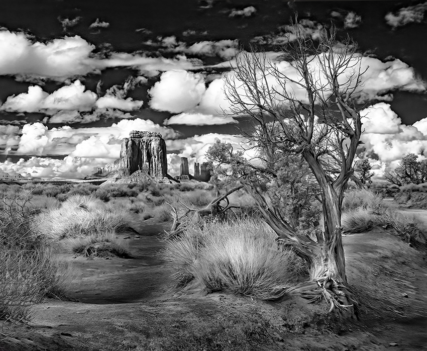
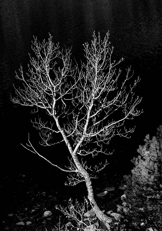
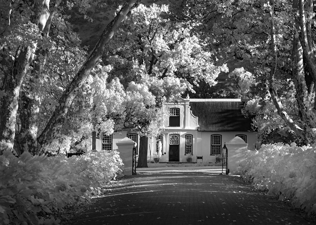
Comment |
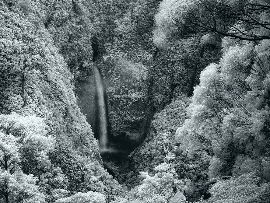
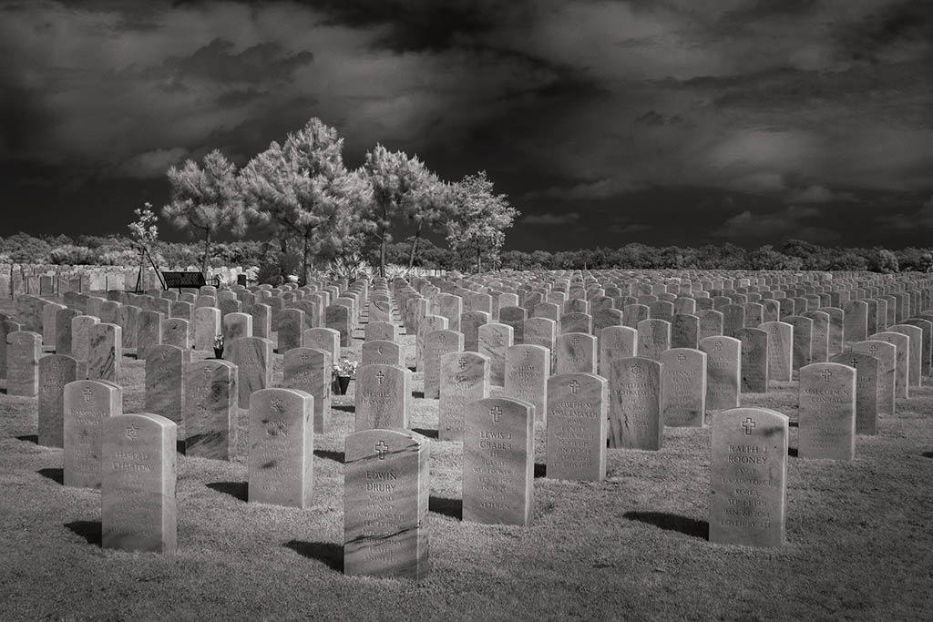
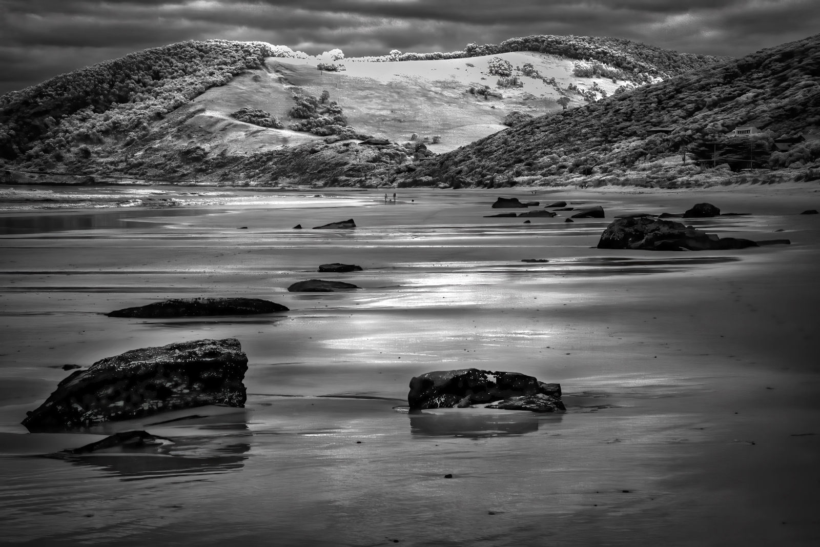
Oh Henry, I know exactly where you were standing when you took this. Such a wonderful place to visit. I regret that I did not have my IR camera with me when I was there. You have managed to tell a story with this capture. Your processing is really good, but I do agree with darkening the sky which makes the windmills really stand out. |
Feb 4th |
| 66 |
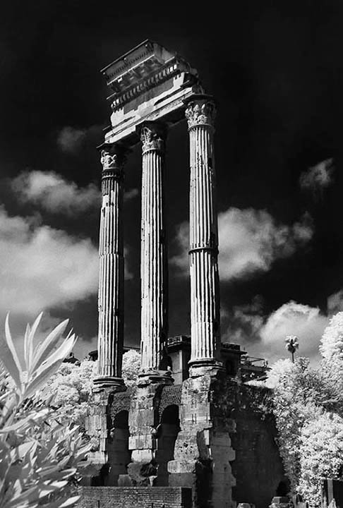
Feb 23 |
Comment |
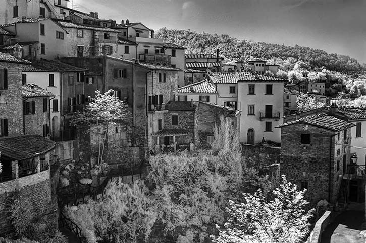
Emil, Fabulous and well seen. I also love and am drawn to this kind of image. You have managed a very busy picture so well. Your second version is now spot on. Thank you sharing this. |
Feb 4th |
| 66 |
Feb 23 |
Comment |
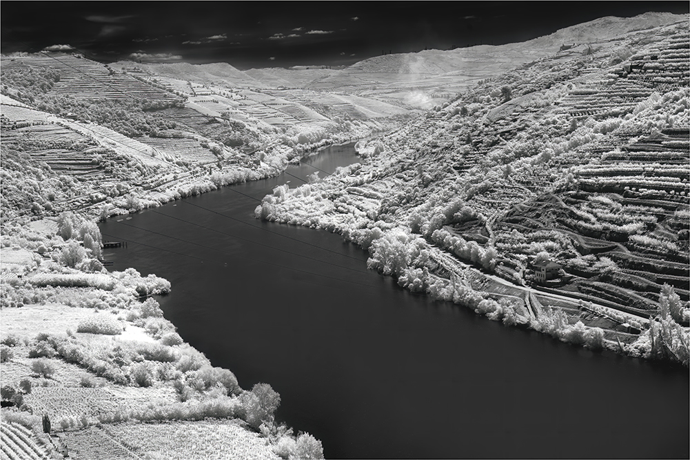
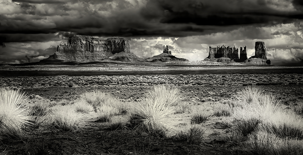
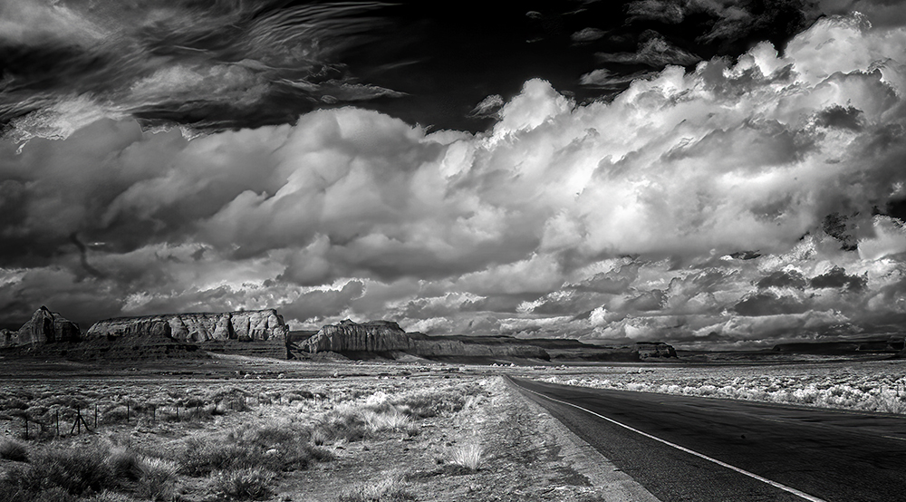
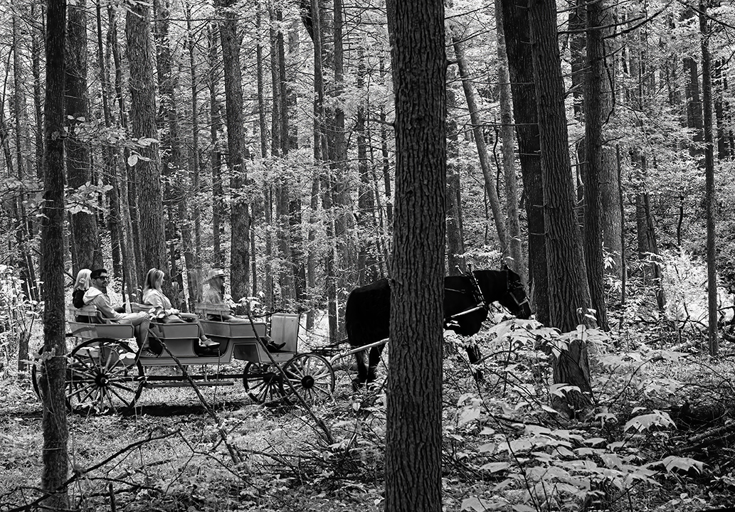
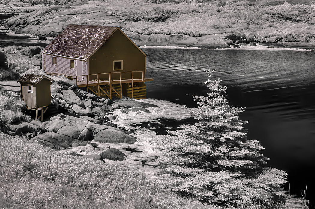
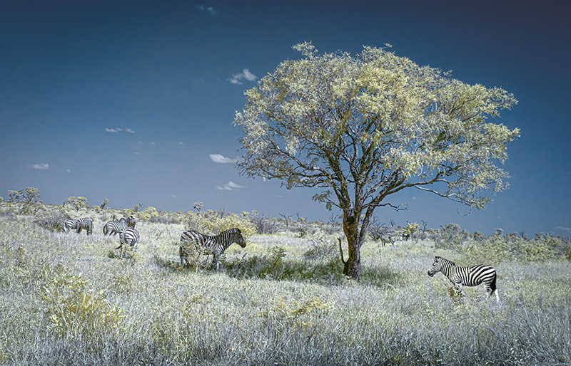
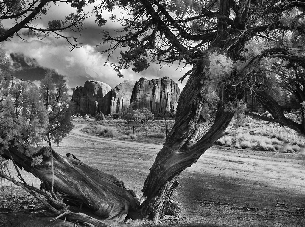
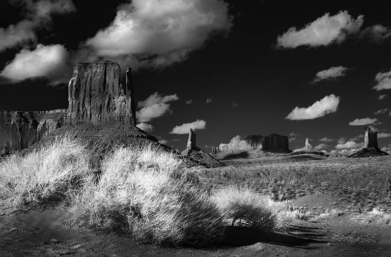
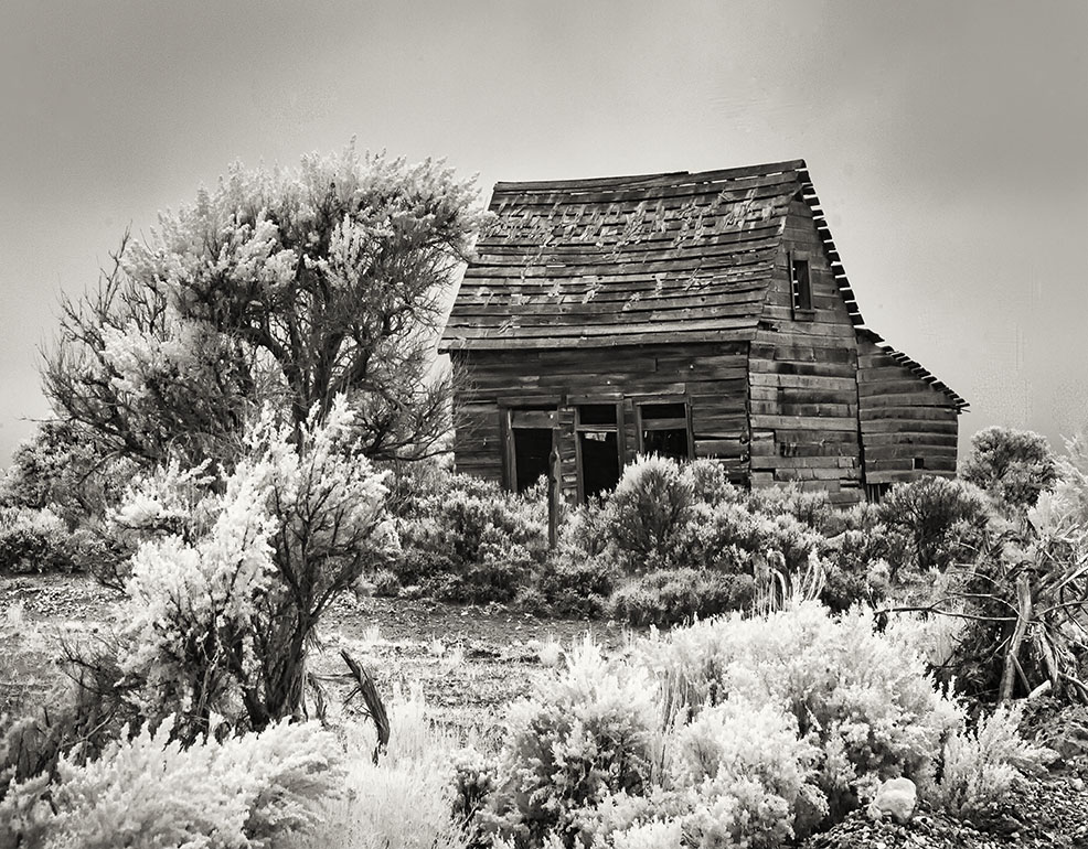
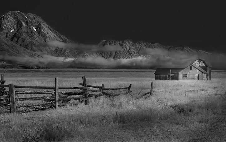
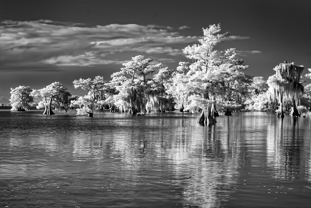
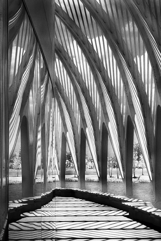
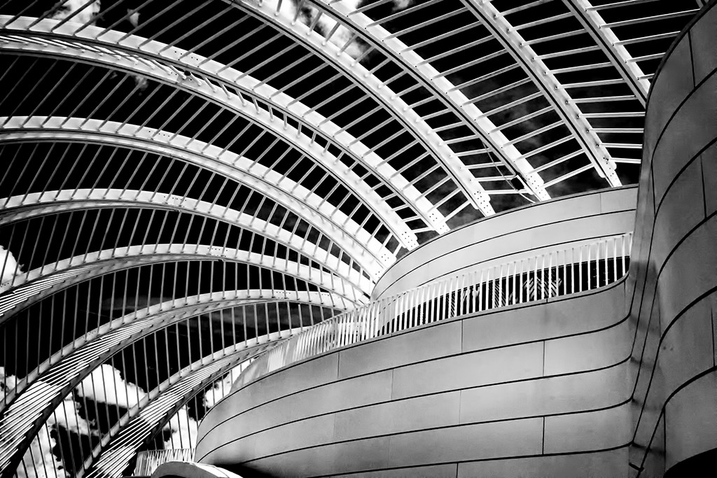
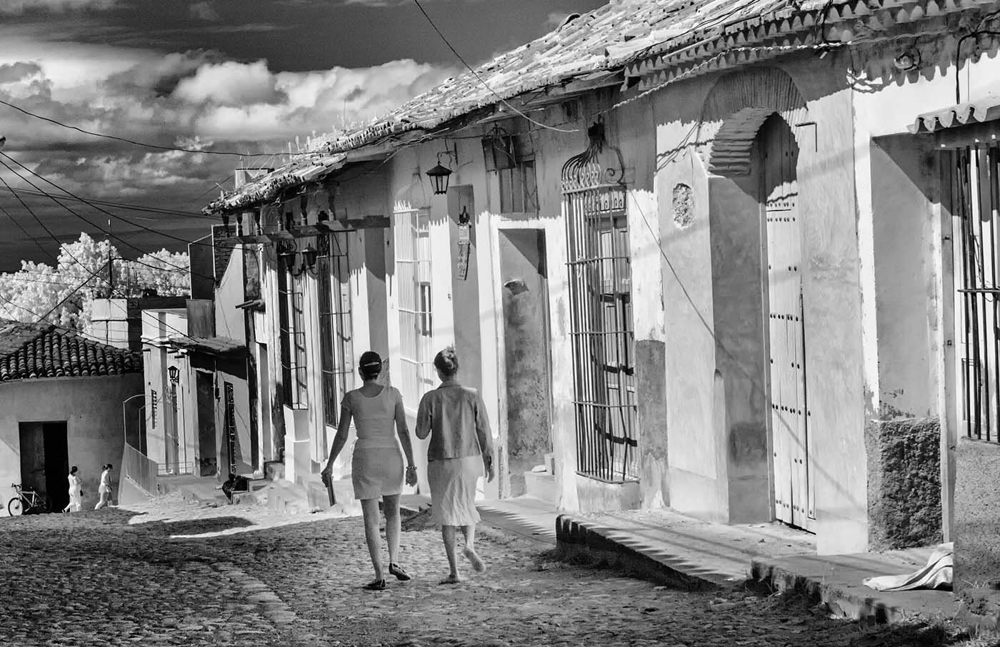
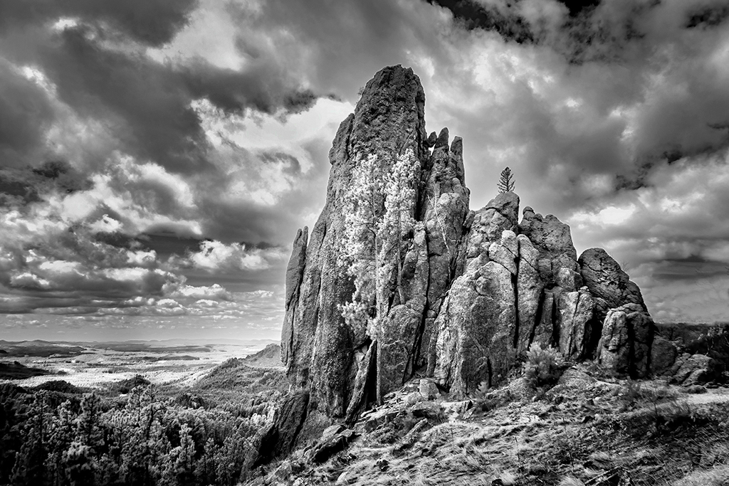
Hi Palli, You found a great scene which is perfect for IR. I really like how the rocks lead us all the way though to the very scenic mountains. I do think that lightening the front rocks would work, as well as playing locally with contrast. I wonder what you think of of my reworked image. |
Feb 4th |
 |
| 66 |
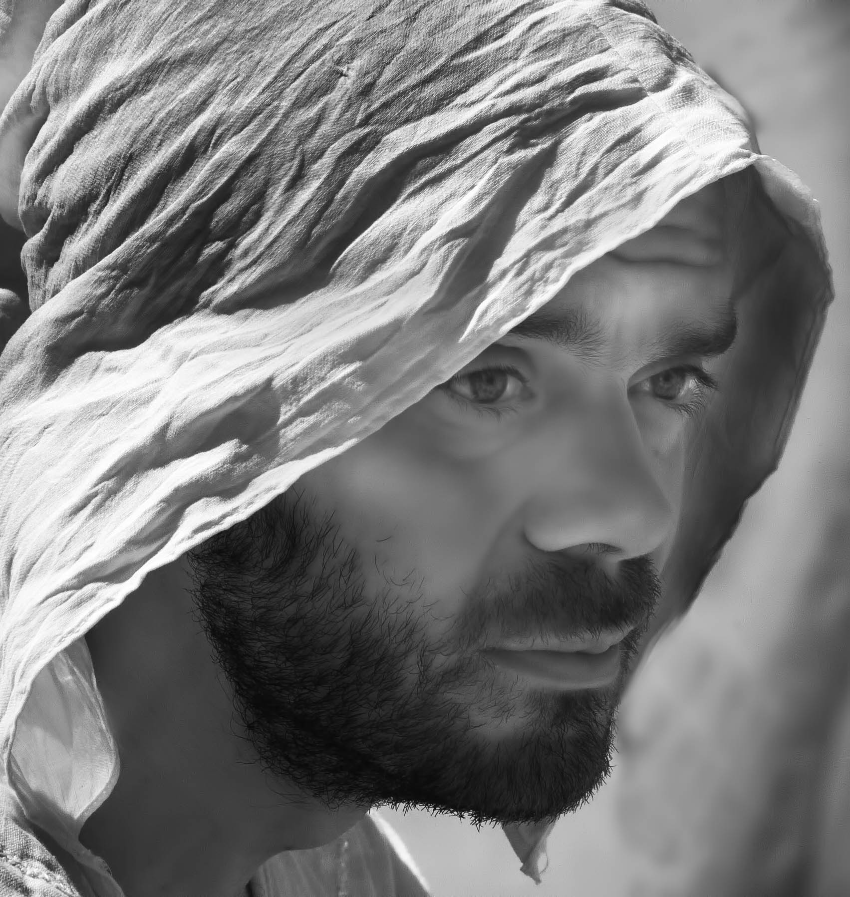
Feb 23 |
Comment |
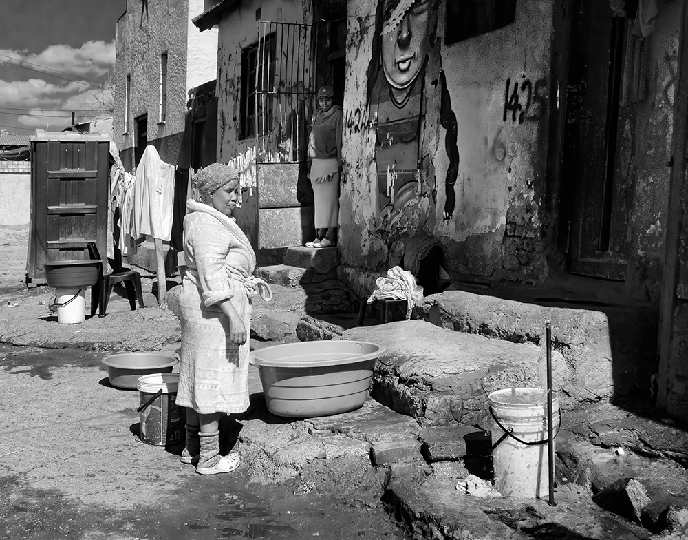
Hi Gary, The fact at you got all the detail you have in the original is wonderful, considering how IR renders with people. Your processing has made it so compelling. My quibble is with her eyes. They have lost the lovely detail you had. Bringing them out would make her even more possessed! |
Feb 4th |
| 66 |
Feb 23 |
Comment |
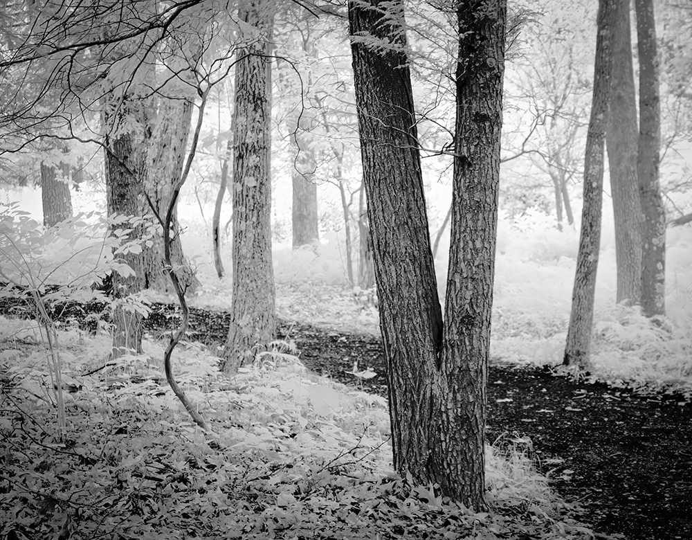
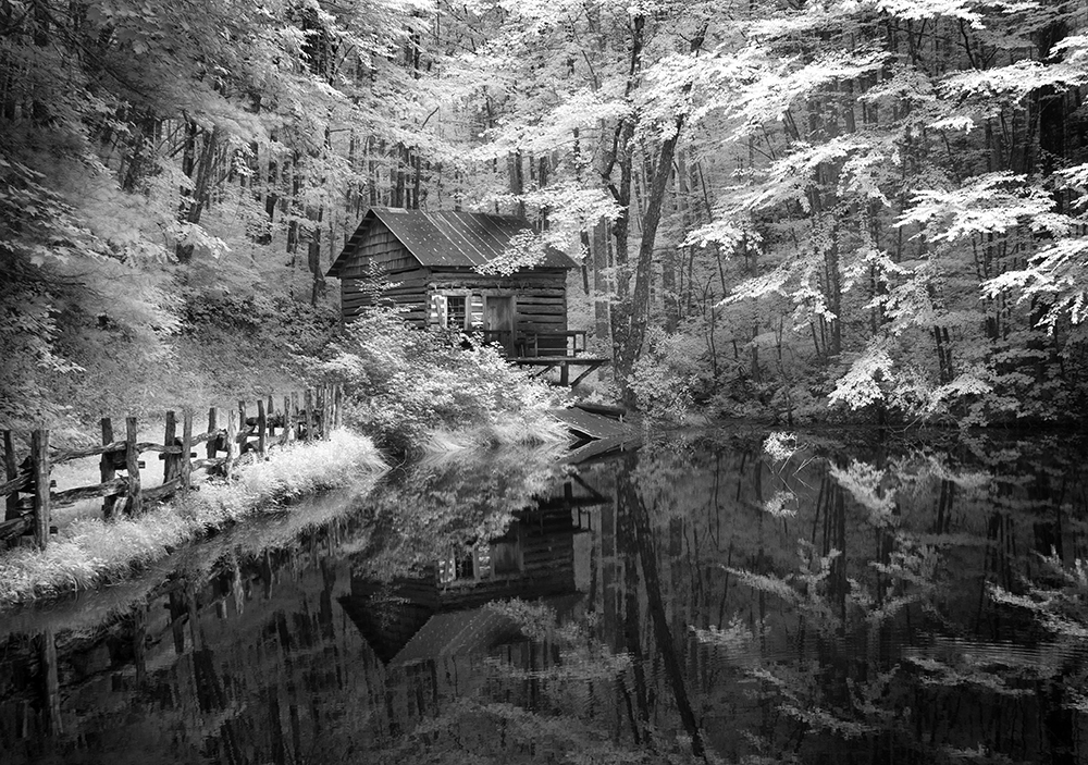
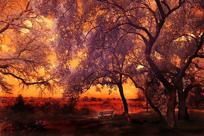
Hi Chuck, I went back and looked at your original image. OMG how far you have come! This is truly lovely. I like the soft tones very much indeed. The delicate reflection leads us into the image and holds our attention. Well done. On another note, Henry's version certainly has merit. |
Feb 4th |
| 66 |
Feb 23 |
Comment |
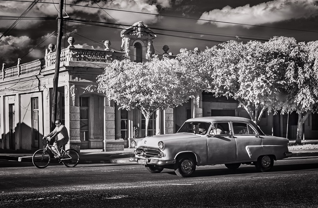
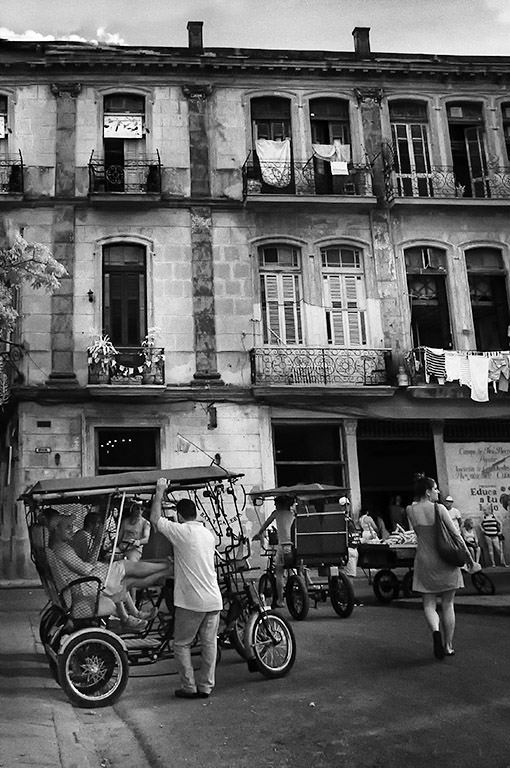
Hi Jack, Been to Cuba and I do remember this bridge. You have great perspective. Almost looks like it was taken from the air. The distance between the cars is is just perfect. I do think that contrast would give it the wow factor. |
Feb 4th |
| 66 |
Feb 23 |
Comment |
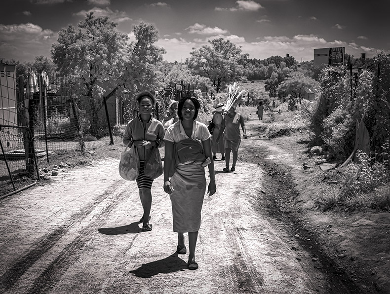
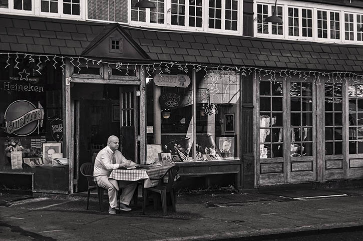
Arik, I love taking indoor images where there are silhouettes to be had. This is a fabulous one. The detail is just so good. I love the dark indoor people , set against the light outdoor folks. My only quibble is that it is a little dark. The vignette seems to heavy causing loss of detail especially on the plants. great job. |
Feb 4th |
| 66 |
Feb 23 |
Comment |
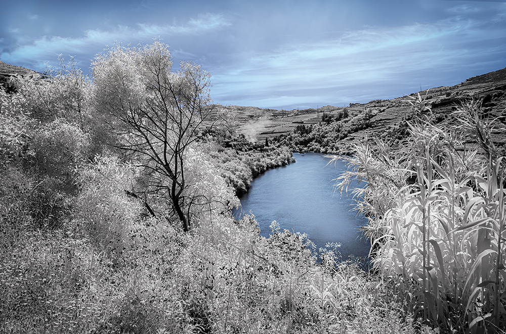
Thank you all for your comments, which as usual are most helpful. It's all about perception. The sky certainly was a bit washed out on the original and I did work on it. But it is obvious that it was not enough. Here is my reworked version. |
Feb 4th |
 |
8 comments - 2 replies for Group 66
|
13 comments - 5 replies Total
|