|
| Group |
Round |
C/R |
Comment |
Date |
Image |
| 65 |
Jan 23 |
Reply |
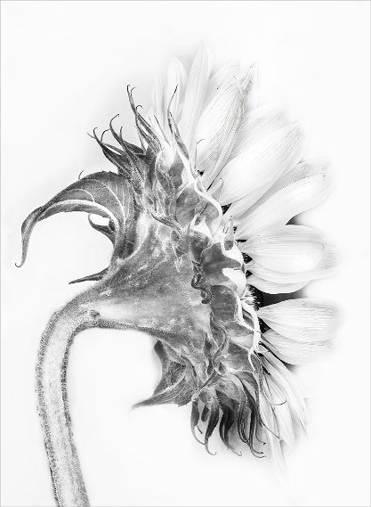
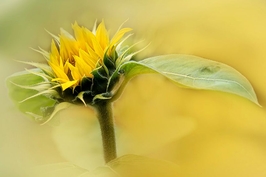
Thanks Al. I must admit that I do like photographing the backs of flowers, just for something different. |
Jan 12th |
| 65 |
Jan 23 |
Reply |
Thank you Fran. Appreciated. |
Jan 12th |
| 65 |
Jan 23 |
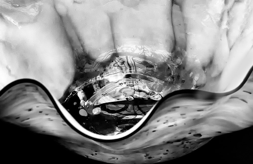
Comment |
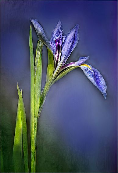
Hi Russel, Great graphic image with wonderful colors on the Iris. Have you tried having some part of the flower touching the glass in order to have something in focus? This must have been a fun project. |
Jan 12th |
| 65 |
Jan 23 |
Comment |
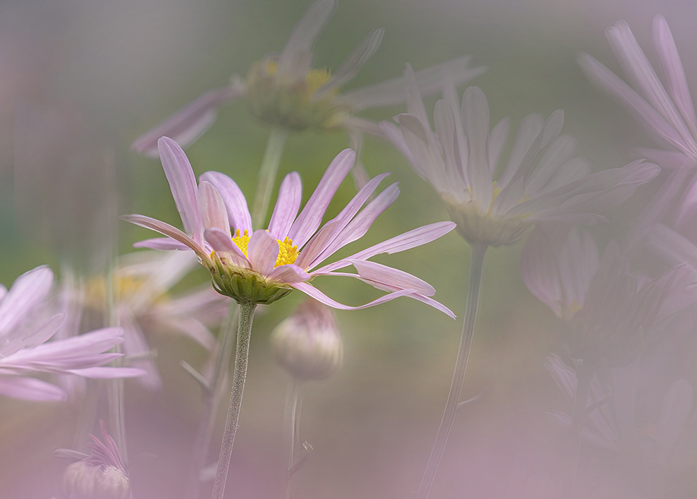
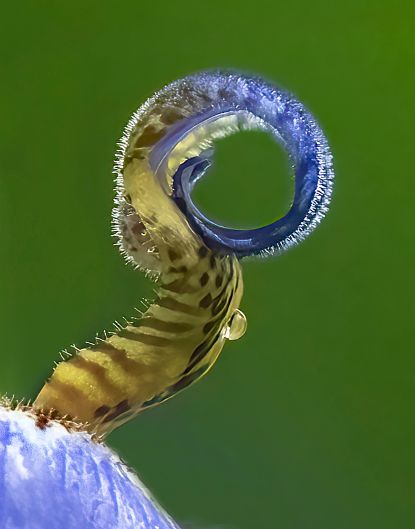
Hi Maria, This was the perfect moment to capture the dandelion. The front edge detail is spot on. I do like how the focus fades away. I agree with removing the white line when you are able. The green background suits the image very well. |
Jan 12th |
| 65 |
Jan 23 |
Comment |
Beautifully presented Fran. I really enjoy how the Iris fades into the subtle background texture you have chosen. The water droplets are such a bonus. Leaving the stem showing was the right way to go. |
Jan 12th |
| 65 |
Jan 23 |
Comment |
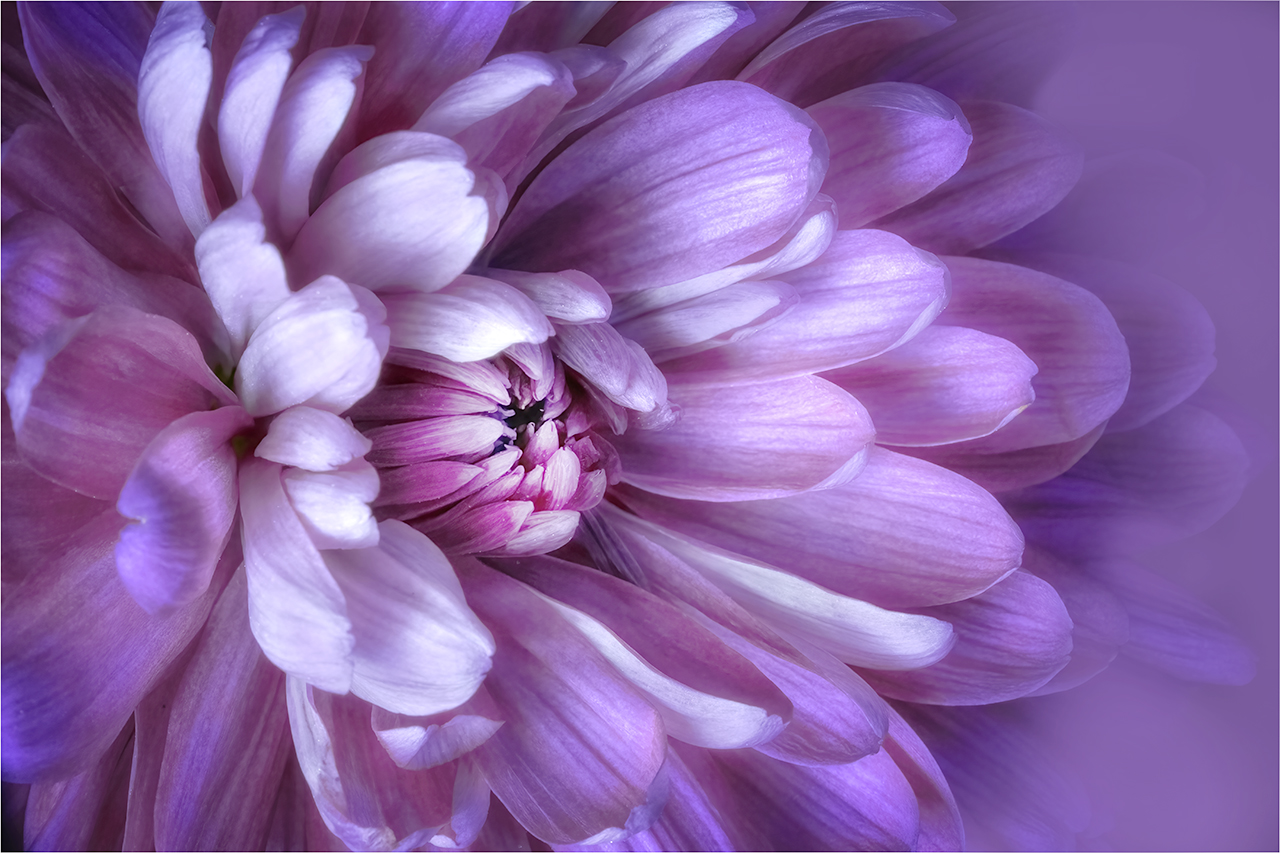
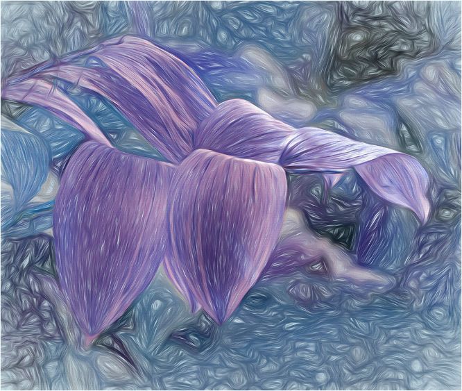
Hi Al, I like how you have cropped this. We focus right into the main flower. I believe that there is more detail to be found in the center. I would use the multiply brush in Photoshop to darken the bright areas and give more detail too. Wonderful colors. |
Jan 12th |
4 comments - 2 replies for Group 65
|
| 66 |
Jan 23 |
Reply |
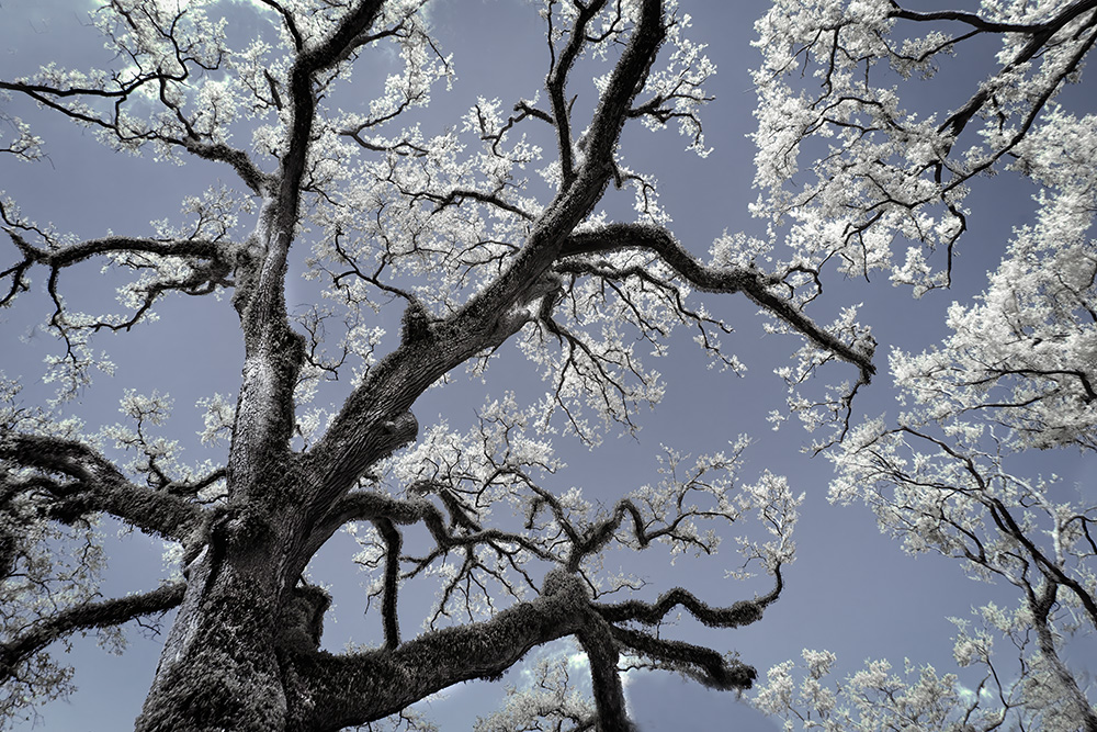
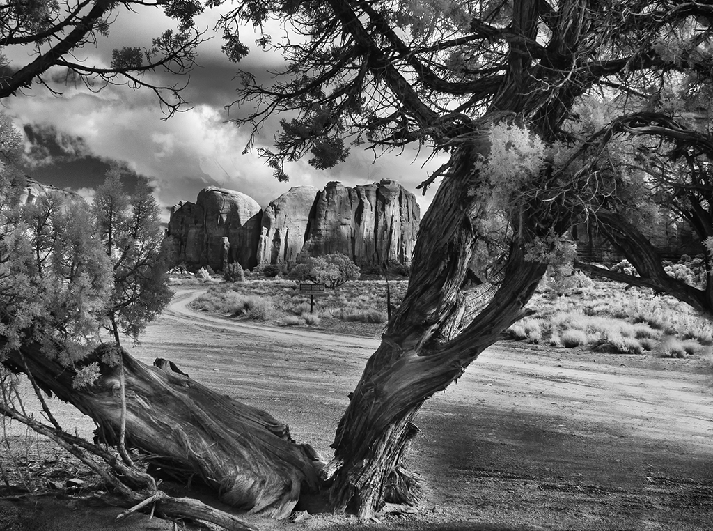
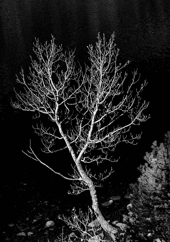
Thanks Emil for taking the time to work my image. I think that darkening the upper left is a good idea. My eye says not quite as much as you have chosen. I wonder what you think of my reworked image which now concentrates on just the tree? As artists we CAN change the world as it is seen! |
Jan 12th |
| 66 |
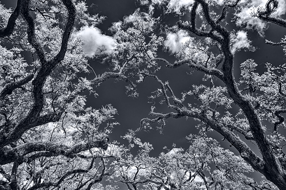
Jan 23 |
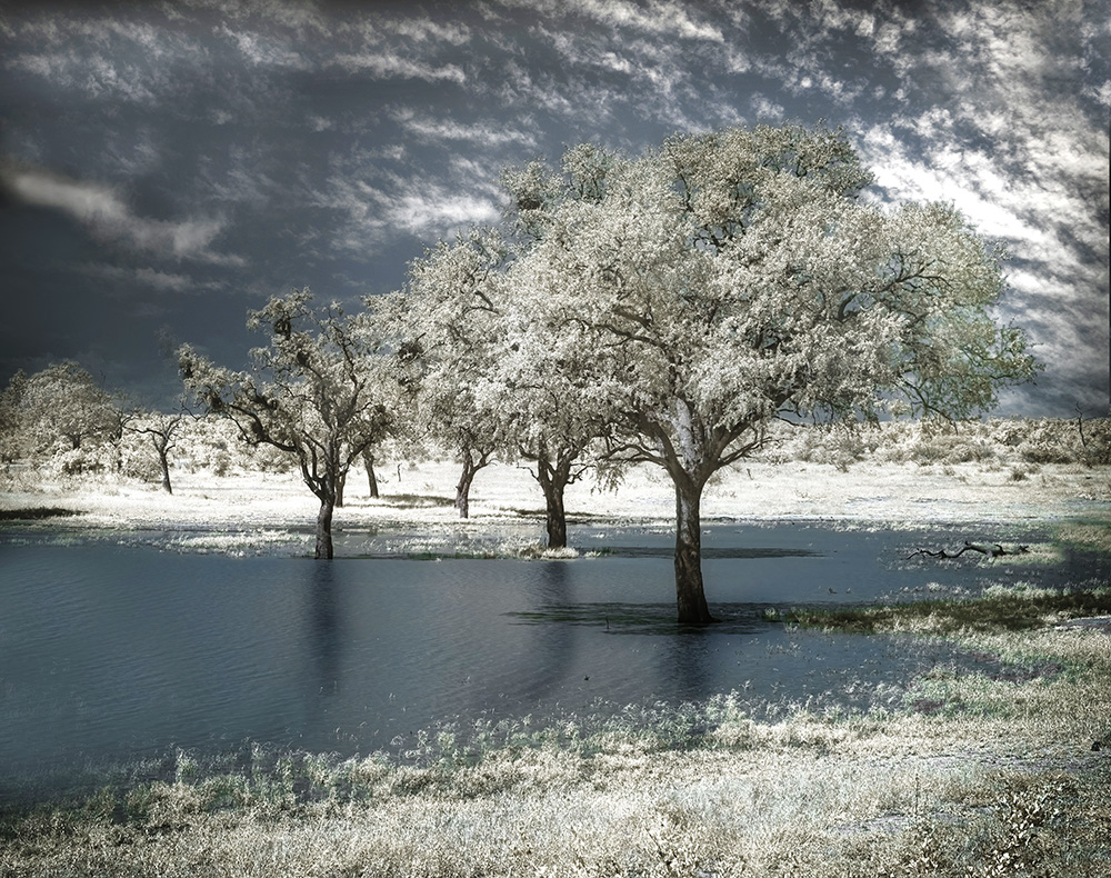
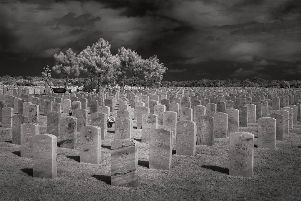
Comment |
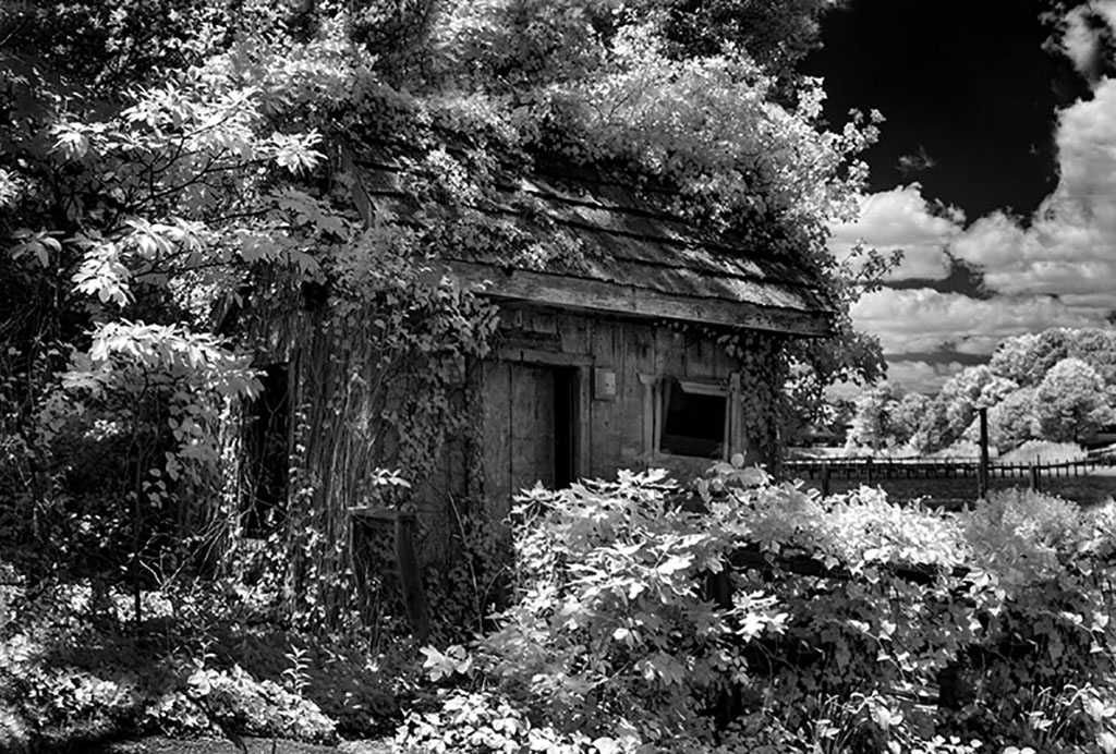
Hi Henry, Car graveyards are just so much fun. Have you been to Car City in White, Georgia? I'm fascinated by the isolation of the camper. It looks like it was discarded at the edge of a hillside instead of art of a collection. The grunge is well shown and as you say, the clouds are such a bonus. Beautifully processed. Try using tonal contrast in Nik You may like it better than DE. |
Jan 9th |
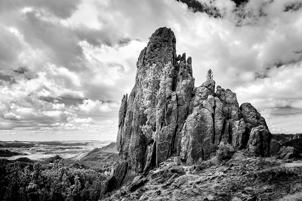
| 66 |
Jan 23 |
Comment |
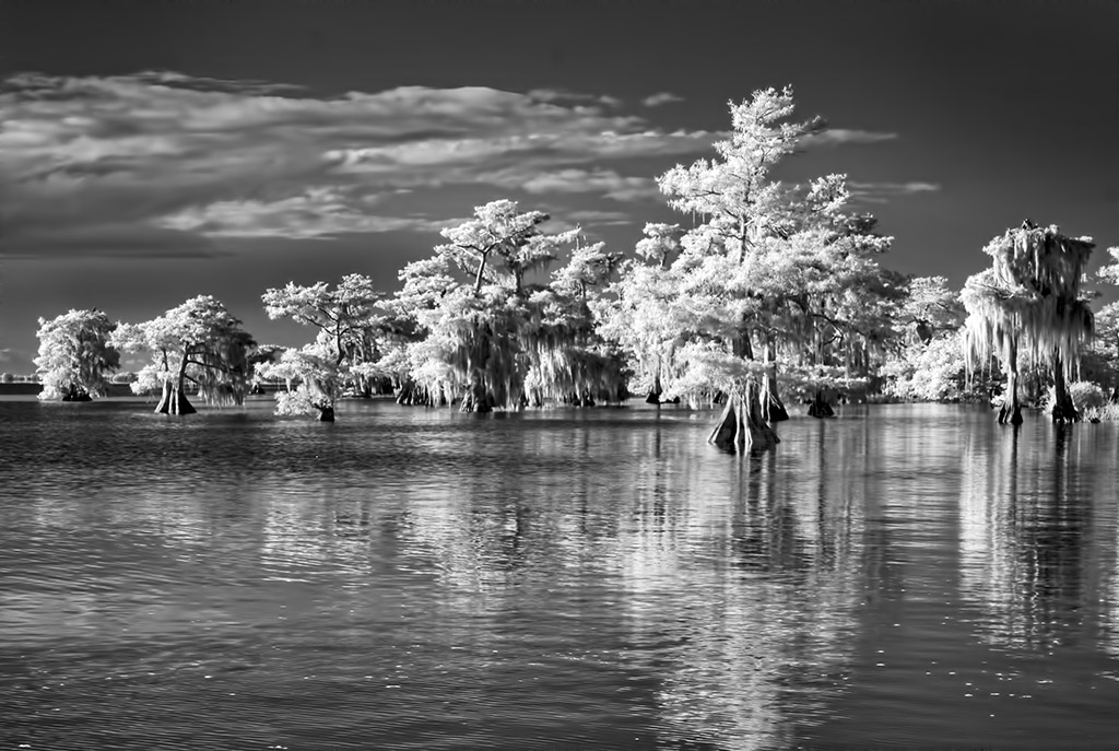
Hi Emil, It is so interesting that so many of us visited the Badlands last year. I did not make the best of it in IR, not picking the camera often enough. This shows off the layers and grasses just so well. It tells us exactly how the Badlands look. BTW I usually prefer the results of tonal contrast over detail extractor in Nik. |
Jan 9th |
| 66 |
Jan 23 |
Comment |
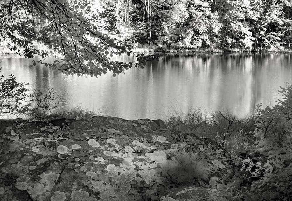
Palli, I love intimate landscapes and this is beautifully presented. Both of your images work. There are so many possibilities within the scene and each one presented by others certainly has merit. Well seen and well done. |
Jan 9th |
| 66 |
Jan 23 |
Comment |
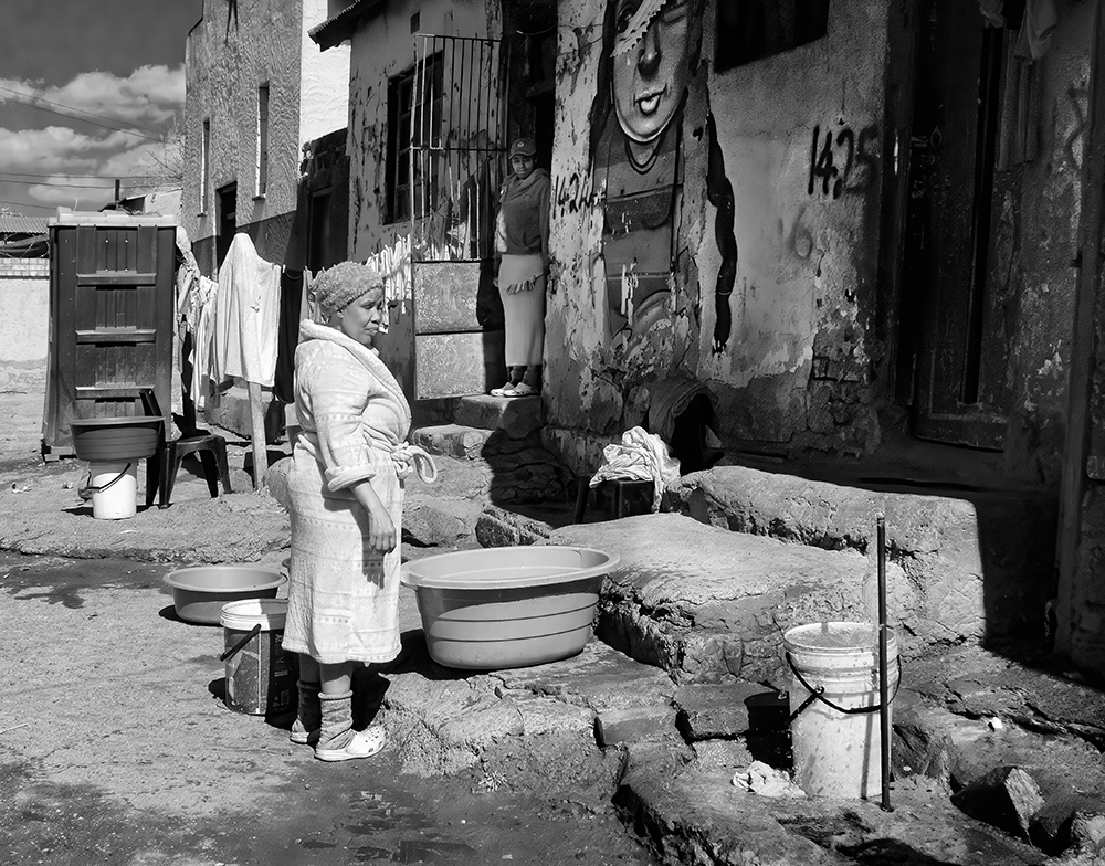
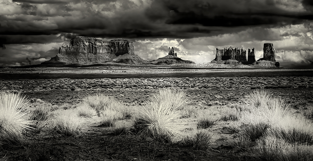
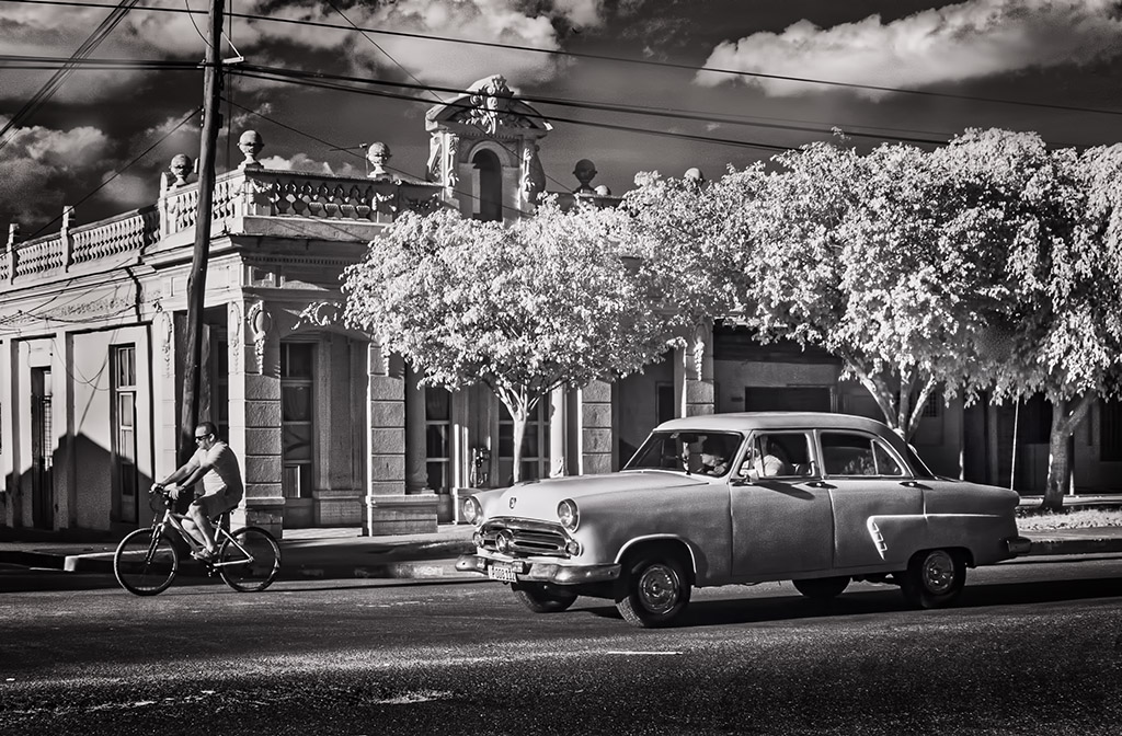
Hi Gary Great to out and photographing I hope it was not too cold. For me everything is working in this very busy scene. The heavy toning does work. I would lighten the front edge of the building on the left just a smidge. I think that the frame overwhelms and distracts from the image. |
Jan 9th |
| 66 |
Jan 23 |
Comment |
Hi Chuck, The reflection is stunning and makes the scene. I do agree the the blues are too strong and would like to see them a little de-saturated. I do believe that you can solve the leaf edge problem by converting to black and white. Great detail from the dark foliage. |
Jan 9th |
| 66 |
Jan 23 |
Comment |
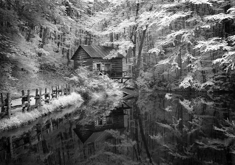
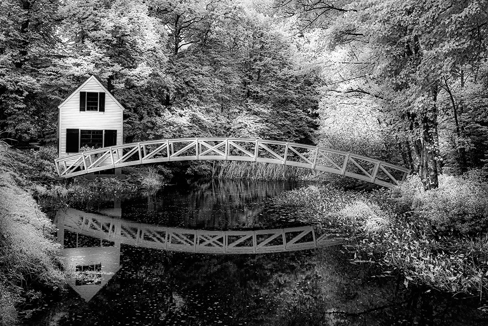
Jack, A gorgeous scene and perfect for IR. The leaf design is very pleasing. Yes to removing the upper left. I would also crop about an inch off the bottom to to get rid of the haze there. Really like the major contrast which is so unusual for you. |
Jan 9th |
| 66 |
Jan 23 |
Comment |
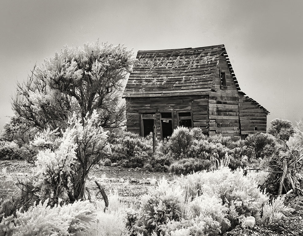
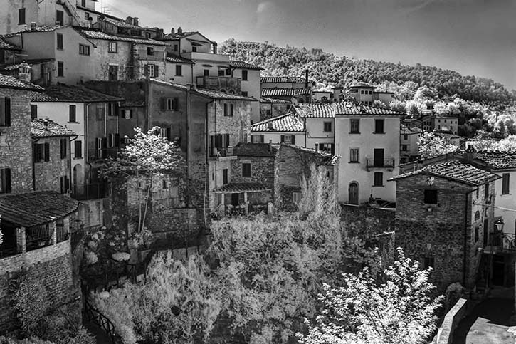
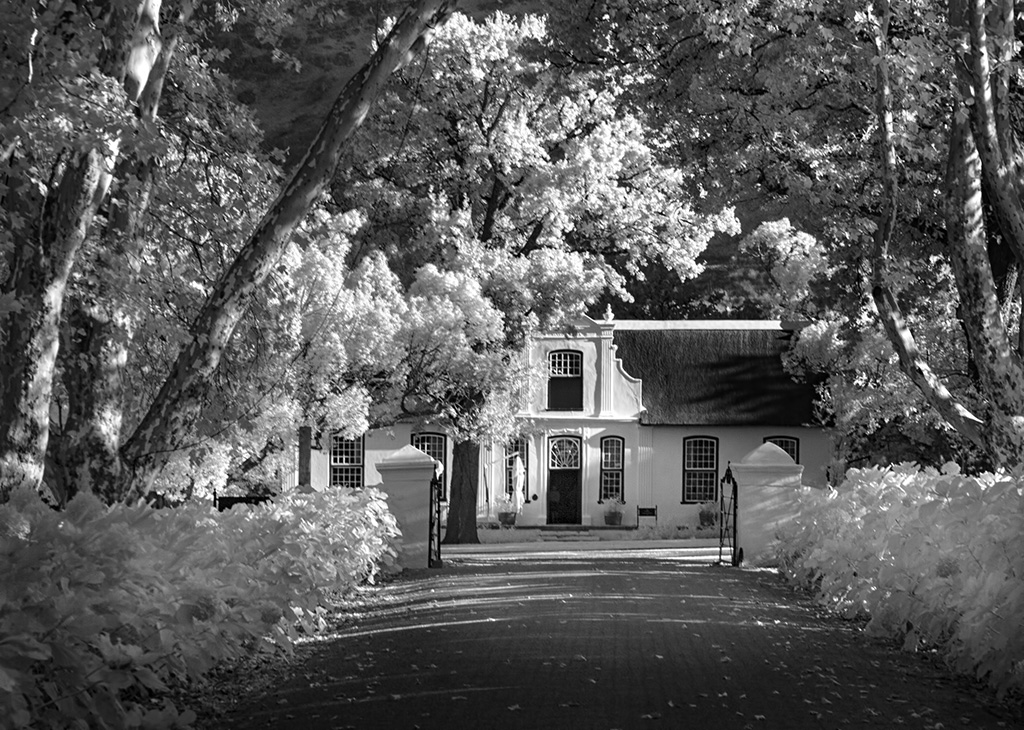
Hi Arik This is lovely. What a beautiful old house and so well photographed. While I do like the tones you you so ably achieve, my eye keeps going to the original, and I find those so delicate and appealing. |
Jan 9th |
| 66 |
Jan 23 |
Comment |
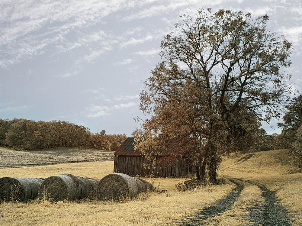
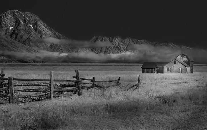
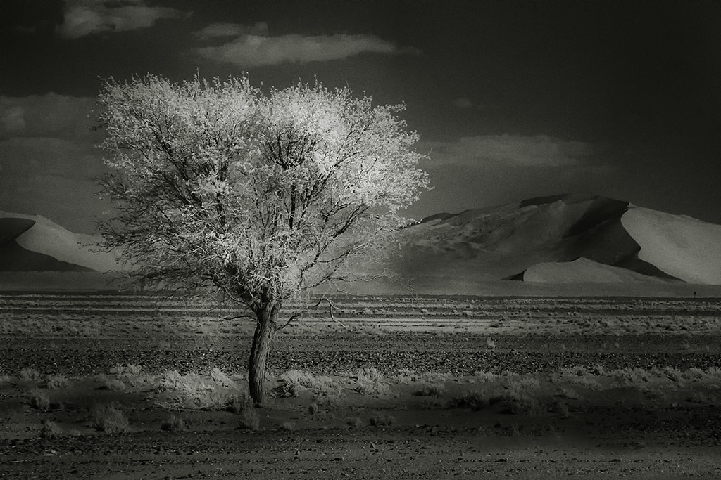
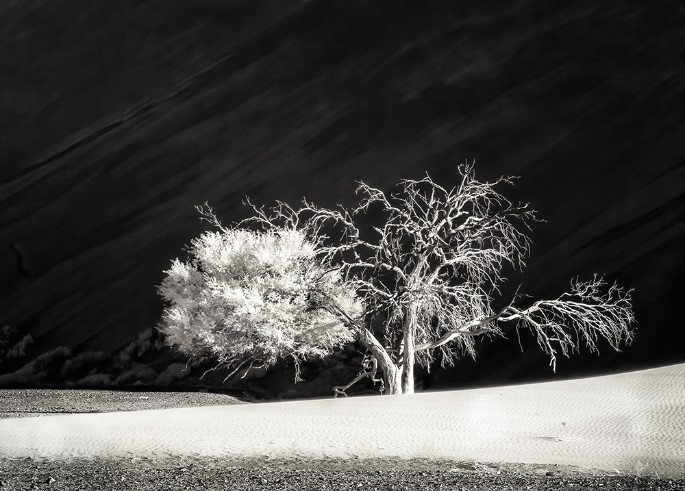
Thank you everyone for your kind and always helpful comments I did feel that showing the edge of the sand dune was important here. I agree that maybe it should be cropped a little. Also, it may just be too bright. I did fill it in and think that it looses character and becomes just a tree against a dark background. I wonder if you have any further thoughts.
|
Jan 9th |
 |
8 comments - 1 reply for Group 66
|
12 comments - 3 replies Total
|