|
| Group |
Round |
C/R |
Comment |
Date |
Image |
| 35 |
Dec 22 |
Reply |
You should post it. I'm sure we would all like to see it. |
Dec 20th |
| 35 |
Dec 22 |
Comment |
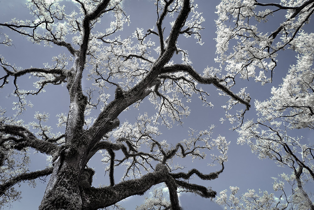
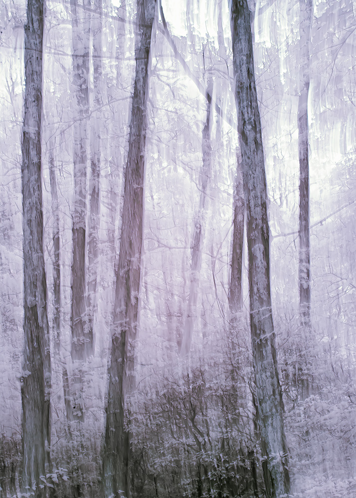
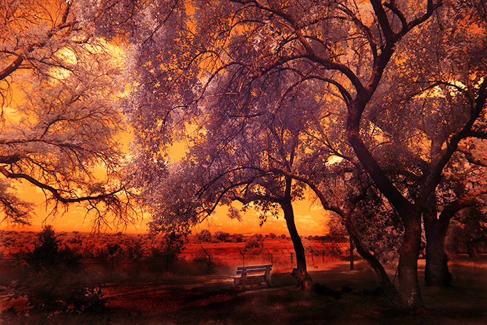
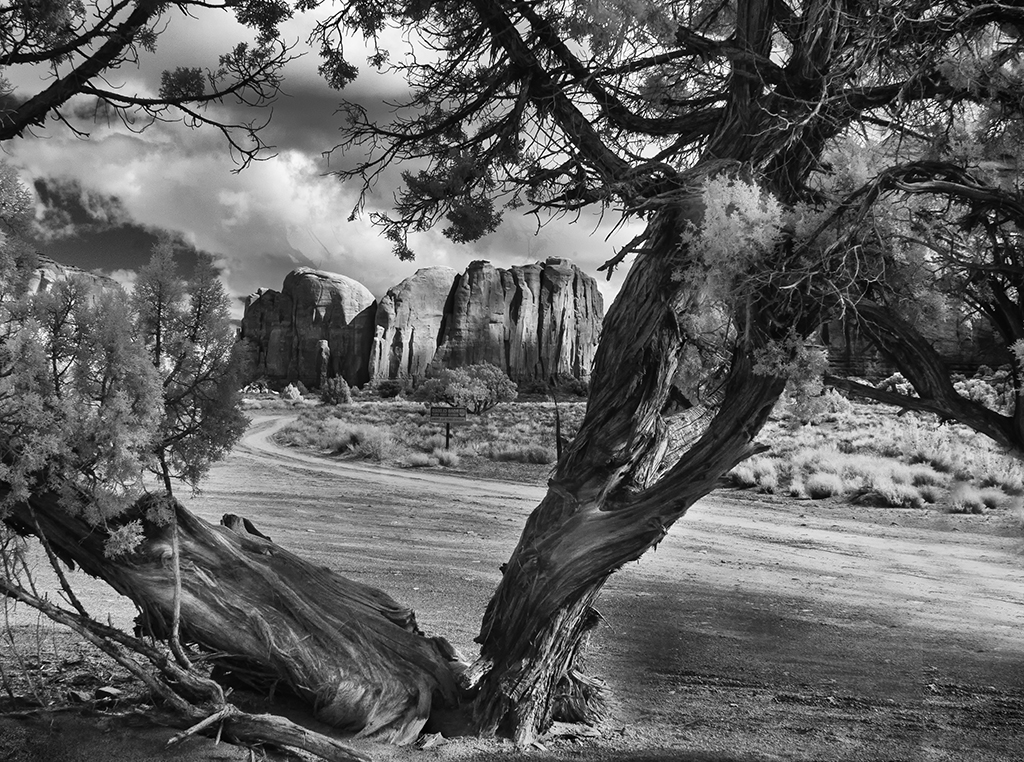
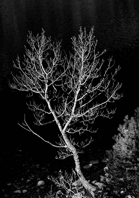
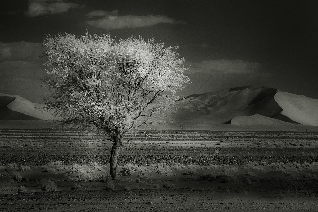
Hi Debbie, This is lovely. I really enjoy the naked branch showing against the sky. Color IR is always difficult to get the right balance. I would tone down the sky, especially the yellows. |
Dec 20th |
1 comment - 1 reply for Group 35
|
| 65 |
Dec 22 |
Comment |
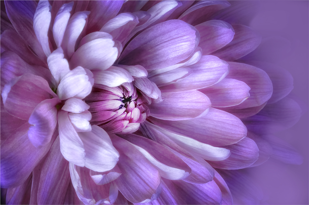
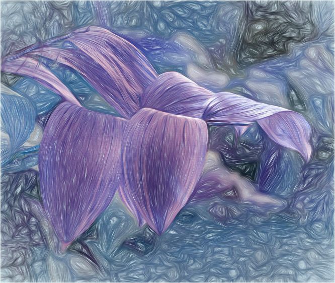
Hi Diana
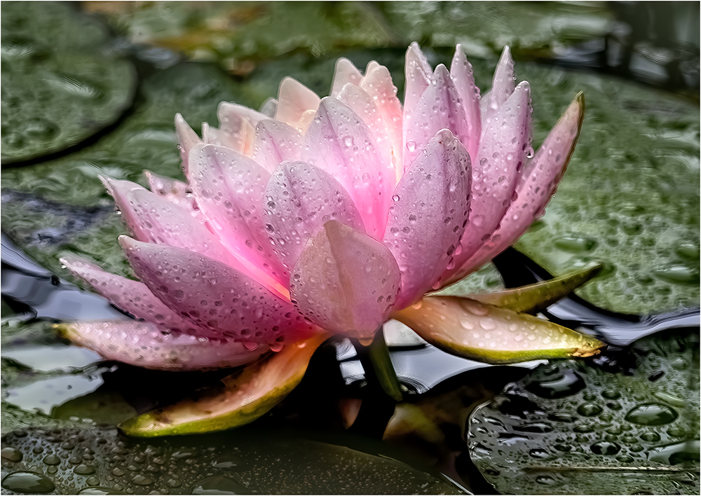
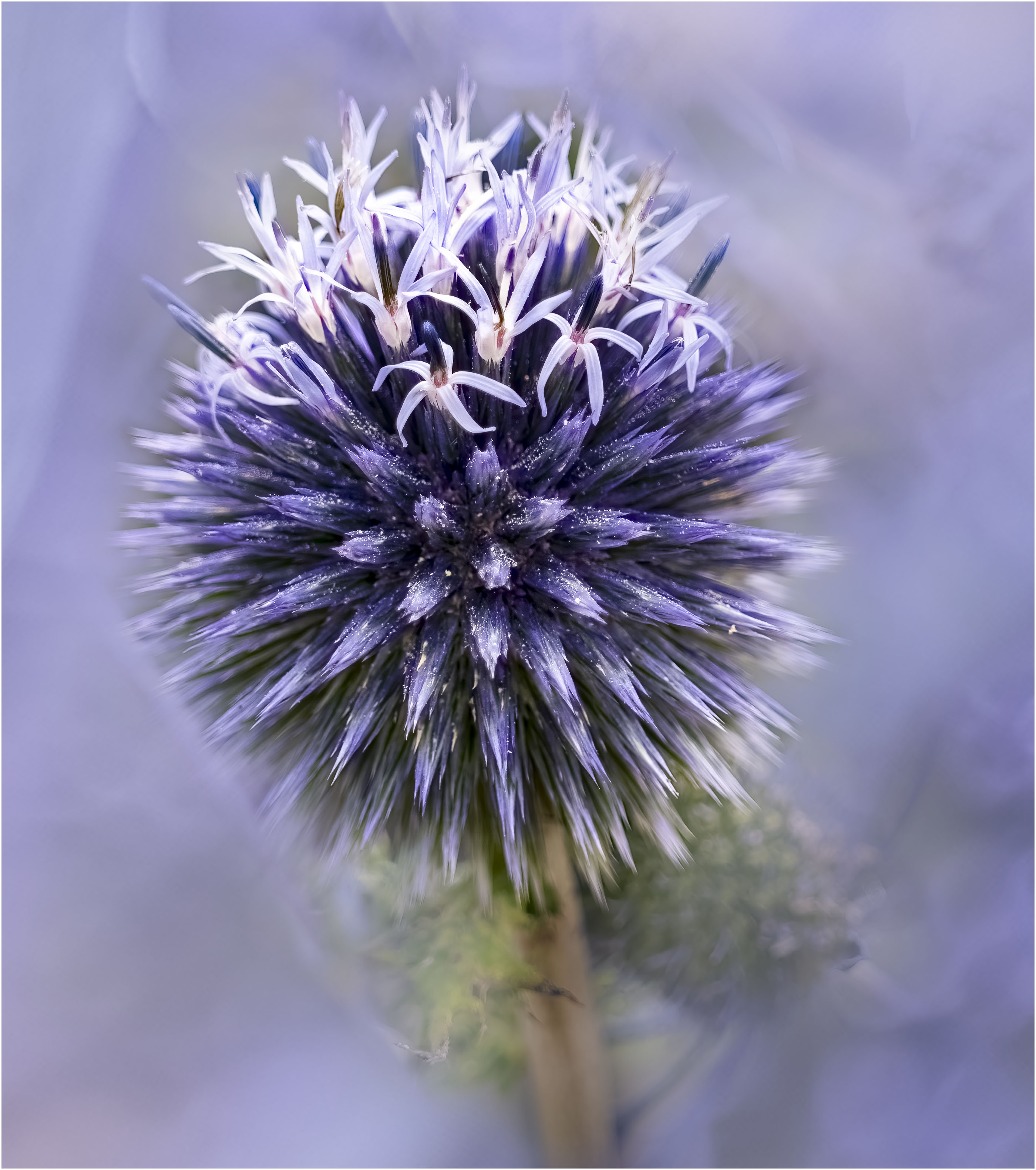
You are doing so well with the velvet lens. I think I would like this even more if it were cropped to concentrate on the central area. You have not shown the original, so I cannot tell what your texture has done. It gives the appearance of the flower floating in the frame as the stem is not obvious. The colors are great for this time of year. |
Dec 20th |
| 65 |
Dec 22 |
Comment |
Hi Russel, I'm pretty sure that you wanted to stems to act as a frame to your Morning Glory. My feeling is that they are just too heavy for the delicate flower. My suggestion is to remove the right hand stems and crop to where the horizontal one will touch the edge. |
Dec 7th |
| 65 |
Dec 22 |
Comment |
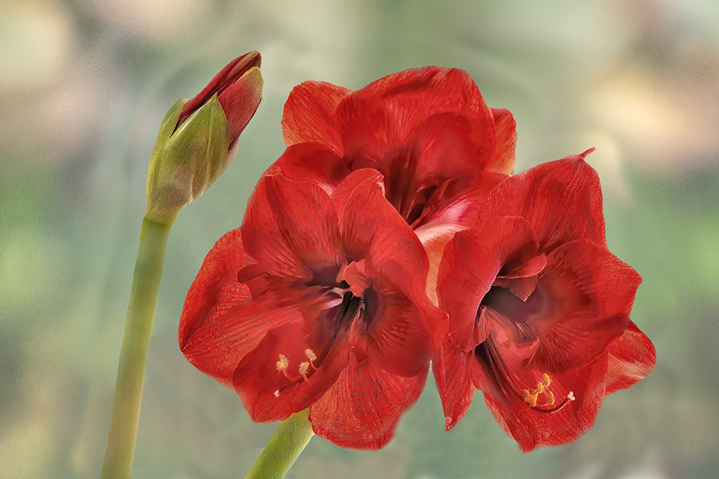
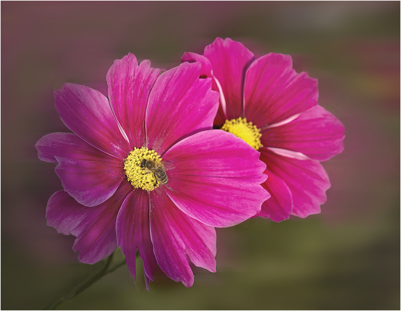
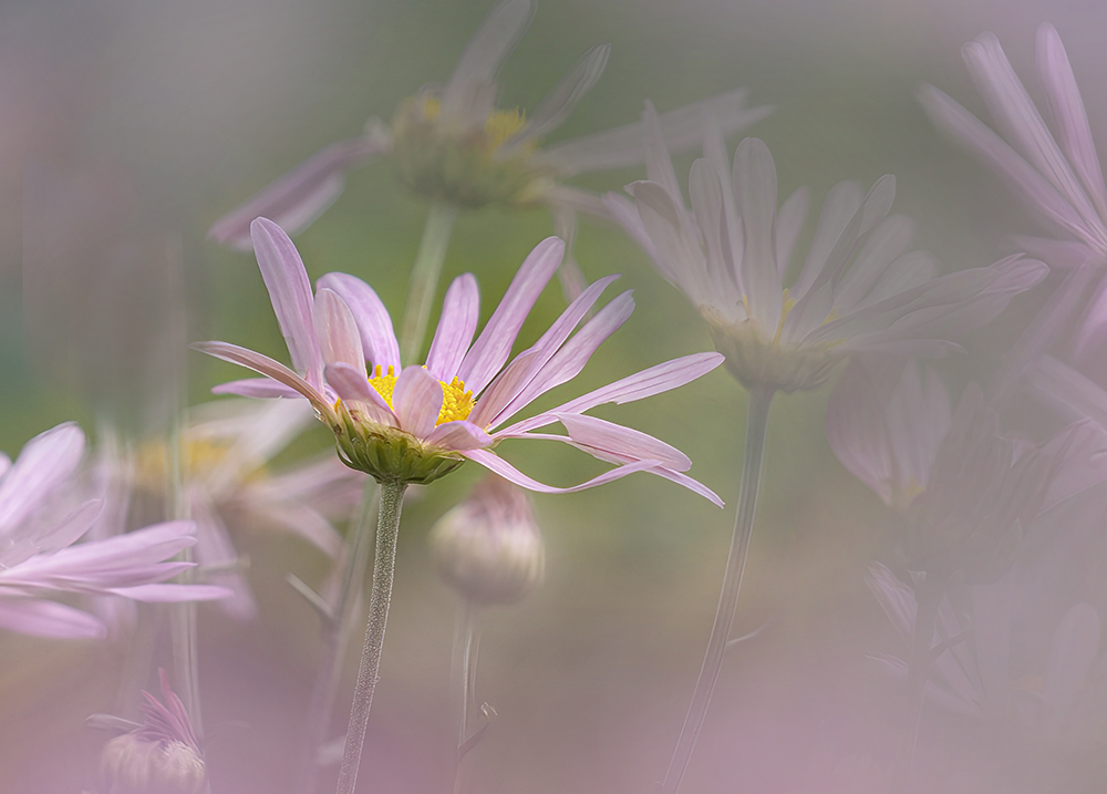
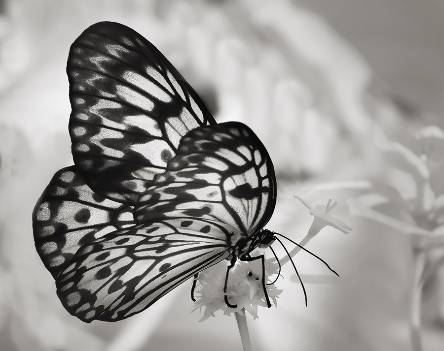
Hi Maria, Poppies make wonderful subjects for our passion. The composition is well thought out. I do wish that the center of the flower was more sharp. Even so, the soft effect is very pleasing, and the enhancement of the reds really work. |
Dec 7th |
| 65 |
Dec 22 |
Comment |
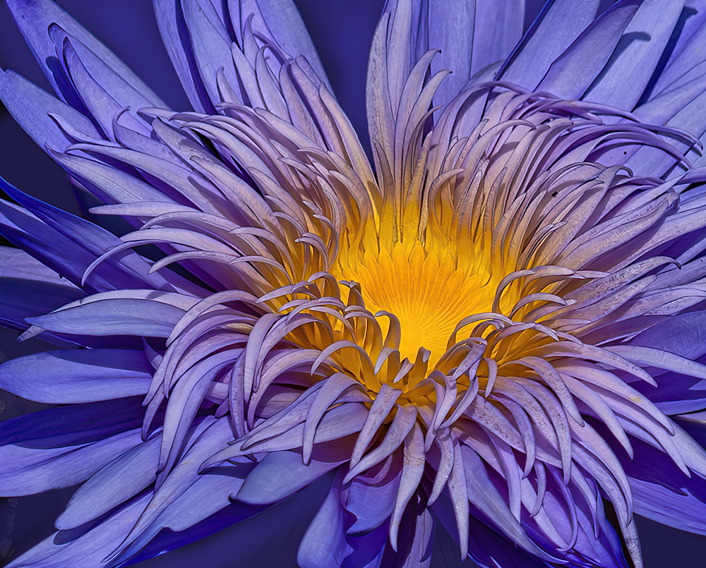
Heavenly is a perfect title. This is stunning! Both the crop and post processing are all working so well. Great job.
|
Dec 7th |
| 65 |
Dec 22 |
Comment |
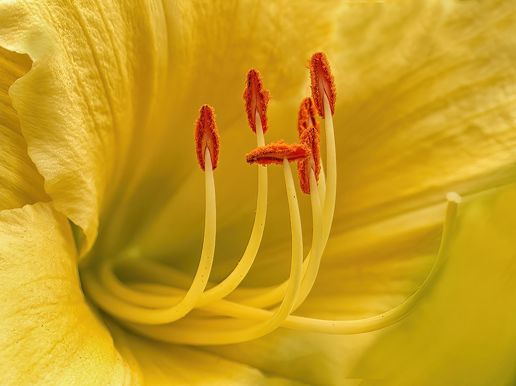
Hi Al, This is a lovely presentation. I like that you have made it all about the pink tulips. I do find it a little too saturated and prefer the more delicate colors in the original. |
Dec 7th |
| 65 |
Dec 22 |
Reply |
Marti, Thank you so much for visiting our group and thank you for the positive comments |
Dec 7th |
5 comments - 1 reply for Group 65
|
| 66 |
Dec 22 |
Reply |
I would like to see the Distressed FX added to something like what Emil shows, as the windmills are more prominent. What do you think Gary? |
Dec 11th |
| 66 |
Dec 22 |
Reply |
Wow Emil!
You certainly saw something that I did not. Your edit is lovely. |
Dec 11th |
| 66 |
Dec 22 |
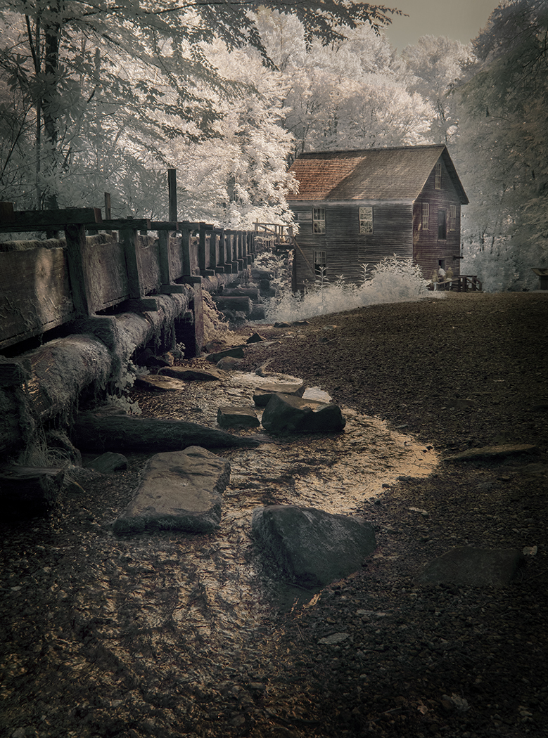
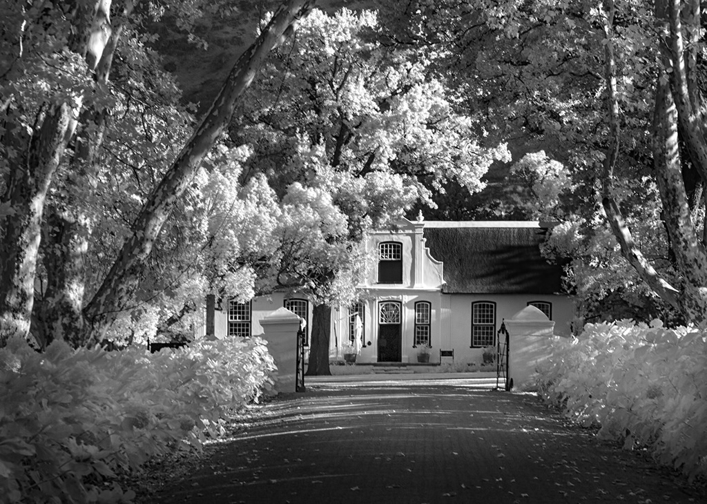
Comment |
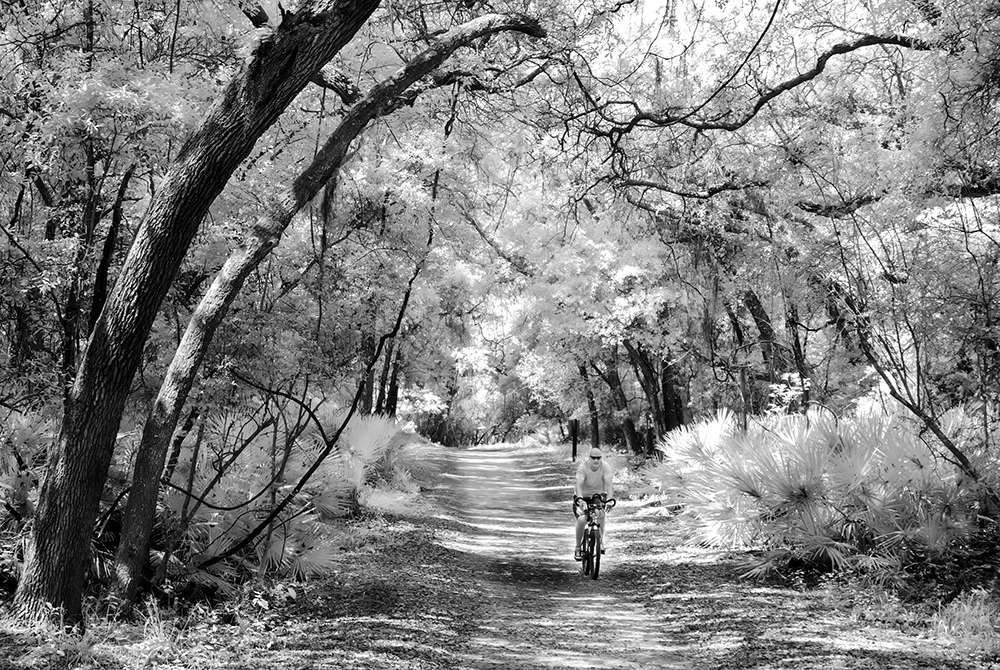
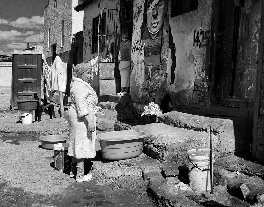
Hi Henry, There is a surprise here for the viewer. It's a vintage processing of a modern scene, so you are making us look very carefully at the presentation. The leaning palms give some tension too. I do not have a problem with what you have included, it tells a story. |
Dec 4th |
| 66 |
Dec 22 |
Comment |
Beautiful scene. Lovely framing. So very well processed. I which it was mine! |
Dec 4th |
| 66 |
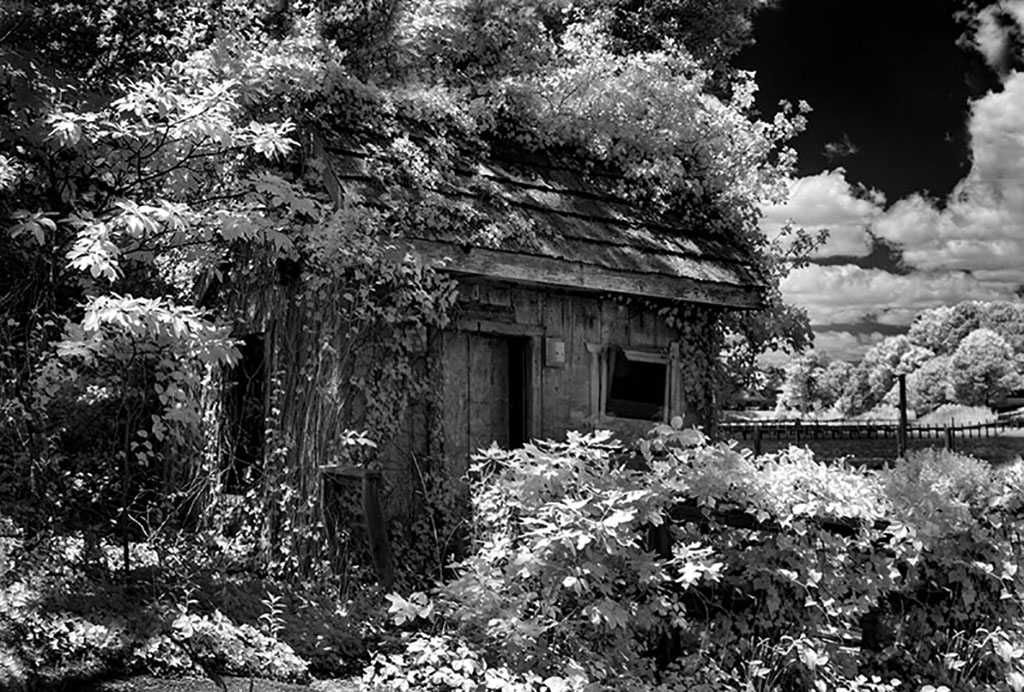
Dec 22 |
Comment |
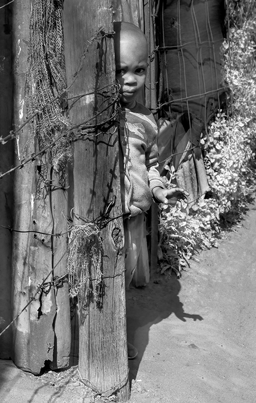
Hi Palli, I think that using the Antique Plate preset certainly can give a lovely vintage look. I'm not sure that it works here. My view is that you would have been better off by toning it and the using a white vignette to fade out the edges. All this being said, I do like your stump perspective. |
Dec 4th |
| 66 |
Dec 22 |
Comment |
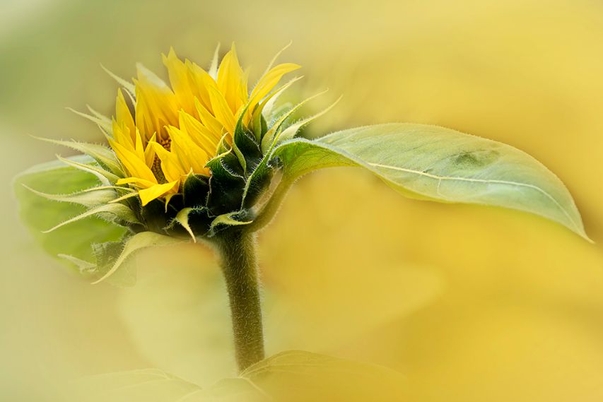
HI Gary, I'm fan of changing images from the original to make a fine art or just an interesting new image. I have not tried Distressed FX. I really like the diminishing turbines.
But.. I think that this was not the best result as the turbines get lost and the birds become the subject. I'm sure you will come up with the perfect image with your amazing imagination. |
Dec 4th |
| 66 |
Dec 22 |
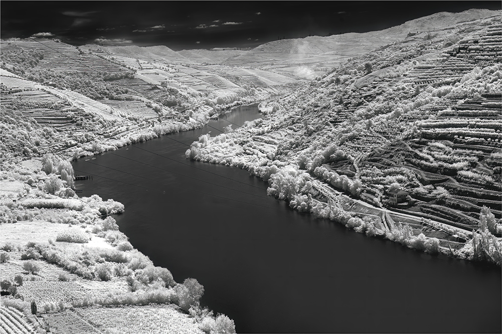
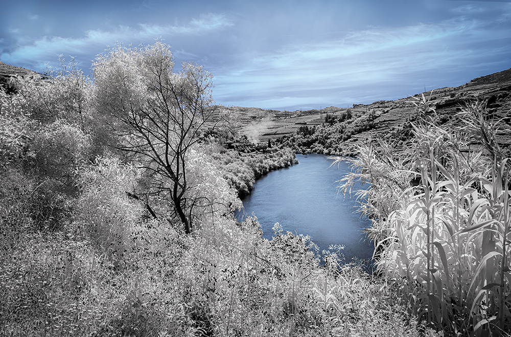
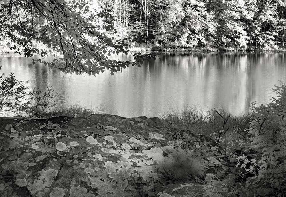
Comment |
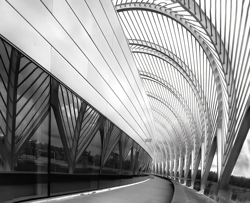
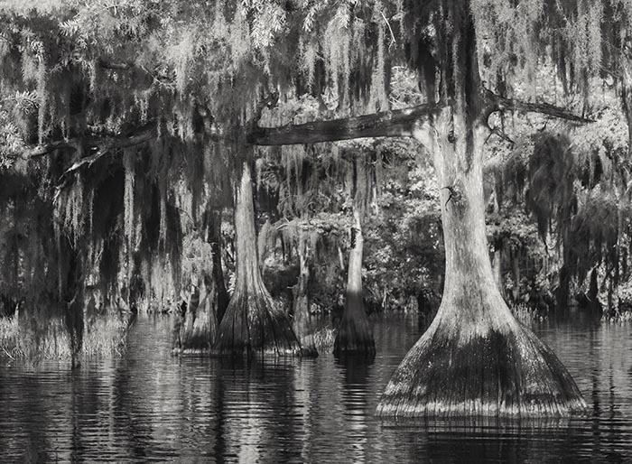
Hi Chuck, The curves are great! My eye travels easily through the reverse S curve to take in the whole picture. Your processing is so very well done. The canoes are certainly an added bonus. |
Dec 4th |
| 66 |
Dec 22 |
Comment |
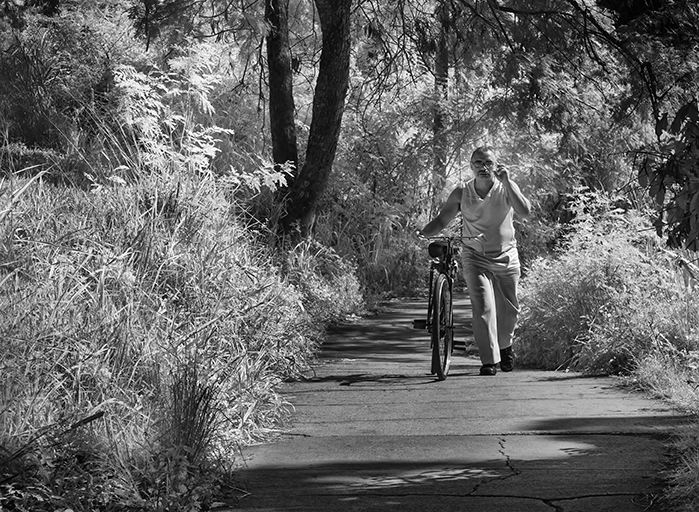
Jack, You always find a wonderful angel, which shows off your images so well. I think the delicate processing here is right and interprets the subject beautifully. |
Dec 4th |
| 66 |
Dec 22 |
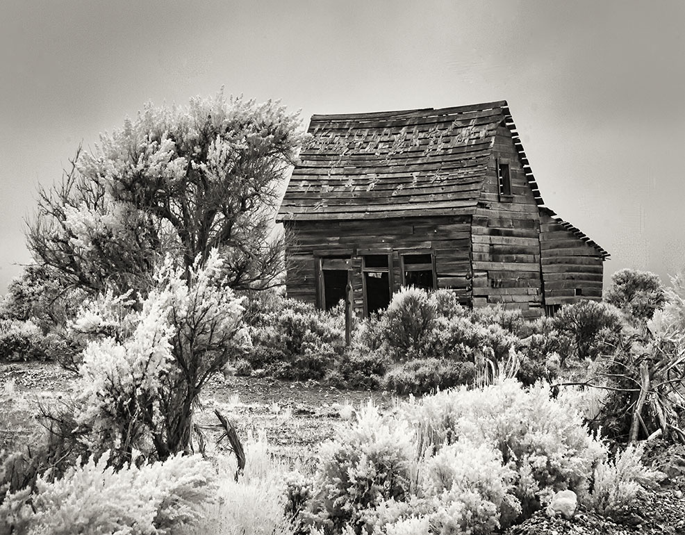
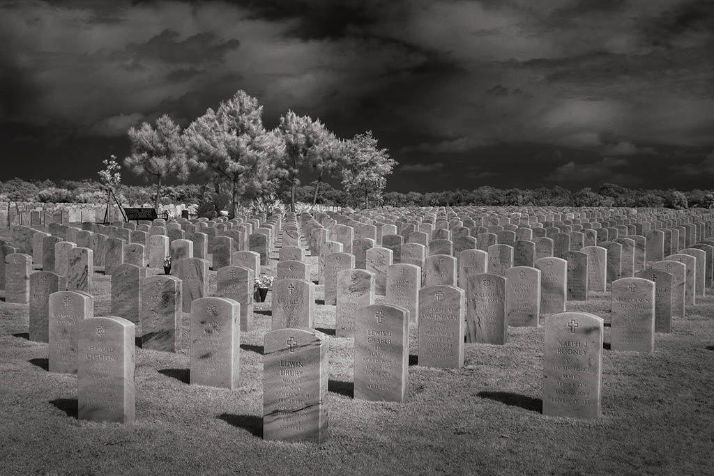
Comment |
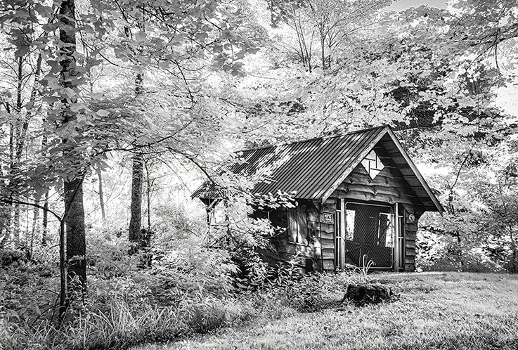
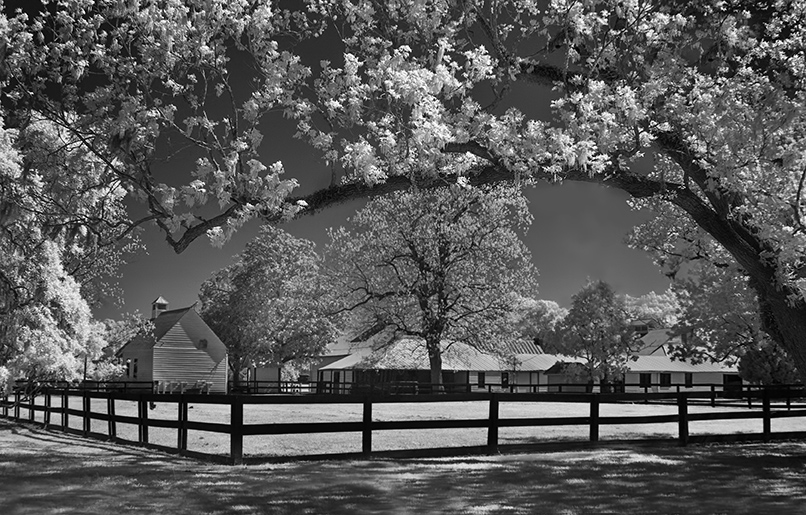
Hi Arik, Firstly the toning you have chosen is lovely. With everything you have included, it's a true Americana scene. This was a great find. |
Dec 4th |
| 66 |
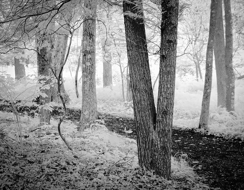
Dec 22 |
Comment |
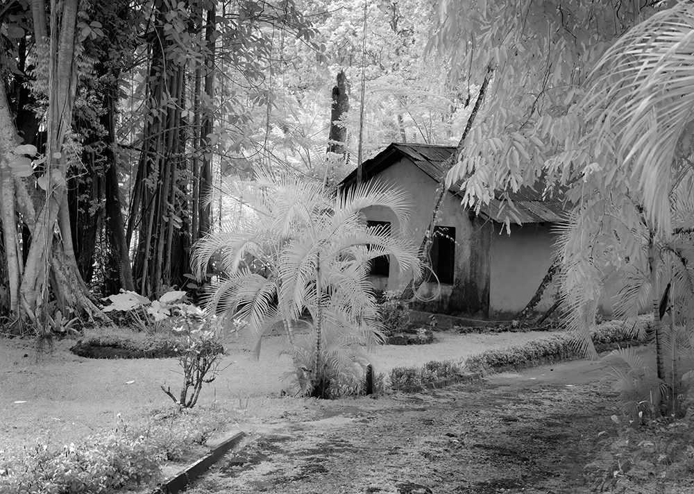
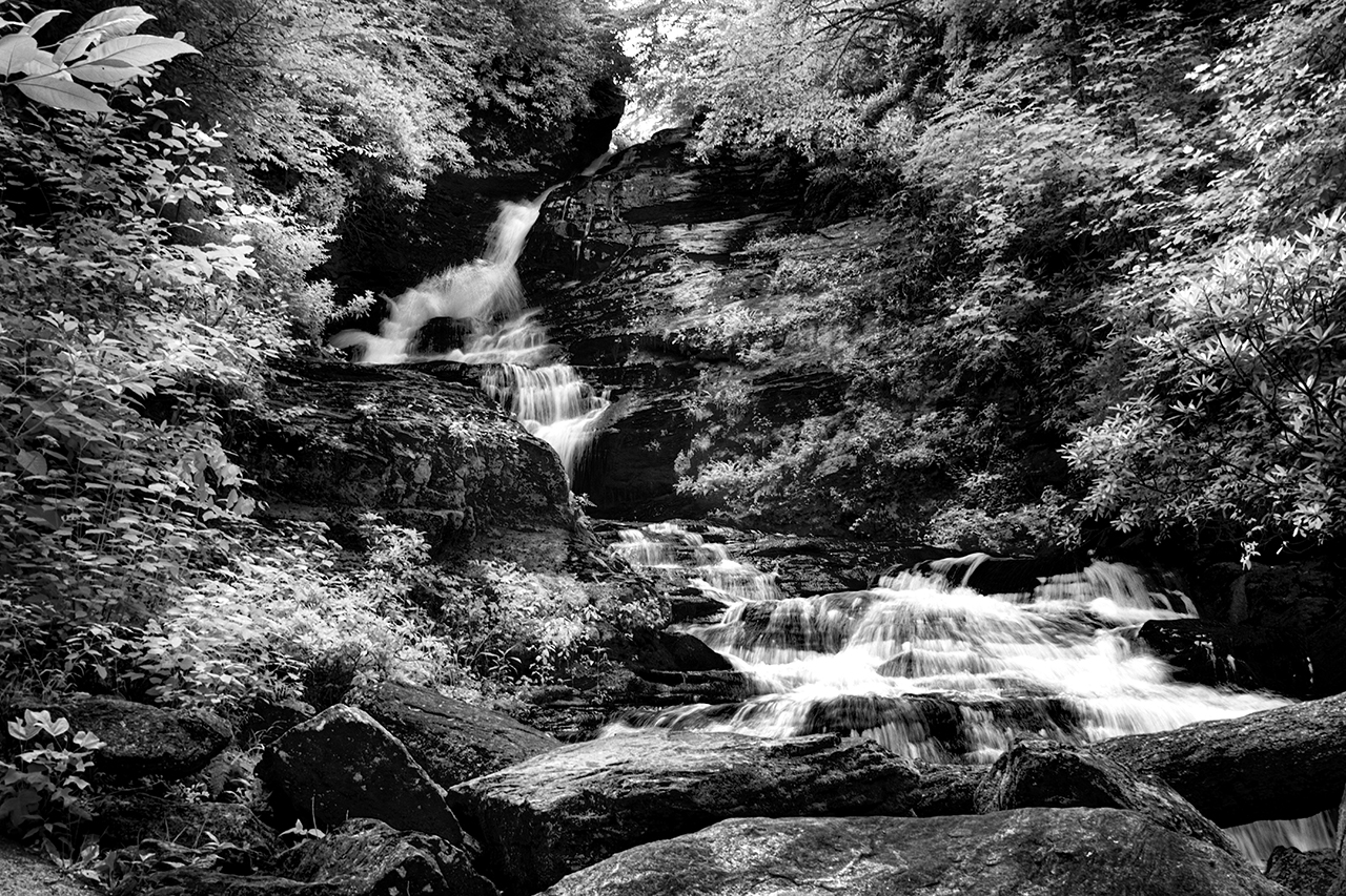
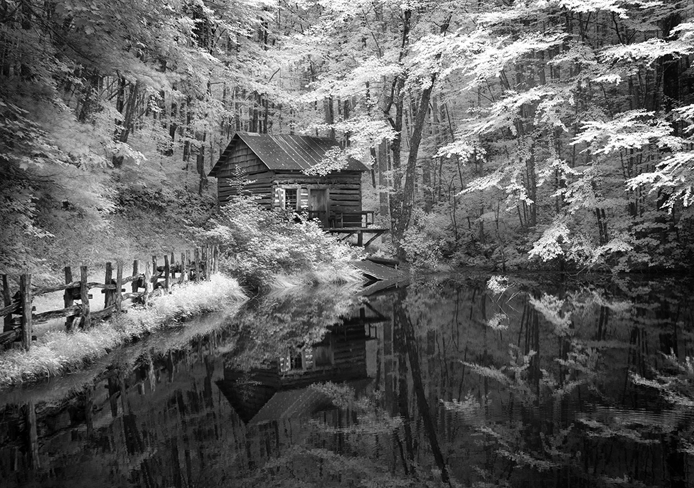
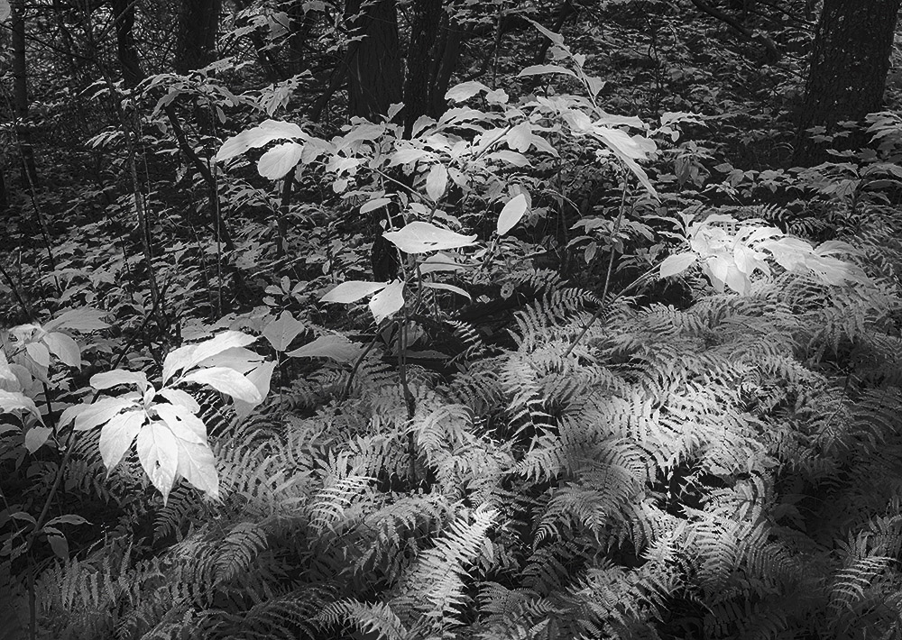
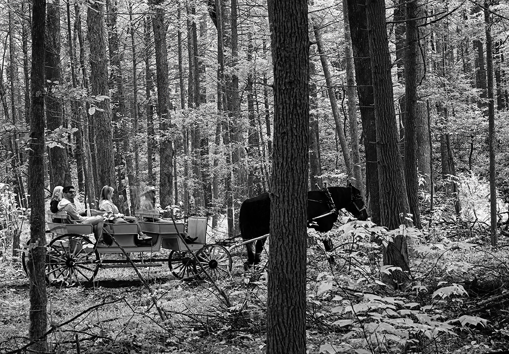
No Jack, this was taken in a forest in North Carolina. I did try to get similar ones in CR but they were not successful. Thanks for the kind comments. |
Dec 4th |
| 66 |
Dec 22 |
Reply |
Thanks Arik. Maybe it would have been nice to compare! |
Dec 4th |
| 66 |
Dec 22 |
Reply |
Thanks Palli. I agree |
Dec 4th |
| 66 |
Dec 22 |
Reply |
Yes I agree. Gary has given it pop. |
Dec 4th |
| 66 |
Dec 22 |
Reply |
Thanks Gary, As usual you find just what is need to refine an image. |
Dec 1st |
8 comments - 6 replies for Group 66
|
14 comments - 8 replies Total
|