|
| Group |
Round |
C/R |
Comment |
Date |
Image |
| 65 |
Nov 22 |
Reply |
Thanks Fran, Green to the edge is correct. |
Nov 13th |
| 65 |
Nov 22 |
Reply |
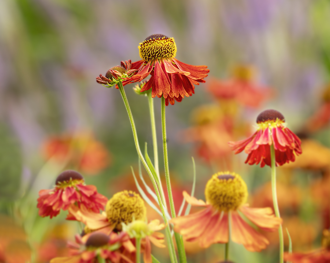
Quite right. I will extend the green to the edge. |
Nov 13th |
| 65 |
Nov 22 |
Reply |
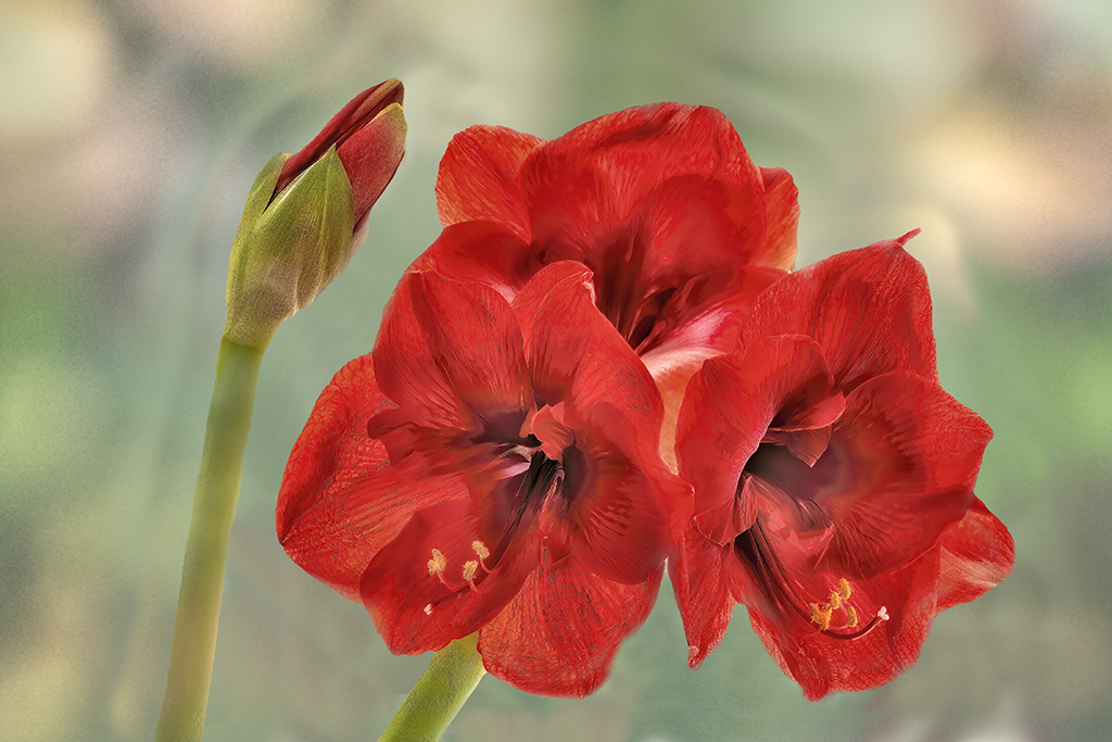
Thanks Maria, I do agree that I should add a little canvas on the right. I'm not sure about the flip. When I did it, seemed too heavy. Really appreciate the suggestion. |
Nov 13th |
| 65 |
Nov 22 |
Comment |
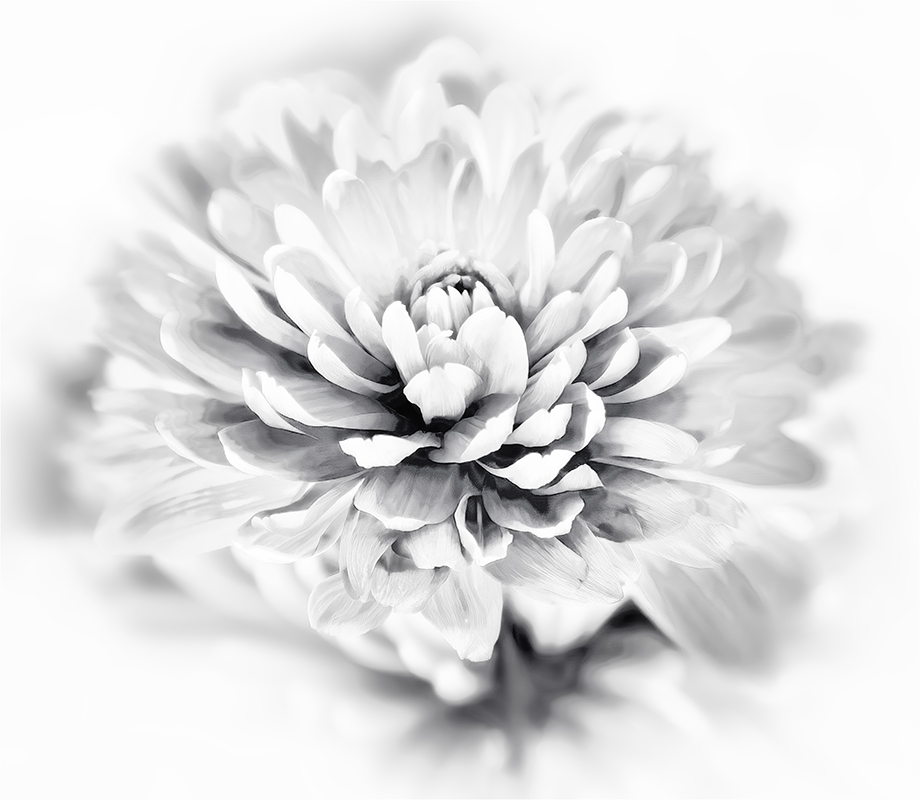
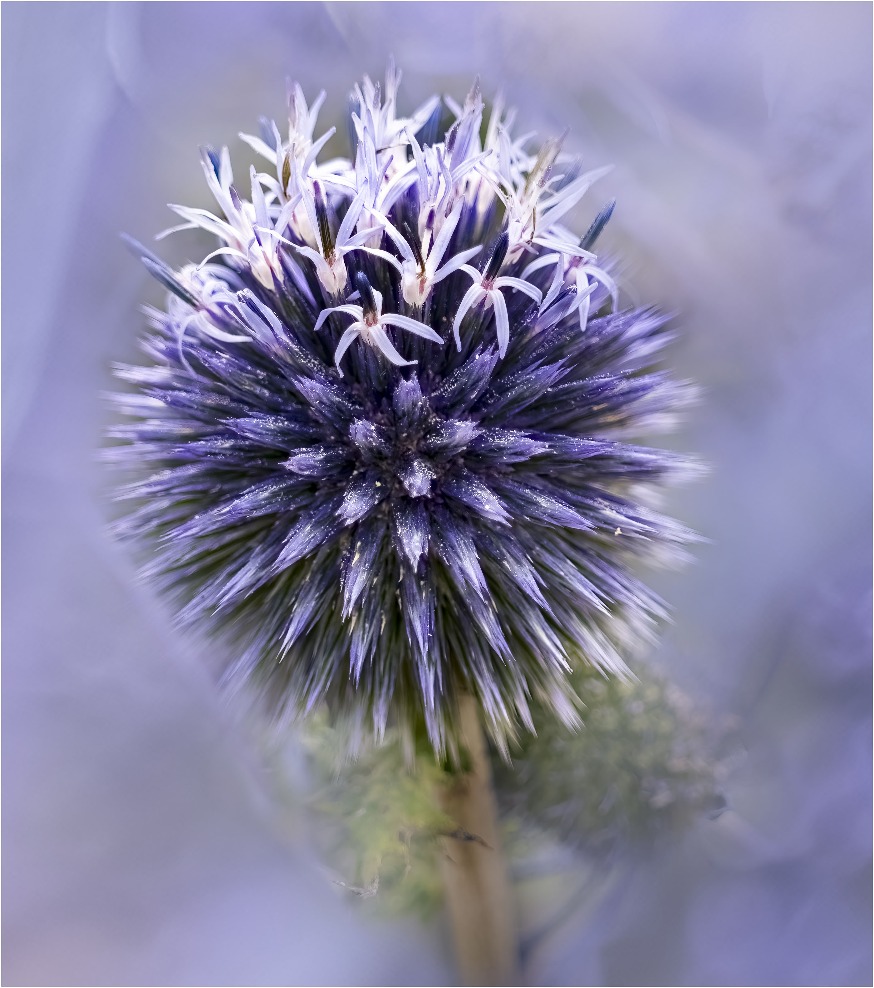
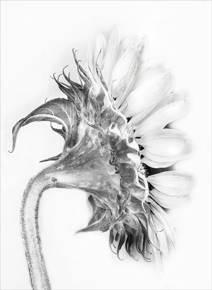
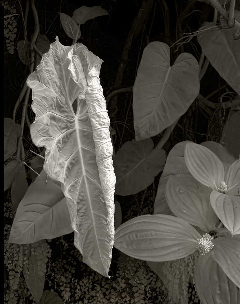
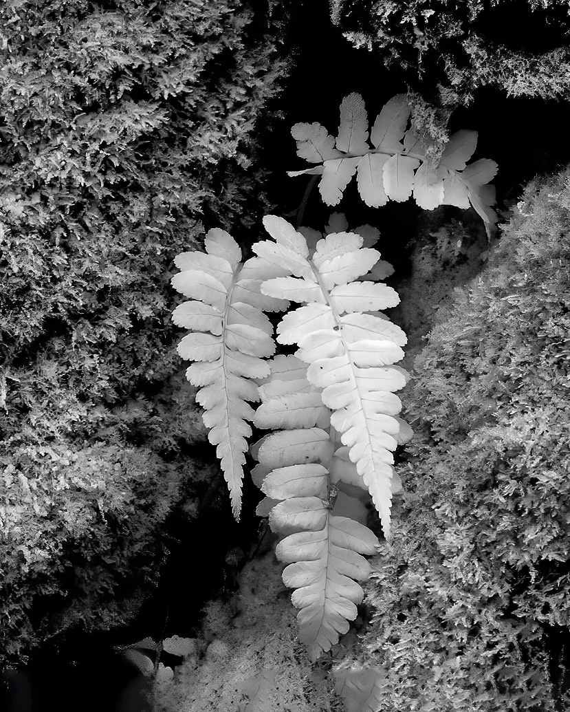
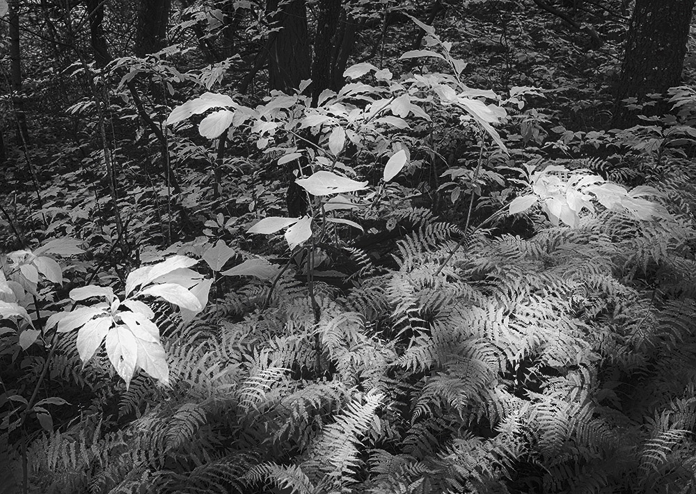
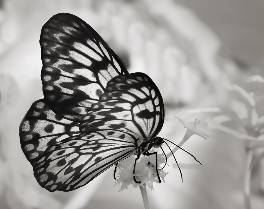
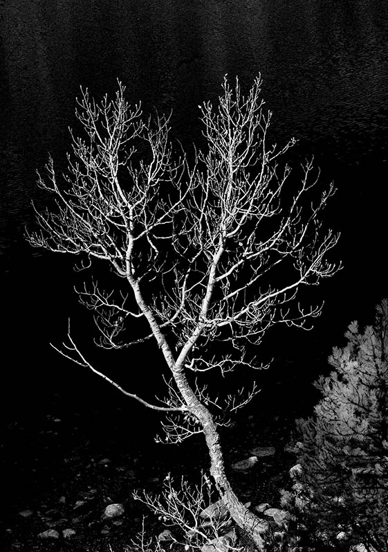
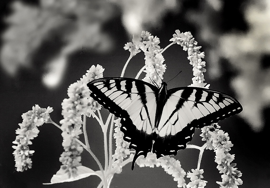
Nicely seen Russel. Great idea to convert to black and white. The white is crisp, but the background detracts. It's a good idea to darken it. I do think that you need all of the stem which acts as an anchor if you choose to crop. |
Nov 13th |
| 65 |
Nov 22 |
Comment |
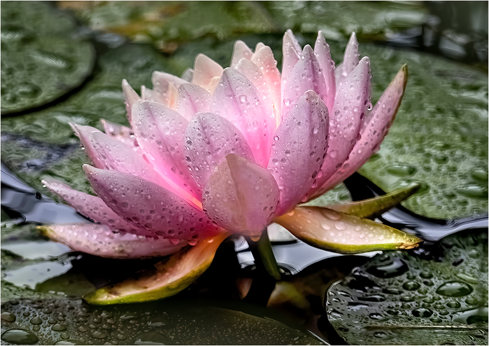
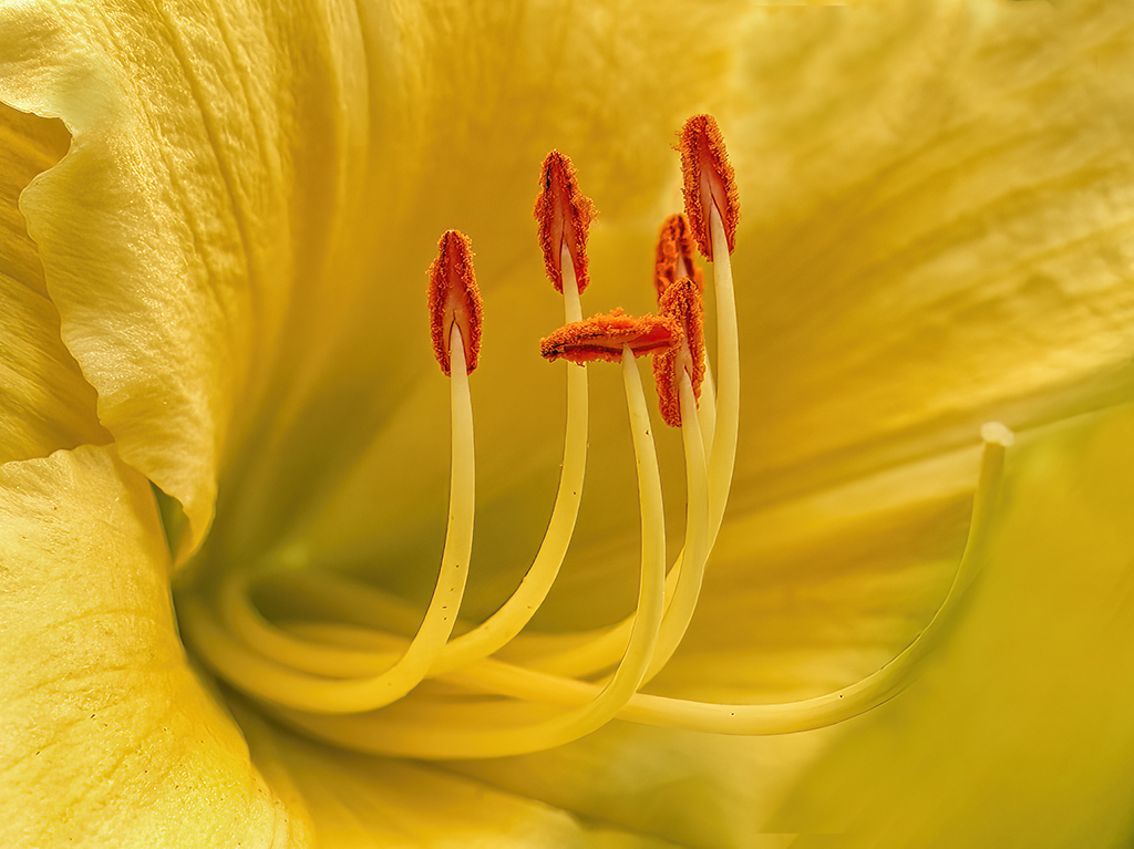
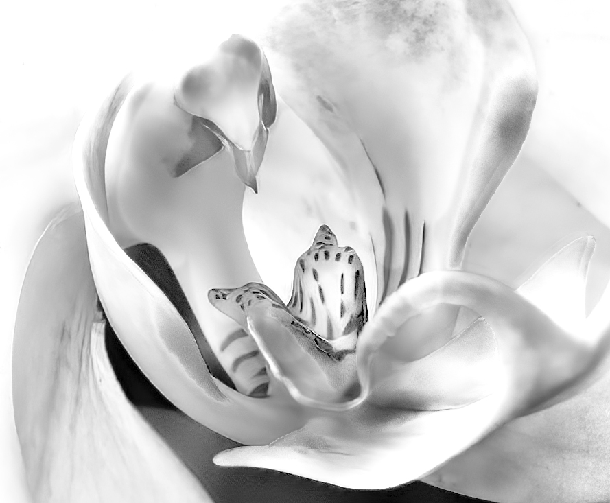
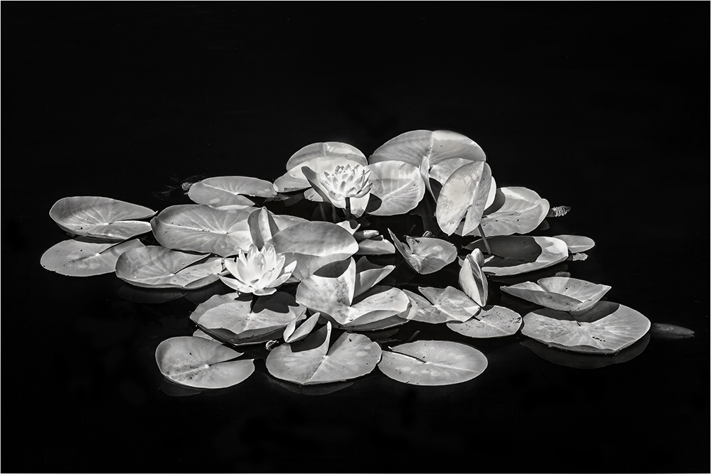
Hi Maria, This is such a delicate flower and it shows. Very nice clean up. It feels like it could be a little sharper, especially on the center flower. You handled the whites really well. |
Nov 13th |
| 65 |
Nov 22 |
Comment |
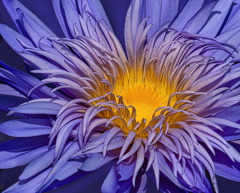
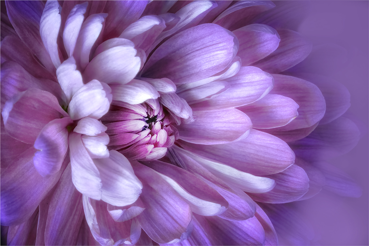
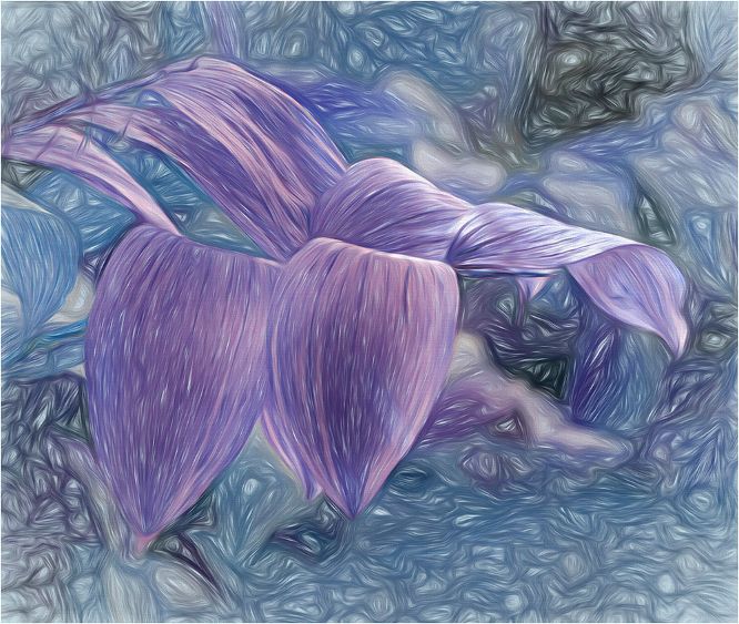
Another great Dahlia image Diana! Lovely processing too. Your texture background adds to the delicacy. Just for fun, as it does make it a different presentation, see if you like a cropped version by cropping out the bottom 2 layers of petals as well as some off one of the sides to take it off center. More lens baby pics please! |
Nov 13th |
| 65 |
Nov 22 |
Comment |
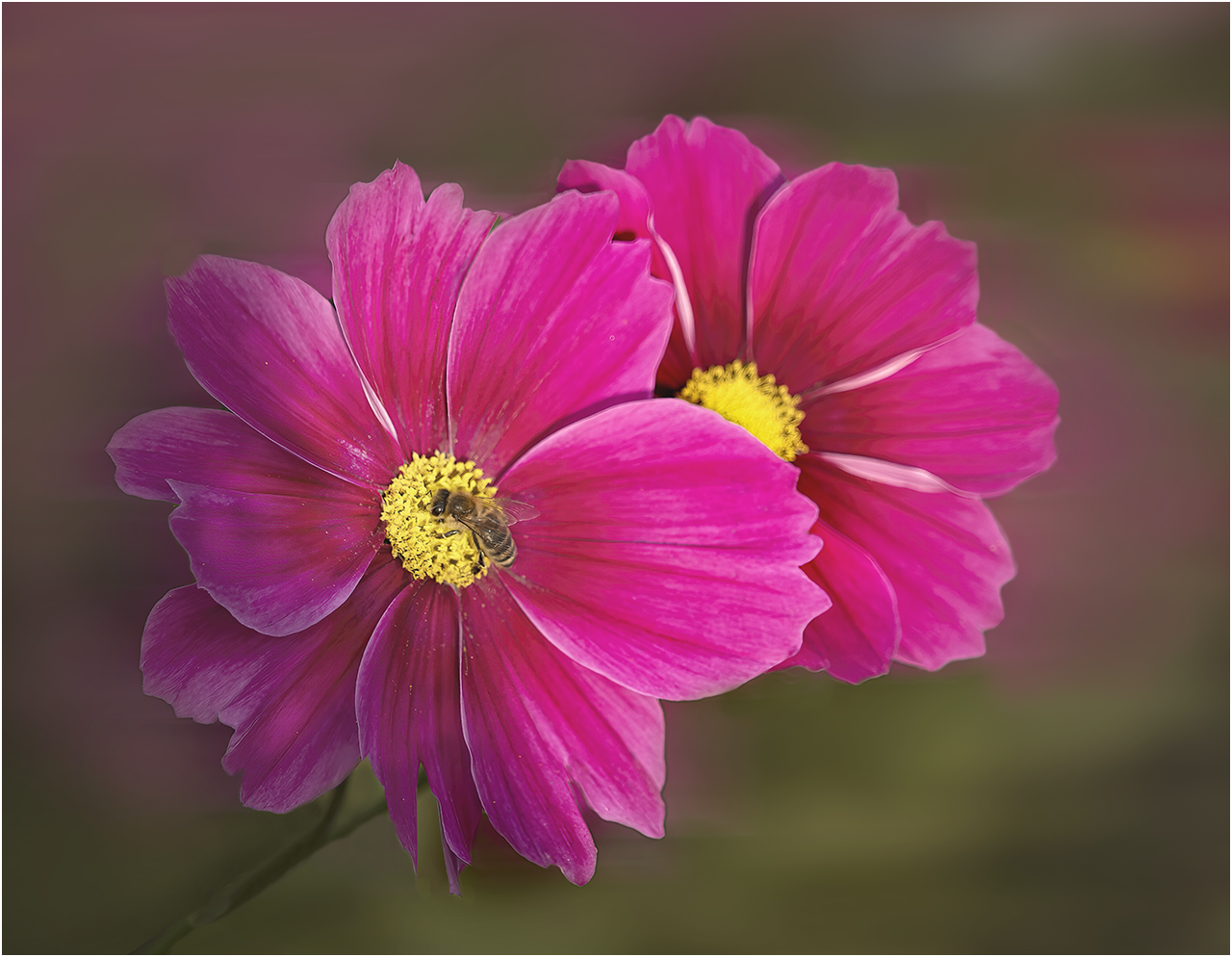
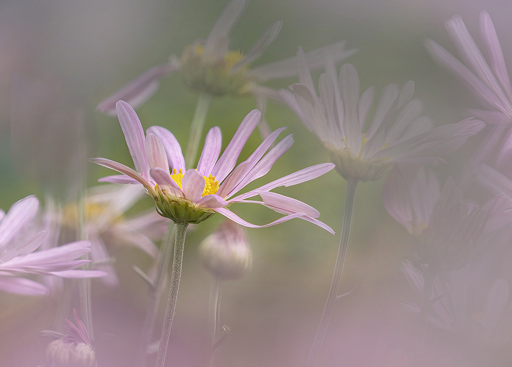
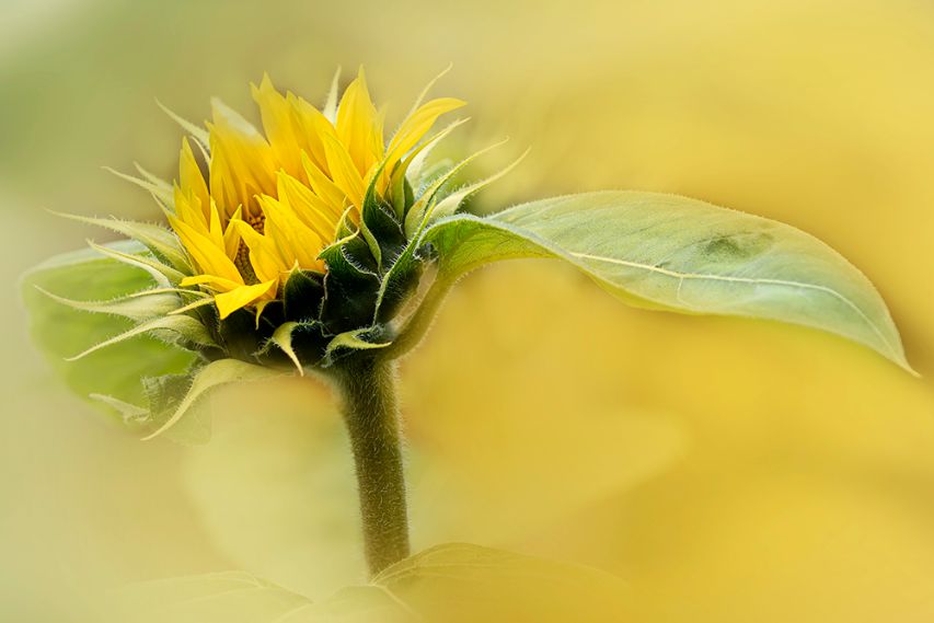
Fran, this is lovely. It screams romance. I think you are doing really well with the lens. Here your sharp focus is on the sepal which does work, even though you may have been looking for the edge of the main petal. |
Nov 13th |
4 comments - 3 replies for Group 65
|
| 66 |
Nov 22 |
Comment |
Hi Arik,
Yay for covered bridges! Your view point is perfect and I love that I can see the road continuation through it. I do like the blue tones as it enhances the feeling of the rainy day. It appears a little dull to my eye. I would take it into levels and play with the right hand slider to give more of a glow. The bleeding into the foliage is easily fixed too. A lovely image.
|
Nov 5th |
| 66 |
Nov 22 |
Comment |
Hi Jack,
I must admit that when I looked at all the images after I had completed uploading them, I thought that I had placed your original instead of your worked image. I will resist working on your image as I think there are enough versions to choose from. Your sky is magnificent, and I have no problem with just seeing a portion of building. I enjoy Palli's version, but would open up the shadows on the building. |
Nov 5th |
| 66 |
Nov 22 |
Reply |
Gary, I deleted your version of Jack's image by mistake. Please reload it if you can |
Nov 5th |
| 66 |
Nov 22 |
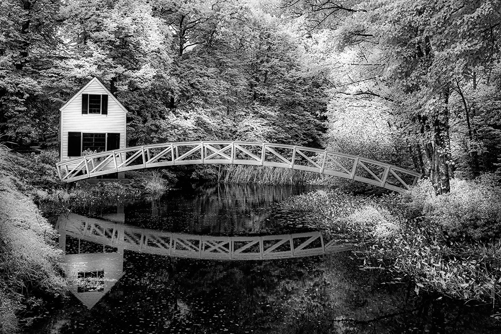
Comment |
Hi Chuck,
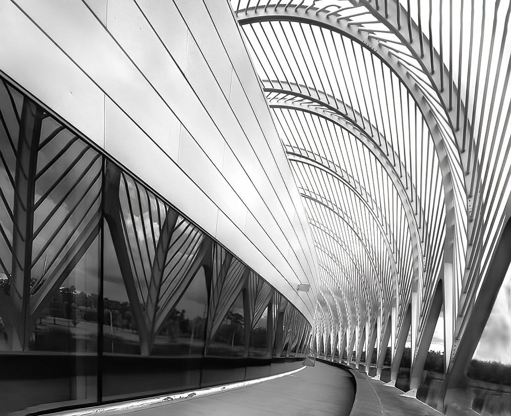
The composition is lovely, I'm sorry it annoyed you! I think the bridge is the main subject. By enhancing the blue of the pond, and making the bridge a different blue, it has become confusing to where the eye should rest. I would de-saturate the pond and make the bridge more prominent, keeping the same tonality as the pond. |
Nov 5th |
| 66 |
Nov 22 |
Comment |
Hi Gary,
Another great shot of Taylor. As I've said before, you have a scary brain, which I admire by the way. Your ability to create something different always gives us images to enjoy. I agree that cloning and feathering very carefully is the way to go around the edges. Red nails, a bonus! I do have a question - was it your intention to have some of the "sky" bleed onto her skin as it looks like it was place over, rather than behind her? |
Nov 5th |
| 66 |
Nov 22 |
Comment |
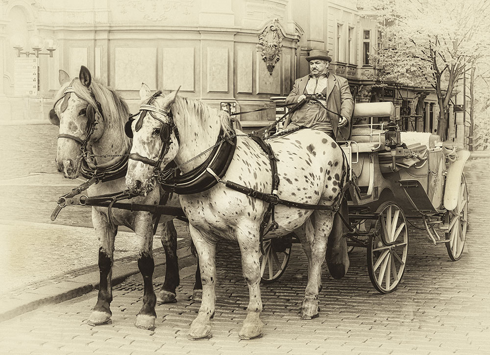
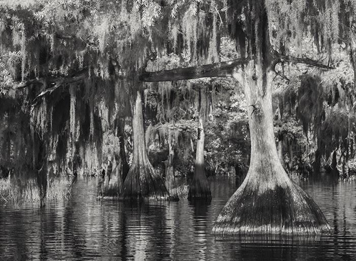
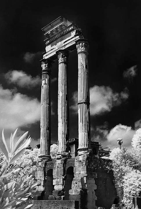
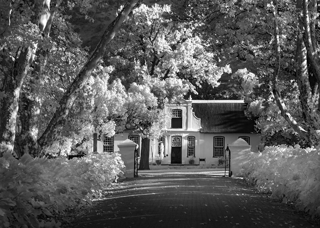
Hi Palli,
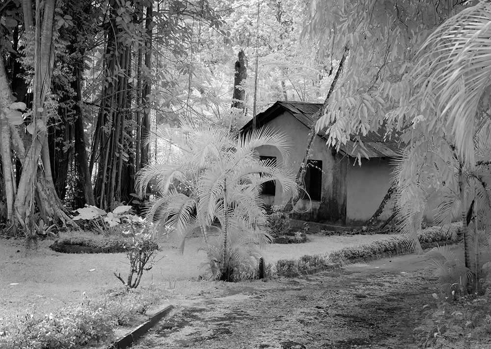
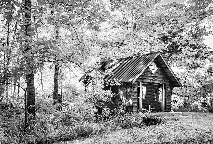
This looks like it was taken in Florida after a hurricane, (thankfully we have not been impacted by one for some years) so not such an unusual sight for me. Your composition and processing are so well done. There is just enough of the upright tree to act as a foil making the image was well thought out. |
Nov 5th |
| 66 |
Nov 22 |
Comment |
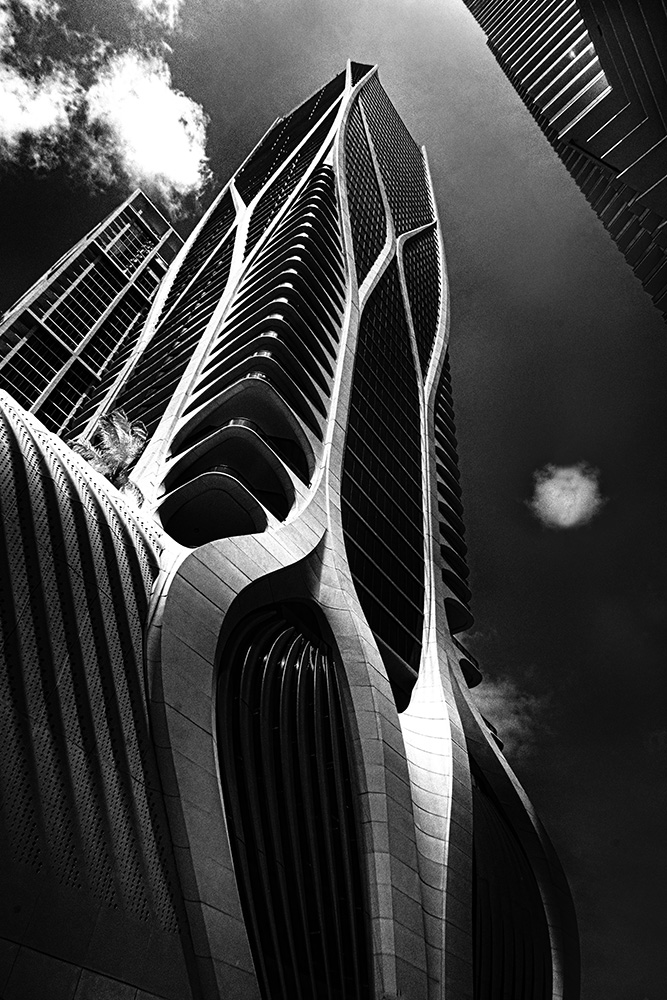
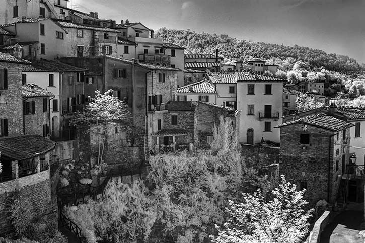
Hi Emil,
Beautifully composed. I might try to find some detail in the facing edge of the building by opening up the shadows. Looking at the original, sepia tones may be an alternative look. |
Nov 5th |
| 66 |
Nov 22 |
Comment |
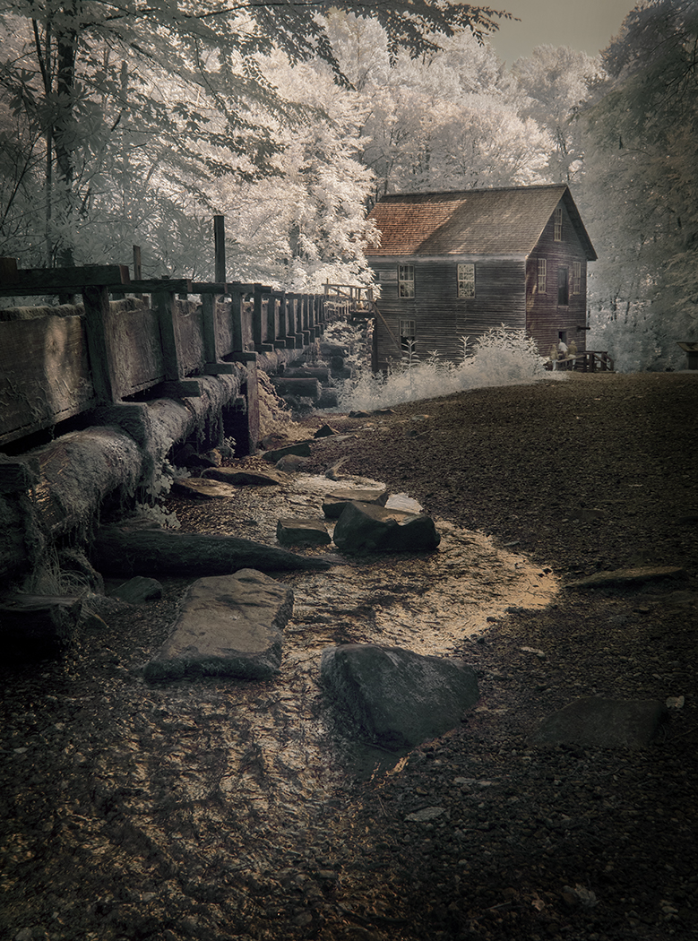
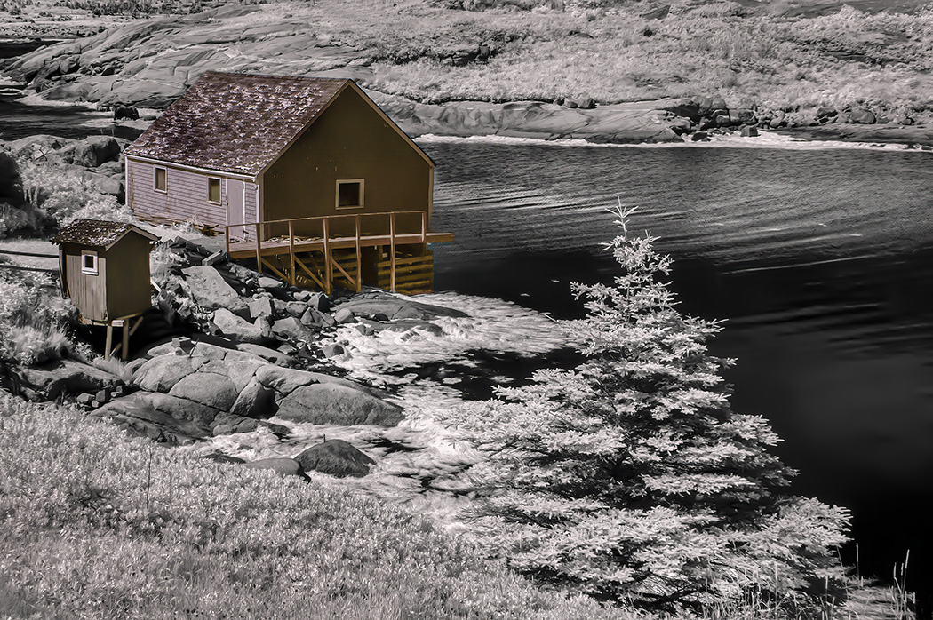
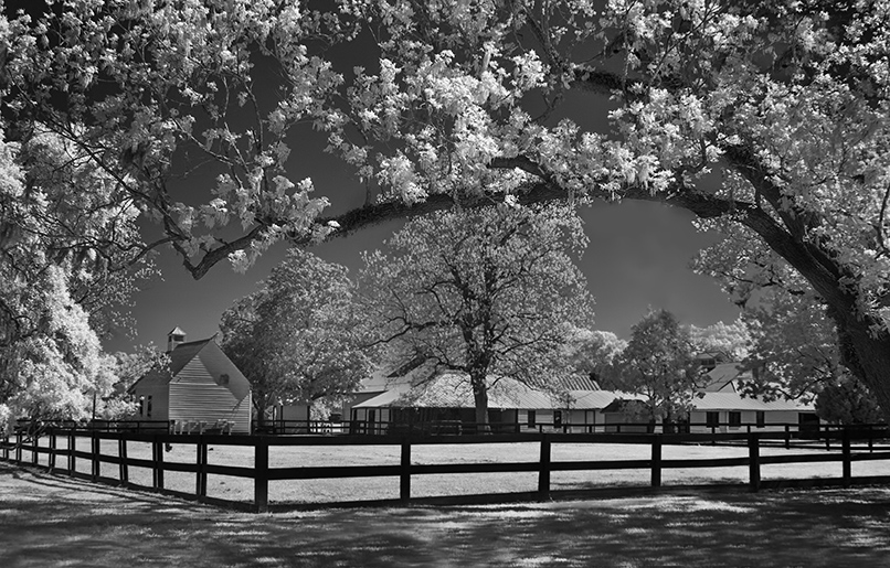
Hi Henry,
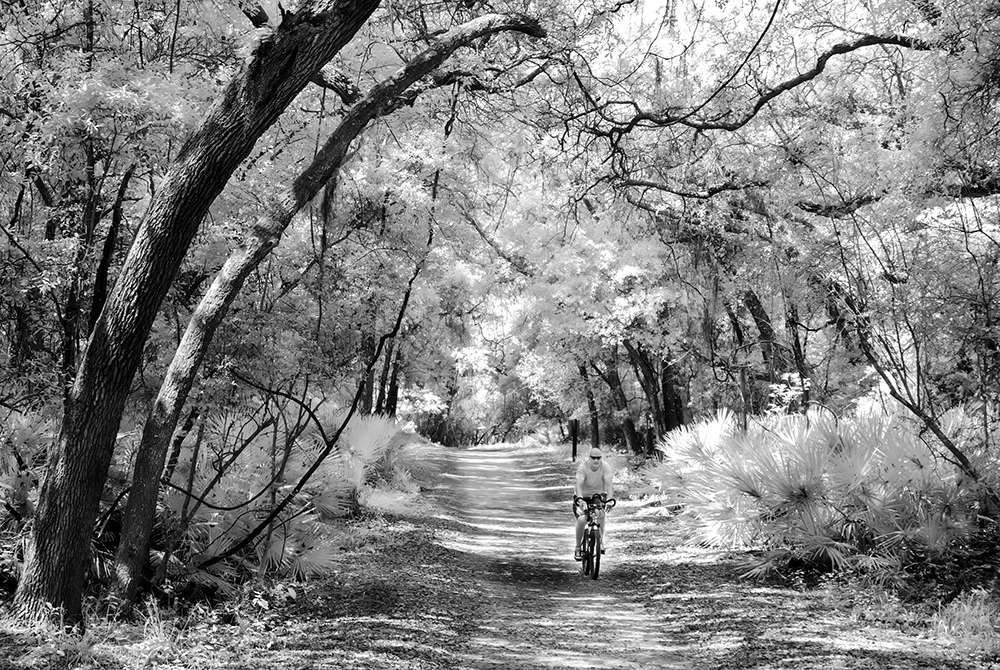
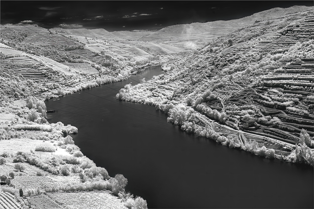
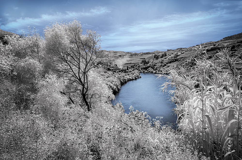
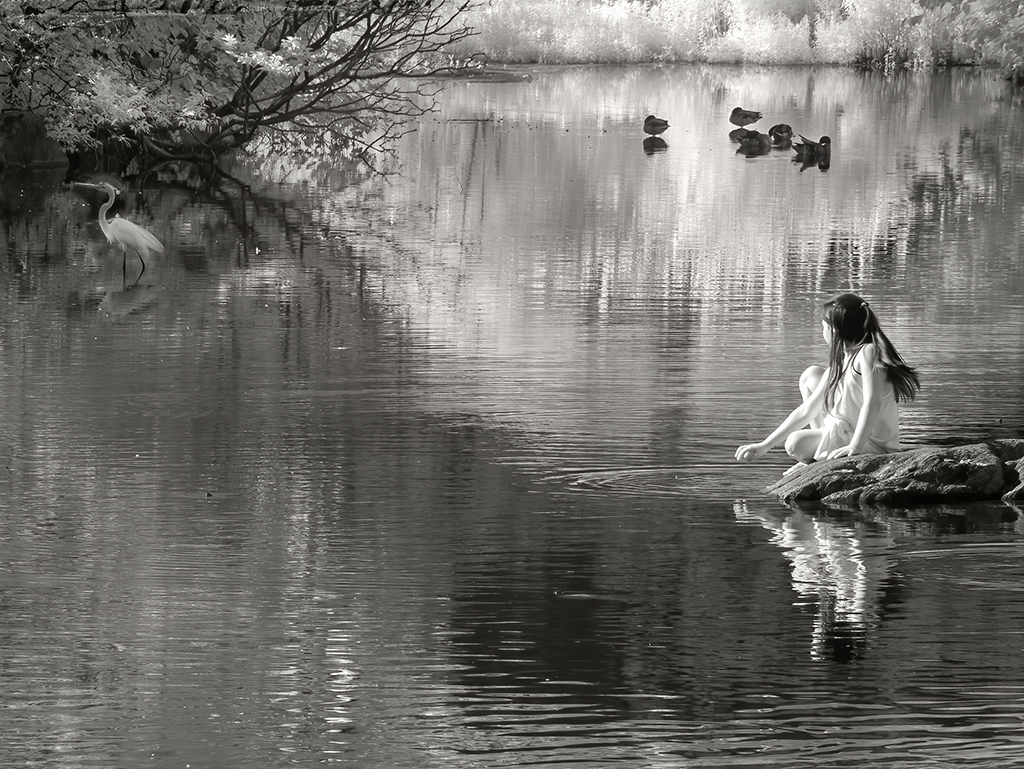
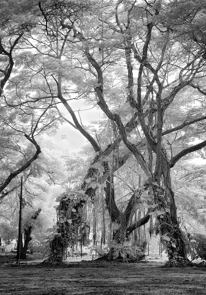
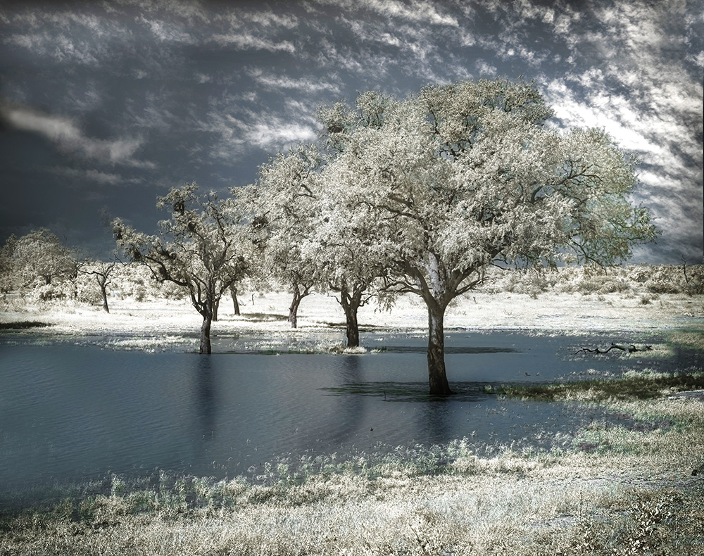
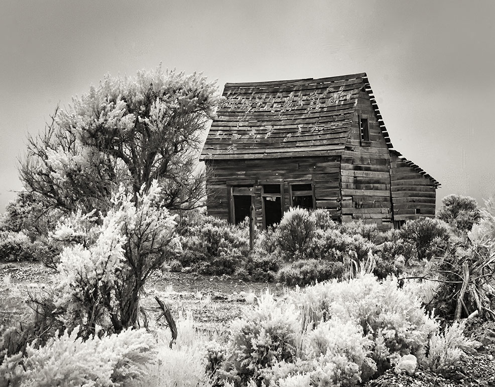
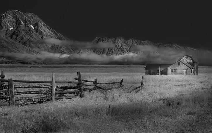
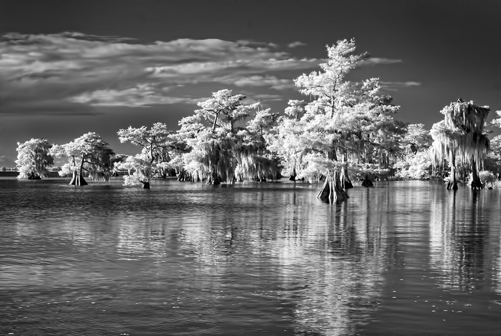
A lovely scene with so much going for it. I really like the graphic quality of the buildings on the left. The balance between the buildings and the white grasses on the right can only be achieved using IR, so well seen. The boats are perfectly placed and needed to make it an extraordinary image. |
Nov 5th |
7 comments - 1 reply for Group 66
|
11 comments - 4 replies Total
|