|
| Group |
Round |
C/R |
Comment |
Date |
Image |
| 22 |
Dec 17 |
Reply |
Thank you. I believe your version much improved mine! |
Dec 14th |
| 22 |
Dec 17 |
Comment |
I like how the concentric circles and colors draw you across the image. A very nicely done set up. Really can't figure out what the pieces are. |
Dec 12th |
| 22 |
Dec 17 |
Comment |
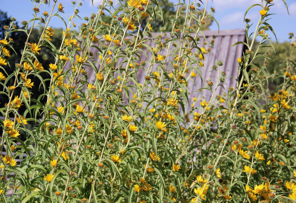
I like the abstract geometric look and bold colors. Nicely done. I'm guessing it's old siding on a wood-frame house. |
Dec 12th |
| 22 |
Dec 17 |
Comment |
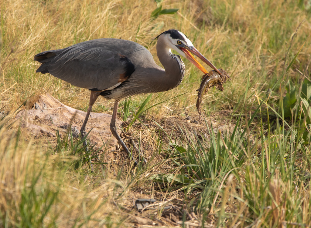
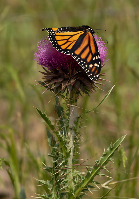
I agree with Peggy that this is a nice image. I especially would like to remark on what a sharp focus you obtained and the perfect exposure. Peggy suggests cropping the image more, but personally, I like the design of the long green stem extending across the page. I appreciate the desire to see more details of the dragonfly. Guess I'm more into the color and design than details about the insect. Just shows you can have different people look at an image and have different and valid perspectives about what appeals to them about it. |
Dec 8th |
| 22 |
Dec 17 |
Comment |
Whatever it is, I like it, especially the way you flipped it. Nice colors and great focus. I agree with Jerry that this would like nice framed and hanging on an office wall. |
Dec 5th |
| 22 |
Dec 17 |
Comment |
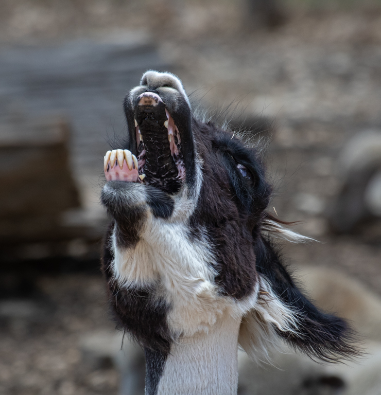
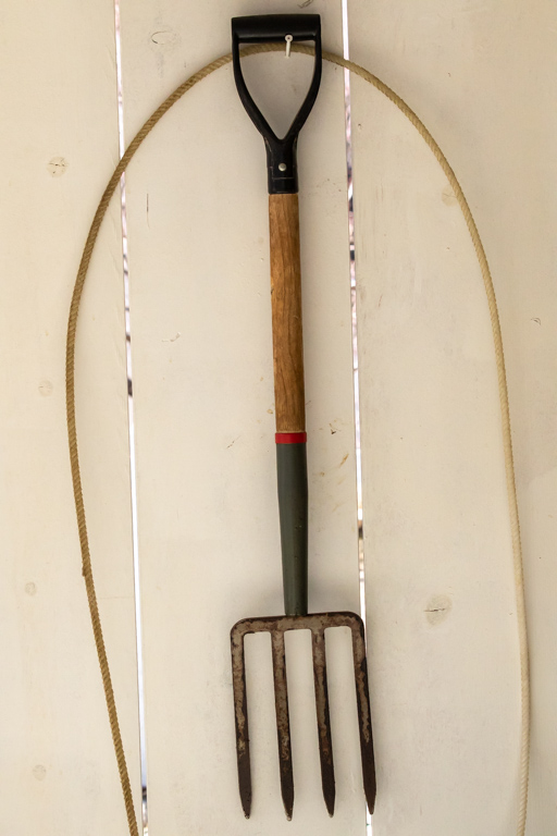
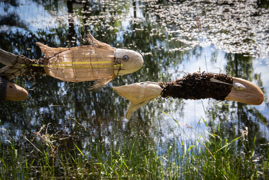
The red really pops out and catches the eye. Looks like this could be the cover of a mystery novel! It's not clear to me what the different elements in the photo are, but that doesn't matter since you apparently are so close you nose must be touching the ash tray! I like the abstract look you've created, though the dark red squiggle at the bottom is a distraction for me. It just seems lost and hanging out there. I think it would have been an even stronger image if the red squiggle was lightened and made a counter-balance to the bigger splotch of red above it.
|
Dec 4th |
| 22 |
Dec 17 |
Comment |
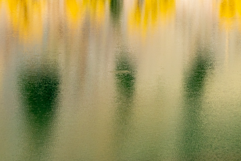
Whatever it is, I like the sleek, abstract look you've created. I also like how you blurred the nearest point, focused on the mid-point, then blurred out the background. The colors are harmonious with each other, creating a pleasant piece. I can imagine this framed and hung in an office that showcases a very contemporary look and feel. |
Dec 4th |
| 22 |
Dec 17 |
Reply |
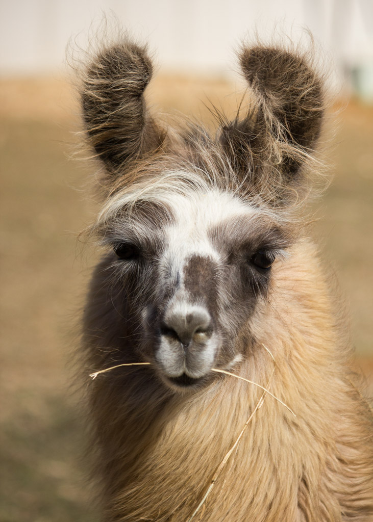
You're probably right about this not technically falling within the exact guidelines of this month's assignment. Marti had the same concern but decided to have pity on me and let it in! Actually, with the cheapy lenses that I own, this is about as micro as I can get anyway. |
Dec 4th |
6 comments - 2 replies for Group 22
|
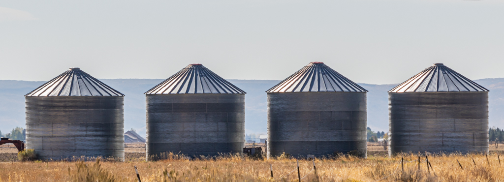
| 70 |
Dec 17 |
Comment |
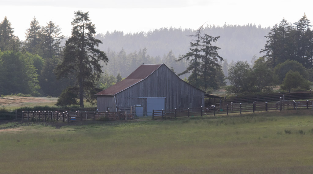
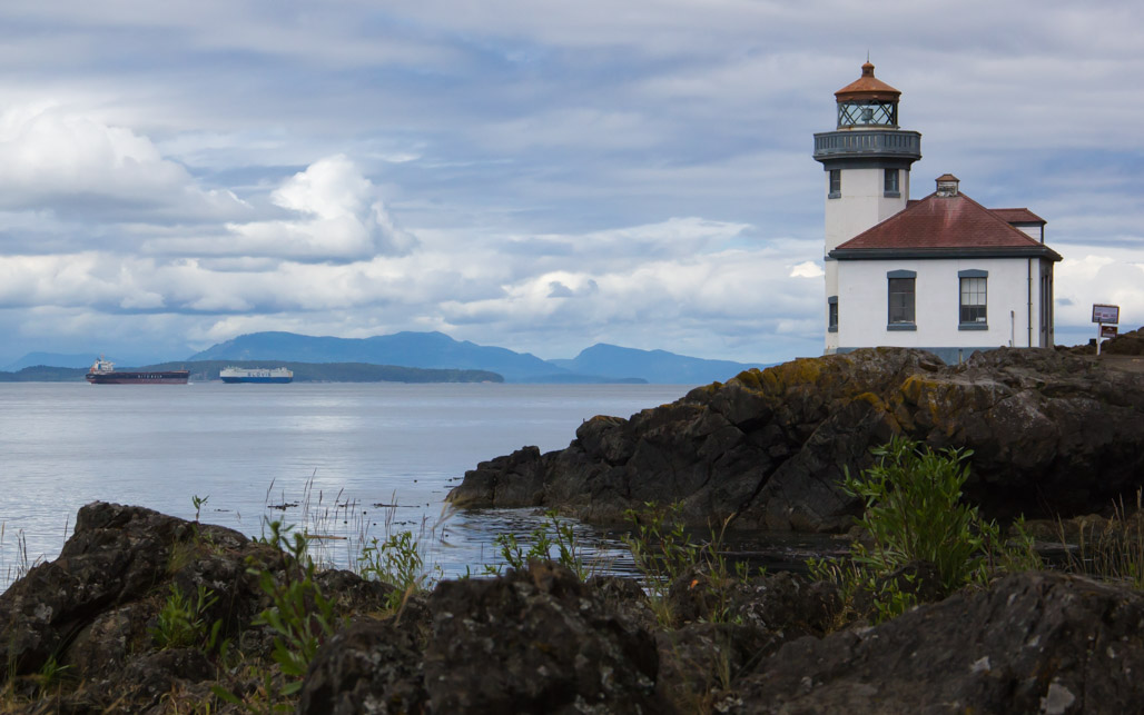
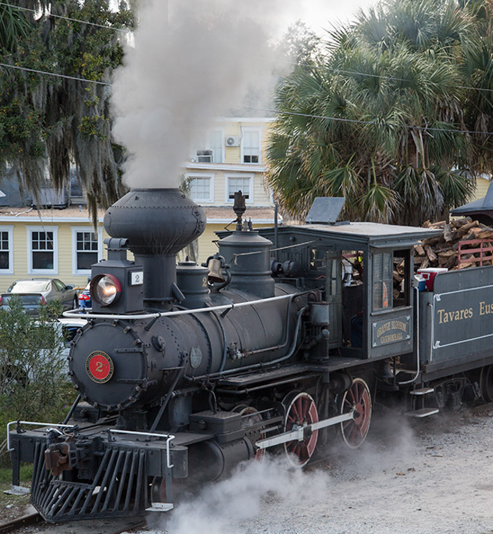
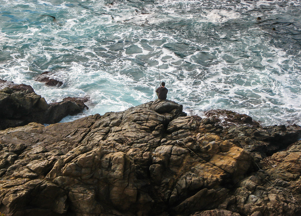
Hello from a drop-in from group 71. I wanted to comment on this image because, to me, it shows an outstanding use of the foreground to anchor the shot and giving it a strong focal point. I often look at images and wonder, what's the (focal) point? The pile of ropes in this image serve that purpose here and provide a strong attraction to the eye. The touch of reds and yellows gives it an extra pop. Then, the rocky shore leads to a secondary focal point, the house in the distance. Such a nice job of composition that I just had to compliment you. |
Dec 27th |
1 comment - 0 replies for Group 70
|
| 71 |
Dec 17 |
Reply |
I gave the black and white version a try. See what you think. |
Dec 21st |
 |
| 71 |
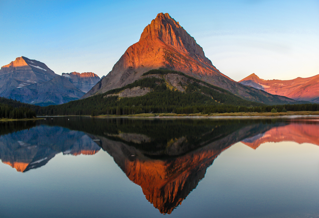
Dec 17 |
Comment |
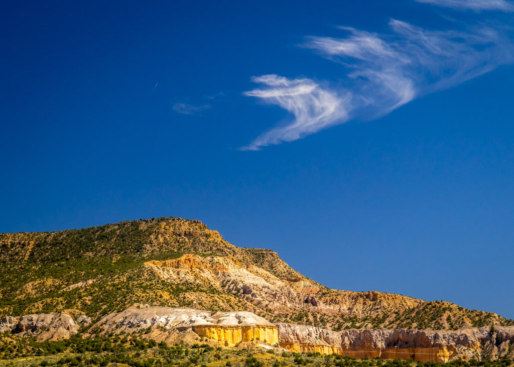
You certainly did a nice job of capturing the vastness of this area. I've been to Abiquiu several times but never to the lake. Need to make it a stop the next time I'm in the area. Your focus appears a little soft and the blue sky appears a bit over-saturated. Other than that, I congratulate you on a great capture. |
Dec 11th |
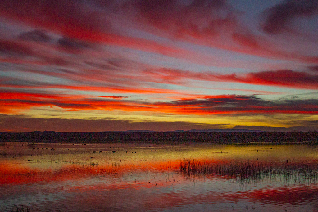
| 71 |
Dec 17 |
Comment |
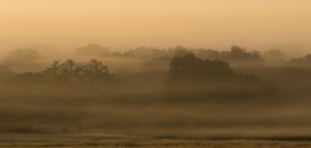
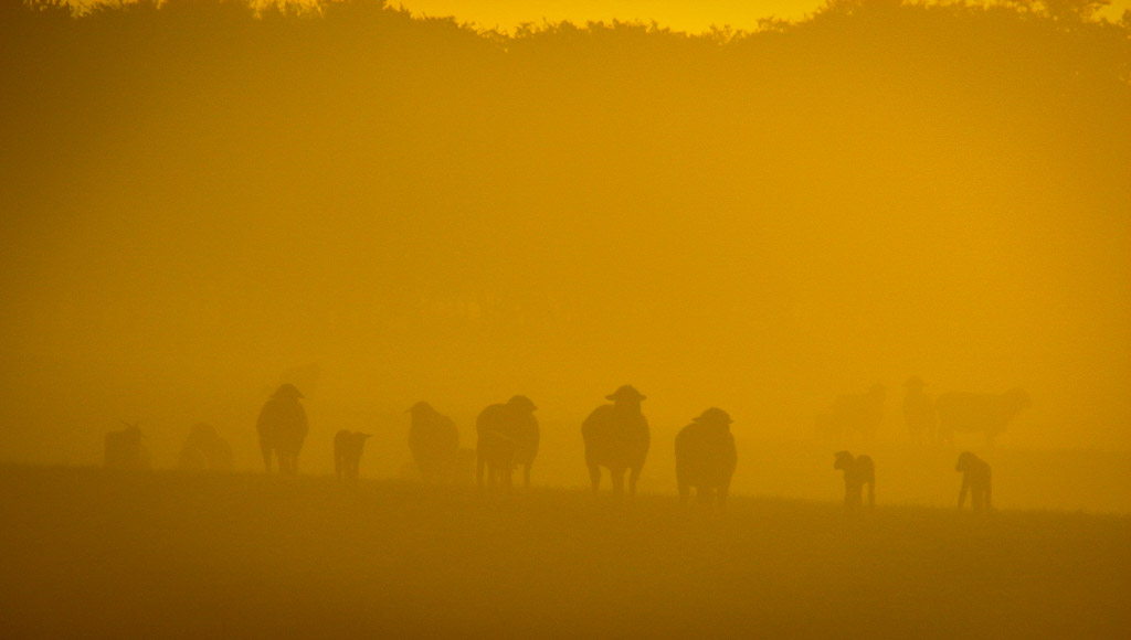
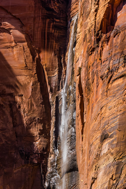
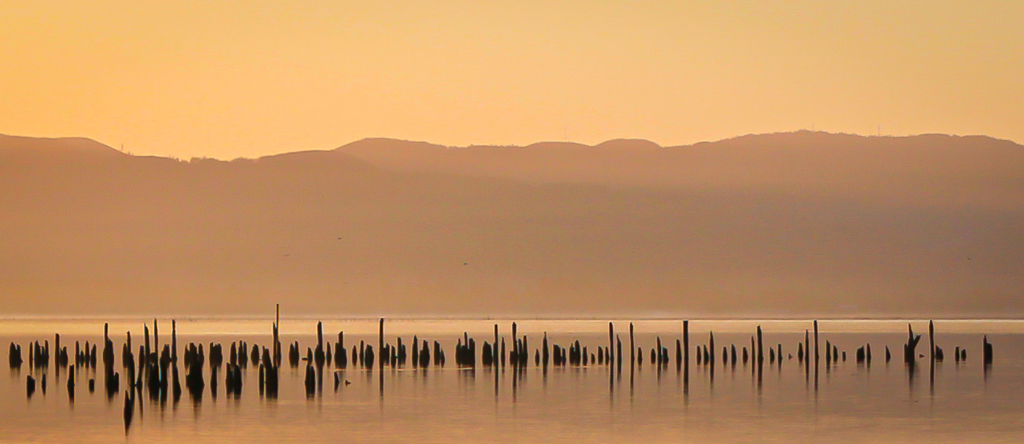
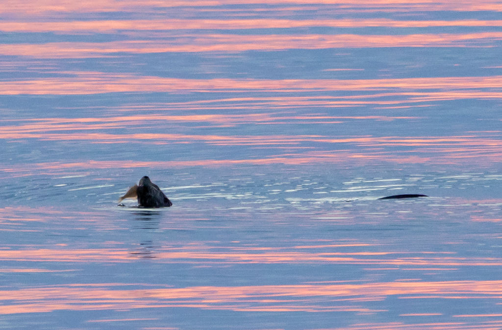
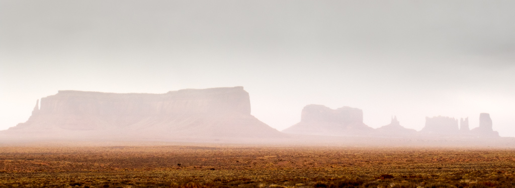
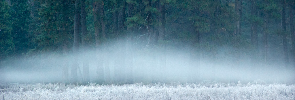
Beautiful capture of the fog along the shoreline. I suggest dodging the extreme brightness of the waves in the center as this seems a distraction from the softness of the flowing fog. |
Dec 11th |
| 71 |
Dec 17 |
Comment |
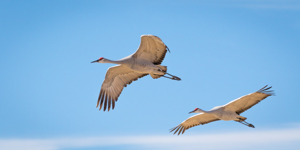
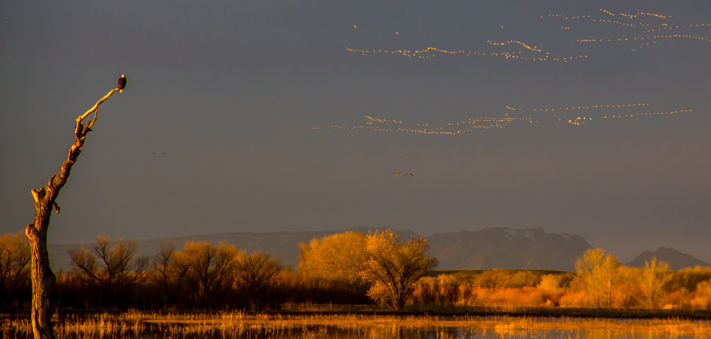
Welcome to our group, John! You're image is absolutely breathtaking. I've seen a lot of photos of the Milky Way. But what sets yours apart and makes it so distinctive are the trees along the horizon. To me, this makes it very unusual and definitely something that stands out. I also like the fading light along the horizon, plus the brightness of the Milky Way that draws the eye across the image. I look forward to see much more of your excellent work. |
Dec 10th |
| 71 |
Dec 17 |
Reply |
Thanks. It helped that I had a photographer from Yosemite's Ansel Adams Gallery tagging along to point out some good perspectives!
|
Dec 8th |
| 71 |
Dec 17 |
Comment |
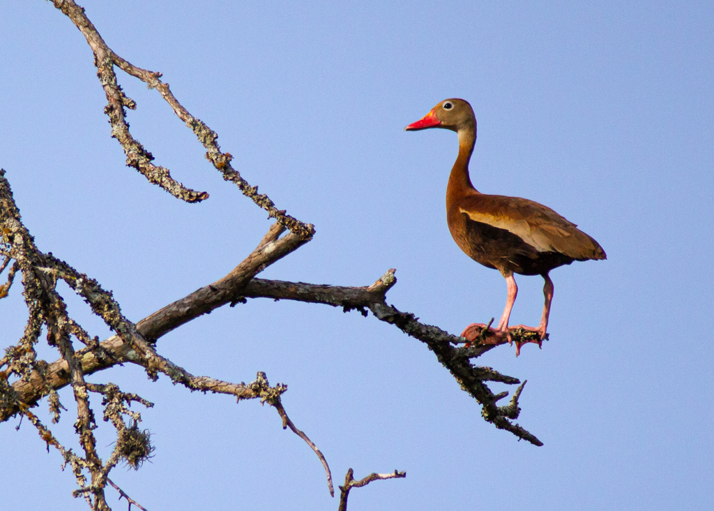
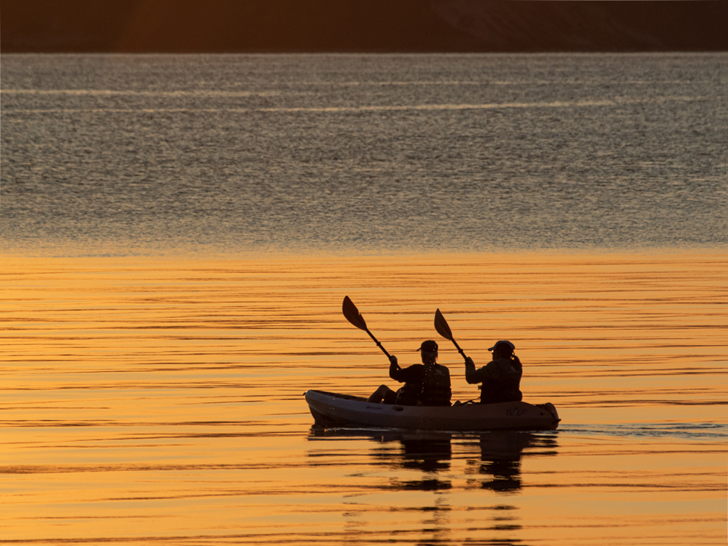
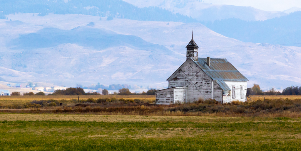
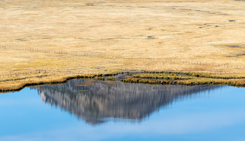
You did a nice job of bracketing the images and doing your processing. I like the soft, muted colors you captured. I also liked how you obtained the sharp focus from the foreground to the distant mountains and boats at sea. What I believe the image lacks is a strong focal point. What is it that you want us to focus on? When I first looked at this, my eyes went directly to the dark clump of brush in the middle. This was partially due to the small fences on either side of it almost creating a frame for it. I don't think you wanted that to be the main point of your image. Beyond that it appears as open water without much to visually anchor it. I'm sure this image is a great one to keep to remind you of a beautiful scene and a wonderful trip. However, to make it more compelling to others you might work on identifying the specific subject or focal point of the photo. |
Dec 8th |
| 71 |
Dec 17 |
Comment |
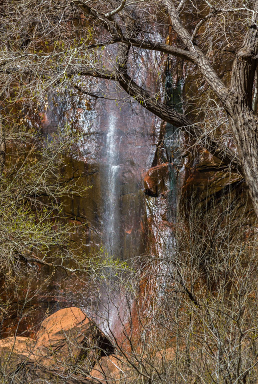
This looks like a beautiful place to take a hike. I like how you composed the image with the three waterfalls drawing in the eye, and leading up the stream to the bridge at the far end. You had a perfect depth of field, keeping everything in focus, from the nearest to the farthest points. To me, the image seems overly saturated, creating an almost garish look rather than something more soothing, which is what I would expect from such a serene scene. Other than that, which is simply a reflection of my own personal taste, I think you did a fine job. |
Dec 4th |
| 71 |
Dec 17 |
Comment |
A sleek contemporary image with strong, clean architectural lines. Nicely composed. I consider this more a study in design rather than an image of a building. The white space at the top is balanced against a lovely reflection in the water. Your choice of black and white rather than color was perfect and enabled you to concentrate on the contrasting tones of the black lines of the roofs and balconies against the light-colored building itself. The dark "clouds" on the right and left are, to me, distracting, appearing almost as smudges. Maybe this is due to going too heavy on the vignette. You always share such striking images. |
Dec 4th |
6 comments - 2 replies for Group 71
|
13 comments - 4 replies Total
|