|
| Group |
Round |
C/R |
Comment |
Date |
Image |
| 22 |
Jul 17 |
Reply |
Vicki, If you like street photography, look up William Albert Allard. You can find a lot of his work by Googling his name or looking on his website. He's done numerous photo shoots for National Geographic, plus other stuff. In my estimation, he's one of the best "street photographers" around. You can learn a lot by studying his work. |
Jul 23rd |
| 22 |
Jul 17 |
Reply |
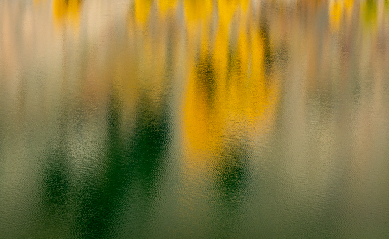
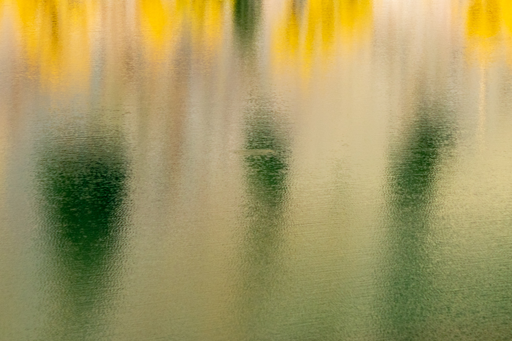
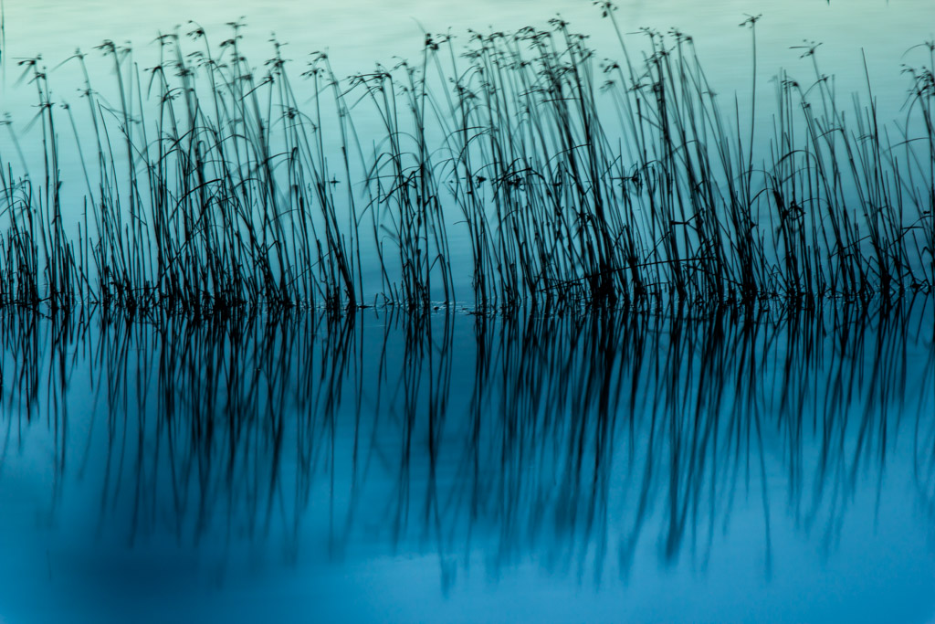
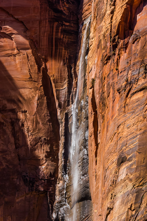
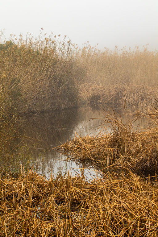
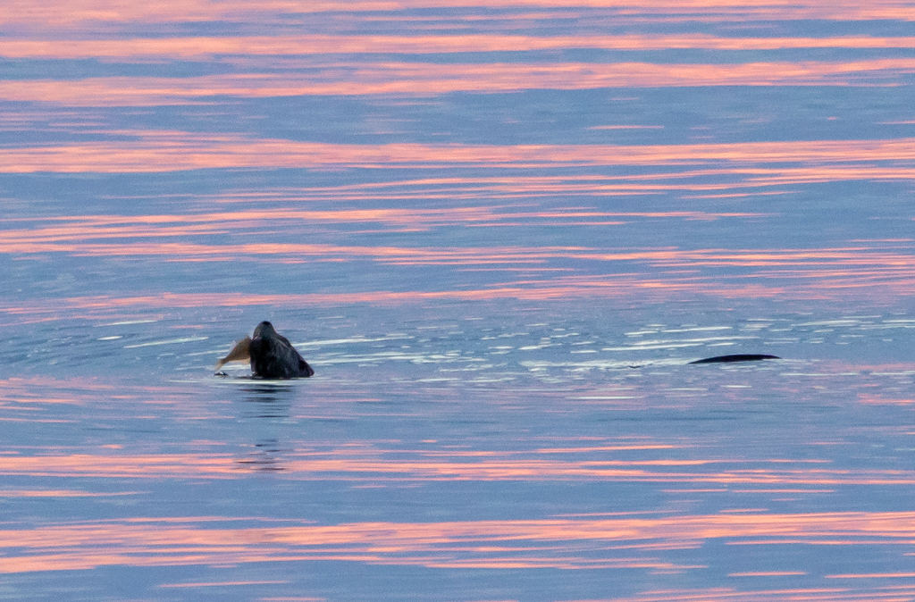
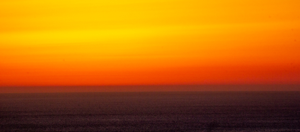
I think you're right -- the water is too bright. |
Jul 18th |
| 22 |
Jul 17 |
Reply |
Great observation about the green squares. I hadn't even noticed those! Duh. |
Jul 10th |
| 22 |
Jul 17 |
Comment |
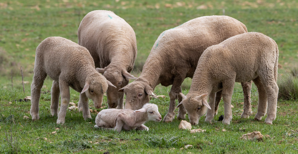
Great job, Joe! Like Jerry, I don't recall seeing this technique before. I think everything you did was absolutely perfect. Just thinking you should have saved this one for our upcoming portrait month. |
Jul 10th |
| 22 |
Jul 17 |
Comment |
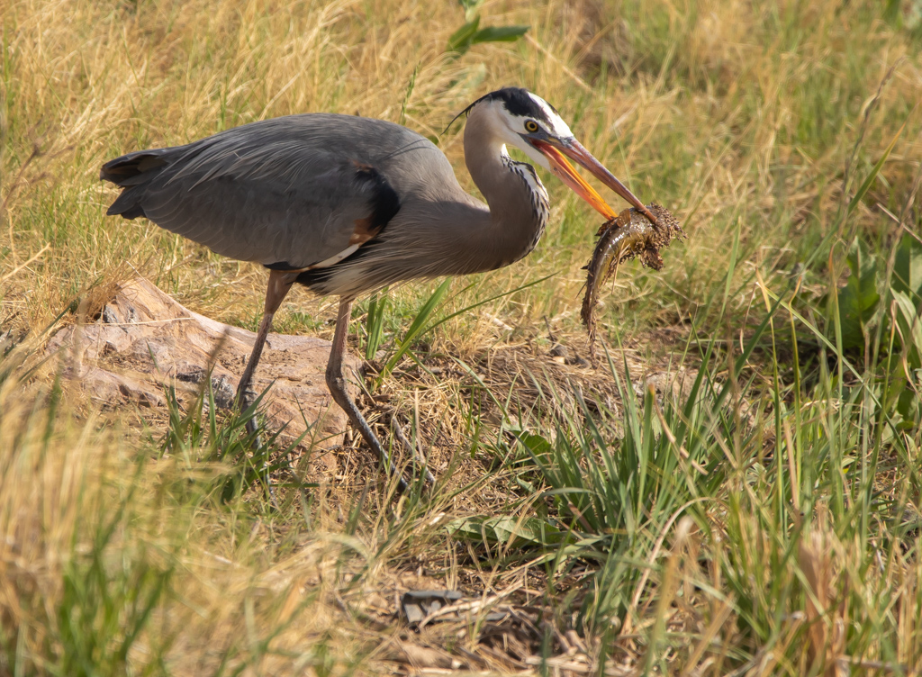
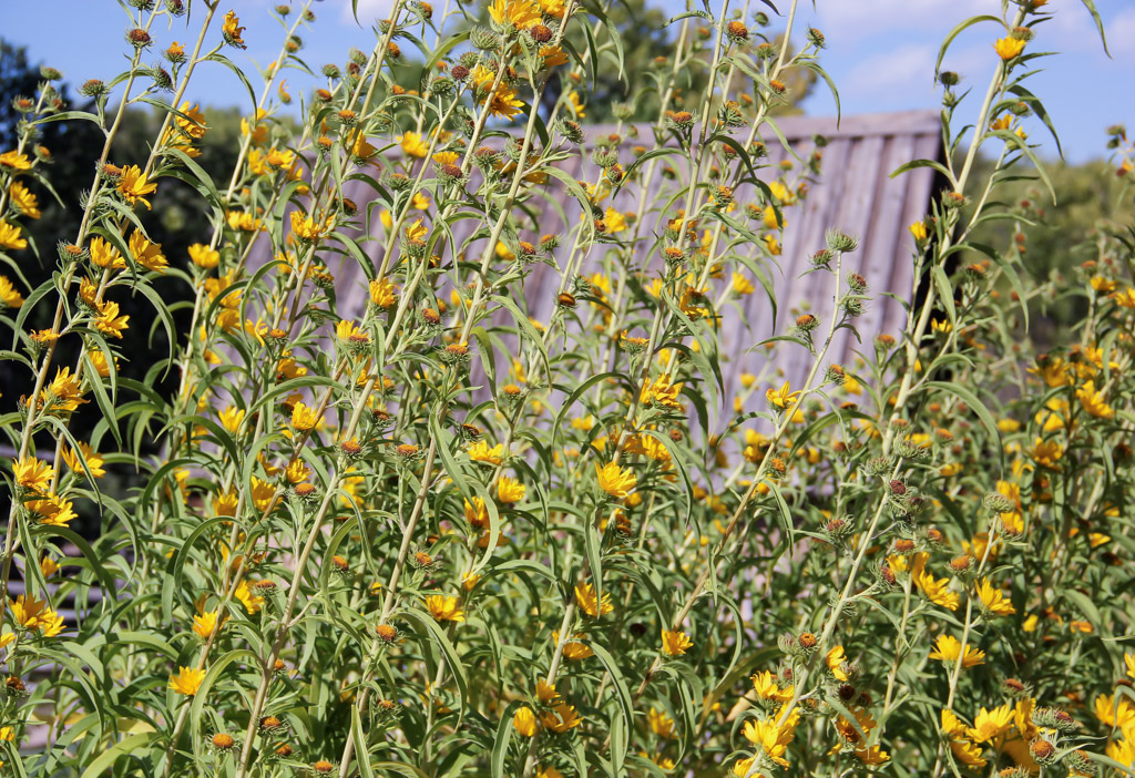
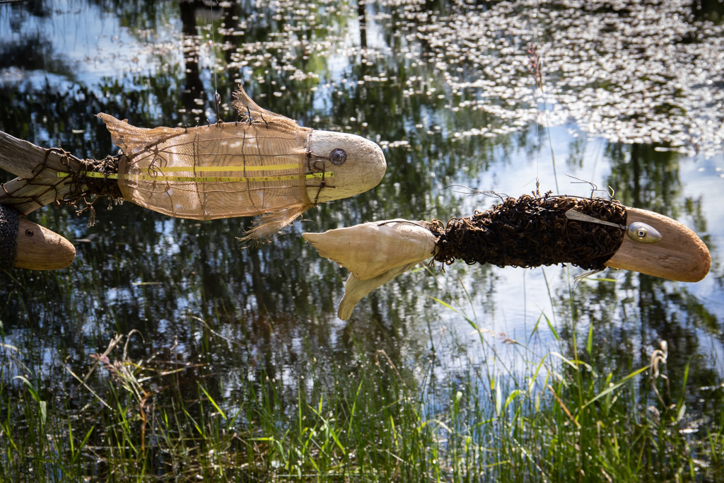
I really like how you focused on a detail of the aircraft. I've seen too many images of car shows and air shows that are little more than snapshots of cars and planes. I think you've hit upon how to look at these events from a creative viewpoint. I find this a nice, almost abstract, image with a perfect balance of geometric shapes -- lines, circles, etc. The two orange wheel blocks give it a nice pop of color. This looks like something that an aircraft manufacturer would use in a high-quality annual report. A well-done, fresh approach to a subject. |
Jul 10th |
| 22 |
Jul 17 |
Reply |
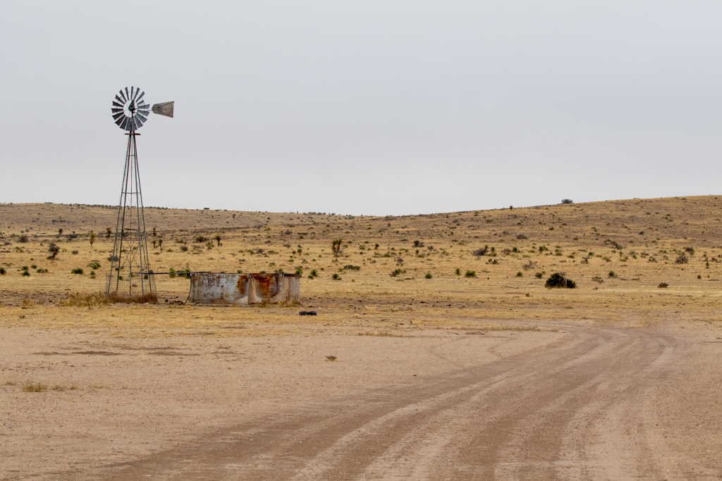
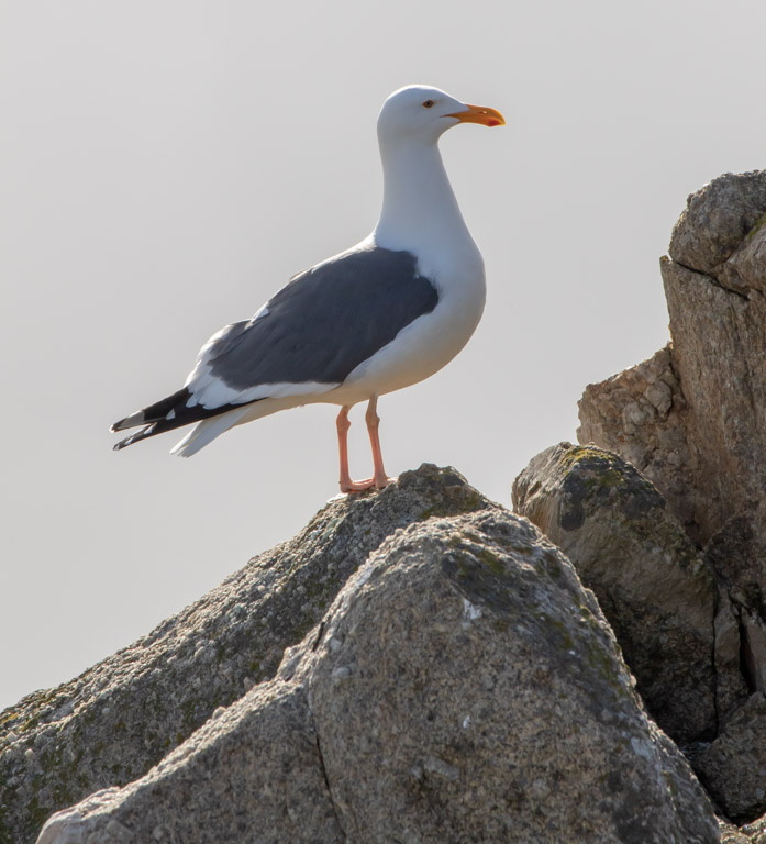
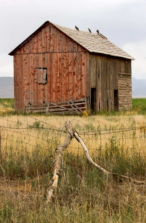
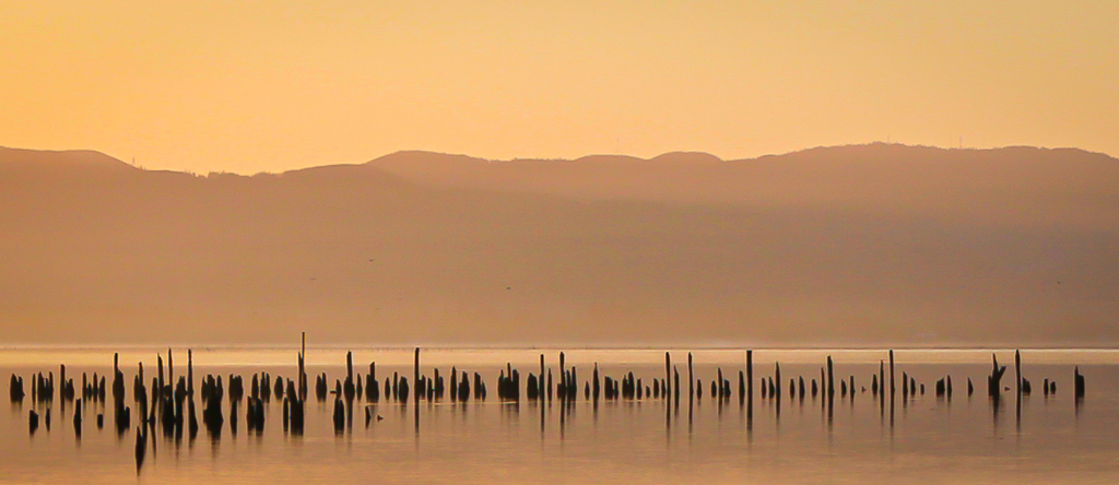
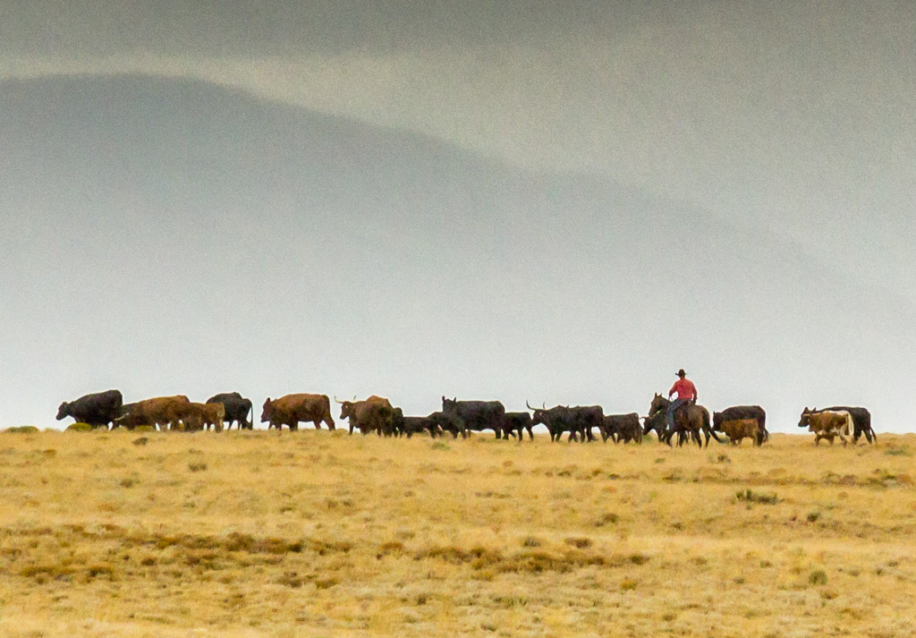
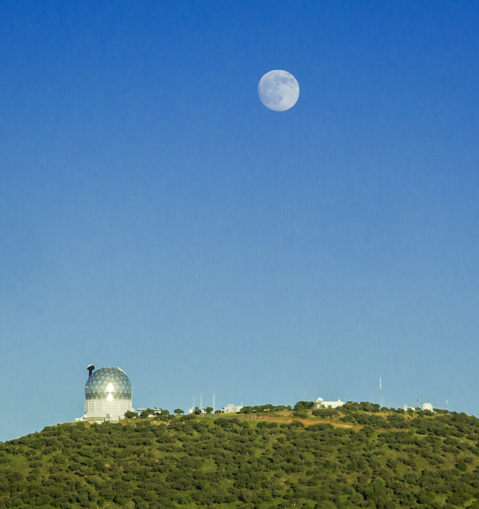
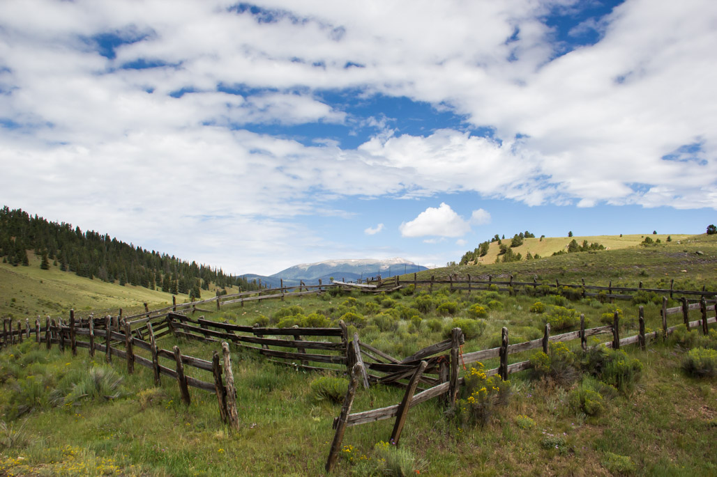
You are exactly right about the cell phone tower on the distant hill. Those things used to bother me but now they don't. I'm a big fan of Ansel Adams. I've looked closely at a lot of his images and many of them have telephone polls, highways, cars, other assorted items in the distant background. I guess I've come to accept that these are just part of the landscape today and don't worry about them. The only time that it really bothers me if they make the photo look real junky and the extraneous debris significantly distracts from the image. You do have an eagle eye! |
Jul 10th |
| 22 |
Jul 17 |
Comment |
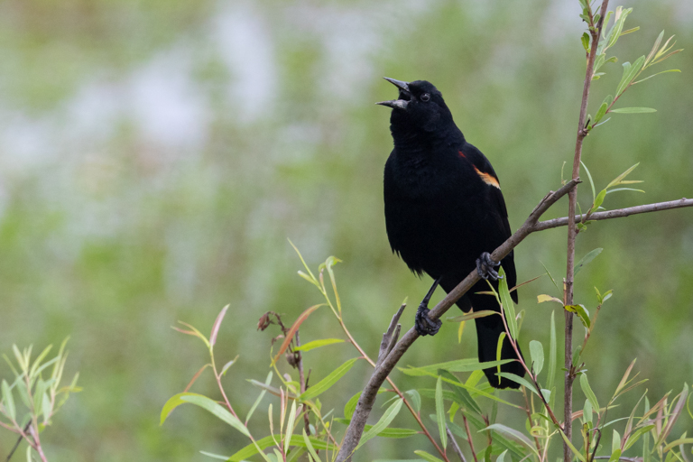
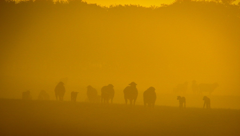
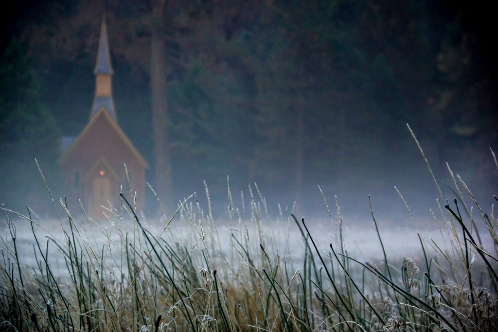
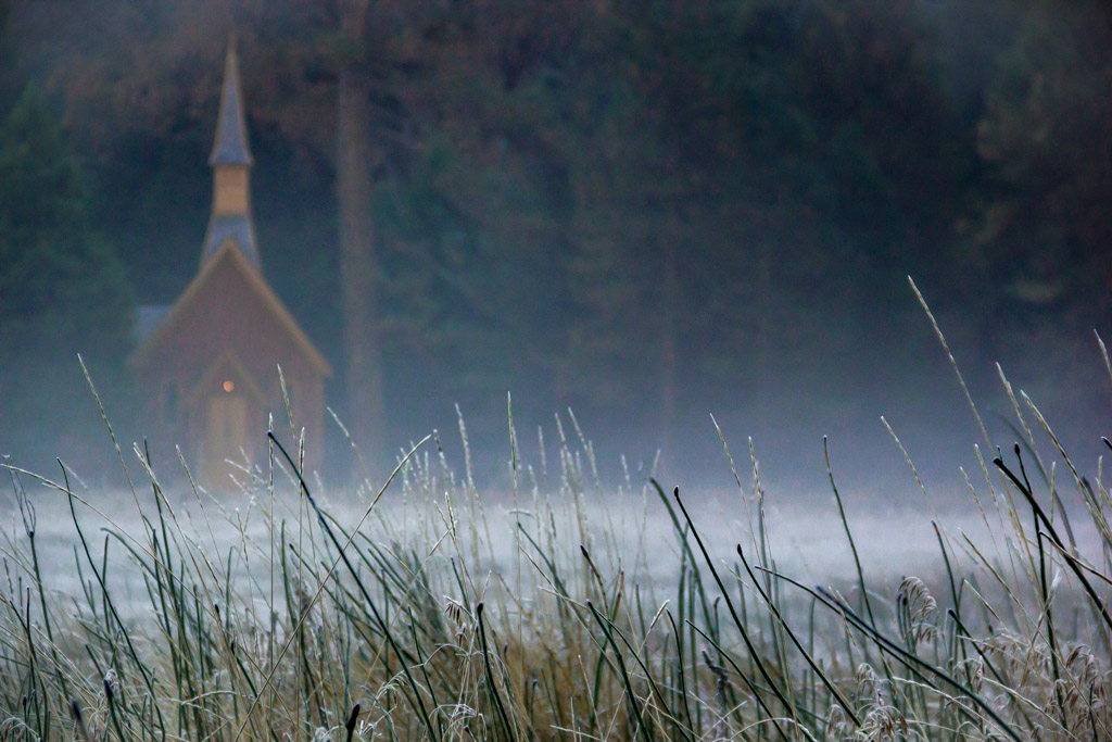
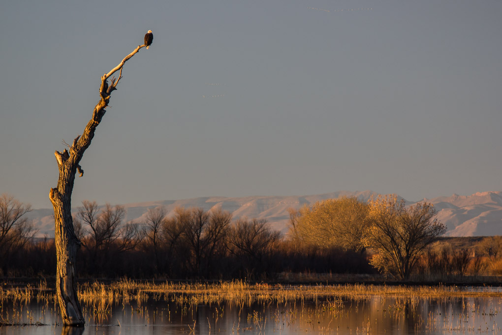
I can see how that golden spot of light attracted your attention. I think you captured a well-composed image, that was focused perfectly and had a nice balance to you. I don't think the glowing yellow light stands out the way you probably saw it. To me, the background is too light to make the spot of golden light stand out. A couple of suggestions: maybe you could dodge the background so that it would be darker, thus making the spot of light stand out. Or, in the future, trying getting a spot meter reading off the spot of light. That would dramatically brighten that light and render the darker background, well, darker. |
Jul 5th |
| 22 |
Jul 17 |
Comment |
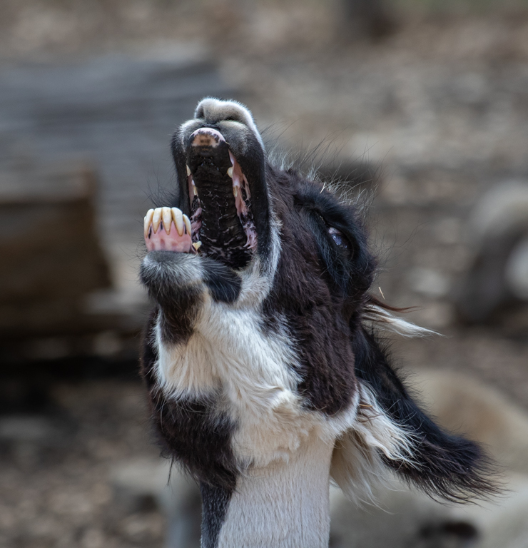
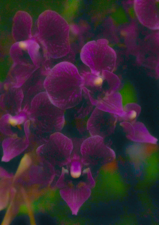
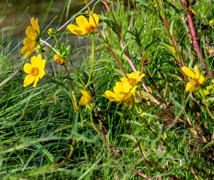
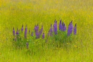
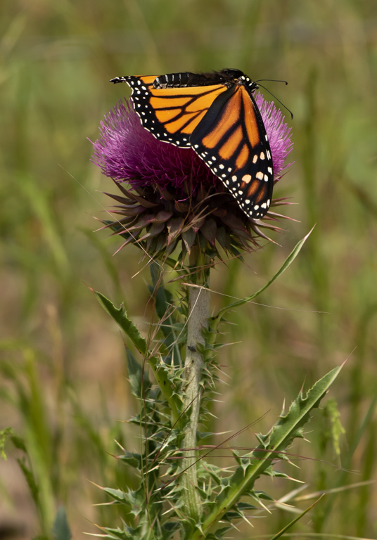
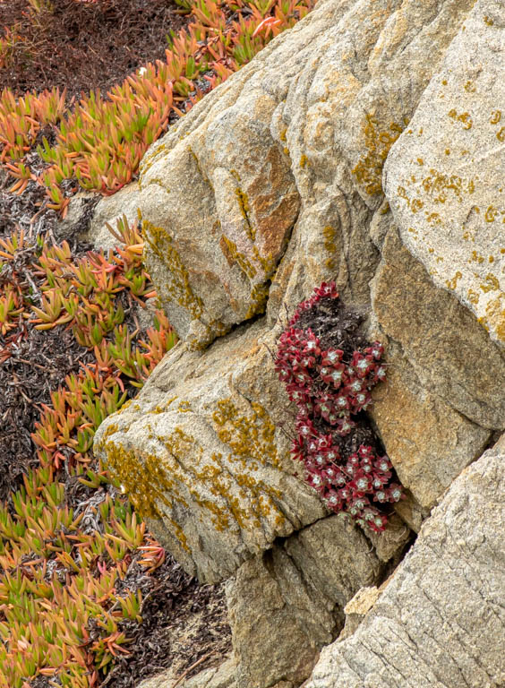
I believe you achieved your goal of capturing a perfect photo. The focus is sharp and I think the green background sets off the pink beautifully. You also faced a real challenge -- capturing the extremes between the darker greens and the nearly pure whites at the center. You did both well. The whites in the center are just bright enough that they are not blown out and even reveal the delicate pinks around them. You kept practicing to capture the perfect shot and were rewarded by an excellent image. |
Jul 5th |
| 22 |
Jul 17 |
Comment |
I enjoyed looking at this image. You mentioned that it was not too sharp. However, it looks sharp to me. I also like the slight blur of her hands in the air which depict the motion. I love how you captured her, really depicting her happiness, graceful motion and freedom of movement. You did a good job of cropping out some distractions from both sides. I can't think of anything to improve what appears to me an excellent shot. |
Jul 4th |
| 22 |
Jul 17 |
Comment |
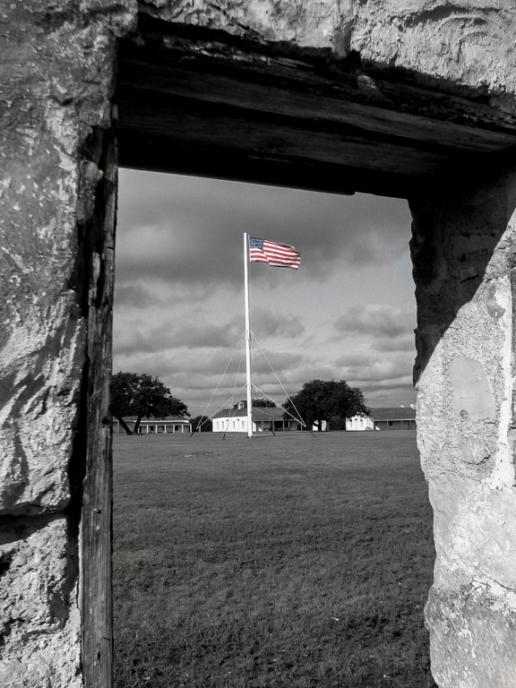
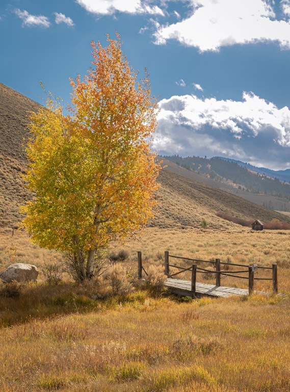
I enjoyed this abstract composition. I like the sharp geometric lines, the sky, the clouds and the building in the background. I think the exposure is especially good. You had a dark foreground which created an almost keyhole look outside. Your focus was also perfect. I did find the tree on the right disruptive to the nice geometric look you had created. I don't know if there was another angle you could have gotten to avoid the tree and I know you couldn't cut it down! So for the future, I suggest that if you have a great, modern geometric composition you try to avoid an object that seems out of place. |
Jul 3rd |
6 comments - 4 replies for Group 22
|
| 71 |
Jul 17 |
Comment |
Marla,
Congratulations on having one of your images selected for the Digital Showcase! What an honor...and what a nice photo. |
Jul 17th |
| 71 |
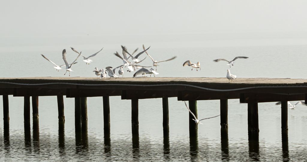
Jul 17 |
Comment |
I think you had a good eye for capturing this image. The water is a nice anchor for the foreground and the pier leads directly to the two figures at the end. Your note states that this was a Cuban couple and you wondered what they might be thinking. While this is a nicely composed shot, I would have never known it was Cuba unless I had read your note. So what I'm saying is that you did a nice job of getting a pretty travel photo. However, if your intent was something more, to cause the viewer to ponder the same question you pondered, you probably needed something to show that this is Cuba, rather than a pier that could be anywhere. I also think the composition, whether in Cuba, Florida or anywhere, could be helped by having the couple look at something besides the sky. If faced with a composition like this in the future, maybe you could find a place to stand that gives you a higher elevation so you could shoot over their shoulders and perhaps capture an object or scene that has more visual interest. |
Jul 12th |
| 71 |
Jul 17 |
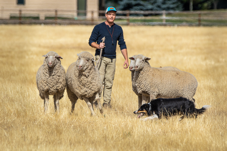
Comment |
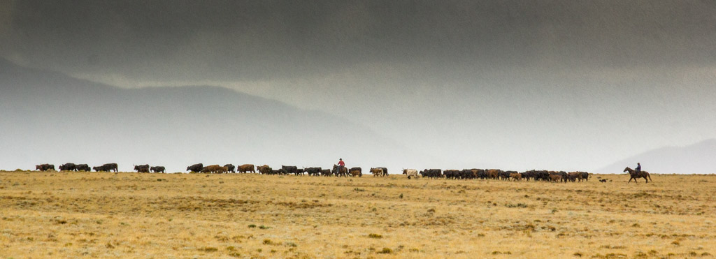
I enjoyed looking at your image. I think you did a good job of composing it. The three figures create a good focal point for the eyes and were perfectly placed in the lower third. The fact that they are looking toward the distant mountains helps carry our focus into the scene. The figures look very sharp and perfectly exposed. I believe the mountains lack contrast, as they seem rather "flat" to me. You might try bringing in a little more black in your processing as well as bumping up the contrast and clarity sliders a bit. |
Jul 10th |
| 71 |
Jul 17 |
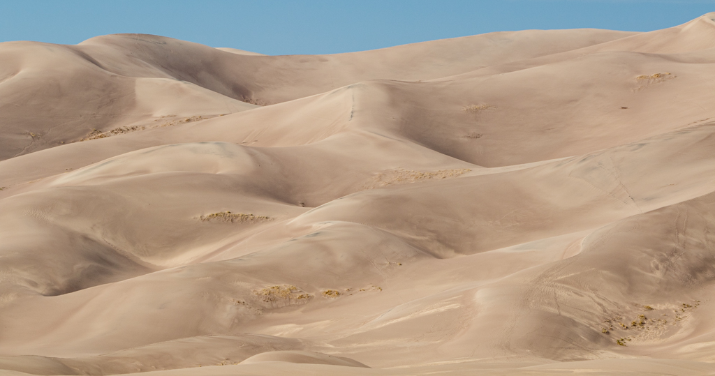
Comment |
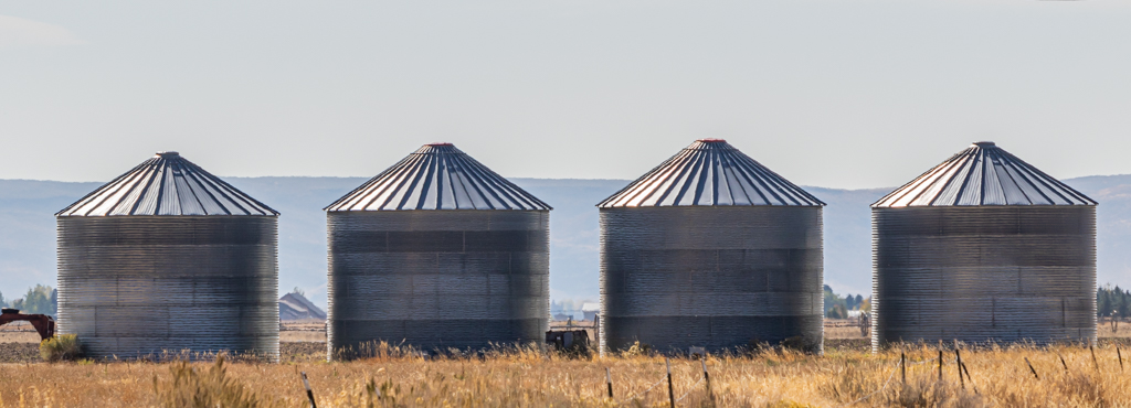
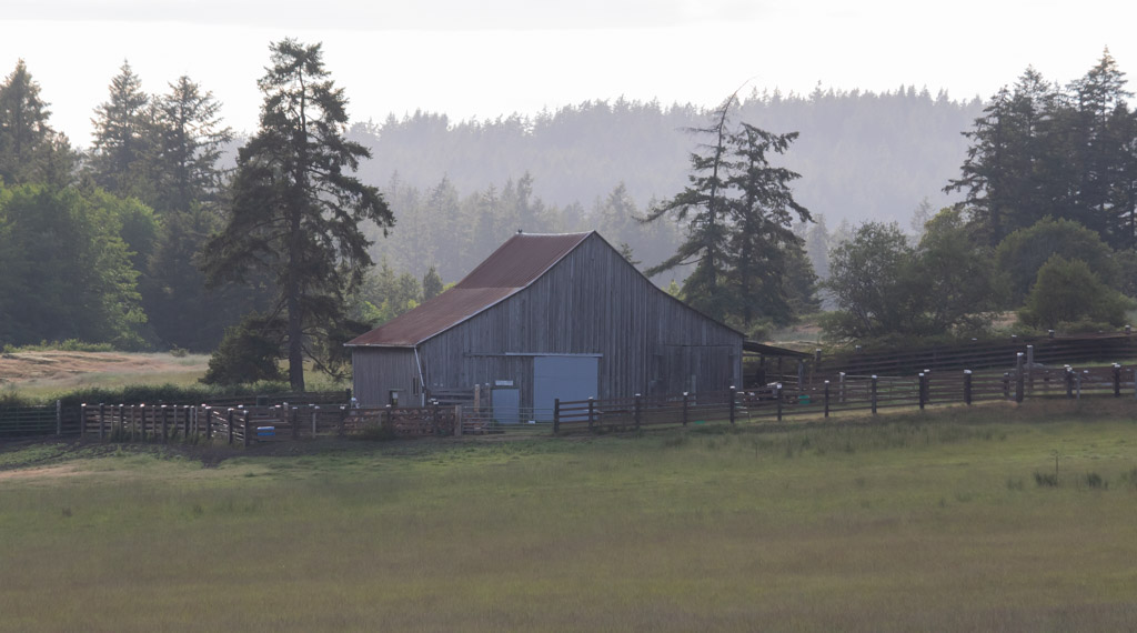
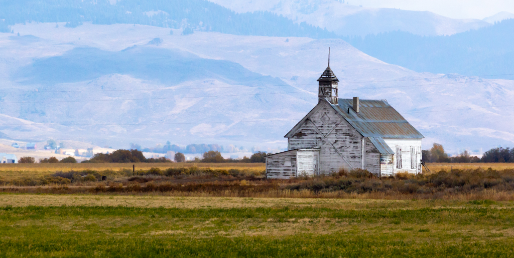
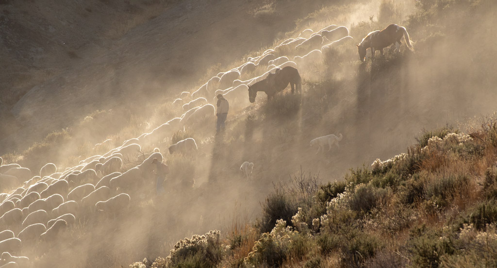
This is a lovely study in light, shadows and rolling hills. I agree that cropping is problematic here. If you crop too much, you'll lose the dynamics of the image, that is the shadows and light on the undulating countryside. However, I personally think you could crop from the bottom to right above that large gash in the hill at the lower right. It seems to distract from the tranquil setting you have captured. I think this might remove the unsightly gash while also keeping a nice focus on the grain elevators (?) and hills overlooking the town. |
Jul 10th |
| 71 |
Jul 17 |
Comment |
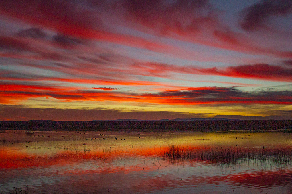
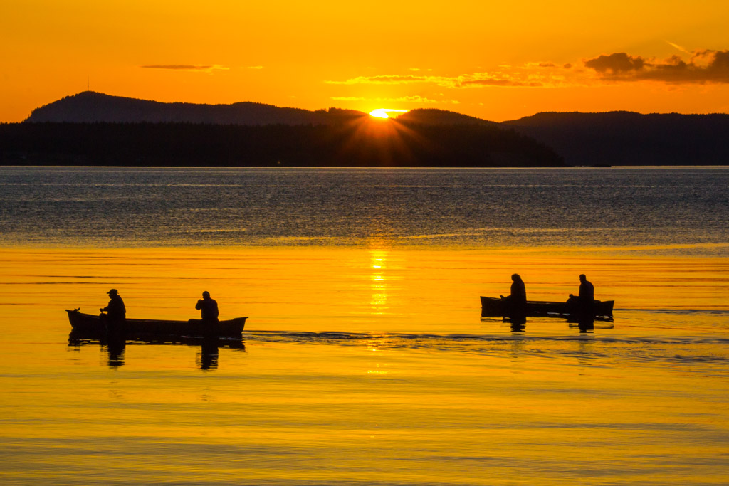
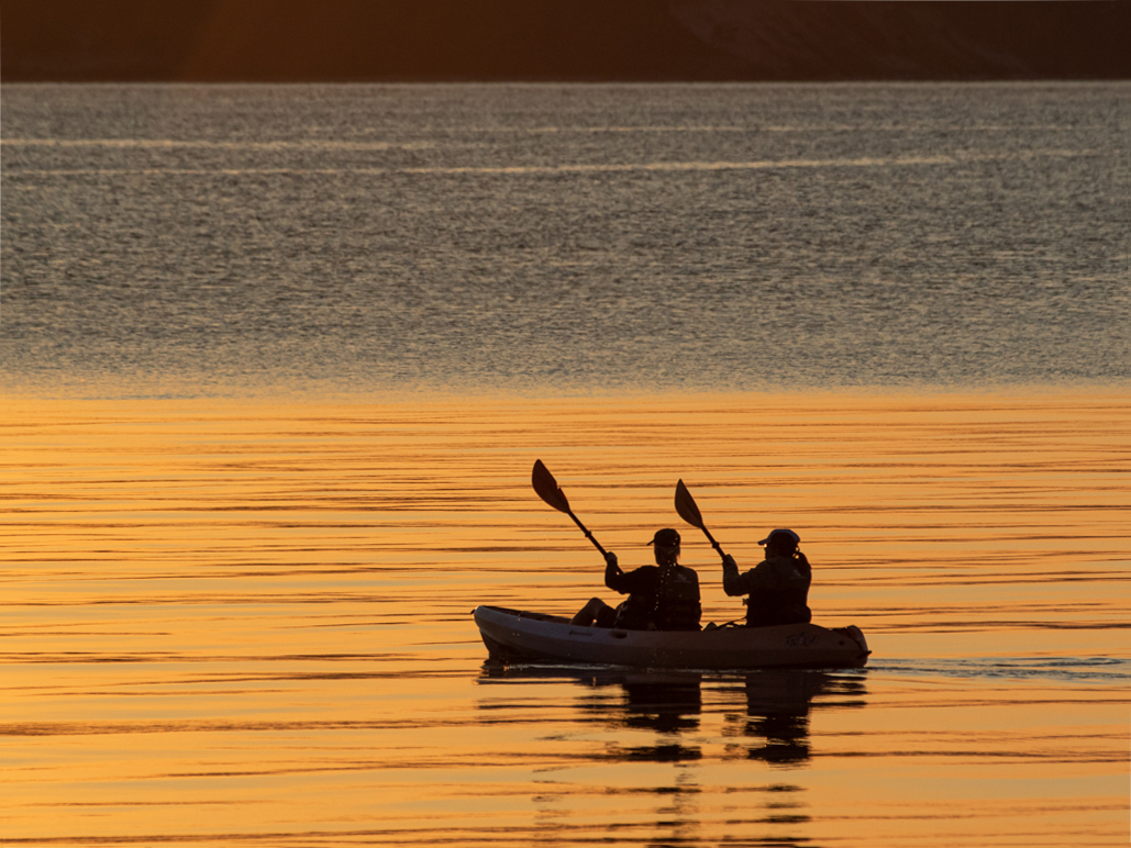
I think this is a gorgeous landscape shot. It almost appears like a tapestry. I like how the slope on the left anchors the shot, while the open space on the right leads across the river/lake to the distant horizon and rising sun. This, like your other shots, are so nicely done and a pleasure to look at that it's hard to find any way to suggest an improvement. |
Jul 10th |
| 71 |
Jul 17 |
Reply |
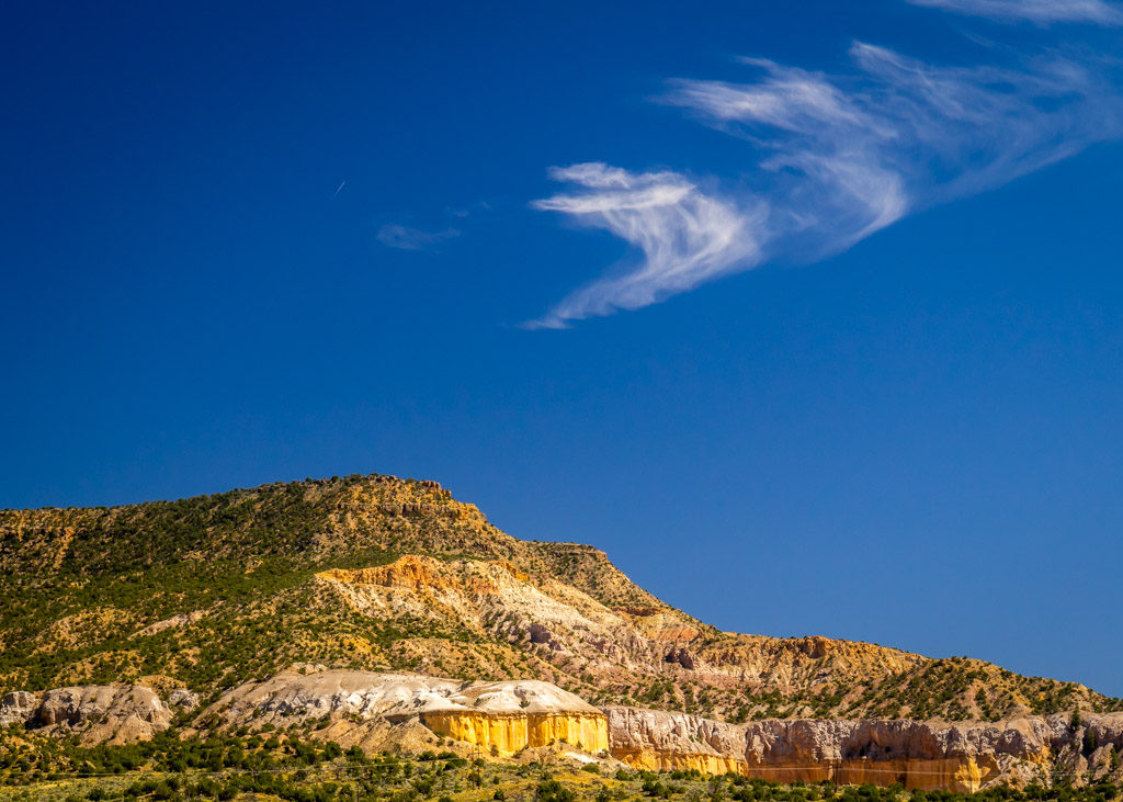
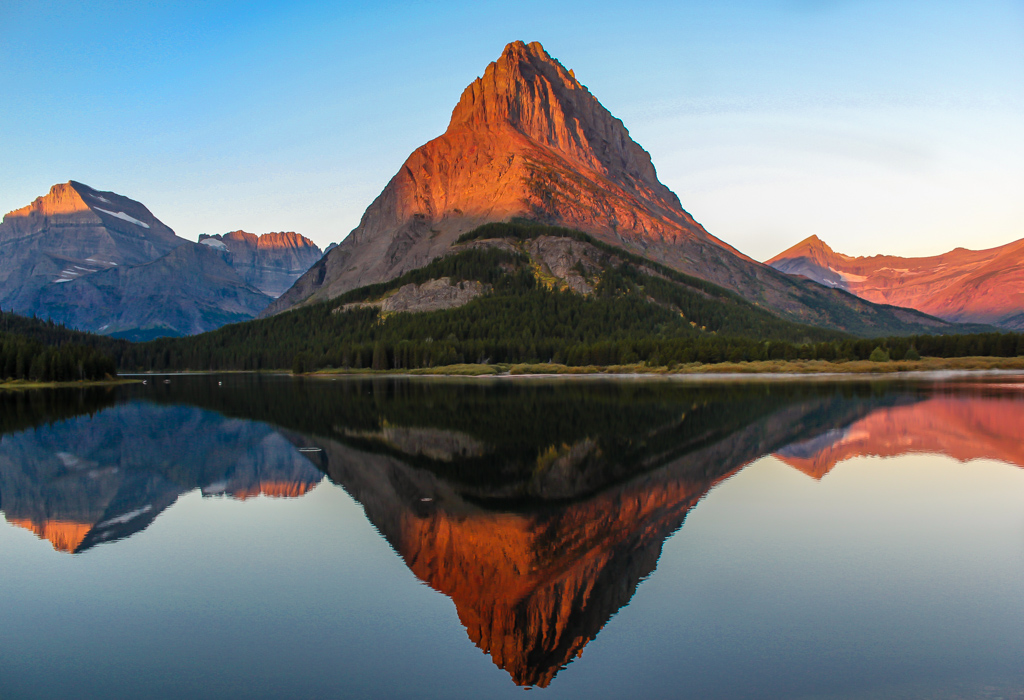
I voted for more sky because in New Mexico the sky is as much the star as the landscape. There is nothing in the world like the deep blue and fluffy white clouds there. Ansel Adams, who took many famous photos there, even began to lower his lens so that the landscape occupied about the lower third of his photos and the upper two-thirds featured the beautiful clouds and sky. |
Jul 10th |
| 71 |
Jul 17 |
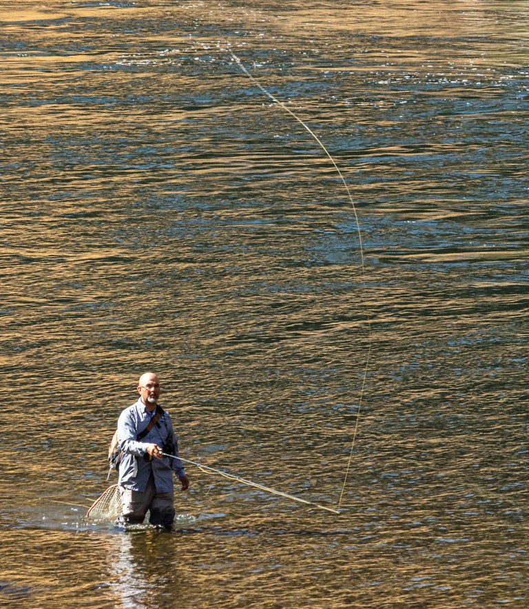
Comment |
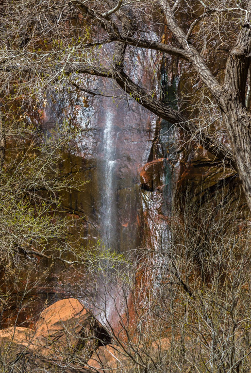
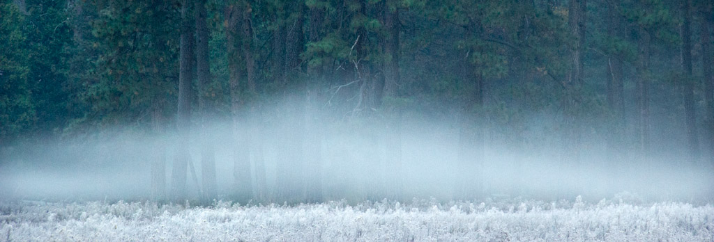
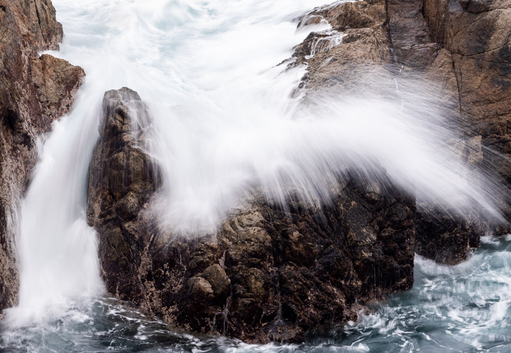
I think you did a good job of composing this shot. I like the way the water in the foreground creates a line to the upper falls. You also did nice work in getting just the right shutter speed to present an almost velvet-looking flow over the rapids and falls. Your focus was also perfectly sharp, from front to back. The image did strike me as too crowded. I wished there was more breathing space on the sides, which would have avoided the rocks and brush in the foreground looking chopped off. Maybe this doesn't affect others but this is just feeling I had when I looked at this. |
Jul 6th |
| 71 |
Jul 17 |
Comment |
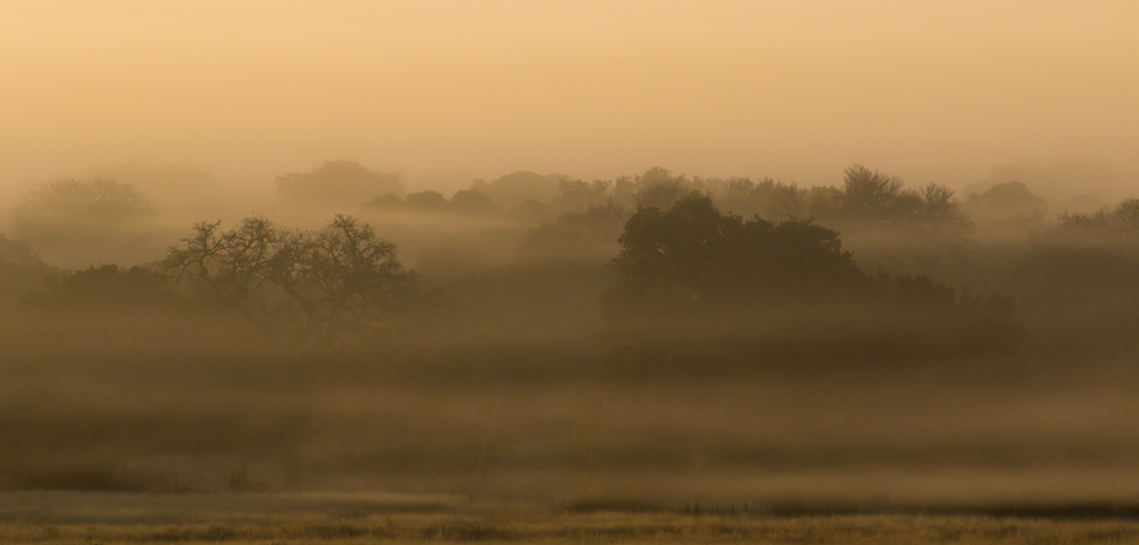
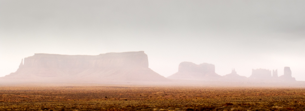
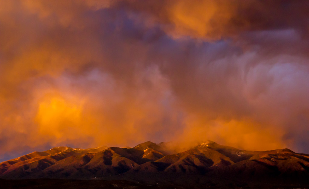
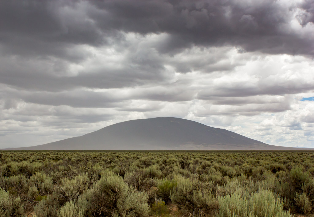
I forgot to mention that what appears as haze on the mountain is actually light rain, thus the problem in using the dehazing tool in Lightroom. Just so you'll know.... |
Jul 3rd |
| 71 |
Jul 17 |
Comment |
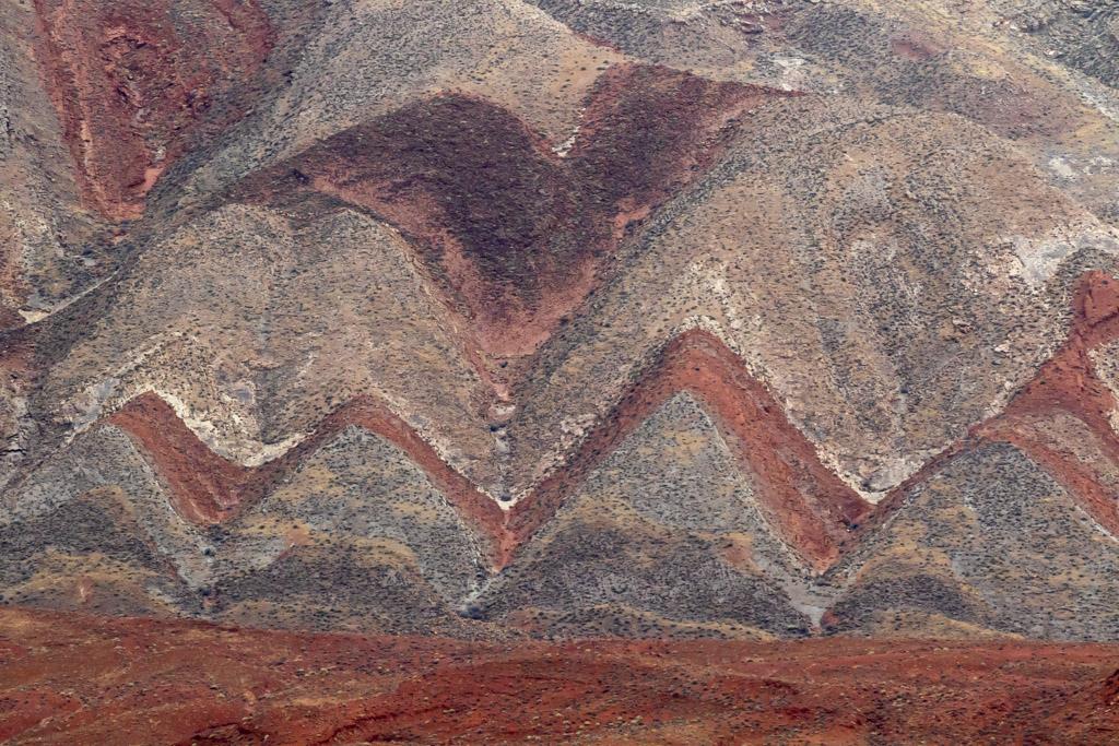
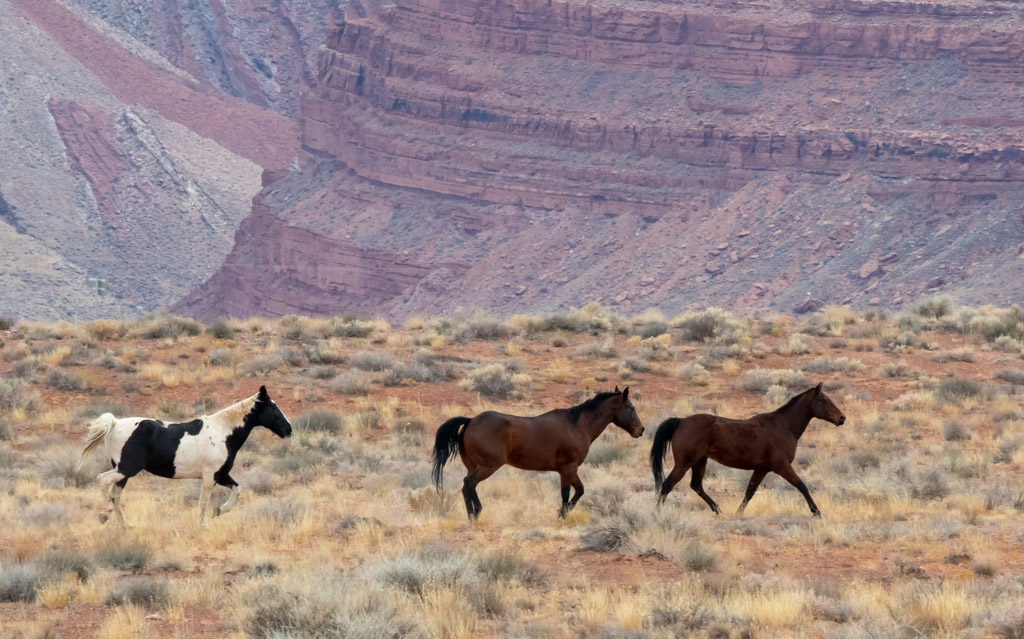
I agree that this is the model New Mexico scene -- the wide valleys, high bluffs and irrigated fields along the rivers. I enjoy how you illustrated the expanse of such a scene and captured the myriad of colors it presented. A couple of suggestions that, in my opinion, might strengthened these images in the future (especially since you live in there and have such wonderful opportunities to capture these shots!) First, your white balance looks off to me, giving the image too much of a brownish tint, especially the junipers in the foreground. Second, I suggest you try to find a focal point of the photo that answers the question, "What am I looking at?" Maybe you could zoom in more on the horses or the farms, perhaps there was something you could use in the foreground, and then use the expanse as a background. It looks like you were on an elevated roadway, overlooking the valley. Maybe you could tilt your camera up, cut out the trees in the foreground, zoom in on the cliffs in the background and capture the wonderful sky. Anyway, I wasn't there so I don't know exactly what you had to work with. My suggestions are simply general ways to approach such scenes in the future. (By the way, it does look like you got a nice sharp focus throughout! I know you've been working on that. Congratulations!) |
Jul 2nd |
8 comments - 1 reply for Group 71
|
14 comments - 5 replies Total
|