|
| Group |
Round |
C/R |
Comment |
Date |
Image |
| 22 |
May 17 |
Reply |
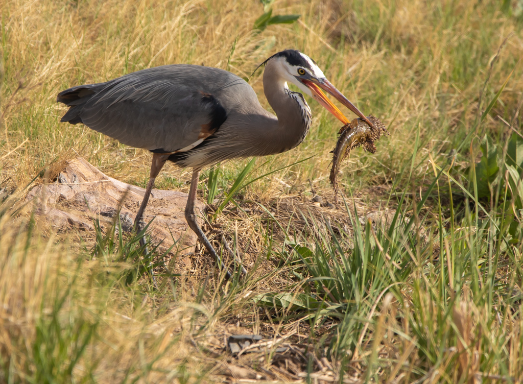
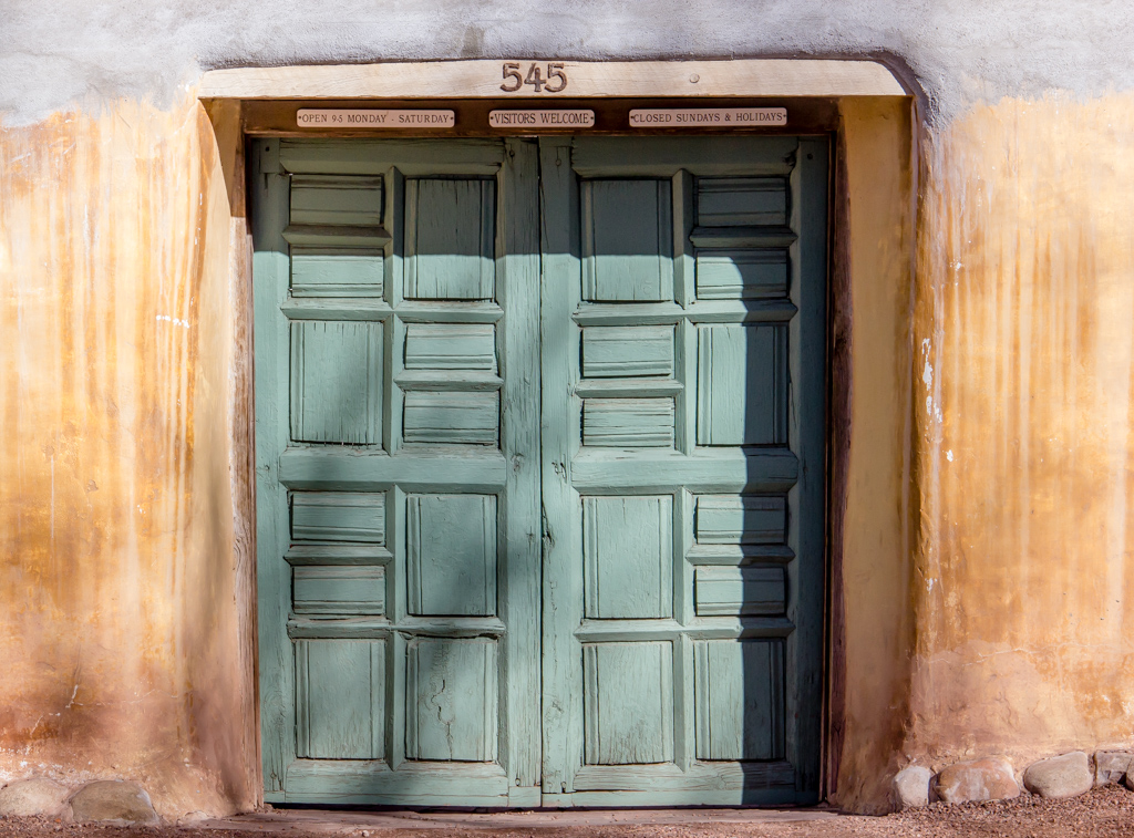
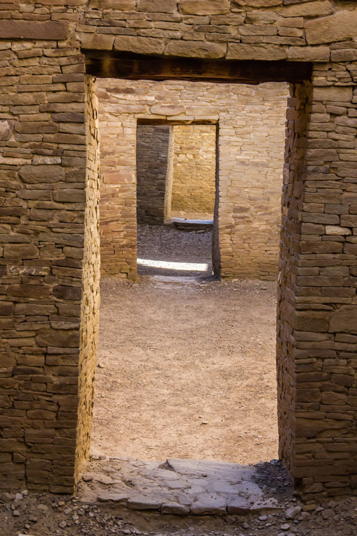
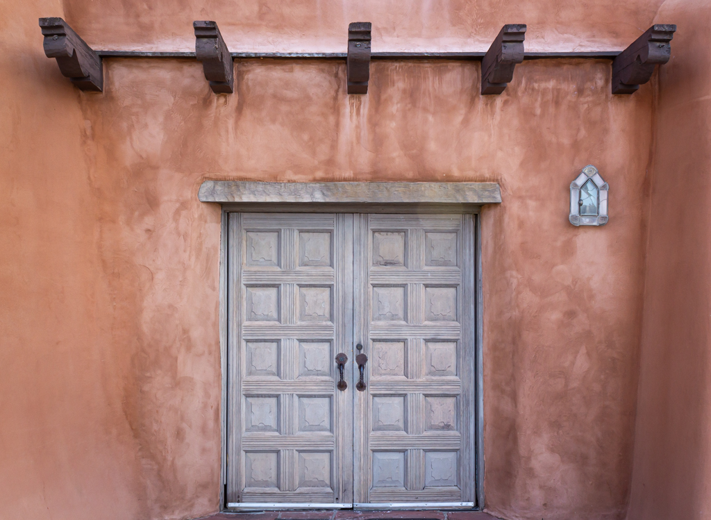
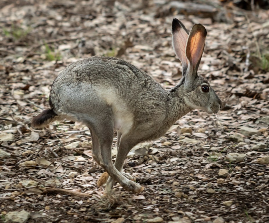
Thank you for your generous comments. I'm 6'1" and had to bend in half to make it through these doorways. I'm guessing they were probably 4' to 4.5' tall and about 2-2.5 feet wide. A couple of other doorways were so small I had to crawl on my hands and knees to squeeze through. Obviously, these people 600 years ago weren't quite as stout as we are today.
|
May 16th |
| 22 |
May 17 |
Comment |
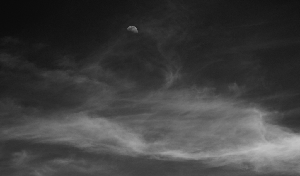
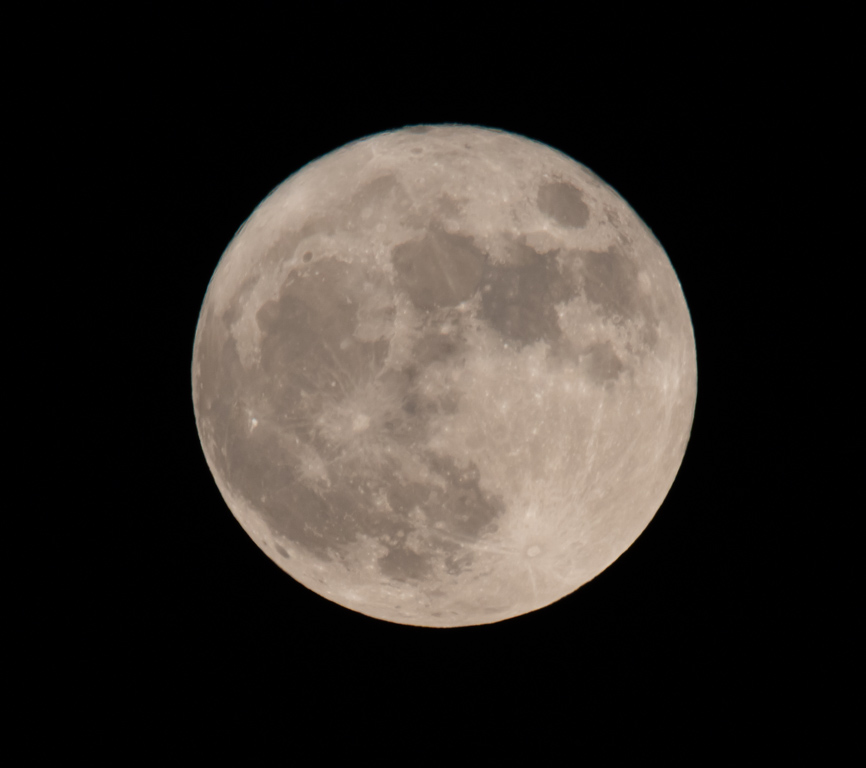
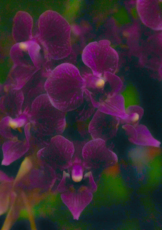
I like this composition and think you've done a good job. In my opinion, her face in the revised version might be slightly overexposed, losing some of the rich brown colors that made the original so attractive. I'd also rather see the moon a little closer to her. Seems like they are too disconnected. These are minor points, however. I like what you've achieved here. |
May 14th |
| 22 |
May 17 |
Comment |
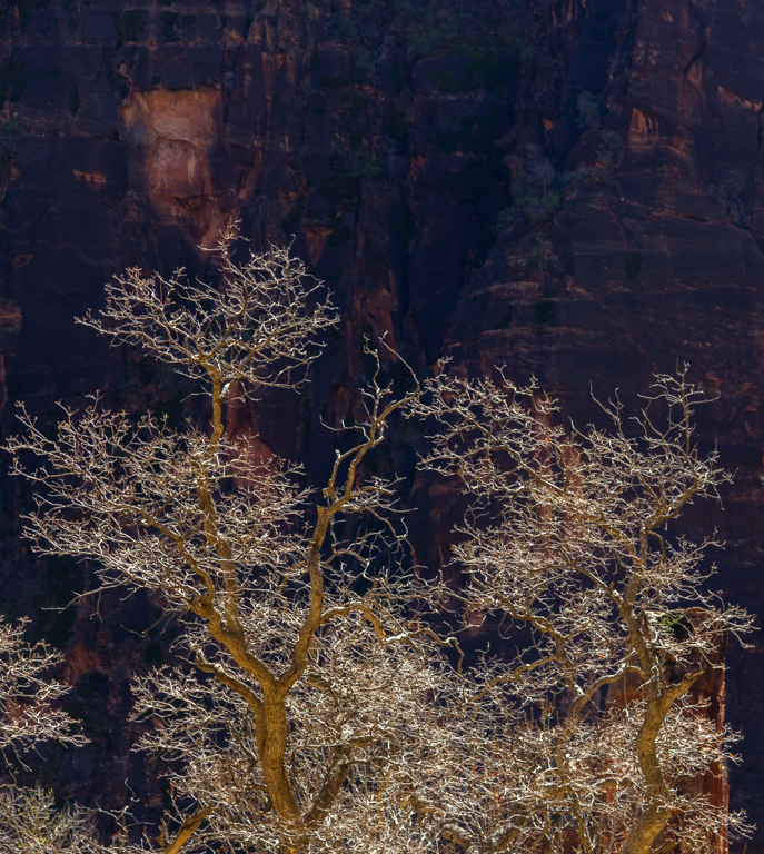
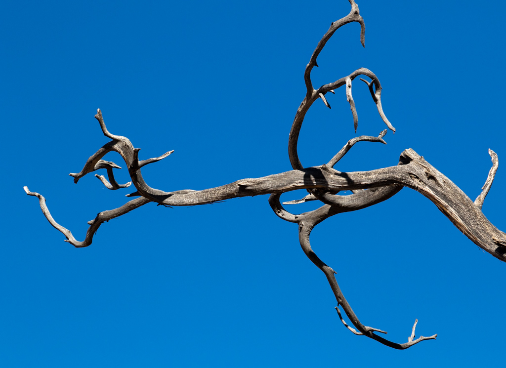
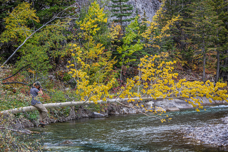
Several things I think are done well here: First, you've done a nice job of warming up the image from the original. Second, I like the sharpness from the foreground to the background. And third, I think the exposure is perfect. I also think the composition is good, with the tree drawing the eye into the photo. From a subject matter standpoint, however, I didn't find this interesting enough to motivate me to stay here more than a few seconds. Unfortunately, to me it looked like another dead tree in a forest. I think the idea behind this composition is good, but I believe it could be improved if you could find a similar subject with something to add some drama, or better point of interest. |
May 14th |
| 22 |
May 17 |
Comment |
I love this image. Although the bridge cuts it in half, the composition seems perfect to me. Since I know next to nothing about Chicago, I look at this not as a cityscape but as an abstract array of forms, textures and colors. The wall to wall line up of the buildings in the background is fabulous. In fact, I don't see them as buildings. Rather they seem like hundreds of tiny geometric shapes. You also did an excellent job in your processing to warm up and enhance the colors. |
May 10th |
| 22 |
May 17 |
Comment |
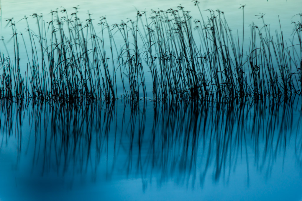
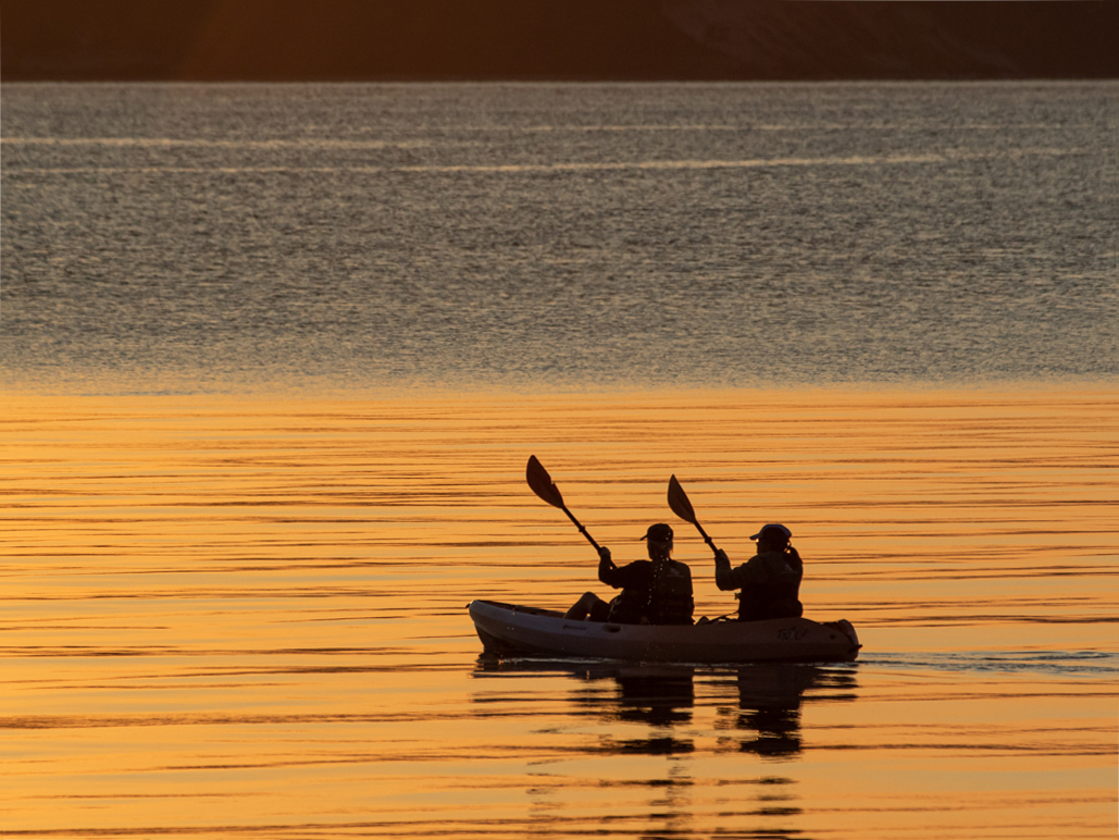
Initially, I thought I liked the softer, muted tones of the revised version the best. But after reading Marti's and Peggy's comments, I vote for the Original 1. I think Peggy nailed it: the gold tones make this image shine. Overall, the shot is nicely composed and creates a pleasant, serene feeling. |
May 10th |
| 22 |
May 17 |
Comment |
I think this is an incredible image, due largely to your post-processing work and that fact that you had three crazy guys willing to jump off a bridge. You've done a fantastic job here. Can't think of a thing to improve this one. |
May 8th |
| 22 |
May 17 |
Comment |
I am very impressed by your street photo. Your work during post-processing definitely paid off. Several aspects to comment on: First, I think you did a good job of cropping, especially from the right and removing the extraneous window sill. I also like your composition and how the road and lights lead into the image. Second, the work you did to enhance the blue of the car parked along the curb was well done and helped give the shot some added vibrance. And third, the people talking in the background bring this photo to life. The focus and exposure were also right on target. |
May 3rd |
6 comments - 1 reply for Group 22
|
| 71 |
May 17 |
Reply |
Thank you for such a nice compliment. I really appreciate it. |
May 28th |
| 71 |
May 17 |
Comment |
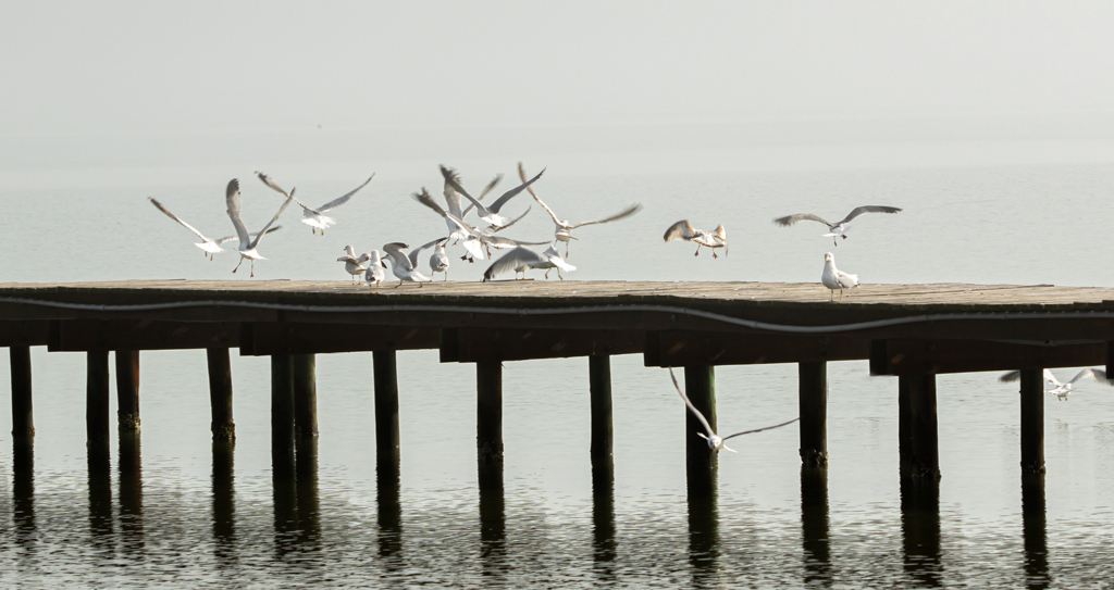
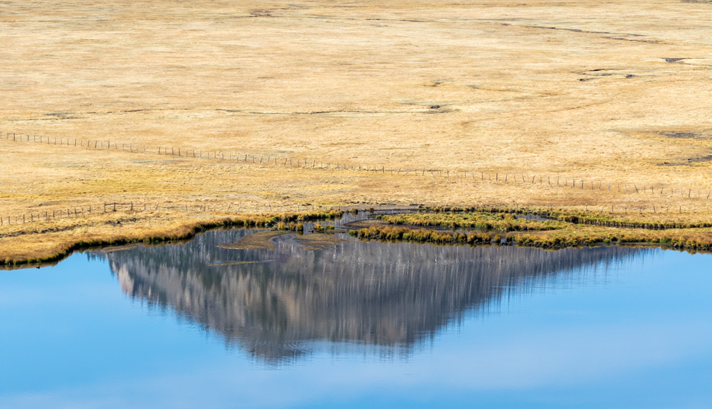
It's always wonderful when we try new techniques (using ultra-wide angle lenses) and seeing how well the images turn out. It's like opening an entirely new way of visualizing images. Your wide-angle lens, and shooting close to the ground, was the perfect way to capture this image. This is definitely one that motivates me to linger. A couple of things to check: Obviously, the smug mark in the upper left hand corner needs removing. The brightest parts of the clouds may be clipped, that is they are overexposed and have lost any detail. This is easily fixable by lowering the highlights in your processing program. You can also lower the highlights by painting with an adjustment brush. Just make sure that the reflected clouds in the water are lower too. You don't want the reflections brighter than the sky. A wonderful job! I hope you continue to try more of these ultra-wide shots. |
May 14th |
| 71 |
May 17 |
Reply |
Good suggestion. Thank you. |
May 10th |
| 71 |
May 17 |
Comment |
Your images always seem so bright and colorful. I'm somewhat envious that you have such a kaleidoscope of beautiful subjects to shoot. Technically, I believe you've done a perfect job here -- the exposure is exactly right and the focus, from the foreground to the distant buildings, is perfect. I also think you've done a fine job of composing this one -- the water brings the eye directly to the purple "palm" (I'm glad you explained what it was!) and then to the soaring buildings and lights in the background. I also like how the blue water is balanced against the blue sky. Another outstanding photo. |
May 10th |
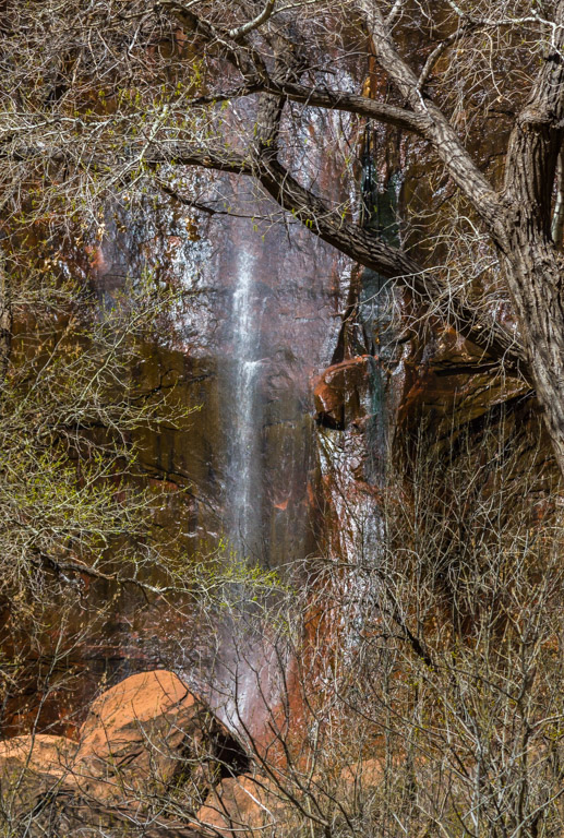
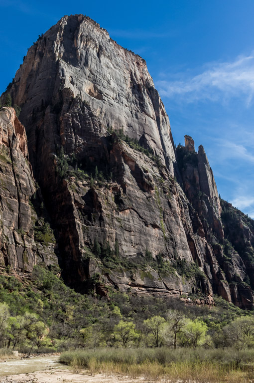
| 71 |
May 17 |
Comment |
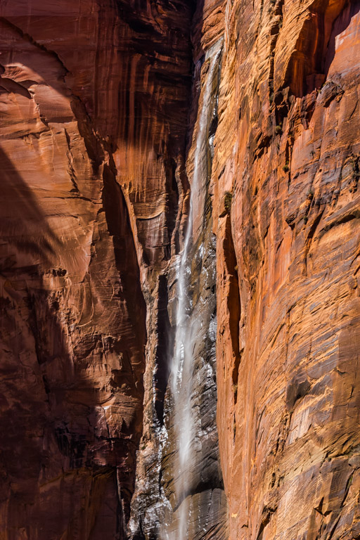
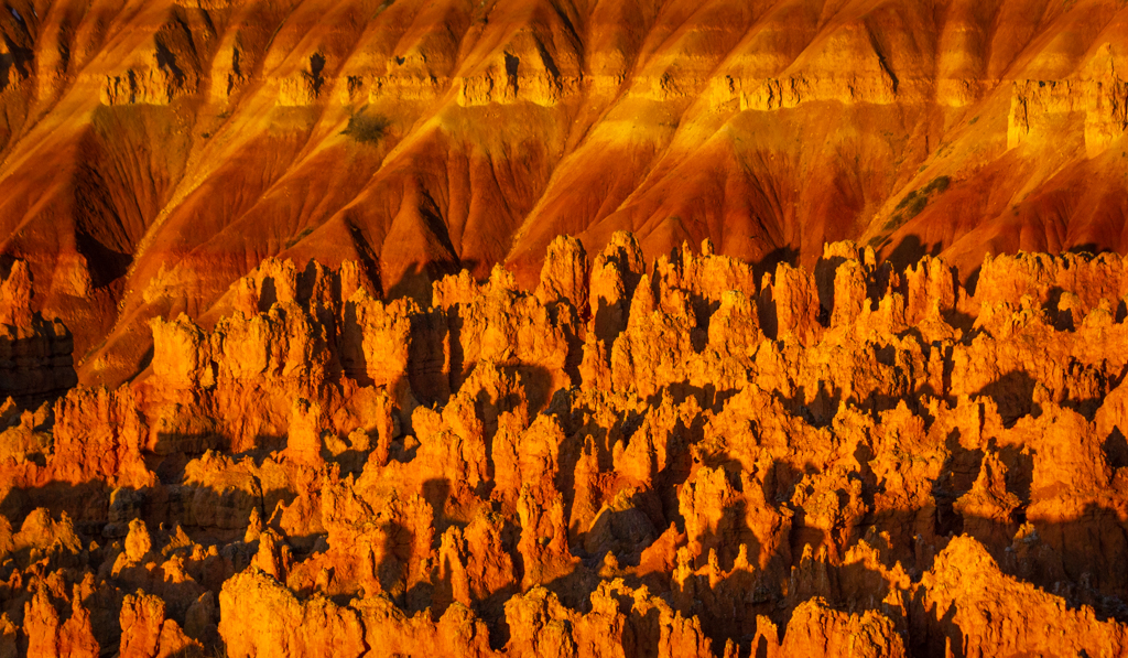
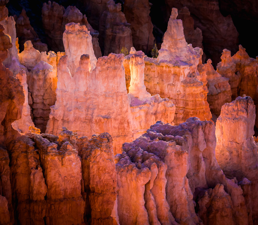
We were in Zion and neighboring Bryce Canyon just last month. They are both beautiful parks. In your case, you caught a nice morning glow on the canyon walls. I imagine this was a difficult shot, since you had an extreme difference in contrast between the darker shadows in the foreground and the bright sunlight hitting the walls. This is nicely composed. The valley in the foreground leads to the golden colors in the background. I think you could crop a little off the bottom to remove the extraneous brush. This also seems a little over-saturated to me. Since you are planning to return soon, I suggest either a morning or late afternoon photo outing where you can catch the shadows along the canyon walls. The sunlight striking the walls in this particular image makes it appear rather flat. Looking for an opportunity to utilize the shadows will, I think, give your images more depth, contrast, perspective and texture. |
May 10th |
| 71 |
May 17 |
Reply |
You actually don't need a specific object to focus on about a 1/3 of the way down. Just pick a spot on the road. See if that helps. |
May 10th |
| 71 |
May 17 |
Comment |
I think this is a lovely shot. The purple azaleas (I assume) and road drew me into the image. I could definitely picture myself in the scene. I also like how the trees provide a nice canopy. The far end appeared to be a bit soft in the focus. You had an extremely sharp f-stop at f25, so I'm wondering if you might need to adjust the exact point you focus on. In extreme depth scenes like this, it's usually about one-third of the way in. I also feel like there should be a stronger focal point at the end of the road -- a house, a person, an animal, a colorful tree. Bottom line, I think you've done a very nice job. I think it would look great framed in your office. |
May 8th |
| 71 |
May 17 |
Comment |
In my opinion, this is a perfectly composed image. The lines of the creek draw the eye directly toward the covered bridge. I like the grayish clouds, which seem to fit perfectly with the grayish colors of the bridge. This presents a nice balance. The green grass on the right bank seems a bit over-saturated for my taste, but perhaps that's exactly the way it appeared. I did like the reflection of the bridge in the water. However, I thought the reflections in the foreground were distracting. Perhaps a polarizing filter might help reduce those reflections while still giving the reflections you wanted from the bridge. I think you had a very sharp focus throughout and a perfect exposure. |
May 8th |
5 comments - 3 replies for Group 71
|
11 comments - 4 replies Total
|