|
| Group |
Round |
C/R |
Comment |
Date |
Image |
| 34 |
Apr 26 |
Reply |
Thanks Steve. I hadn't heard of him so I looked him up. Really interesting work. Kinda trippy. |
Apr 13th |
| 34 |
Apr 26 |
Reply |
Thanks Bob! |
Apr 13th |
| 34 |
Apr 26 |
Reply |
Valid point, especially since you made such a conscious choice. |
Apr 13th |
| 34 |
Apr 26 |
Reply |
You are absolutely right Bob; I should have used a dark pink brush rather than a gray one for the shadow. I was thinking it wouldn't be noticeable enough with pink. Your edit helped the bottom of the vase surface look a little more contoured, which worked well. But to my eye it still needs a shadow under the bottom to keep it from looking like it's floating. Just me being nit-picky. |
Apr 13th |
 |
| 34 |
Apr 26 |
Comment |
Another wild and crazy image, Steve. Keeping the glasses and right eye pretty much intact grounds the image just enough to help the viewer figure out that there is a face at the center. Love all the bright colors. Is there any way to regain the color burst in the large upper right black area? That would be my only suggestion. |
Apr 4th |
| 34 |
Apr 26 |
Comment |
This is a wonderful triptych Frans. You did a great job of photographing the dancers. I like the center one being in focus so the viewer can tell what we're looking at in the other two. The bright colors and movement are fabulous. I agree with Sylvia and Angela regarding the feet; they should all be on the same plane and the center one needs a spotlight on the feet like the other two. The living room setting is very cozy and warm, but I feel like it distracts from all the work you did on your triptych. As a photographic project, I think the emphasis should be on the beautiful cultural story of the dancers. |
Apr 4th |
| 34 |
Apr 26 |
Comment |
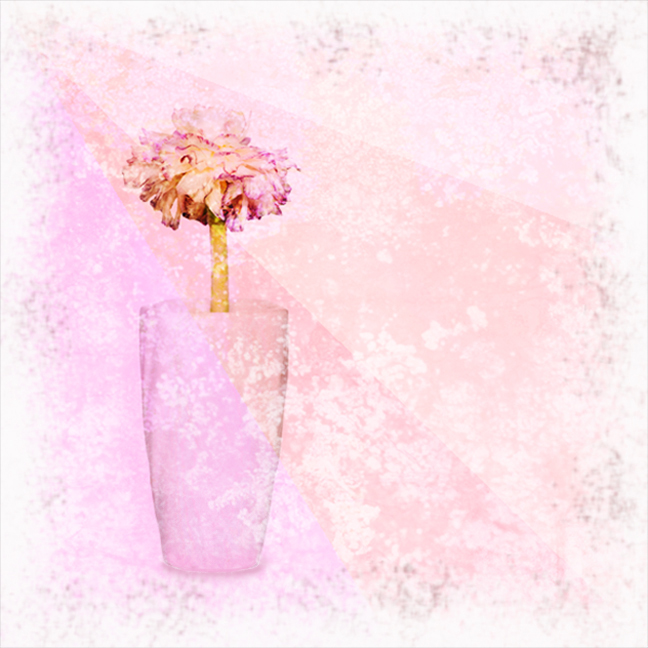
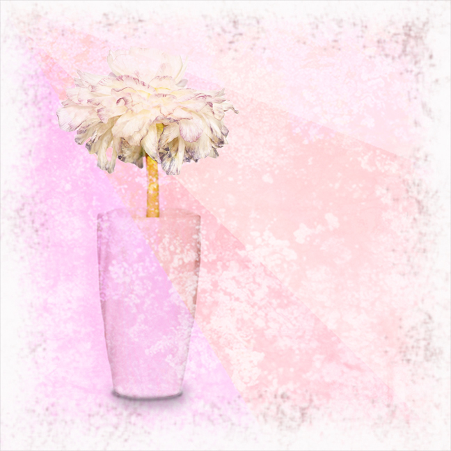
Hi Sylvia. This is a very nice image for April and Springtime. Your high key original is really lovely too. The blossom is especially pretty in the original, with its ruffled colorful edges. I think the texture you used in your final adds a lot to everything except the blossom; it seems to have made it look withered and dry. You could have used a layer mask to remove the texture (or part of it) on just the blossom. Are you familiar with layer masks? I agree with Angela regarding the vase needing a slight shadow to ground it. I played with your final to illustrate. I enlarged the blossom, removed most of the texture from it, and painted a shadow beneath the vase. |
Apr 4th |
 |
| 34 |
Apr 26 |
Reply |
Might be interesting to have a face shot of Dorinda function as the "over-seer" in the sky area rather than an AI one? |
Apr 3rd |
| 34 |
Apr 26 |
Comment |
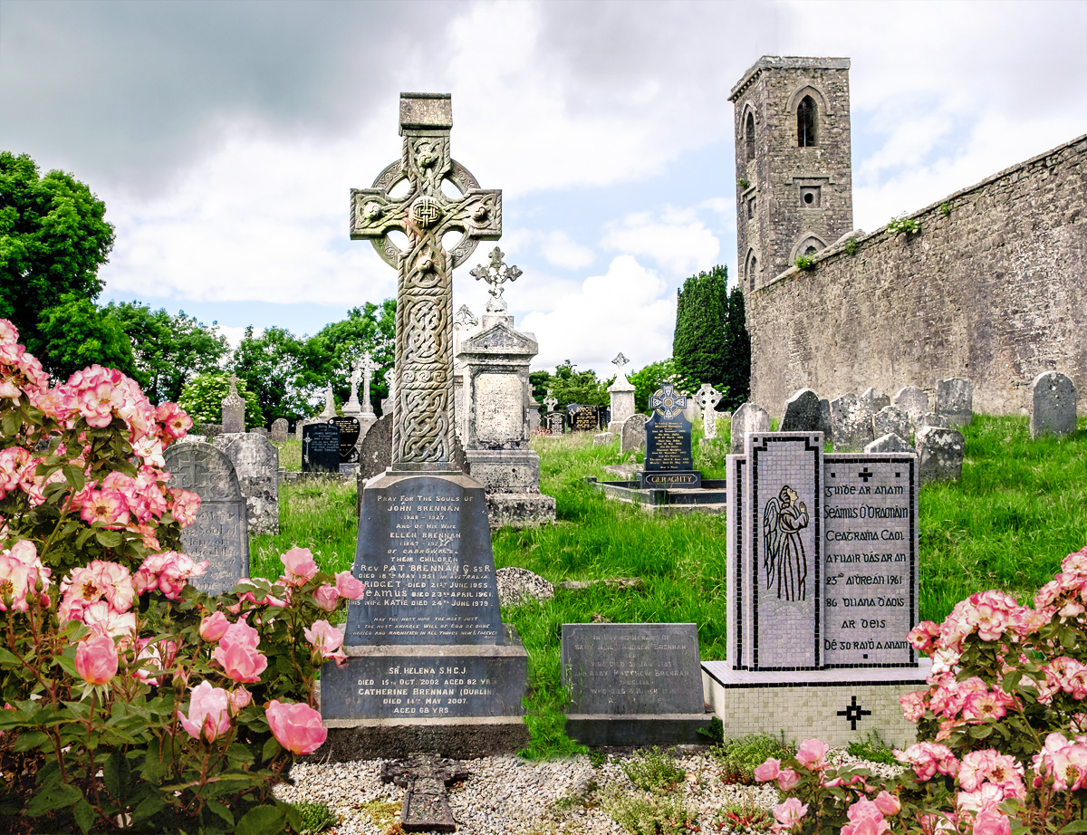
This is a good practice composite Bob. The cemetery is so interesting and mystical on its own, so starting there was a good idea. The roses also add interest, but I agree that they're a bit too saturated for the rest of the image. I hope Dorinda won't take it personally, but I kind of feel like she's a distraction from all the wonderful intricate headstones and crosses. And the dead plant at the center bottom keeps pulling my eye, even though it's dark. I'm glad you used AI to generate the top of the cut-off tower, and I really like the oil paint texture and face that you added at the top. I tried seeing what it would look like with just the cemetery and flowers; I brightened it up some so the wonderful details popped a bit more. I visited Ireland several years ago and it's absolutely one of my favorite places I've ever visited. Irish Dreams, for sure. |
Apr 2nd |
 |
| 34 |
Apr 26 |
Comment |
This is a real crack-up Angela. The faces are all so cute and well drawn; did you use a stylus or a mouse to draw them? That would have taken me forever! I think brightening the broken egg white/yolk might help it stand out a bit more. This is a fun, creative image. Well done! |
Apr 2nd |
| 34 |
Apr 26 |
Reply |
Thank you Angela. It was really just a matter of using the quick selection and polygon selection tools to cut out the pieces from the various texture photos and dragging them onto the tan background image. Then placing them where I wanted them and changing the blend mode and/or opacity on some of them so they showed through other pieces. That creates a lot of layers, of course, so sometimes it gets kind of tricky to keep track and manipulate the layers. But that becomes easier with practice. |
Apr 2nd |
| 34 |
Apr 26 |
Reply |
Thanks Sylvia! Yes, I like the more defined lines and textures too. |
Apr 2nd |
5 comments - 7 replies for Group 34
|
| 77 |
Apr 26 |
Reply |
Thanks Georgianne. I find it very relaxing to play with various filters. You just have to be prepared for a few "duds" before finding a "winner" with perseverance. |
Apr 17th |
| 77 |
Apr 26 |
Comment |
Beautiful subject: check! Odd number of subjects: check! Diagonal leading lines: check! Very well photographed and processed. I like the revised color temp of the background. I also like the brightening of the blossoms, but I wonder if taking that one more step might be even better? Lovely spring image, Denise. |
Apr 11th |
| 77 |
Apr 26 |
Comment |
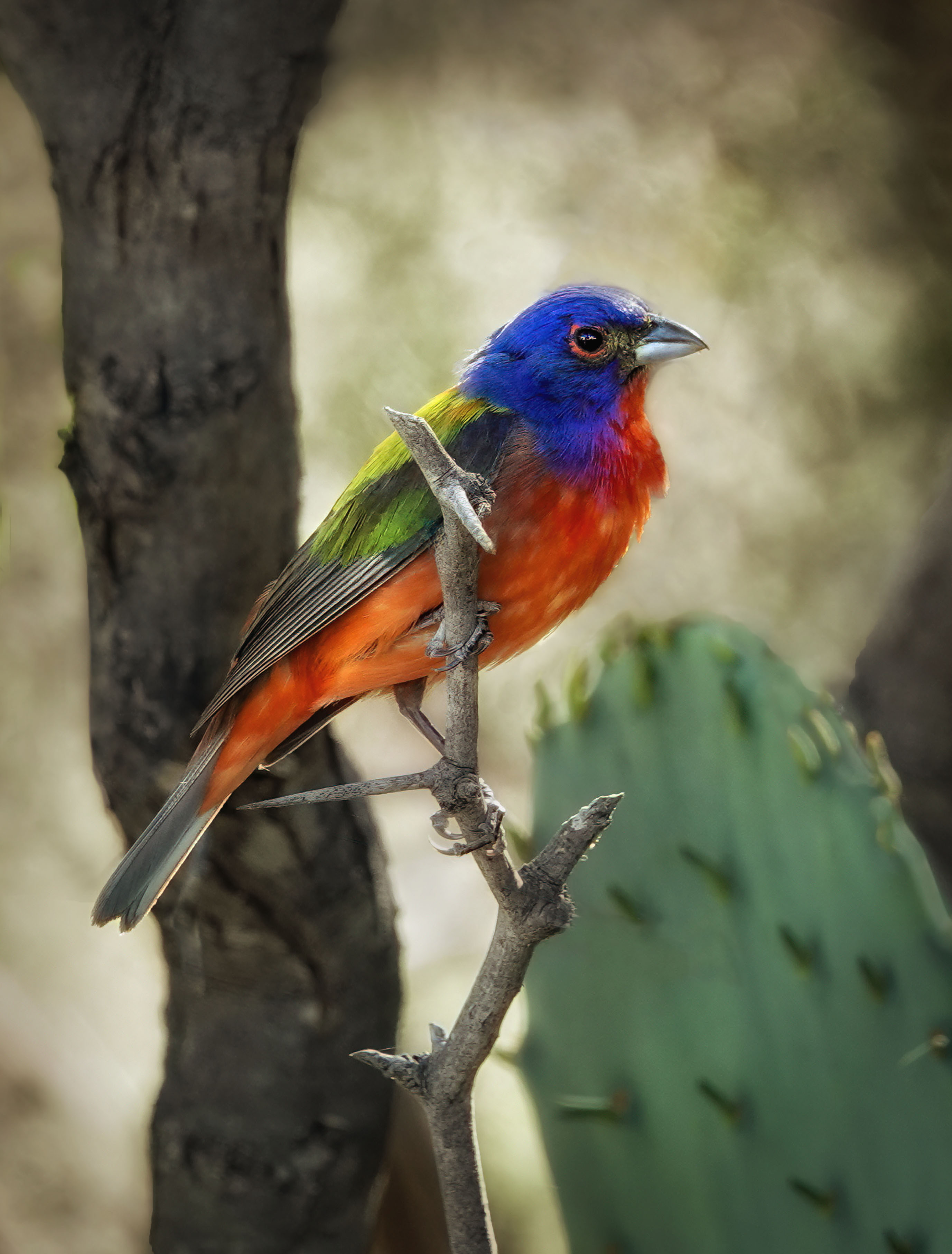
What a pretty bird; such beautiful colors. You did a great job photographing it with a nice sharp eye and catch light. You said you cloned out a tree in the background and I'm wondering if that made the top of the head a little blurred on the outside edge? If you're able to bring back the sharpness there, that would be one suggestion. It also seems to me the bird needs even more dodging and a vignette might bring attention to it even more. The thorn right below the bird catches my eye since it's so light. An overall warmer tone might give more of a feeling of sunshine and warmth and complement the orange feathers. Just a couple of thoughts that popped into my head as I viewed it. Good luck with your entry! |
Apr 11th |
 |
| 77 |
Apr 26 |
Reply |
Thanks Denise. There is a lot going on for sure. I cropped out quite a lot, but maybe even more would be better. |
Apr 11th |
| 77 |
Apr 26 |
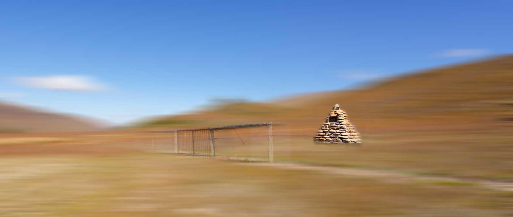
Comment |
I like this Mary! You applied just the right amount of motion blur and keeping the cairn in focus and the fence in partial focus worked well. I do like Denise's crop to eliminate some of the less interesting parts. I even wondered if a little less sky might bring more attention to the cairn and fence, so I tried it. Once I'd gone that far, I decided to enlarge the cairn a bit. I also burned the shadows and dodged the highlights on it a bit. I'll ask the same question as Denise: does this still catch your intent? Or did I go too far? |
Apr 11th |
 |
| 77 |
Apr 26 |
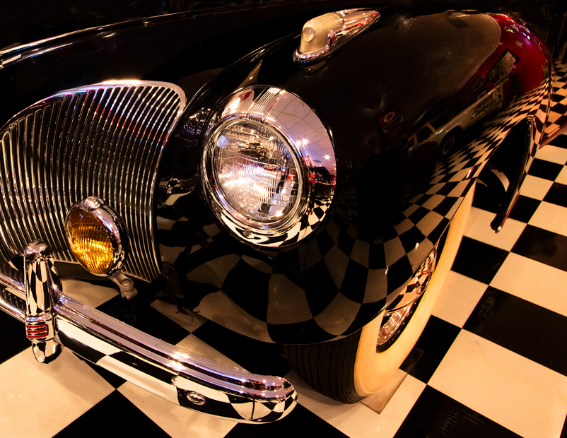
Comment |
You did do a very nice job of getting rid of the cluttered background; good for you for not giving up! The first thing I noticed when I looked at it was the interesting reflection of the checkered floor on the side of the car, so I wondered if zooming in on that feature might simplify the clutter and accentuate the positive. I cropped off most of the background, eliminated the blue highlight Denise noticed, and used the healing brush to get rid of quite a few spot highlights. I cloned the plain black areas of the car over the hood area to make it appear shut rather than open. Just a little different perspective on your beautiful interesting car shot. |
Apr 11th |
 |
| 77 |
Apr 26 |
Comment |
Great image Carol. The original is very nice, but you took it to a much higher level with your edits. Taking out the tattoo helped a lot; her skin tones are soft and radiant; the lighting is beautifully dramatic. The new background frames her much nicer than the original. Well done! |
Apr 11th |
5 comments - 2 replies for Group 77
|
10 comments - 9 replies Total
|


