|
| Group |
Round |
C/R |
Comment |
Date |
Image |
| 20 |
Mar 26 |
Comment |
Interesting image Sylvia. It looks like she's falling into her final descent, I guess because of the blur. Making the background B/W was a good idea. The signage on the upper right grabbed my eye and kept drawing me back to it, so I would suggest cloning it out or using the remove brush (if you use PS). Bob's version manages to blur it out effectively. I agree that the third figure might work better a bit higher up. I bet it was fun to take photos in an almost empty mall. You envisioned this image well. I look forward to seeing your creative images in Group 34 in the future! |
Mar 16th |
| 20 |
Mar 26 |
Comment |
You did a really good job of bringing out the details from your original shot, Angela. The red, foggy atmosphere was a really good idea. I like the addition of the red eyes and "headlights" too. Even though you have an even number of subjects, it works well because you placed two smaller ones on the left side and three on the other side. My only suggestion would be to maybe try making the progression of the sizes more noticeable. Or it might also look cool to add several more aliens and have them tapering off in size and opacity into the distance, to add to the concept of "marching" and menacing invaders. |
Mar 16th |
2 comments - 0 replies for Group 20
|
| 34 |
Mar 26 |
Reply |
But if the tree was in the foreground, it would be much larger than the buildings in the distance. It's a really interesting tree for sure and could be used in lots of composites. |
Mar 25th |
| 34 |
Mar 26 |
Reply |
I like this better too. The moon is more recognizable. I wonder if the tree might be more recognizable if it was a bit larger? Since it's an unusually shaped one, it's puzzling to my brain/eye for some reason. Sounds like you're making progress with layers. So glad I was of some help. Good for you. Keep up the good work! |
Mar 25th |
| 34 |
Mar 26 |
Reply |
Thank you Sylvia; glad you liked it. That sounds fun to do something with books for your club members. Welcome to Group 34; I'm looking forward to seeing your creative images! |
Mar 17th |
| 34 |
Mar 26 |
Reply |
Thanks very much Angela. And welcome to Group 34; glad to have you aboard! Looking forward to seeing your creative images. |
Mar 16th |
| 34 |
Mar 26 |
Reply |
Many thanks Judi. I had fun working on it, but it was a long term project. I think I'll try to come up with something a little simpler for next month! :-) |
Mar 7th |
| 34 |
Mar 26 |
Reply |
Now that you mention it, I do remember various food tins looking like houses and shops, but hadn't thought of them in years. Thanks for the memories. And thanks for your kind words. |
Mar 7th |
| 34 |
Mar 26 |
Comment |
I think the colors in your three images go well together. I agree with Judi that the center one doesn't quite fit with the other two, since the watch is so recognizable, but I really like the background in that one. Perhaps if you could somehow show the centermost part of the watch, but make it scatter out into the background. The image you posted in reply to Bob looks like bugs, and I like the color palette of the other three much better. |
Mar 7th |
| 34 |
Mar 26 |
Comment |
These images are all lovely Frans. The B/W ones have a minimalist artistic look and I like the extra white space in your crops. The only thing I would suggest is the right image could be lowered just a bit to match the positioning of the other two; and that ballerina needs a darker shadow directly under her shoe to anchor her to the floor. The color versions do have more drama to them, but I think the smoke in the third one is puzzling and unnecessary. You did a fantastic job of extracting the women from their backgrounds for the B/W versions; you kept all the details from the hair and fringe beautifully. Very well done. |
Mar 7th |
| 34 |
Mar 26 |
Comment |
Your Original 3 is a work of art in itself and I think it could stand alone as a Creative image in its own right. I'm curious as to how you processed it to get the look you did. It's wonderfully painterly.
As for your final image, it's interesting to look at as an abstract, but none of the elements are recognizable as what they actually are, to my eye, so your title doesn't really fit. When you were processing it, did you have three layers when you were at the Original 1 point? --sky background, tree layer, and moon layer? |
Mar 4th |
| 34 |
Mar 26 |
Comment |
You certainly did convey an eerie vibe Judi. The eyes on the gargoyles are especially creepy. I like all the angles in the piece, and the green color tone works well. The gargoyle on the right side seems to be entering the scene from around a corner, but did you intend to cut off its wing? |
Mar 4th |
| 34 |
Mar 26 |
Reply |
One of my favorite YouTube instruction sites is Phlearn.com. It has lots of free tutorials and they're well done. He talks pretty fast, but you can pause and rewind of course. Here's one on layers that might be helpful.
https://phlearn.com/tutorial/30-days-photoshop-day-4/
Let me know if it's too easy or too hard, so I'll know where you are in the learning process. PS is great because it's such a powerful tool, but (as you know) it has a pretty steep learning curve. It took me a long time to feel comfortable enough with layers to use many in one composite; practice and patience are key! |
Mar 3rd |
| 34 |
Mar 26 |
Reply |
Good suggestion; there were so many layers and details to deal with that I missed those. Thanks Steve. |
Mar 3rd |
| 34 |
Mar 26 |
Reply |
Thanks so much Bob; so glad you enjoyed it. I've been planning this one for a couple of months. I spent probably a couple of hours looking thru stash photos now and then. As for processing, I'd guess about 8-10 hours total, but I spread it out over a couple of weeks. |
Mar 3rd |
4 comments - 9 replies for Group 34
|
| 77 |
Mar 26 |
Comment |
Very nice still life Carol. Your selection of live elements is lovely, and the detail in the bottle is very nice. I love all the textures you used. The stroke and drop shadow add a lot. I wouldn't change a thing. Beautifully done! |
Mar 18th |
| 77 |
Mar 26 |
Comment |
This is a beautiful scene Georgianne. I agree with all of Denise's comments and I like her version. A soft, dreamy treatment fits it perfectly. The reflections in the calm water give it a nice serene vibe. |
Mar 18th |
| 77 |
Mar 26 |
Comment |
I think I like the color version of this Mary. The statue has such a nice patina that doesn't show up in B/W. You obviously chose to keep the three men in the scene, and I think you do need the width of the panorama to keep the scope of the statue's viewpoint. You can't just crop them out. I tried using PS spot healing to take them out but it didn't do a very good job. I don't think the hand railings add anything to the scene though, so I would recommend cropping the bottom up to the line of the wall behind the men. This is a peaceful scene with a nice vibe. |
Mar 13th |
| 77 |
Mar 26 |
Comment |
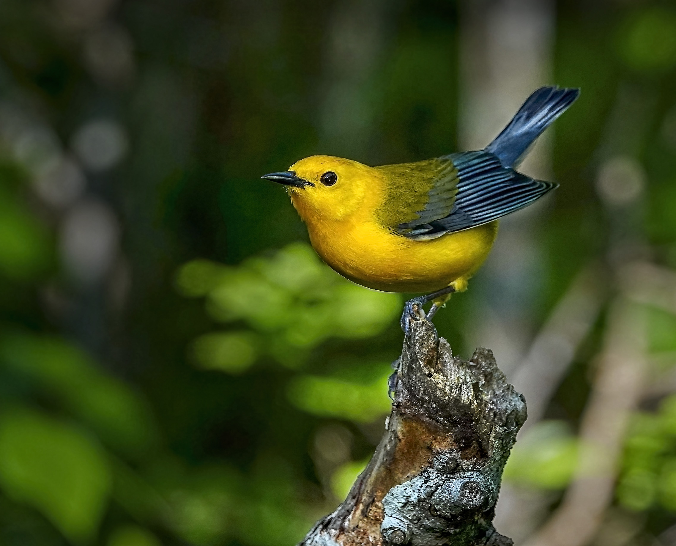
What a sweet little guy. You did a great job of photographing him. I can't ever seem to get good photos of wildlife. I love the colors and the blurred background with the interesting and well focussed bird and tree limb. My first thought was that the white bokeh spots on the left side needed to be cropped out, but that put the bird too close to the edge. He needs room to breathe, so I just darkened the background, especially around the edges to get rid of the bright spots. You might want to bring out a bit more detail in the bird so he really pops off the background. I just applied a dynamic contrast filter in On1 and then used the dodge and burn tools in PS to lighten the highlights on his wing and tail feathers, beak, and chubby light parts of his body to make him appear a bit more rounded. I think I also dodged the light parts of the tree to accentuate the blue, to complement the blue on the bird. I wish you good luck with your entry! |
Mar 13th |
 |
| 77 |
Mar 26 |
Comment |
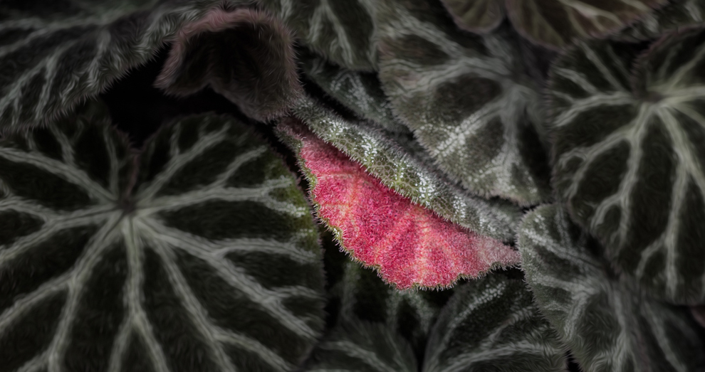
Hi Denise. I can see how this little leaf caught your eye. I like the treatments you gave the surrounding leaves to make them darker and make the pink stand out. I wondered if a tighter crop might work to make the pink leaf even more prominent in the overall scheme of things, but still preserve some of the pretty leading lines from the surrounding leaves. Just a bit different take on your unique image. |
Mar 13th |
 |
5 comments - 0 replies for Group 77
|
11 comments - 9 replies Total
|


