|
| Group |
Round |
C/R |
Comment |
Date |
Image |
| 34 |
Feb 26 |
Reply |
Thank you Frans; glad you like it! |
Feb 27th |
| 34 |
Feb 26 |
Reply |
Thanks Steve; valid point. |
Feb 21st |
| 34 |
Feb 26 |
Reply |
I totally agree that the rule of thirds isn't absolute and can create a boring composition at times. My version is simply personal preference to offset the elements; balancing negative space was your priority. |
Feb 21st |
| 34 |
Feb 26 |
Reply |
Sometimes when I use a filter that comes out too strong, I create a second (copied) layer of the original layer and then apply the filter to that second layer. Then I reduce the opacity on that layer so some of the original layer details can show through. Then you can delete the layer where the effect was too strong. This works sometimes and not others. I also sometimes greatly reduce the too-strong effect in small areas (like a face, or helmet) by creating a mask and using a low opacity brush to remove most of the filter effect in just that area. Forgive me if I didn't explain these suggestions clearly or they are something you are already aware of. |
Feb 7th |
| 34 |
Feb 26 |
Reply |
Thanks Bob; I appreciate your view of my storytelling; very kind. The flowers were very saturated in their original forms, and my aim in reducing that was an attempt to make them seem more ethereal so they imitated sound rather than substance - pretty lame now that I've verbalized it. Since the guy's jacket is so dark, it does look better to have the flowers balance that out, as you did. |
Feb 7th |
| 34 |
Feb 26 |
Reply |
Thanks for your kind words Judi. I wanted a muted look to everything, but now that I'm looking at it again, it does seem unbalanced. Good suggestion. |
Feb 7th |
| 34 |
Feb 26 |
Comment |
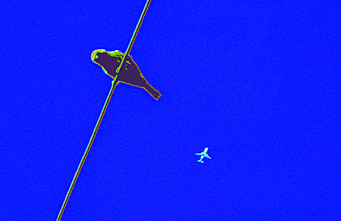
I like the simplicity of this image, and it is true to your style since it's in the non-realistic realm. I also like that the bird is large and the plane is small. It might look cool to crop the top slightly so the bird is in the rule of thirds and then move the plane so it's not on the same sight line with the bird, for a less static composition. |
Feb 6th |
 |
| 34 |
Feb 26 |
Comment |
You've done a fabulous job with this composite Frans. The mood and lighting are wonderful. I love the building reflection and moon additions; they add a lot to the story. The shadows coming out from the feet of the actors in the original appeal to me more than the building reflection that was added at the bottom. I would also suggest using the spot healing tool to get rid of the small window reflections and inner lights in the building (especially the ones on the left side) since they detract a bit from the wonderfully dramatic elements of the scene. Even though this has a dark mood, it also has a fantasy aspect that makes it fun too. Well done. |
Feb 6th |
| 34 |
Feb 26 |
Comment |
This is a fun and creative composite Bob. The images you chose go really well together. I like the filters you used; they make for a very artistic result. I wonder if scaling them back just a bit might allow a little more detail to come through so the men's faces and the wheels of the canon are easier to discern. The men's helmets are very cool and stand out nicely against the darker background in original 2 (better than against the light background in the final). At any rate, a very unique and interesting image! |
Feb 6th |
| 34 |
Feb 26 |
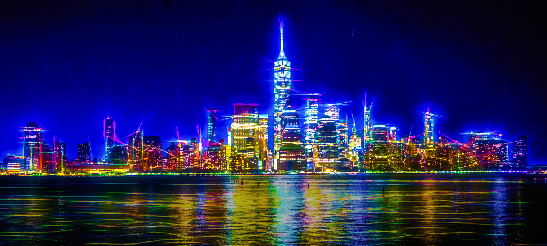
Comment |
Welcome to the Group Judi! Great first image. It does indeed look like a sparkling city. The effects you applied are fun and creative. Unlike Bob, I kind of like the pilings in the water because they lead the eye to the center of the city. My first thought was that the reflections in the water sort of detracted from the city since they are very saturated and bright. I tried selecting that area and toning down saturation just a smidge and increasing darkness a bit. Not sure it helped; just a different take on the very cool image you created. |
Feb 6th |
 |
4 comments - 6 replies for Group 34
|
| 77 |
Feb 26 |
Reply |
Thanks Carol. I wanted to keep all the colors very soft and pastel, but your point about more depth is a good one. I think I'll try creating shadows under the 3 main flowers to accomplish that before I print it. |
Feb 24th |
| 77 |
Feb 26 |
Reply |
Aww, thanks Rita. I do plan to print it to replace a framed photo in my family room that I'm tired of. |
Feb 16th |
| 77 |
Feb 26 |
Reply |
Thanks so much Denise! |
Feb 16th |
| 77 |
Feb 26 |
Comment |
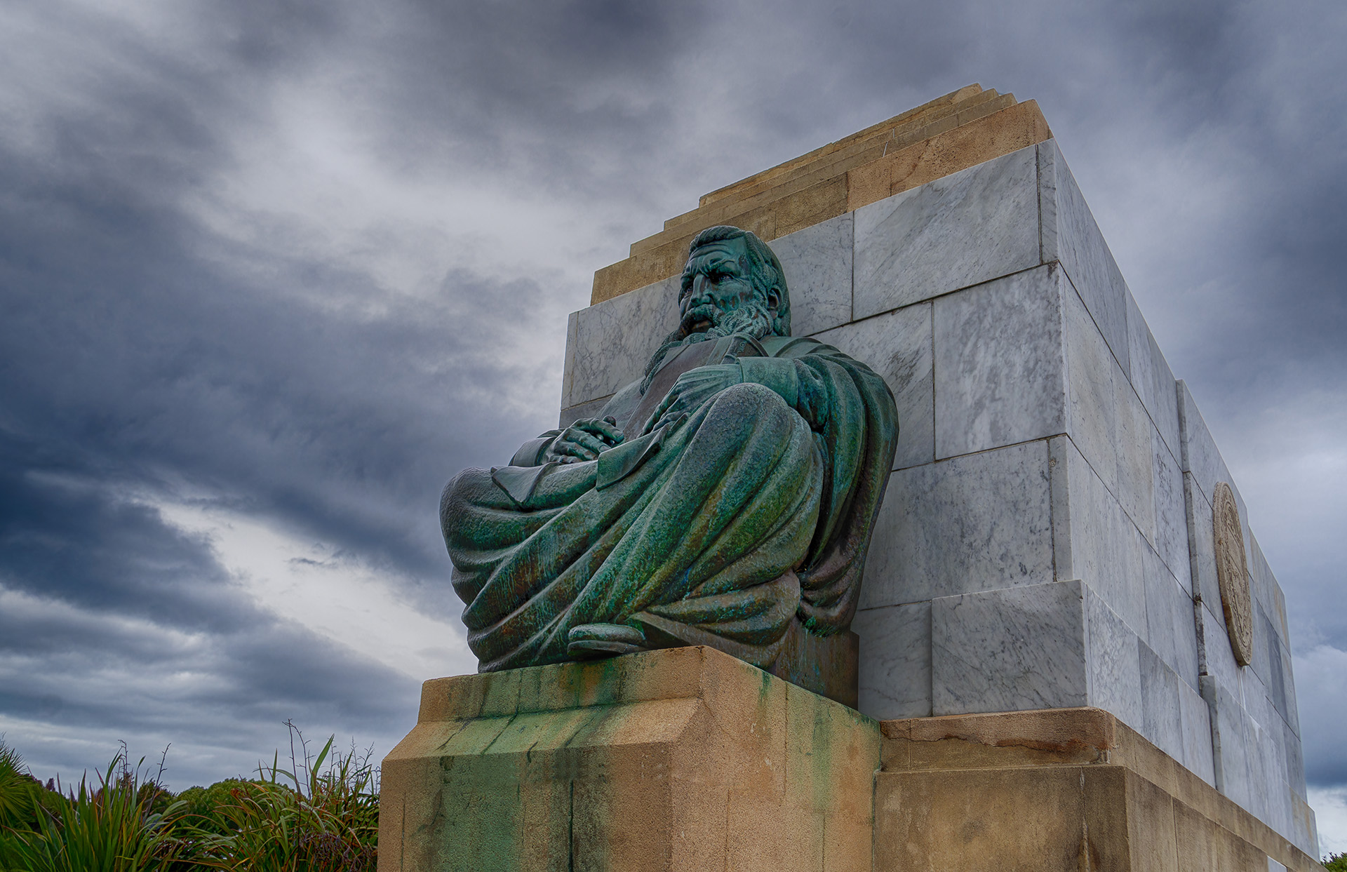
You did a really nice job of removing all the distractions and bringing out the details in the main subject. The colors are nice too. The various vertical lines of the stones are good, but for some reason the strong, off kilter horizontal line across the center stone under the figure seems strange. I got rid of it by using the spot healing brush and then straightened the left vertical edge by selecting that area and then using the transform > skew tool. I then had to use the clone tool to add in some of the bushes up to the new edge. Probably overly nit-picky on my part, but I'm including the result for your perusal. |
Feb 16th |
 |
| 77 |
Feb 26 |
Comment |
What a great, fun image Georgianne. It's such a hoot to see where totally free experimentation takes you, and you obviously just went with the flow and found your way to something completely unique. Your playing really paid off. Thanks for the detailed explanation. Nicely imagined and processed. |
Feb 16th |
| 77 |
Feb 26 |
Comment |
Lovely image Carol. The snow absolutely enhances it. I do like Denise's crop, especially taking out that horizontal line across the bottom, since it detracts from the strong leading line of the road to the church. I'd also recommend removing the distracting light post or whatever that is to the left of the church. You've created a beautiful soft image that evokes serenity and charm. |
Feb 16th |
| 77 |
Feb 26 |
Comment |
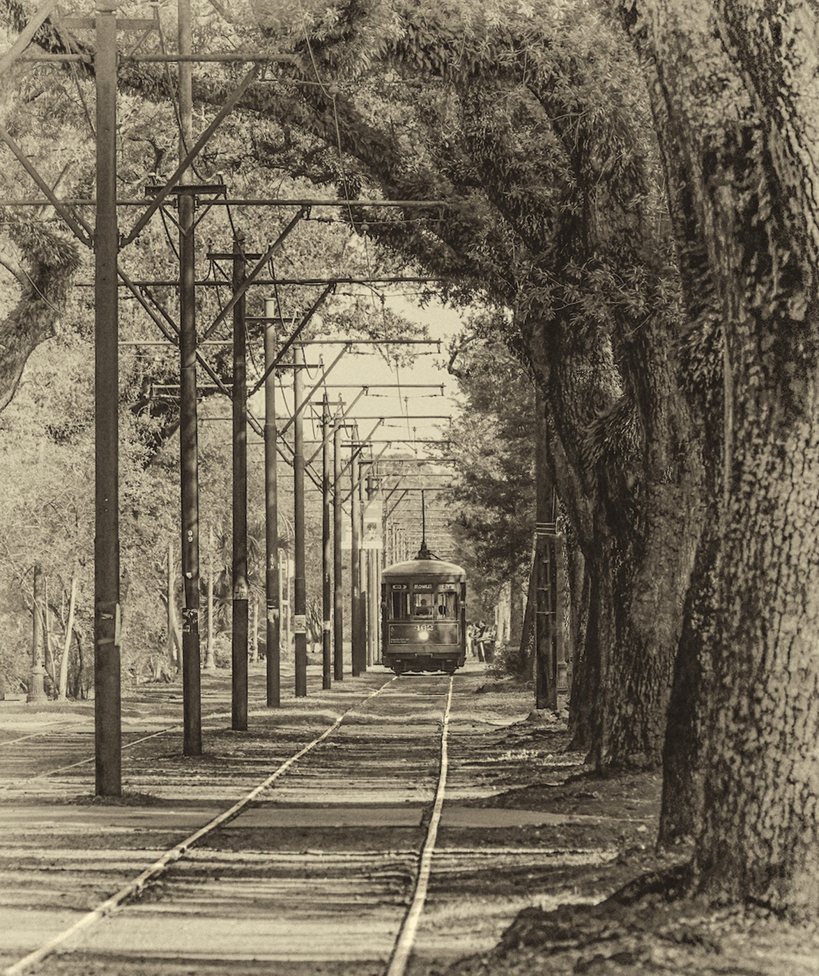
Hi Rita. I also recognized the St. Charles line trolley, so it brought back great memories of my one visit to New Orleans. I love the curve of the trees and the straight lines of the telephone polls in contrast to each other; nice juxtaposition. I agree that removing some of the small distracting elements is a good idea. And I would go a bit further and get rid of the cars on the left (especially the dark one on the left border). The tracks provide perfect leading lines to the trolley, so I used the dodge tool to lighten them up a bit. I think the antique filter you used worked great. Good luck with your entry! |
Feb 10th |
 |
| 77 |
Feb 26 |
Reply |
Thanks so much Georgianne! Glad you liked it. :-) |
Feb 10th |
| 77 |
Feb 26 |
Comment |
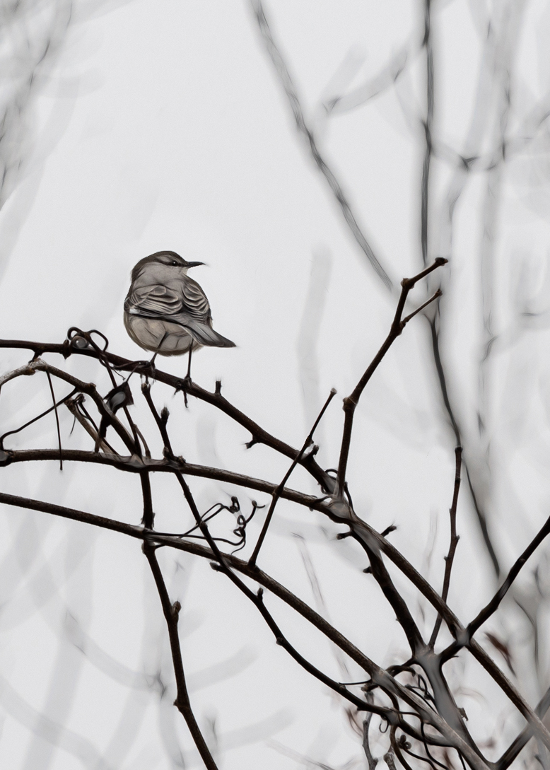
I love your treatment of this image Denise. The foreground twigs in focus and the blurred background ones give it a lot of depth. You pulled a wonderful amount of detail out on the bird. I agree with Georgianne regarding the crop; placing the bird in the rule of thirds seems to be called for here. It also seemed to me that your concern about it perhaps being too busy could be mitigated a bit with a different crop too. I took some off the top and left side, but when I did that the lovely background twigs in the upper left got eliminated, so I just copied that corner and moved it over after the new crop. I also like a catchlight in live subjects' eyes, so I added one as a final step. You've got so much rich and interesting detail in this image; well done. |
Feb 10th |
 |
5 comments - 4 replies for Group 77
|
9 comments - 10 replies Total
|


