|
| Group |
Round |
C/R |
Comment |
Date |
Image |
| 34 |
Jan 26 |
Reply |
Thank you Frans! All very good suggestions! |
Jan 26th |
| 34 |
Jan 26 |
Reply |
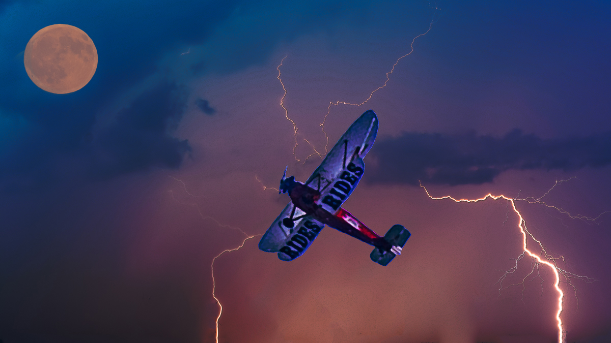
I think the plane and lightning are perfect. I'm totally nit-picking here, but the moon still seems too yellow to my eye, especially since the lightning is a pinkish white and the sky is pinkish blue. The moon in your original shot seems much closer to the other color tones in the final image. I've placed it over the yellow moon here to see how you think it works. |
Jan 15th |
 |
| 34 |
Jan 26 |
Comment |
There is a LOT to look at in this image; it's unbelievably busy, but it totally works. I like that the four large ducks don't really look like ducks, but the smaller ones here and there hint at what the main figures are. I agree with Bob that the bright white tubular shapes detract from the rich colors in the rest of the image. A happy, energetic image that's really creative. |
Jan 14th |
| 34 |
Jan 26 |
Comment |
Beautiful, creative image and a beautiful explanation, Frans. I love the soft black and white tones, and the abundance of white space is surprisingly effective. The way you faded the left and right edges out to white is really artful. If I were to nit-pick, I'd suggest removing the white sign post to the right of the door and whatever that is on the ground to the right of the building; it kind of looks like a real estate sign or something that's detracting from those lovely and wispy plants on that side. I very much agree with you that creativity doesn't need to rely on complexity or composites. This image is stunning in its simplicity. Well done! |
Jan 14th |
| 34 |
Jan 26 |
Comment |
Nice composite Bob. I like the color changes you made to the plane and sky. The lightning is nice and dramatic, and I think the size of the plane is good. My only suggestion would be to use the coloring from your original moon image rather than changing it to yellow. To me, it seems to match the reddish hues in the sky better and look more natural. And if it was moved slightly to the right so that the left edge of the entire image could be cropped off a bit, it would place the plane away from the exact center of the image. All in all, an electrifying image! |
Jan 14th |
| 34 |
Jan 26 |
Reply |
You're right Bob; the eyes aren't balanced. I was so busy fixing a distracting part of one of her ears that I totally missed the difference in the eyes. :-0 |
Jan 5th |
3 comments - 3 replies for Group 34
|
| 77 |
Jan 26 |
Reply |
Thanks Rita! |
Jan 28th |
| 77 |
Jan 26 |
Reply |
Thanks Rita! |
Jan 26th |
| 77 |
Jan 26 |
Reply |
Good suggestion Georgianne. Thanks! |
Jan 26th |
| 77 |
Jan 26 |
Reply |
Thanks Carol. I'll try that. |
Jan 26th |
| 77 |
Jan 26 |
Reply |
Thanks Denise. I did take out a couple of the white stamens around the outside for the same reason you mentioned, but guess I didn't go far enough. I didn't even think about blurring the hard segment lines so I'll try that. |
Jan 26th |
| 77 |
Jan 26 |
Comment |
I love the color of the rose, and the edits you made are really nice. The border is nice looking, but it seems too close to that top petal. I think it would help to extend the size of the border/texture area (but not the rose) so the distance between it and the outside edge of the image is narrower. |
Jan 15th |
| 77 |
Jan 26 |
Comment |
What a sweet image Mary. Your crop is perfect and the black and white conversion is a big improvement. You did a great job of evening out the lighting on the faces. The movement you captured is especially nice. Well done! |
Jan 15th |
| 77 |
Jan 26 |
Comment |
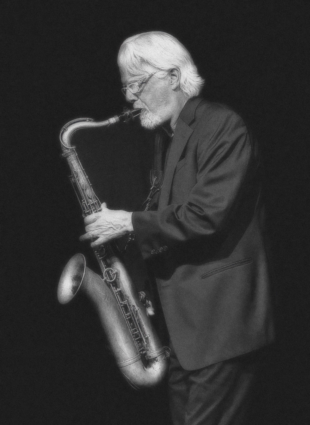
Very soulful image Rita; I can see why they accepted it. I love that the man's head and the sax are highlighted; the shadows and folds in his suit are great. I agree with Denise that cropping on the right (and maybe a tad on the top too) and extending the canvas on the left would help the composition. As for adding more of a fine art vibe, I used PS to add Film Grain and then into Nik Efex for Soft Focus. Lots of different possibilities here tho. Great job with your cell phone! |
Jan 14th |
 |
| 77 |
Jan 26 |
Comment |
Great subject Georgianne. We're usually told that odd numbers are better than even, when it comes to composition, so I can see why you chose to keep three objects. But I agree with Denise that zooming in on the two dominant shapes make the composition more impactful. She also got rid of the blown out white highlights on the piece with the green edges. Beautiful colors and textures here. I can only imagine how enjoyable it was to photograph these on a rainy day. |
Jan 14th |
| 77 |
Jan 26 |
Comment |
Very nice Carol. The detail, color pallette, and lighting are lovely. The even spacing seems a bit static to my eye; I wonder if moving either the right or left pod closer to the center one and overlapping it a slight bit might make the composition a bit less predictable and uniform. The colored stroke is just right, and the texture you achieved under the pods is perfect. |
Jan 14th |
5 comments - 5 replies for Group 77
|
8 comments - 8 replies Total
|


