|
| Group |
Round |
C/R |
Comment |
Date |
Image |
| 34 |
Dec 25 |
Reply |
Your assessment of the depth of field issues are spot on. Thanks. |
Dec 26th |
| 34 |
Dec 25 |
Reply |
The rules on using AI are different for DD than for competition, so you're free to use it in your creative endeavors here, especially for generative fill options like extending the canvas area or background of the image. It's also fun to experiment with it just to see what it can (and cannot) accomplish. It's getting better with each software update. |
Dec 17th |
| 34 |
Dec 25 |
Reply |
Ok, yes, I see what you were getting at now. You're right that bright areas do draw the eye, so your point is well taken. Your revision does address that issue. Thanks Bob! |
Dec 17th |
| 34 |
Dec 25 |
Comment |
I can certainly see why this stump caught your eye. It absolutely looks like a creature. I kind of like the original better than the too-symmetrical final though. The mouth in the original, with the red leaf looking like a tongue in a toothless grin, seems to have more quirky character and animation. I do like the more saturated colors and greater definition in the final. Even if you prefer the mirrored version of the face, I'd suggest making the background not mirrored. Of course, the image wouldn't be altered reality if you hadn't made the changes you did. I'm just saying the original face is more interesting to my eye. |
Dec 12th |
| 34 |
Dec 25 |
Comment |
This is really beautiful Frans! And so appropriate for the New Year. I think all of your techniques worked very well; your technical expertise is clearly on display here. You said the night scape was shot in 2021, but your original is a daytime shot. Did you alter the daytime shot to look like it was taken at night? My only suggestion would be to lighten up the moon a bit to make it a little more luminous. I love the contrast you added from the original moon, but since it's very much the same color as the building under it, it might make it stand out more if it was brighter. Beautifully shot and processed. |
Dec 12th |
| 34 |
Dec 25 |
Comment |
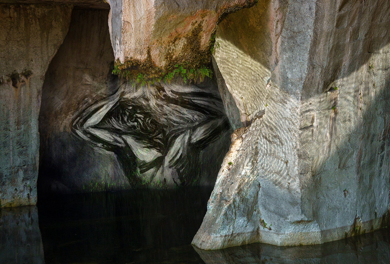
Your background image is indeed very powerful once the viewer knows the story, but I think you created a huge task for yourself to convey strong emotions of human suffering and cruelty to your viewers. I think Original 2 is a little too abstract and angled to do that, but Original 3 definitely has the potential to do so (especially the tortured face of the main figure).
You did a good job of lightening up the wall where the ferns are growing and the detail there is wonderful. You also did well eliminating the bright sunlight in the water at the bottom.
I used PS to see if I could emphasize the strongest parts and simplify the overall image a bit, so that the viewer has less interpreting to do. I used Luminosity Blend Mode on the man and a mask to eliminate the parts of that image that weren't needed. Perhaps it isn't at all what you had in mind; just another perspective to consider.
I really applaud your ambition in tackling this project, especially considering you haven't been doing composites for very long. You have a strong vision for creating impactful images. |
Dec 11th |
 |
| 34 |
Dec 25 |
Comment |
Nice composite Bob. I love the way the right tree branch curves around the balloons. The colors in both of your originals are really vibrant and dramatic, so I'm torn about whether the light gradient at the top adds atmosphere or just washes out the nice color and details of both images. I think the topmost balloon is too close to the top edge, so perhaps you could use AI to generate more sky at the top of Original 1 and then add the light gradient up higher to create the atmosphere you're aiming for. Just a thought. |
Dec 11th |
| 34 |
Dec 25 |
Reply |
Thanks Bob. Perhaps I didn't understand your comment, but I felt that the snail and teacups were the important part of the image, so I wanted them to be dominant in the foreground and in full focus, while the castle was just a supporting element to show where he was heading. So it made sense to me that, even though the castle was a large part of the scene, if it was blurred it would recede in importance. The tonal balance in the B/W version seems very harsh, but I appreciate that you took the time to offer an alternative. |
Dec 11th |
4 comments - 4 replies for Group 34
|
4 comments - 4 replies Total
|


