|
| Group |
Round |
C/R |
Comment |
Date |
Image |
| 34 |
Nov 25 |
Reply |
Thank you for your kind words Bob. Much appreciated. |
Nov 18th |
| 34 |
Nov 25 |
Reply |
That's a really good suggestion about the bright area on the hand. Thanks Frans! |
Nov 18th |
| 34 |
Nov 25 |
Reply |
Thanks so much Peter! |
Nov 18th |
| 34 |
Nov 25 |
Comment |
I absolutely love your black and white original, Bob. It's a piece of art in itself. If you could somehow make it a more dominant part of the image, I think it would be a stronger composition. The many layers seem to sort of cancel each other out by being on top of each other. I agree with Peter that the leaf shapes in the upper third are too recognizable and detract from the driftwood. The green area in the lower right accomplishes your aim of adding color, without being obvious leaves. I'd recommend removing the green leaf layer over the driftwood though, because the driftwood has strong and interesting lines that get muddled by the leaves. The shells aren't really recognizable as shells, and only one of them has any color to add. In the driftwood shot, I suggest taking out the stick that isn't part of it. I tried working with your images, but didn't manage to come up with anything that seemed to work. You mentioned that you created this because you wanted to take a vicarious trip to the coast, so if it accomplishes that for you, then it works for you. But perhaps working with it a bit more will yield even better results. |
Nov 11th |
| 34 |
Nov 25 |
Comment |
The pillars are really interesting Peter; the contrast is striking. You did a good job of removing all the distractions. You mentioned that took the most time. I'm wondering if you've tried the Spot Healing Tool; it's in the same group as the Remove Tool. I've found it works great for things like the thin black line and flagpoles here; literally only a few seconds to accomplish. The trick when using it is to keep the selected area only a tiny bit larger than the item you want "healed;" if you select too much outside the area, PS gets confused and does strange things. As for the purple pool, it looks too opaque and pasted on to my eye. Perhaps if you added it over the original pretty tiled pool bottom at a reduced opacity (so the tiles could show through a bit) and blurred the edges, it would give it a more nuanced look. The pillars seem like a good candidate for lifting out of this scene and placing on a more surreal background. But I like that you analyzed the scene and made changes to take the image into creative territory. |
Nov 11th |
| 34 |
Nov 25 |
Comment |
I like this a lot Steve. The bokeh effect is great. The subdued colors are great. Your idea to create the water effect worked nicely. The fine white lines and spots around the moth are a little distracting, so I would suggest getting rid of those. I'm not familiar with the editing software you use, so I don't know whether that's an easy task or not. In Photoshop it's super easy with the spot healing brush. This image is quite a bit different than what you usually do, and I'd say you nailed it! |
Nov 8th |
| 34 |
Nov 25 |
Comment |
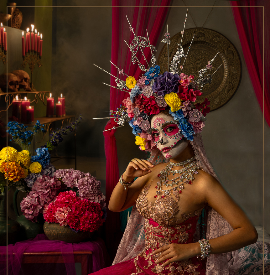
Hi Frans. This is a very cool image. The colors are wonderful and the sugar skull is beautifully done. My only suggestion would be to get rid of the bed frame. My eye gets pulled there rather than to the model. And it's kind of confusing as to why she's sitting on a bed. I did a quick edit to try that out by just cropping it off the bottom and then using the clone tool to add the background color over the back part of the bed. I didn't take the time to add your nice key line on the bottom. I like your addition of the candle altar; you did a great job of making it look like it was there originally. Well done! |
Nov 8th |
 |
4 comments - 3 replies for Group 34
|
| 54 |
Nov 25 |
Comment |
Great piece, Alan. Minimal and complex at the same time. I love the way you created so much depth with both the arches and the line of druids. The LUT you chose is perfect. Very nice! |
Nov 13th |
1 comment - 0 replies for Group 54
|
| 77 |
Nov 25 |
Reply |
Thanks for your kind words Georgianne. Darkening it gives it a moodier vibe. |
Nov 30th |
| 77 |
Nov 25 |
Reply |
Thanks for your feedback Carol. If I decide to use this image anywhere else, I'll consider taking out the clock. |
Nov 18th |
| 77 |
Nov 25 |
Reply |
Thanks so much Denise! |
Nov 18th |
| 77 |
Nov 25 |
Comment |
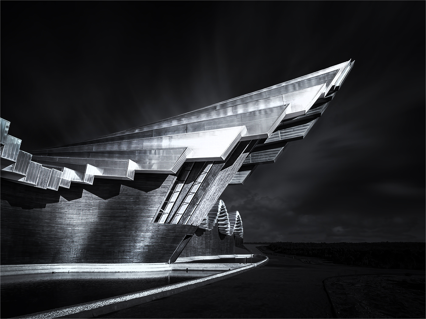
What a great building, Carol. Black and white is definitely the best treatment for it. I like what you did to add drama, and you might want to consider adding even more contrast. I increased the contrast quite a bit and then did even more dodging and burning. I probably went a bit too far in an effort to make it noticeable. I agree with Denise that the part of the roof you cropped off had some nice detail and interesting lighting. Calatrava's architecture is so very unique and I very much enjoyed seeing this structure. Well photographed and processed. |
Nov 13th |
 |
| 77 |
Nov 25 |
Comment |
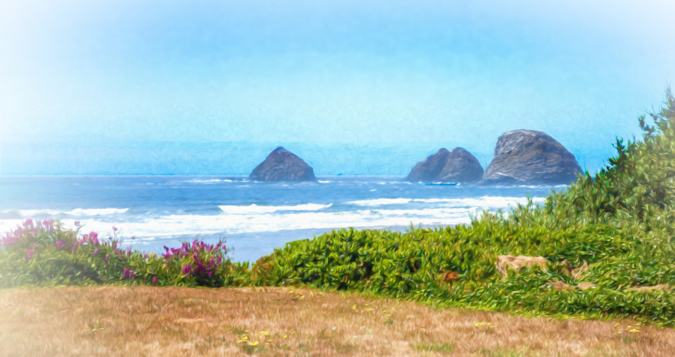
The painterly filter you applied works nicely. And I like the increased saturation in your final. To my eye, the scene might benefit from a bit of cropping; the brown foreground seems too dominant, and the big sky seems to make the wonderful haystacks seem less important than they should be. I also cropped off the dead upper branches of the pretty green foliage on the right. What a lovely view to ponder as you enjoyed a leisurely lunch! |
Nov 13th |
 |
| 77 |
Nov 25 |
Comment |
This is a very charming and nostalgic lamp. How lucky you are that your husband was able to create a base. I agree with Denise that showing more detail in the base gives more interest to the piece. She also managed to get rid of the light part of the cord at the bottom of the curtain. I like the texture of the backdrop and the soft lighting overall. |
Nov 13th |
| 77 |
Nov 25 |
Comment |
I also like the B/W version best, Mary. Since there isn't a lot of color in the original image anyway, it seems to me that the B/W takes it into the realm of fine art. And the absence of the power lines seems better to my eye too. I love the way the outlines of the hills fade in and out of the clouds. Beautiful! |
Nov 12th |
| 77 |
Nov 25 |
Comment |
This poppy is quite lovely Rita. I think the center whorl is the star of the show and since it was taken with a cell phone, it needs some sharpening and drama. The background red poppies are blurred, but still seem to detract from the main subject, especially the one directly above it; that one reminded me of a hand with the thumb in hitchhiker position. I worked a bit with your original image to see if perhaps I could coax out more details and make the main blossom stand out more. I rotated it slightly to put the stem on a bit more of an angle, cropped some of the distractions out, and cloned out some of the others. I sharpened the main blossom and used the dodge tool on the center whorl to pull out some highlights. I used Color Efex Monday Morning filter to darken it and then back into PS for the Oil Paint filter. I think your vision for this image was good; my version is just a bit different way of getting to the same end result, as you requested. |
Nov 12th |
 |
| 77 |
Nov 25 |
Comment |
The colors and shapes in this image are what catch my eye. Since I'm not a fan of dying flowers, I have a hard time appreciating the realism here. I had a go with it in PS to see if I could highlight just the shapes and colors. This isn't at all what you intended with the image, which I respect. My version was just an attempt to take it into the realm of abstract art to see where that led. Your photographing techniques are very nice with good detail and composition. I think I like the cool colored background best, as it's a nice contrast to the foreground. |
Nov 9th |
 |
6 comments - 3 replies for Group 77
|
11 comments - 6 replies Total
|


