|
| Group |
Round |
C/R |
Comment |
Date |
Image |
| 34 |
Oct 25 |
Reply |
Thank you Frans. I certainly appreciate your perspective. The soft black glow does give it a much softer look. My husband feels the same way you do because he thinks that makes it blurry rather than sharp. I kind of liked the look it gave the image because it seemed more "other worldly" to me. |
Oct 14th |
| 34 |
Oct 25 |
Comment |
This is a really nice effect Steve. Love your usual bright colors and the kaleidoscope effect worked well. I like that you didn't just place one of the groups of bees in the center of the image. The offset parts are what make it more interesting to view. |
Oct 11th |
| 34 |
Oct 25 |
Comment |
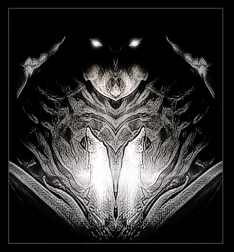
Hi Frans. You did a lot of work to create this spooky composite. Since the woman on the right is in her original state inside the mirror, to me it tells a story of her emerging from the mirror as a fair maiden, but Medusa has placed a curse on her with snake skin and red eyes. Her distressed look fits well with the story. The photo of Medusa is very dramatic. Since her eyes are looking at the camera rather than her victim, I think it might be good to change that. I also might suggest that the snake above the victim be lowered a bit so it looks like it's resting directly on her head, and maybe even a little larger. I love your concept with this creation. Very well conceived and executed! Did I understand your story correctly? |
Oct 11th |
| 34 |
Oct 25 |
Comment |
The fact that the original composition caught your eye is impressive; I don't think I would have even looked twice at it. Your experimentation certainly paid off though. The conversion to B/W and the black background makes a great Halloween image. Very spooky. It's interesting to study it and note that the upper part is very minimal and wispy, while the lower part is heavier and they complement each other. My only suggestion would be to add a medium gray outline to distinguish it from our DD website background. I opened it in PS for fun and experimented with making the "eyes" glow to ramp up the eeriness. Your processing all worked very well! |
Oct 11th |
 |
3 comments - 1 reply for Group 34
|
| 77 |
Oct 25 |
Comment |
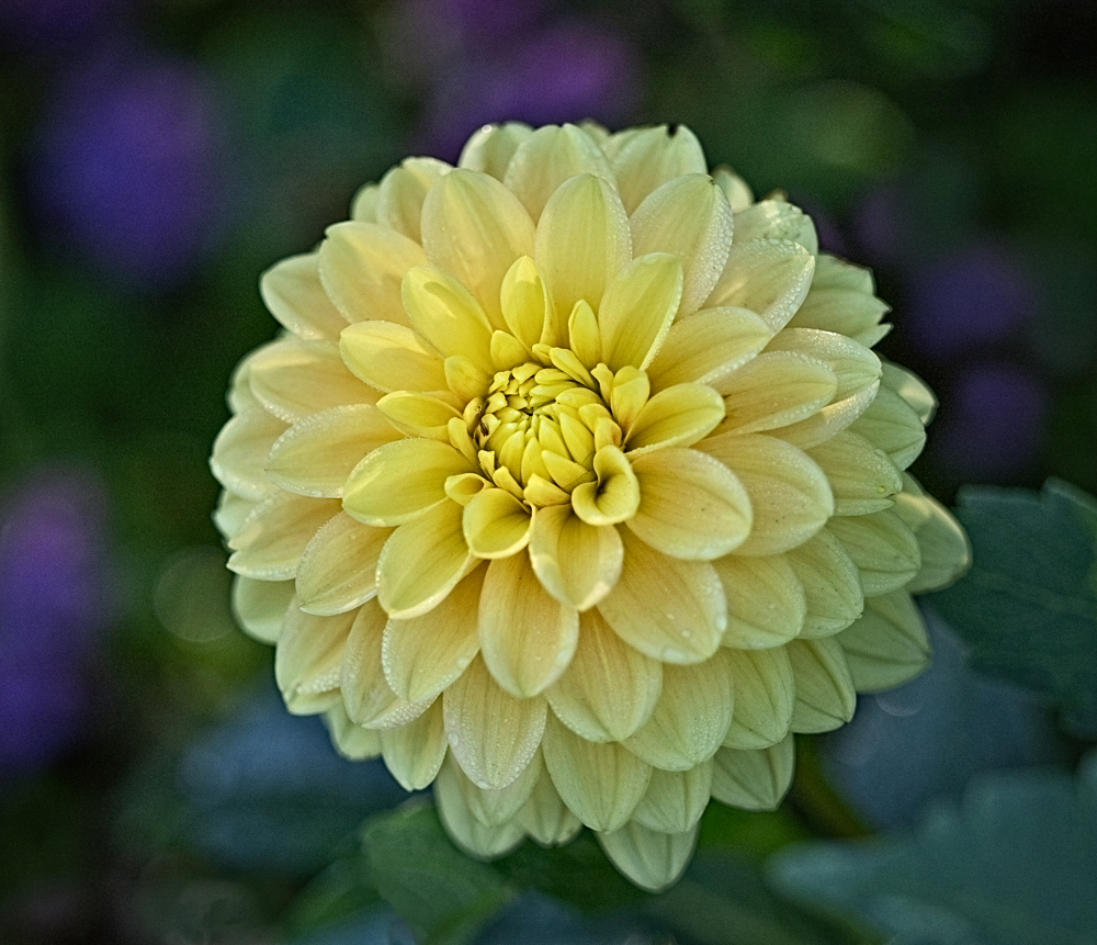
A beautiful specimen of a flower Denise. I don't think the background is too busy, and I like the bits of purple to complement the yellow. I do sort of feel like the flower itself might need more strength of details to make the background take more of a "back" seat to the main subject though. I didn't really realize there were dew drops on some of the leaves until I read your description. Just to see what would happen if I tried a couple of things, I used On1 Color Efex Dynamic Contrast and HDR effects. Then back in PS I dodged the dew drops to brighten them a bit. The look is now quite a bit more punchy than your original, but I'm not sure it worked, because there's something about the softness of your version that really appeals to me. |
Oct 14th |
 |
| 77 |
Oct 25 |
Comment |
Beautiful image Rita! When I first glanced at it, I thought maybe the colors were too saturated and unrealistic, but the more I took it in, the more I liked the vibrancy of it. Love the ICM; it worked to great effect. Adding the mountains was inspired, and I like that you placed them off-center. I loved discovering that hint of another mountain in the haze on the mid left! |
Oct 14th |
| 77 |
Oct 25 |
Comment |
This is a really interesting image Mary. The B/W treatment works well since you were focusing on the shapes. I like that you blurred most of the background, except right at the area where the butterfly is holding on. I agree with Denise that the darkest wing needs a bit more definition, especially since the details on the other three wings are so nice. I think Denise's tighter crop works well too. I think your use of B/W takes the image more into the realm of fine art. Very nice! |
Oct 14th |
| 77 |
Oct 25 |
Comment |
Nice composition Georgianne. I love that you didn't make all the figures the same size; it gives much more depth and interest to make them smaller as they go up. I agree with Denise that the top left figure is much different looking than all the others, I think mostly because the lighting is soft on all of them but harsh on the upper left one. Since she's dressed in black, it makes the contrast too stark on that one figure, compared to the others. Nicely photographed and conceived and I like your story of awakening. |
Oct 14th |
| 77 |
Oct 25 |
Comment |
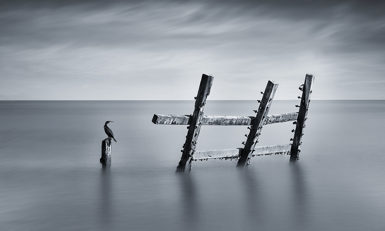
Great image Carol! I didn't even notice the bird in the original, so it was a good idea to take it out. The cormorant is a perfect addition, but I agree with Denise that putting it on the short post would balance everything a bit more and make it face towards the rest of the scene. I also wondered if a tad more contrast would work, so I used PS to try both. I also cropped it a tiny bit on the right. Love the B/W treatment and your new sky. Well done. |
Oct 14th |
 |
5 comments - 0 replies for Group 77
|
8 comments - 1 reply Total
|


