|
| Group |
Round |
C/R |
Comment |
Date |
Image |
| 34 |
Sep 25 |
Reply |
Thanks Peter. Don't try too hard to find the dog! I deleted him because he didn't fit in with the geometric shapes. |
Sep 20th |
| 34 |
Sep 25 |
Reply |
Thank you Frans! |
Sep 20th |
| 34 |
Sep 25 |
Reply |
Thanks Bob. I probably got a little carried away with too many layers and shapes. The dog isn't in the final; I wanted to keep the abstract to just geometric shapes, so the dog was deleted and I just used the pipe. |
Sep 20th |
| 34 |
Sep 25 |
Comment |
Welcome to Group 34, Bob -- glad to have you aboard!
Your first image is interesting in that you achieved the "reddish war pattern" you wanted by using the feathers image. I never would have thought of that.
While the image is interesting from a historical aspect, I think it could use a little jazzing up by adding a "rocket's red glare" or something to bring more action to the scene. Most of the figures are at a distance and standing still, so it's a little static in overall effect. I don't mean to sound harsh on your very first image. You said you're getting acclimated to composite work, and there's definitely a learning curve in figuring out how to create images with "altered reality" that couldn't possibly have been captured by a camera. I hope you enjoy and learn from the journey. |
Sep 9th |
| 34 |
Sep 25 |
Comment |
I love the feeling of this image Frans. The tree is so delicate and lovely. Using monochrome was a great idea. My only suggestion would be to flip the bird horizontally, so that it's facing into the image rather than out of it. The black border inside the edge adds a very nice element, and your signature in red is the perfect footnote. |
Sep 6th |
| 34 |
Sep 25 |
Comment |
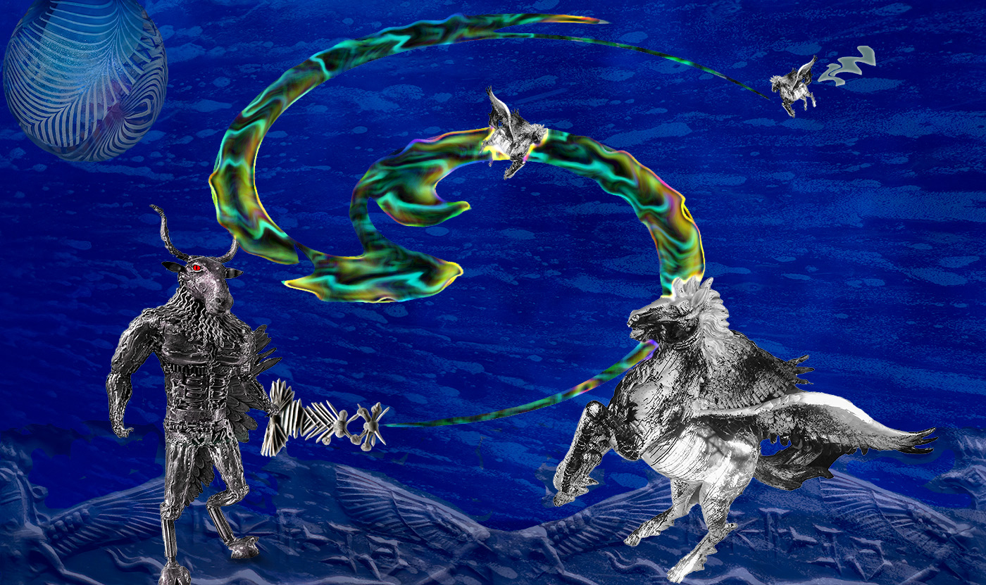
You've put together your elements well here Peter. I like the imagination you used to create the weapon. My first impression of the death ray was that it seemed a bit too opaque and looked like a huge knife blade or something with more substance than what I imagine a death ray to look like. I took the liberty of playing with it to see if I could figure out a way to give it a "lethal ray of light" appearance. My result isn't quite what I imagined and I neglected to include the little zap on the upper right, but you get the idea. The monster seems like it would be more menacing if it was much larger than Pegasus. Your car wash background is a great idea. You created "altered reality" for sure with this imaginative scene. Well done. |
Sep 6th |
 |
3 comments - 3 replies for Group 34
|
| 77 |
Sep 25 |
Reply |
Hmmm, sorry but it seems to me he needs to be in the corn field, and it's in the distance compared to the pumpkins. I didn't want him to be dominant, just a supporting character. |
Sep 10th |
| 77 |
Sep 25 |
Comment |
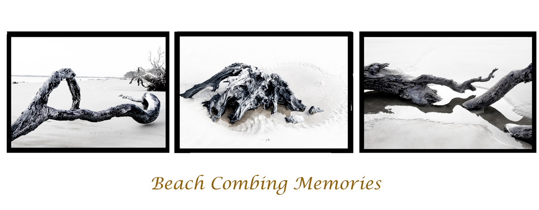
This would fit nicely in a vacation scrap booking project. The combo of the images makes a nice trio. I like Connie's crop on the bottom, and I see why she switched the left image, but I think having both the left and right images radiate out from the center, as in yours, works a little better. Maybe you could try flipping the right image too, so both of them lead the eye toward the center? You did a good job of bringing out detail. |
Sep 10th |
 |
| 77 |
Sep 25 |
Comment |
I agree that a night scene works much better with the composition here. You had a good eye for what elements to capture. I do like Georgianne's version, since it seems to accentuate the feeling of nighttime very nicely, and it sounds like you like it better too. Your decision to keep the flag in color worked really well. |
Sep 10th |
| 77 |
Sep 25 |
Comment |
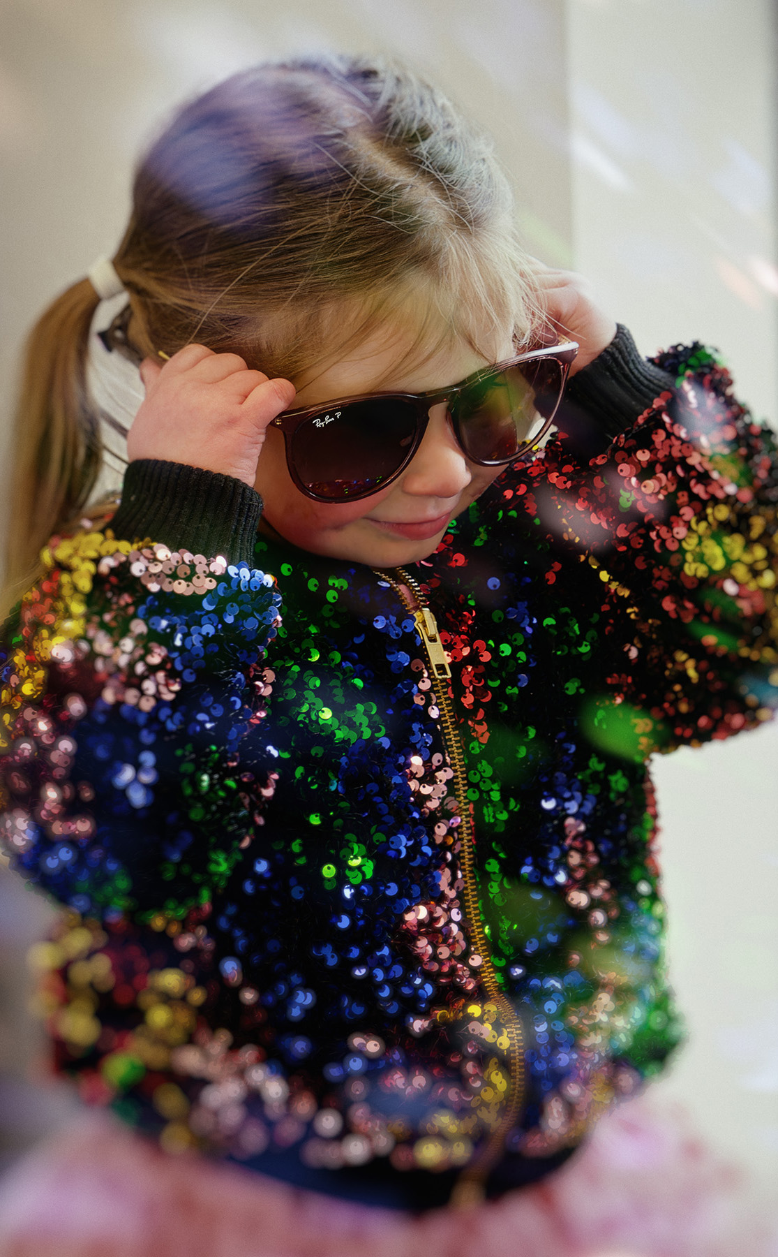
Cute as a button, Mary! I love the colored sparkles and her sweet little hands. You did a great job of getting rid of the distractions and lightening her face so we can see her darling features. Even though you blurred that blue trash can, it still seems to compete with the colored sequins, so I wondered if a much tighter crop might work. Taking it in on the right side to match got rid of the light/dark parts of the window too. |
Sep 10th |
 |
| 77 |
Sep 25 |
Comment |
You did a great job of bringing out the interesting details Denise. I think all of your edits worked well, especially getting rid of the white parts of the background. This is just a nit-pick, but it looks to me that there's a very faint spider web running from the top right side of the down the outside length of the stem towards the right bottom. The only reason I mention it is because once my eye saw it, it kept getting drawn to it even though it's so faint. Go figure. The minimalist composition and color scheme are so calming. Nice job. |
Sep 6th |
| 77 |
Sep 25 |
Comment |
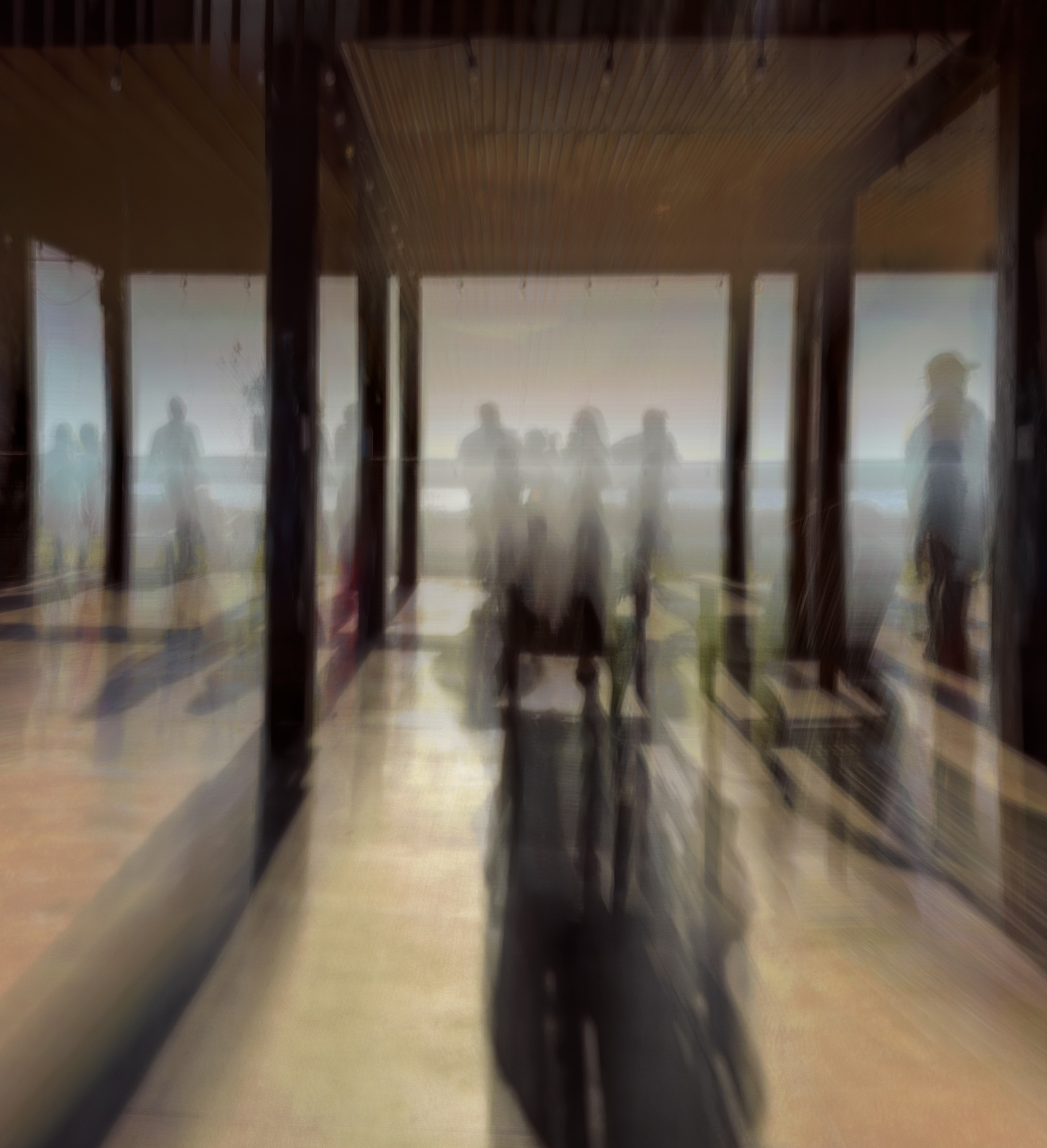
I like this a lot Rita. It has a very nice mood and can be interpreted in so many ways. The walls on both sides seem to distract from the wonderful human forms, so I would suggest cropping those out. I also experimented with increasing the contrast, which seemed like a good idea, but ended up leaving that alone because it changed the mood of the piece too much. Great ICM experimentation and outcome! |
Sep 6th |
 |
| 77 |
Sep 25 |
Comment |
Lovely image Carol. The subtle light rays are so nice, and I like that you kept the original line between the floor and wall across your new improved background. It grounded the ballerina in the space rather than making her look like she was floating. Well done. |
Sep 6th |
6 comments - 1 reply for Group 77
|
9 comments - 4 replies Total
|


