|
| Group |
Round |
C/R |
Comment |
Date |
Image |
| 34 |
Aug 25 |
Reply |
Thanks Peter. Since I started with the desert background, I tried to make all the other lighting conform to it, with the light coming from the upper left. I added the sun to the sky and then added highlights to the upper left sides and shadows to the lower right sides of the green/blue area. When I added the tree shadows, I tried to make them match. Luckily the pitcher already had more shadowing on the right side, so I didn't do anything to it. |
Aug 26th |
| 34 |
Aug 25 |
Reply |
Thank you Frans; I'll try that if I take it further. |
Aug 26th |
| 34 |
Aug 25 |
Reply |
Thanks Patrick. Yes, the blue is the river in Original 2. The trees in the foreground are actually IN the river. I wanted to include the water element to support the "Oasis" concept. |
Aug 15th |
| 34 |
Aug 25 |
Comment |
Your treatments did a good job of taking care of the blurriness of the original. I like the energy and happy feeling I get when viewing it. Good vibes. |
Aug 9th |
| 34 |
Aug 25 |
Comment |
Very nice composite Frans. I love the mood you created. The car and street sign on the far right seem to distract from the nice ambiance though. The Spot Healing Tool and/or Clone Stamp should work pretty well for getting rid of them. You isolated the dancer nicely. If I were to nit-pick, it seems that, even though there is some light coming from the store window, there is stronger light on the dancer from the upper left. So it seems to me that her shadow should angle more to the lower right. I agree with you that it's always challenging to create realistic shadows when doing composites. I like the white borderline inside the outer edge; it ties in nicely with the dancer's dress. Well done. |
Aug 9th |
| 34 |
Aug 25 |
Comment |
I feel like I'm not quite "getting" this image, Patrick. It does look very anatomical in B/W. To my eye, it seems more impactful in the original green, what with the nice glow and that interesting little round bubble right in the middle. Just personal preference though. Your final does have a gentle simplicity that is very nice. |
Aug 9th |
| 34 |
Aug 25 |
Comment |
This is a fun composite Peter. I think it's an excellent image to ponder the use of shadows. When I first looked at it several days ago, the shadows sort of jumped out as feeling a little "off." For me, shadows are often the hardest aspect of making composite images seem logical. So I've been trying to observe shadows more intentionally and I looked up some info online. I found this site quite helpful: bingedrawing.com/basics/types-of-shadows (especially type 5, occlusion shadow). In the original photo of your wife, both of her feet are on the ground (there's a very slight occlusion shadow under both of her feet), but the shadow in the final image makes it look like she's dancing a jig with her right foot off the ground because there's so much distance between her foot and the shadow of that foot. Was that your intent? Since there aren't strong shadows in the original, there's no help there. The prominent shadows of the window frames dictate how all the other shadows should look.
I tried using AI to generate your wife's shadow, but it clearly has not learned how to do that. You've provided an excellent image for the study of shadows. I'm taking note of shadows everywhere I go now!
I found this YouTube video really helpful: https://youtu.be/gmeKTzxQHFE?si=CuQVzKlI186YLNNR. The shadows here are really similar to the ones in your image. |
Aug 8th |
4 comments - 3 replies for Group 34
|
| 77 |
Aug 25 |
Comment |
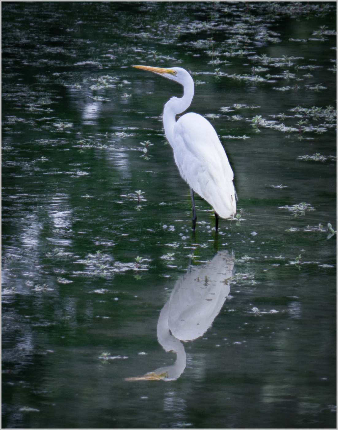
How lucky you are to have this quiet refuge so near your home! This is a lovely shot Denise. I think I prefer the blue wash because it makes the shot more dreamy. I might be tempted to scale back the blue on the bird itself a tad, so it retains that wonderful whiteness. As for the bird's reflection in the water, in the original there isn't a lot of distortion, so I don't think you need to fiddle with trying to make it look more "watery." You captured reality. It seems to me that perhaps the reflection is just a bit too bright in the final version and that's what's making it look pasted on, so I just selected the reflection with the quick selection tool and then adjusted the brightness to -48 and contrast to -30. I love your crop and your processing. Well done. |
Aug 22nd |
 |
| 77 |
Aug 25 |
Comment |
Great image Rita. Wonderful capture of nature's beauty. I agree with the previous comments and wish you well in your competition. |
Aug 22nd |
| 77 |
Aug 25 |
Comment |
What a strong image Mary. And your caption is perfect. This is proof that mundane items can indeed become fine art in the hands of a great photographer. I'm so glad you're past a critical stage and back with the group. Hoping for each day to bring you strength and that wonderful "adaptability" you've tapped into. |
Aug 22nd |
| 77 |
Aug 25 |
Comment |
The blossom is very nice, but the textured background pulls my eye away from it. I kind of prefer the plain background in your original. I agree with Denise about the cut off buds needing to be removed. This might look nice in B/W, but very nice as you've processed it also. |
Aug 22nd |
| 77 |
Aug 25 |
Comment |
I also prefer the rotated version. I think the soft colors are nice. And the minimalist nature of it as an abstract appeals to me. |
Aug 22nd |
| 77 |
Aug 25 |
Comment |
I really like this image Carol. I'm not usually a fan of dead flora, but these seem more "dried" than dead. The soft colors are very nice and your background complements them perfectly. I like the curvatures of the stems. If I had to make a suggestion, it would be to perhaps place the center stem a tad higher and then stagger the other two in relation to it so the upper pods and lower clusters of leaves are at different levels. Lovely job as it is though too. |
Aug 22nd |
6 comments - 0 replies for Group 77
|
10 comments - 3 replies Total
|


