|
| Group |
Round |
C/R |
Comment |
Date |
Image |
| 34 |
Jul 25 |
Reply |
Well done Frans. I like it! |
Jul 27th |
| 34 |
Jul 25 |
Reply |
Thank you Frans. I hadn't really noticed it, but I think you're absolutely right. He was trying too hard when he posed for my shot. I'll try to see if I can fix it PS or maybe retake the photo if I plan to use this image again. Thank you! |
Jul 27th |
| 34 |
Jul 25 |
Reply |
Peter, I tried to answer your question, but I guess it was too wordy and wouldn't post. I'll send it by email instead. |
Jul 15th |
| 34 |
Jul 25 |
Reply |
I do see what you're referring to now; and I do appreciate your taking the time to provide thoughtful feedback. When I took that second look, I noticed the boxes don't really have consistent lighting either! :O |
Jul 15th |
| 34 |
Jul 25 |
Comment |
The bright colors are very eye-catching. Your psychedelic style looks nice on this subject. I agree with Patrick that it was a good move to make the left and right sides different colors in the brightest areas. |
Jul 14th |
| 34 |
Jul 25 |
Comment |
I like the edits you made to the background Frans. You accomplished smooth and dreamy. I agree with Patrick that it would create more depth if the fins closer to the viewer were much larger, and then make the ones in the distance smaller as they get farther away. The bright white tail could then be placed closer to one of the boats and much smaller. How exciting to be able to see these wonderful creatures in the wild; your composite captures that sense of wonder. Well done. |
Jul 14th |
| 34 |
Jul 25 |
Reply |
Thanks Patrick. Hmmm, I thought the lighting was pretty consistent coming from the upper left on my husband and the flamingo, but I guess I'll have to take another look. I considered putting in more boxes in the distance, but decided more than five might get redundant. Thanks for your assessment. |
Jul 14th |
| 34 |
Jul 25 |
Comment |
What a hoot Patrick. Lots of fun, but also good technical aspects. The neck on the father is shaded just right to give a rounded contour. The reflections are very well done. Even though this is a completely unreal scene, your attention to detail worked to "sell" the concept and make the creatures seem realistic in terms of real-world factors. |
Jul 11th |
| 34 |
Jul 25 |
Comment |
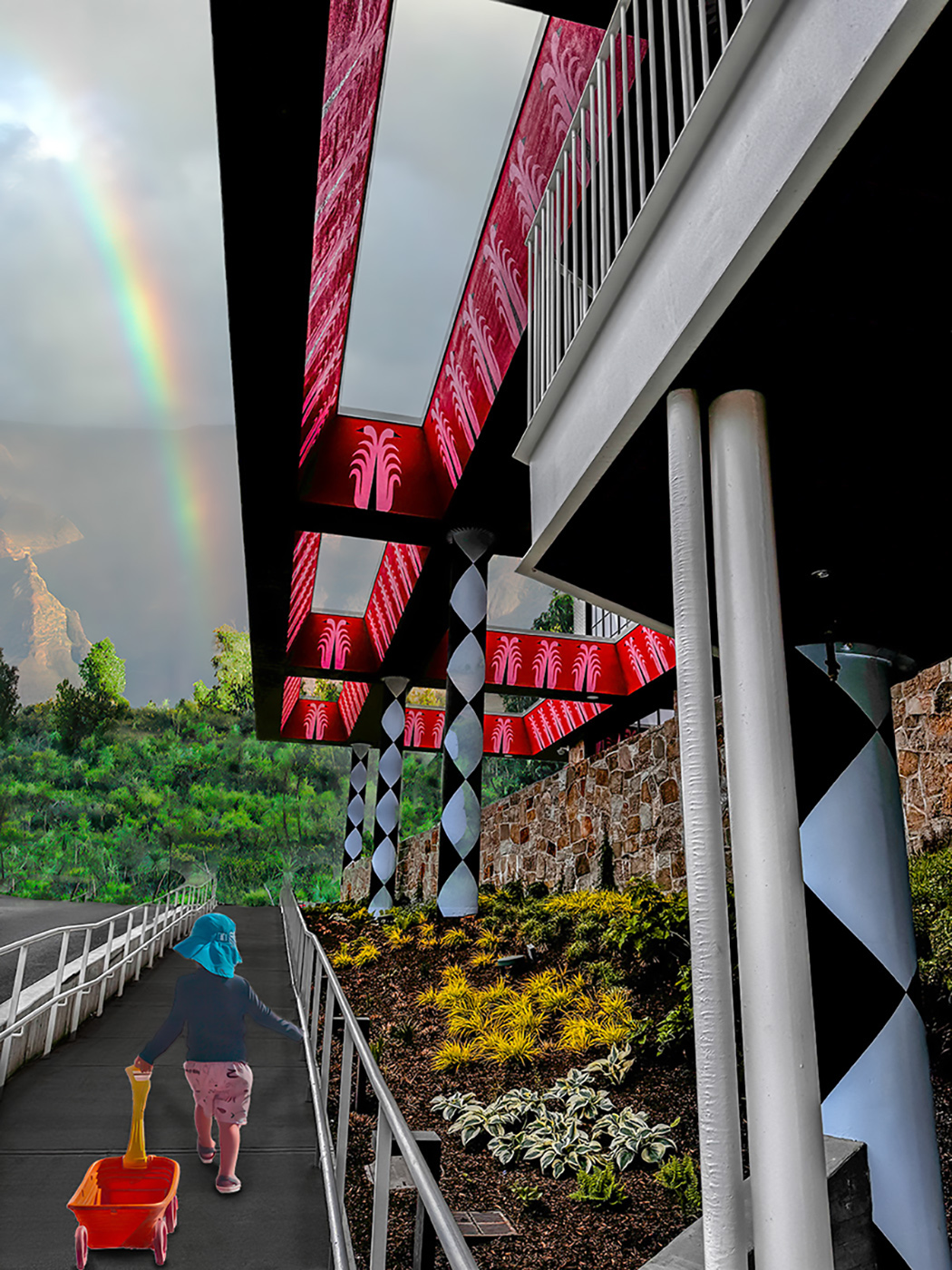
Fun image Peter. I love the bright colors. And you did a great job of pulling out the details from the dark original. I sort of disagree with Patrick about the lighting. There are faint shadows from the handrails on either side of the walkway, which indicates to me that there's diffused light coming from mostly straight above. Your grandson is definitely lit from the side, but I think you could mitigate that by reducing the contrast on the original, rather than increasing it as it appears happened in your final. The issue for me is that he looks pasted in because there's no shadow beneath him or the wagon. The original shadow is much too slanted, so I just painted in one more directly under him and the wagon to ground him to the walkway. Not done with much finesse, but you get the idea. |
Jul 11th |
 |
| 34 |
Jul 25 |
Reply |
Hi Alan; thanks for visiting. It's kind of uncanny how the similarities in our surreal images manifest themselves; unintentional for sure. I appreciate your perspectives and suggestions. The birds were a last minute add that I thought would carry the viewer's eye into the infinite distance, but I should have stopped myself. |
Jul 8th |
4 comments - 6 replies for Group 34
|
| 77 |
Jul 25 |
Reply |
Thanks for your assessment Georgianne. Sorry it didn't sit well with you. Your version has some good points, but your treatment made it blurry and smudged looking, so that seems less than ideal to me. But I appreciate your feedback. |
Jul 19th |
| 77 |
Jul 25 |
Reply |
Thank you Rita! |
Jul 19th |
| 77 |
Jul 25 |
Reply |
Thanks Carol. I'll try that. |
Jul 19th |
| 77 |
Jul 25 |
Reply |
Thanks Denise! I'll try and see if AI can generate a bit more space on the left. |
Jul 19th |
| 77 |
Jul 25 |
Comment |
The curved stem is unique and gives this image a very nice ambiance. I think the size of the flower in relation to the rest of the composition is just right, although cropping the top ever so slightly might work too. I like Carol's version that's just a tad brighter, but your version is really lovely also. You are a wonderful flower photographer. |
Jul 19th |
| 77 |
Jul 25 |
Comment |
Such a sweet image. I agree with the other comments regarding taking out the adult. The expression on the child is priceless. Well done. |
Jul 19th |
| 77 |
Jul 25 |
Comment |
I have a hard time fully appreciating dying flowers, for some reason -- sorry. I think the basic shapes are interesting here, but I agree with other comments about the plastic wrap filter not quite working to good effect here. The yellow, purple, and green pallet is impactful, color wise. And I like the curvature of the stem. |
Jul 19th |
| 77 |
Jul 25 |
Comment |
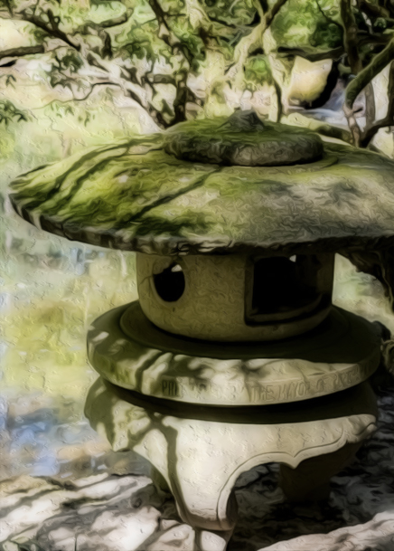
Interesting treatment Georgianne. Since I lean toward minimalism when trying to convey serenity, I would have cropped in on just the lantern; there is lovely curvature on the bottom of it that goes unnoticed in your final. Some of the shadows on the lantern are lovely too. To my eye, the bright colors add energy rather than calmness. Just personal preference though. |
Jul 19th |
 |
| 77 |
Jul 25 |
Comment |
Lovely image Carol. I love the new background you added, much more chic. I think the B/W treatment was the right move, but I sort of feel it could use brightening a bit and increasing the contrast perhaps. Do these dancers usually pose in set positions, or do they sometimes dance so the photographers can get action shots too? |
Jul 19th |
5 comments - 4 replies for Group 77
|
9 comments - 10 replies Total
|


