|
| Group |
Round |
C/R |
Comment |
Date |
Image |
| 34 |
Jun 25 |
Reply |
Thanks so much Peter. I think you're referring to the one with the frame, stairway, and planet? There was no clock in that one, but my husband collects antique clocks and we have many in our home, so I have a ready supply to photograph and frequently like using the concept of time in composites. |
Jun 24th |
| 34 |
Jun 25 |
Reply |
How kind of you to visit our group and offer such nice comments. Thank you! |
Jun 24th |
| 34 |
Jun 25 |
Reply |
Thank you so very much Frans. How wonderful that you were able to visit my area of the world! I trust the weather was nice for you? |
Jun 24th |
| 34 |
Jun 25 |
Reply |
I agree. Much stronger with your edit! |
Jun 24th |
| 34 |
Jun 25 |
Reply |
Thanks Patrick. To my mind, when creating this fantasy image:
1. The clock isn't the entry but the mid-point between two worlds. The path leads the viewer from the outer world to the inner world.
2. There is no horizon in the background image; it's just a brown, lifeless expanse that functions as a backdrop to the rest of the image that I hoped would be more uplifting.
3. The tree was placed at the intersection of the path and the clock in order to further bridge the two worlds. And I just liked it in that position after trying it a few other places.
Sometimes I have a specific story I'm trying to tell with an image, but more often than not, I just try to provide an interesting, ambiguous image so the viewer can create their own story.
|
Jun 12th |
| 34 |
Jun 25 |
Reply |
Me too, Peter! |
Jun 8th |
| 34 |
Jun 25 |
Comment |
This is an interesting concept Frans. I like that you used the silhouette of the butterfly wings as the frame for the faces; it's much more clear and dramatic than in the inspiration poster. The background behind the woman's face on the left side is quite busy and detracts from the wing silhouette. Maybe make it match the right side background more. The yellow outline is a good idea, but it seems a bit too heavy/bright to my eye. I applaud your experimentation with layers and modes. I always have fun experimenting with that too. You have a very creative mind. |
Jun 7th |
| 34 |
Jun 25 |
Comment |
Welcome to our group Patrick! You have an interesting background. How great that you have so much PS experience and now get to use it for being creative.
I love this image. You did a great job of reducing it down to the minimalistic essentials. And you managed to make it look like both the eyes and whiskers were glowing from within. My only suggestion would be to make the black pupils of the eyes less round and more pointed at the bottom so they look more like cat eyes. |
Jun 7th |
| 34 |
Jun 25 |
Comment |
Very nice composite Peter! Your elements go together well. I love that car wash photo, but I think it might contribute more to your theme if you shrank its size to show more of it through the window. Also, my eyes keep getting drawn to the black wall hangings on the left wondering what they are. Maybe get rid of them to remove the distraction? I definitely would be worried if I found myself in this creepy corridor. Nicely done! |
Jun 7th |
| 34 |
Jun 25 |
Reply |
How kind of you Robin. Thanks for visiting! |
Jun 7th |
| 34 |
Jun 25 |
Reply |
Thank you so much Jennie! So glad you like it. |
Jun 7th |
3 comments - 8 replies for Group 34
|
| 77 |
Jun 25 |
Comment |
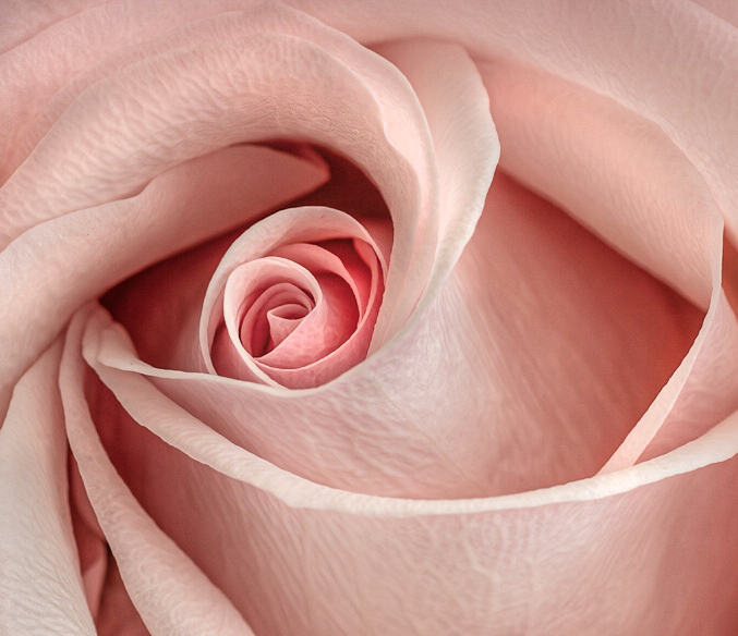
I also love the structural aspects of flowers, and roses in particular, Denise. This is a lovely specimen. I like the increased texture you brought out. For some reason, though, my eye keeps getting drawn to the imperfect split petal on the left, so I thought maybe cropping that part out might give an opportunity to zoom in even further on the wonderful structural form and place the center in the rule of thirds. Some would find that imperfect aspect endearing, so maybe I'm off base. I'm partial to the color version, so I used it to play a bit. Once I cropped, I used dodge and burn tools to accentuate the curves even more. Just a little different take on your lovely image. |
Jun 10th |
 |
| 77 |
Jun 25 |
Comment |
A very sweet photo Connie. I like the high key idea. My eye keeps getting drawn to the dark green leaves since they're so dominant in the composition. I think it could be considered fine art if it was converted to B/W and the dark leaves were toned down some. |
Jun 10th |
| 77 |
Jun 25 |
Comment |
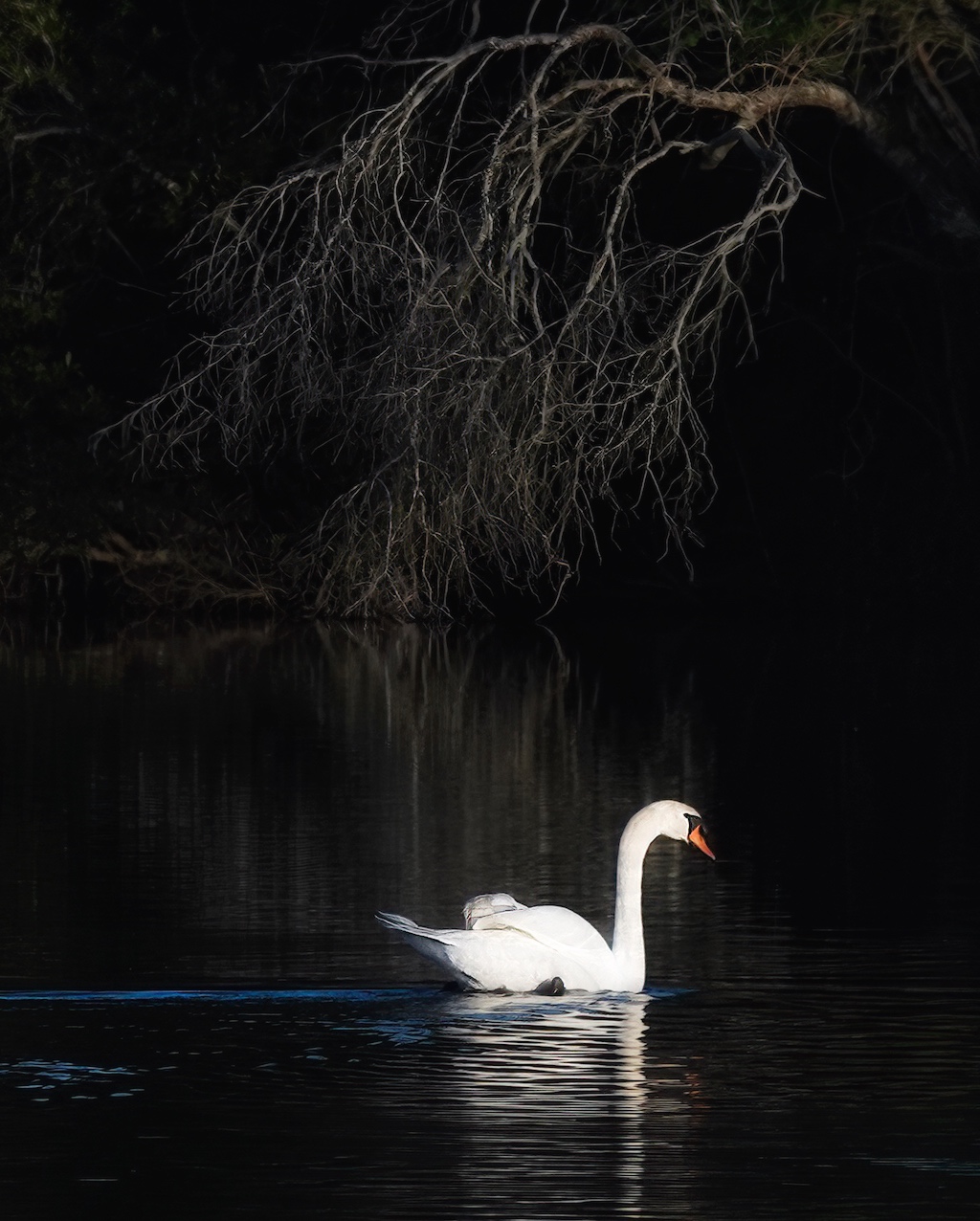
I like the increased detail in this one over last month's image, Rita. To me, the most lovely parts are the swan, that gnarly tree branch, and the reflection of each. I think cropping in and up to place the swan's head in the rule of thirds, with the branch serving a leading lines support role might elevate the image even further. You've captured a dramatic and gorgeous scene that epitomizes elegance and grace. Nicely done. |
Jun 8th |
 |
| 77 |
Jun 25 |
Comment |
I agree with you that minimalistic images have a calm beauty about them. I like the color gradient you applied, but it seems to me that the image is still quite busy. There are also a couple of places where the mask left white edges next to the branches and the straight dark piece at the bottom isn't a true reflection of what is above. I felt it might work with a much tighter crop to eliminate those issues and bring it down to an even more minimalist level. It isn't as clear that it's a reflection on a body of water though, so maybe I went too far. I like your idea to add to the top of the image so the branch wasn't cut off, as in the original. This is a peaceful and soothing image. |
Jun 8th |
 |
| 77 |
Jun 25 |
Comment |
This is a lovely portrait Carol. You did a great job of making the model's face brighter and more evenly lit. At first I wasn't sure the cooling filter worked because the skin color seemed a bit unnatural, but I decided after I looked at it for awhile that it has given everything a nice dreamy look. Beautifully photographed and processed! |
Jun 8th |
5 comments - 0 replies for Group 77
|
8 comments - 8 replies Total
|


