|
| Group |
Round |
C/R |
Comment |
Date |
Image |
| 34 |
May 25 |
Reply |
Boy, have I been there... trying to recover after a crash. Easy to get so engrossed in figuring things out that you forget to hit Save. :-0 |
May 20th |
| 34 |
May 25 |
Comment |
Looks like a super cosmic storm cloud around a glitchy planet. Great colors. Creative editing. Nicely done! |
May 14th |
| 34 |
May 25 |
Comment |
This is a very dramatic composite Frans. You did an excellent job of making the fabric translucent so that the background image shows through it. The colors are great. I like your crop on the left side of the background, but I would suggest cropping the top area to get rid of the bright white UOB sign on the building. My eye is getting drawn there and away from the ballerina. Beautifully photographed and processed. |
May 14th |
| 34 |
May 25 |
Comment |
Nice combination of effects Candy. The original photo is very nice too, and I like the fact that the bird's eye is a little more noticeable in it. So my only suggestion would be to add an eye after all the filters so that it could be seen better. |
May 12th |
 |
| 34 |
May 25 |
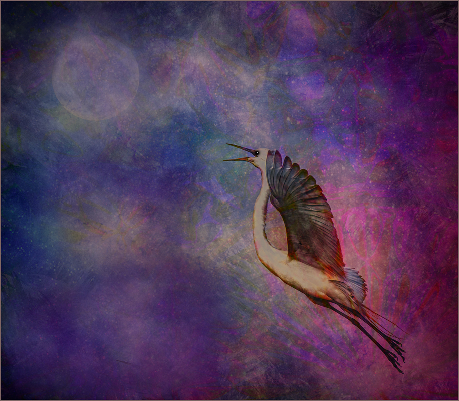
Comment |
Very nice composite Peter. You chose nice images to construct it with. I wondered if the flying eagle should be a bit larger to give it more impact and if the moon could serve a dual purpose of looking like a pupil of the eye. So I gave it a try. |
May 12th |
 |
| 34 |
May 25 |
Reply |
Hi Peter. The cottage was at Epcot Center and the garden was in New Zealand. You're right about the out of focus shot of the girl. The use of Poster Edges in PS frequently serves the purpose of making things more crisp, in addition to making different photos take on a consistent look in a composite. Thanks for your re-work. I guess I was thinking that keeping the main subjects brighter than the background helped them stand out better. |
May 12th |
4 comments - 2 replies for Group 34
|
| 77 |
May 25 |
Comment |
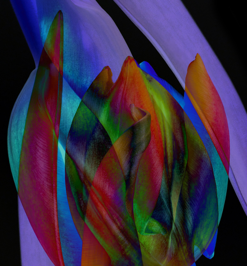
The tulips are absolutely gorgeous Connie. They're in such a unique array, and the leaves provide wonderful grace and structure to the still life. But the crumpled foil pot detracts greatly from the elegance above it. I would suggest completely changing out the vessel in Photoshop to maybe just a simple low rectangular vase. |
May 14th |
| 77 |
May 25 |
Comment |
Your photo of the warrior woman is beautiful. The strong geometric shapes in her clothing are so dramatic. I agree with Denise that there's a lot going on. It's not clear to me that the moon is a moon, but the idea is good. Simplicity seems to be calling out for this image, so I tried a bit different take, still hoping to set her in a night scene. I didn't spend a lot of time eliminating the halo around her when I used the selection tool, but I'm sure you get the idea. I added an image of the moon on a completely black background. Then into Nik Color Efex for a Midnight filter. I also cropped up from the bottom a bit to get rid of the prop she's resting her knee on. |
May 14th |
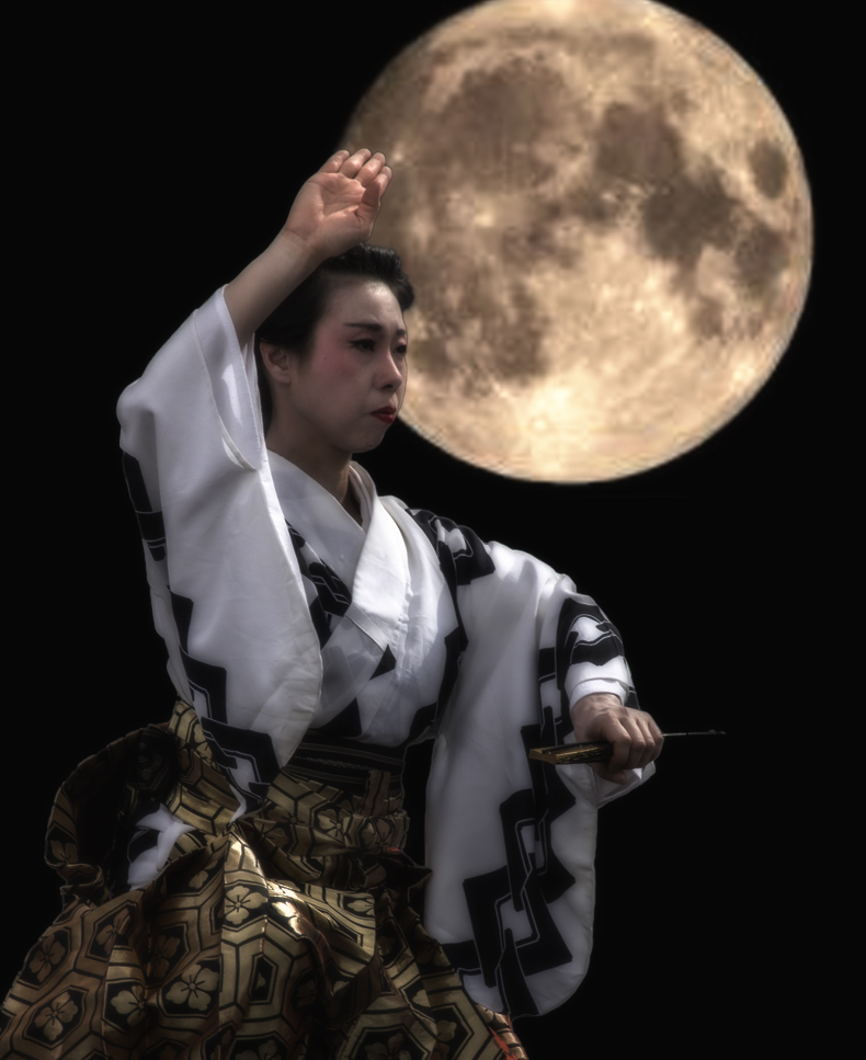 |
| 77 |
May 25 |
Comment |
All of your edits worked really well Carol. I especially like the way you created gradients of tone within most of the shapes that make for a stunning fine art image. Well done! |
May 14th |
| 77 |
May 25 |
Reply |
Thanks for your comments Denise. I was thinking that I wanted the flowers to look like a large mask that she was wearing and intended for the two main flowers to be directly over her eyes. The pink rose was put in to be an upward balance feature for the downward calla lily on the opposite side. I did add some shadows on her face under the flowers so they wouldn't look pasted on, but in hindsight weren't effective. Thanks for your feedback. |
May 14th |
| 77 |
May 25 |
Reply |
Thanks for your assessment Georgianne. My intent was to make everything high key and unrealistic from a photographic standpoint, but I didn't execute very well. |
May 14th |
| 77 |
May 25 |
Comment |
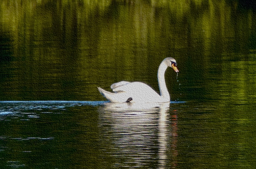
I love that you captured the water dropping from the swans beak. The reflections on the water and the blue trail behind the swan are lovely. The white areas of the swan have no detail and the blown out highlights have turned that part gray. I like Denise's crop, so I did pretty much the same, but then used PS filter gallery to add some Sandstone texture so that the body and neck are white rather than gray and at least have some bit of detail. Not an ideal solution, for sure, just another possibility. I love the serenity and elegance of your capture. |
May 14th |
 |
| 77 |
May 25 |
Comment |
An interesting image it is Denise! Your original shot is really lovely; the twisted leaf tip is the highlight for me. And by mirroring the image, you created double the impact. I applaud you for branching out and trying layers and blend modes in PS. One of my favorite blend modes, especially with an image like this with so many color variations, is Difference. It's so fun to duplicate the image to create a second layer, then use the transform tool to rotate the top layer, and apply Difference blend mode to that layer. Once you've done that, it's an artistic journey to experiment with rotating again more or less, enlarging or reducing the second layer, moving it around to see where you get the most dramatic and beautiful effects for what I think usually create really cool abstracts. I've done that here. Since the leaf tip was a favorite part, I made sure that stayed recognizable. |
May 14th |
 |
5 comments - 2 replies for Group 77
|
9 comments - 4 replies Total
|


