|
| Group |
Round |
C/R |
Comment |
Date |
Image |
| 34 |
Apr 25 |
Reply |
Thanks for visiting Alan, and for your kind words! |
Apr 18th |
| 34 |
Apr 25 |
Reply |
You are indeed correct Steve, if you're referring to the moon calendar. Since I only created one wing, when I duplicated and flipped it, I had totally forgotten that I'd have to replace the backwards version on the second wing. |
Apr 18th |
| 34 |
Apr 25 |
Comment |
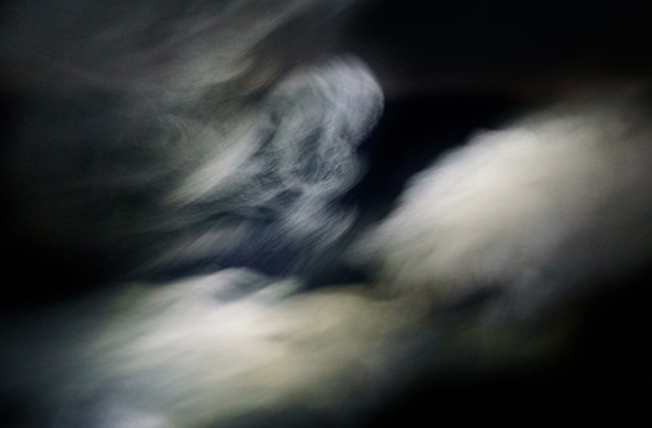
I'm a sucker for photographing pareidolia objects that I happen upon too Steve. This one is fun. I like all your interim and final versions. The only thing I noticed in the final was that the mouth became less impactful with all the textures there. I agree with Peter that the background is a bit distracting in the final; maybe if it was just cropped/blurred/darkened? |
Apr 15th |
 |
| 34 |
Apr 25 |
Comment |
This is an interesting concept Frans. It must have been so exciting to photograph the monkeys in the wild. You did a good job of isolating the various shots and incorporating them into the scene. I agree with Steve that the color balance is leaning too heavily into the magenta range. The warm coloring on the pair in Original 1 is so nice, and a beautifully photographed portrait also. |
Apr 15th |
| 34 |
Apr 25 |
Reply |
|
Apr 15th |
 |
| 34 |
Apr 25 |
Reply |
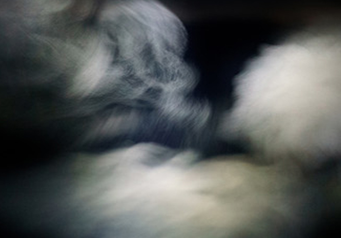
Not knowing where you are in the PS learning journey, I'll throw out a couple suggestions for dealing with the sky and see if they're something you hadn't tried. First, you could use the crop tool to make either wider or higher, whichever you needed for your composition. Then, select the Content Aware Fill option in the top tool bar. This works amazingly well in many situations, so I always try it first. However, since the sides of this image are mostly black, PS (AI) would just add black to the edges. If you wanted to increase the area of the white clouds, you could use the Edit > Free Transform tool, and hold down the Shift key while pulling the side handle on whichever side you wanted to pull out. Holding the Shift key allows you to pull only one side, rather than the whole selection sizing to the same ratio. Alternatively, you could use the Edit > Transform > Distort tool and pull the handles in various directions to get the look you want. I don't know whether this is helpful at all Peter. Please let me know if I'm just confusing you further. The first image below was done using the Shift key/pull the handle technique. The second one was done using the Distort technique. |
Apr 15th |
 |
| 34 |
Apr 25 |
Comment |
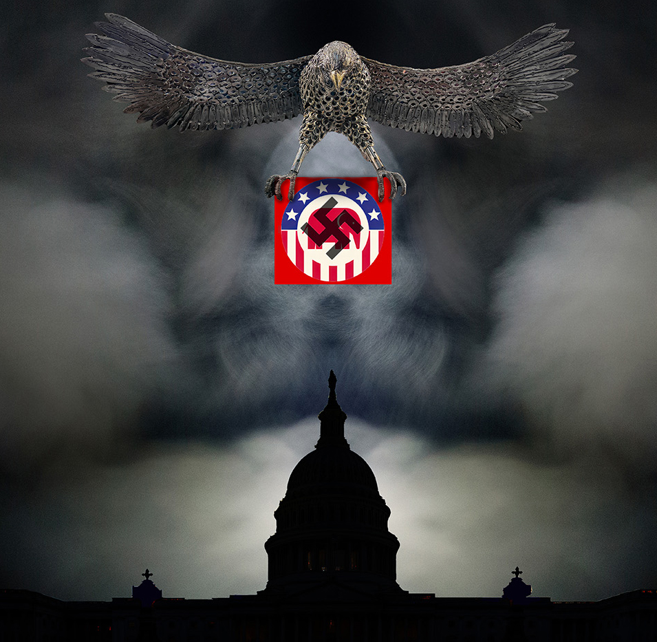
This is a strong statement Peter. Your combination of images is striking. You did a great job getting the eagle isolated from all the lights and reflections. The fact that the GOP/swastika part is the only highly saturated area makes it really stand out. A couple of nit-picky suggestions: In a "real world" situation, the eagle's talons and body would cast shadows on the symbols, so by adding that detail, it helps them look less pasted on. The capitol building has some white halo edges, especially noticeable where the background is dark. I love the breath vapor idea to give the sky real drama and evilness. I think I like it as in your original though, rather than making it mirrored. I like the crop on your original image, but I used your revised version to demonstrate the shadowing. A very well constructed composite. |
Apr 11th |
 |
3 comments - 4 replies for Group 34
|
| 77 |
Apr 25 |
Reply |
Thanks Georgianne. Good point about moving the seagull in a bit. The rays from the sun were from the original shot (no light leak filter). The Diffusion filter I used in post processing made them a little brighter and more contrasted with the sky. |
Apr 19th |
| 77 |
Apr 25 |
Comment |
I like the new color of the background. It's a nice complementary color to the lovely blossom. Maybe my monitor is a little off, because the treatment that gave the edges of the petals their current color seems to have given them a muddy appearance to my eye. I very much prefer Original 2 because the progression of the colors from green to pinkish salmon to yellow to darker pinkish salmon are absolutely wonderful. It has a natural, yet ethereal, vibe. The simplicity of a single blossom always appeals to me, and your composition with the little bit of slanted stem is just right. |
Apr 19th |
| 77 |
Apr 25 |
Comment |
I agree that the plastic wrap filter on the bottle worked well to give it more depth and character. I kind of liked the flowers as they were in the original though; the filter seemed to make them look a bit battered. Denise's version is very nice too. I like the simplicity in composition and color ways; blue and white always appeal to me. Nice Springtime image! |
Apr 19th |
| 77 |
Apr 25 |
Comment |
I agree with Connie and Denise. A little less texture, but the image is very creative and unique. Well done! |
Apr 18th |
| 77 |
Apr 25 |
Comment |
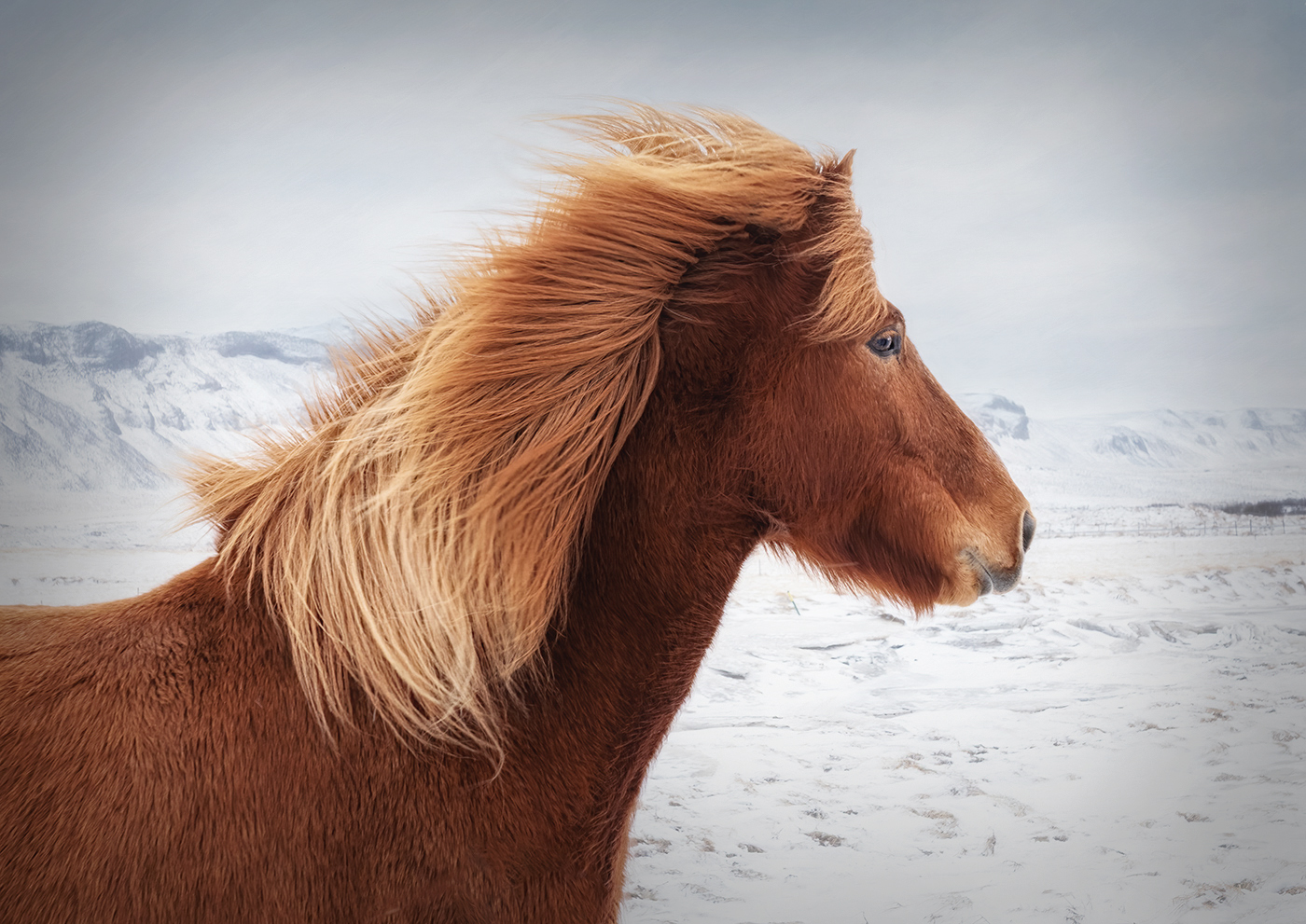
This is great Carol. It makes me cold just looking at it, but that's what makes it impactful. What you did to the background worked well to accentuate the horse. It's cool that his eye is looking at you, but his head is still in portrait. I wondered if a bit of glow and vignette would add anything to your lovely image, so I gave it a try. |
Apr 18th |
 |
4 comments - 1 reply for Group 77
|
7 comments - 5 replies Total
|


