|
| Group |
Round |
C/R |
Comment |
Date |
Image |
| 34 |
Feb 25 |
Reply |
Thank you for your kind words Frans. Good suggestions also. |
Feb 28th |
| 34 |
Feb 25 |
Reply |
I like it Gunter. Changes the mood quite a lot! |
Feb 14th |
| 34 |
Feb 25 |
Comment |
Both images have made the bench sort of disappear into the background. If that was your intent, then mission accomplished. But to my eye, the main subject needs to stand out a bit more. I like that the shadow in the surreal version also has inline breaks. |
Feb 12th |
| 34 |
Feb 25 |
Comment |
A very cool image Mike. Love the colors. I don't think the rabbit is necessary; I wouldn't have known he was a rabbit if I hadn't read your description. And I would suggest cloning out the dead branches on the large tree; they detract from the otherwise dreamy mood. Everything took on a lovely look with the expressionism filter. Good choice. |
Feb 12th |
| 34 |
Feb 25 |
Reply |
Nice of you to visit Alan! And thanks for your very kind comments. They mean a lot coming from someone who's as adept at surrealism as you are. :) |
Feb 10th |
| 34 |
Feb 25 |
Comment |
The lighting and drama that you managed to bring out of the simple snapshots is amazing. Your composition is great. I agree that the two men are pretty large compared to the rest of the group, but they also serve the purpose of interacting with the frame around the upper group of warriors to tie everything together. The sky you used is perfect for the scene and mood. You certainly have a knack for presenting cultural events in beautiful ways. |
Feb 10th |
| 34 |
Feb 25 |
Comment |
At first I had a hard time deciding whether I liked the color version or the B/W version best. You did a great job of simplifying the B/W version and eliminating all the small distractions in the color version. I agree with Mike that lightening the foreground would balance the image and draw more attention to the nice texture there. I'm not sure the black planters contribute much to the symmetry and they seem somewhat distracting to my eye. But I think your experimentation with mirroring created a really interesting image. I think the B/W version is more dramatic. Nicely done! |
Feb 10th |
| 34 |
Feb 25 |
Reply |
Valid comment Mike. It's a bright rock on top of the shale and I neglected to notice that it didn't get blended into the blurred white horizon. Thanks! |
Feb 10th |
| 34 |
Feb 25 |
Reply |
Creative suggestion; thanks Peter. |
Feb 10th |
| 34 |
Feb 25 |
Comment |
As you know, I really enjoy experimenting with blend modes, so this appeals to me. It's sort of a study in textures, and I like your end result. Using two images of such similar colors gives much different (more subtle) results than using images with dissimilar colors and shapes (especially in Difference mode). Did you enjoy the process of seeing how the various blend modes affected the results? |
Feb 5th |
| 34 |
Feb 25 |
Comment |
Welcome to our group Peter! This is a really fun image. You've done a great job combining the various photos and using PS generative fill to get rid of the parts you didn't want. What a cutie Roscoe is. He looks perfectly natural driving the little car. My only nit-pik of a suggestion would be to use the spot healing brush (or remove tool) to get rid of what I assume are reflections of museum spotlights overhead on the hood of the car, since they're a bit distracting and wouldn't be there if the car was actually outside. I love the humor here; well done! |
Feb 4th |
6 comments - 5 replies for Group 34
|
| 77 |
Feb 25 |
Reply |
Thanks Denise. I think you're right about calming down the whites a bit. |
Feb 14th |
| 77 |
Feb 25 |
Comment |
The colors and mood in this image are very nice Rita. I agree that the rocks sort of detract from the rest of the scene. I like Denise's crop. I use added-in birds often in landscape images, and my thought when I saw the birds here was that they were too close to the trees and would add a nice counter element if they were up higher in the sky and fading away into the distance. |
Feb 14th |
 |
| 77 |
Feb 25 |
Comment |
Super image Mary! Very creative. I do sort of agree with Georgianne that the flour and the book are more distinctly different objects in the original; the flour is more white and the book has more contrast with more yellowish pages. But I love all the other changes you made very much. The mood is dark and eerie and fun. Great job photographing and post processing. |
Feb 14th |
| 77 |
Feb 25 |
Comment |
What a lovely image Carol. The layers of trees peeking through the fog are so interesting. The top most bit of trees seem to be gliding right up into the clouds. For some reason, my eye keeps getting drawn to the lowest group of buildings right in the center, with two windows lit up; so I might have cloned those out since all the other buildings are clearer and more interesting. Your crop is very nice and the texture of the water is so calming. Lovely mood here. |
Feb 12th |
| 77 |
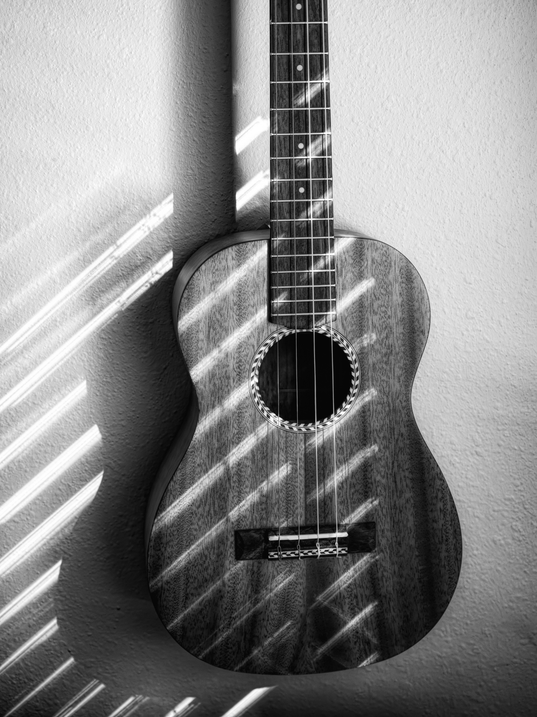
Feb 25 |
Comment |
Great capture Denise. Love the B/W treatment and the way you increased the textures. Good move to take out the label inside too. It seemed to me that even more contrast might give things more drama, so I had a go at it. I also used a glow filter to see how that worked. Both changes are pretty subtle, so might not even be noticeable. How cool that you play the ukulele! Do you sing too? |
Feb 12th |
 |
| 77 |
Feb 25 |
Comment |
I love this Georgianne. Such a perfect photo to use the treatments you did. Your final version, with hints of color added back in, is so striking. Beautifully nostalgic! |
Feb 12th |
5 comments - 1 reply for Group 77
|
11 comments - 6 replies Total
|


