|
| Group |
Round |
C/R |
Comment |
Date |
Image |
| 34 |
Oct 24 |
Comment |
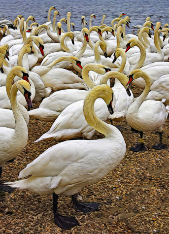
What an interesting place to visit. Like Frans, I first noticed the graceful curves of their heads and necks (especially just right of the center line) and what great shapes they made. In order to accentuate that, I played with the crop to bring the viewer's eye in closer, and then increased the contrast and saturation. It doesn't have the added fun of your additional flying swans, of course, but since I'm a minimalist at heart, the pared down aspect was what I was going for. I like the fur and feather filter you used; perfect for this scene. Since you composited in the flying swans, I think it meets the altered reality criteria. Well done. |
Oct 10th |
 |
| 34 |
Oct 24 |
Comment |
Freaky image for Halloween. Great colors. I like that you added eyes on the bust. |
Oct 10th |
| 34 |
Oct 24 |
Comment |
You did a great job of combining your images Frans. I like your sense of humor in creating something that would never happen, even though it appears to be something that did actually happen. It's so interesting that the indigenous people are happy to see and greet the visiting photographers. My only suggestion would be to crop out the partial people on the right side, to the lady in the pink blouse. Very well done composite. |
Oct 10th |
| 34 |
Oct 24 |
Comment |
This is a nice image Gunter. Love the colors and the way the light is bouncing off the glass. I'm glad you made the table surface solid black to blend in with the rest of the background. It looked like a fun image to play with a bit, so I used PS filters to soften it and give it an even more altered reality vibe. Not better, just different. You did a great job photographing the glasses. Beautiful lighting. |
Oct 10th |
 |
4 comments - 0 replies for Group 34
|
| 56 |
Oct 24 |
Comment |
Your image caught my eye as I was scrolling through this month's images. You did a stunning job of turning this into a painting. Bravo! |
Oct 15th |
1 comment - 0 replies for Group 56
|
| 77 |
Oct 24 |
Comment |
Hi Carol. This image is stunning; the minimalistic subject, the soft and soothing color palette. I love the way you made the rock formation turn into water and a sandy beach. Beautifully done. This would enhance any interior wall space! |
Oct 14th |
| 77 |
Oct 24 |
Comment |
You have a good eye for dramatic and interesting compositions Connie. This is very cool. I do like Denise's version, as it leads the viewer's eye from left to right toward the flag pole. I like the sky you added and you did a good job of taking out the shadow. There are a few remaining artifacts of noise right at the top, but I think you could hit the larger ones with the spot correction tool and the rest probably wouldn't be noticed. Nicely seen and processed! |
Oct 14th |
| 77 |
Oct 24 |
Comment |
I like your final image best too Mary. You certainly enhanced it with your processing. I feel like the tiny bits of color at the top and bottom are distracting, so I adjusted the angle a bit and deleted them. It was fun to peek into the windows and wonder what might have been going on in all those rooms. I thought maybe it might be fun to add in a silhouette of someone looking out of one of the windows, so that's what I've done here. |
Oct 14th |
 |
| 77 |
Oct 24 |
Comment |
When I first looked at your image, I loved the watercolor look of it, but also felt that it lacked a little depth. The contrasts between light tones and dark tones in the original had more depth to my eye. So I tried working with the original in PS to keep the contrast but also get the softness that you did. I failed. So then I used your final image and just used the Burn tool to darken some of the branches a bit. It's a subtle change, and maybe not the look that appeals to you. At any rate, I think your tree is lovely and is a beautiful homage to Autumn. Makes me want to go run through some fallen leaves! |
Oct 12th |
 |
| 77 |
Oct 24 |
Comment |
Taking photos of charming doors is one of the things I love most while traveling, and I love this door! The filter you applied gave it a lovely look. I sometimes struggle with deciding whether to fix the perspective of something straight like a door, when the camera creates skewed lines. With this particular one, since it's only slightly skewed, it seems like fixing it to have straight verticals and horizontals keeps it from feeling "off." In photos where the angles are greater, it sometimes gives the scene a nice depth to keep them. All a matter of personal preference, for sure. Just a thought. I've never heard of Luminar Neo; gotta check it out. Well processed Denise! |
Oct 10th |
 |
| 77 |
Oct 24 |
Reply |
Looks like you did fine with the poster edges Bob. The original of this image was blurry, so they added a bit of crispness to the edges. |
Oct 10th |
| 77 |
Oct 24 |
Reply |
Hi Bob. Thanks for visiting and thanks so much for your very kind words about my image and my website! I love that you're interested in trying the Poster Edges filter too. A couple of tips... I always put the posterization slider all the way to the right (6 setting); the edge thickness and edge intensity sliders are usually nice and subtle at 0 or 1, but those numbers are more of a personal preference, trial and error process. Happy experimenting! |
Oct 5th |
5 comments - 2 replies for Group 77
|
| 97 |
Oct 24 |
Comment |
Your image is stunning. Beautifully photographed and processed. It really stood out as I was scrolling through this month's images. |
Oct 15th |
1 comment - 0 replies for Group 97
|
11 comments - 2 replies Total
|


