|
| Group |
Round |
C/R |
Comment |
Date |
Image |
| 34 |
Aug 24 |
Reply |
Hi Frans. Thank you for your kind words. The trees are in a local park near the San Diego coast. I didn't know what they were called, so I appreciate you telling me. And you are correct that the flower garden is the Keukenhof; I visited it in 2018. The yellow highlights on the trees were just painted on using a yellow paintbrush, set to maximum softness and reduced opacity in PS. |
Aug 27th |
| 34 |
Aug 24 |
Comment |
Your original shot is really nice Mike. It looks like a painting in its own right. But the final takes the artistic look to a whole new level. There are a lot of critters here and they're pretty evenly spaced around the area; I might have reduced the number by a third. I really like the two-tone frame you added. This definitely evokes Summertime. Well done! |
Aug 12th |
| 34 |
Aug 24 |
Comment |
This is fun Steve. The colors and vibe are so "you." I would suggest cropping the left side just a tad so that exactly half of your glasses appear on both left and right edges. Altered reality to the extreme. Very cool. |
Aug 12th |
| 34 |
Aug 24 |
Comment |
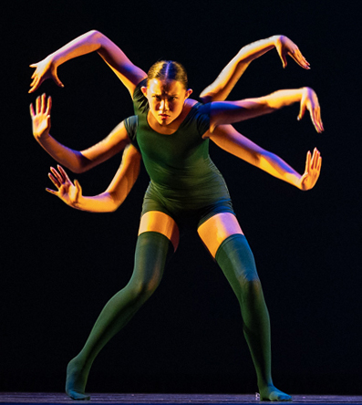
The stage lighting is so dramatic and unique. It really adds to the mystique of your final image. You did a great job of capturing several good shots under difficult conditions. My only suggestion would be to keep the same lighting and intensity on all of her arms, rather than making four of them darker. I think it would make it look more like all of the arms were actually hers. I didn't take the time to fine tune where the arms connect to her body, but include this version only for illustration. Your grand daughter appears to be an excellent performer and a wonderful photo subject. |
Aug 12th |
 |
| 34 |
Aug 24 |
Comment |
Wow, what a transformation Gunter. You were wise not to scrap it before trying alternatives. It almost takes on the look of an abstract. I especially like the little areas of orange highlights in the water that weren't really noticeable in the original, but greatly enhance the final. Well done. |
Aug 12th |
| 34 |
Aug 24 |
Comment |
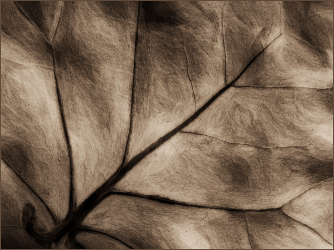
Love this Candy. The texture is wonderful; I kind of get drawn in and lost in it. I think it would have a bit more depth if the contrast was increased slightly, but there's also a case to be made for keeping it less harsh. Very nice! |
Aug 12th |
 |
| 34 |
Aug 24 |
Comment |
This is great Steve. All of the elements beautifully complement each other. That sky is amazing. You did a great job of brightening up the faces to bring out their character. Can't see anything I would change! |
Aug 12th |
6 comments - 1 reply for Group 34
|
| 77 |
Aug 24 |
Comment |
This is stunning Carol. The B/W version is great, but Denise's version is cool too. I like your crop, and kudos for darkening the upper right corner to tamp down the distracting bits up there. I think you could also burn down the horizontal highlights (steps?) to make them disappear. Your edits all work beautifully to make her the focal point of the composition, but still have context with the other features. Bravo! |
Aug 14th |
| 77 |
Aug 24 |
Comment |
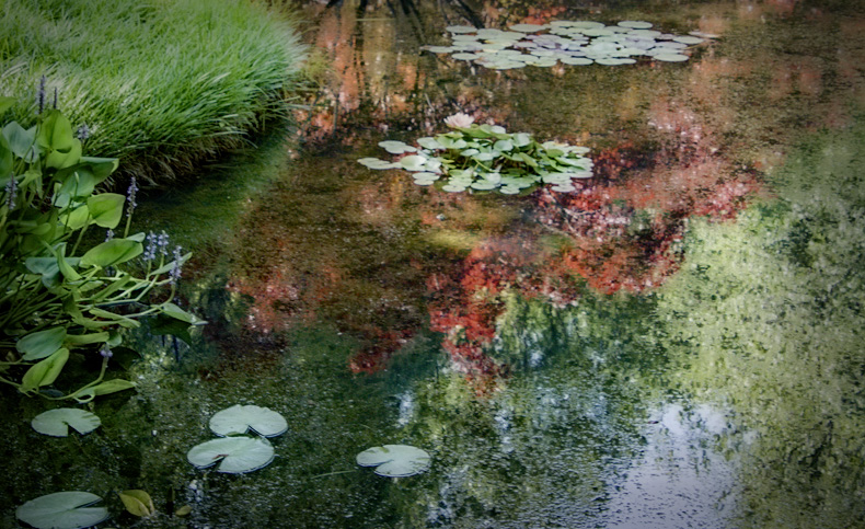
What a lovely place to pass away some time and snap some shots Georgianne. It almost seems to like there are two different compositions here. The upper part shows the beautiful reflections; the lower part accentuates the Monet-like textures. It kind of seems to me like there's too much going on. Forgive me, I'm a minimalist at heart, so I tend to favor pared down compositions. I took the liberty of having a little play with your sweet image by cropping, then adding Glow and Dynamic Contrast in On1. Certainly not better, just different. |
Aug 14th |
 |
| 77 |
Aug 24 |
Comment |
I also like the hills showing some detail. Or perhaps they could be cropped out so that the clouds are the only subject. It must have been amazing to see this scene. How cool that you see these often. I think you did a very nice job of bring out more color and detail. I kind of like the final darker version, as it's more moody and dramatic. Nicely seen, captured, and processed! |
Aug 14th |
| 77 |
Aug 24 |
Reply |
I'm not sure why it came out so huge. Hope this version is better. If not, you can just save the image to your desktop and then view it with your normal photo viewing app. |
Aug 13th |
 |
| 77 |
Aug 24 |
Comment |
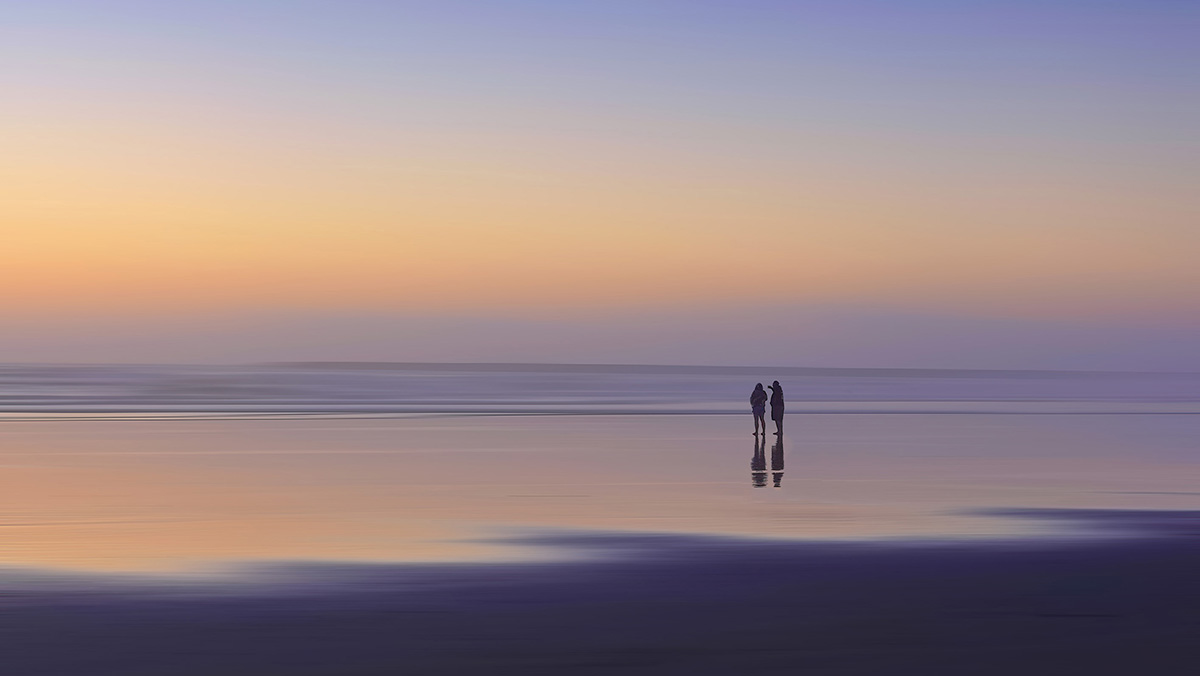
I love the colors here, Rita. And the people have a lot to contribute to the scene. I like the idea of blurring the background, but it seems to me that it's a bit too far. The people now seem to sort of be disconnected or ungrounded, to my eye. I use motion blur frequently, so I tried an experiment to see if I could find a happy medium between the original and final images. I tried to leave a bit of landscape detail, so the people are still anchored, but blur out the distracting detritus around them. Perhaps not to everyone's taste, but I had fun giving it a go. At any rate, your image has a lovely ambiance and story. |
Aug 13th |
| 77 |
Aug 24 |
Comment |
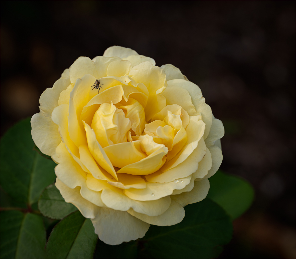
I think all your decisions were good ones Denise. The flower has nice texture but isn't harsh or overdone. I also like darker backgrounds to make a beautiful subject like this pop, and the vignette is just right. I notice there's a very sweet dew drop with great lighting on one petal. So I had a little play with adding another two just for fun. While I was at it, I added a very thin green key line since the top is dark enough to blend into our black background. Your edits have all taken the original image into the realm of stunning. And even though I'm not a spider fan, I have to admit this little guy has a certain charm. Nice! |
Aug 13th |
 |
| 77 |
Aug 24 |
Reply |
Thanks Denise. When I darkened the trailer, it also darkened the shadow underneath it and blended into the black tire. I agree with you that I should have dealt with that. Guess I was so focused on the other elements that I couldn't see that oops! |
Aug 13th |
5 comments - 2 replies for Group 77
|
11 comments - 3 replies Total
|


