|
| Group |
Round |
C/R |
Comment |
Date |
Image |
| 34 |
May 24 |
Reply |
I can understand how you might wear out a few pairs of shoes wandering over the area. It must be very peaceful and soul-mending to explore this beautiful part of the world. |
May 18th |
| 34 |
May 24 |
Reply |
Very cool Steve -- I like it! |
May 18th |
| 34 |
May 24 |
Reply |
You're right Mike; it does look a bit like the tree branches are growing out of his head when he's bigger. I should have AI generated some additional water at the bottom of the image to give him more room. At any rate, I think your concept is fun and makes me smile. |
May 9th |
| 34 |
May 24 |
Comment |
Very cool shapes and colors here. I really like the way it looks like a mirror image at first, but then when you study it, it's different in each area. I seems like it needs at least a slight border to define the area, or maybe fade out the parts that are cut off by the boundary so they appear to be exploding into space. Fun image! |
May 8th |
| 34 |
May 24 |
Comment |
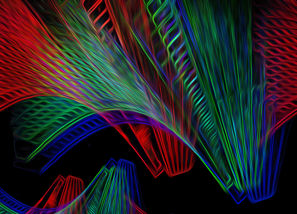
What an interesting building and I really like your perspective for the shot. The upper half seems more interesting than the lower half, because of the combination of straight and curved lines and the way the shapes and colors overlap each other. The center black area seems too empty. It looked like a fun image to play with so I used PS Poster Edges, Glowing Edges, and Oil Paint on just the upper portion. The lower left was too empty then, so I just copy/pasted/resized part of the resulting image. You created a bright and happy abstract that truly catches the eye! |
May 8th |
 |
| 34 |
May 24 |
Comment |
I like the crop that includes only the prettiest leaves. My favorite version is Original 2, mostly because it seems more dramatic than the lighter final version. The mood of the final is more ethereal and the sun beams are an interesting addition. |
May 8th |
| 34 |
May 24 |
Comment |
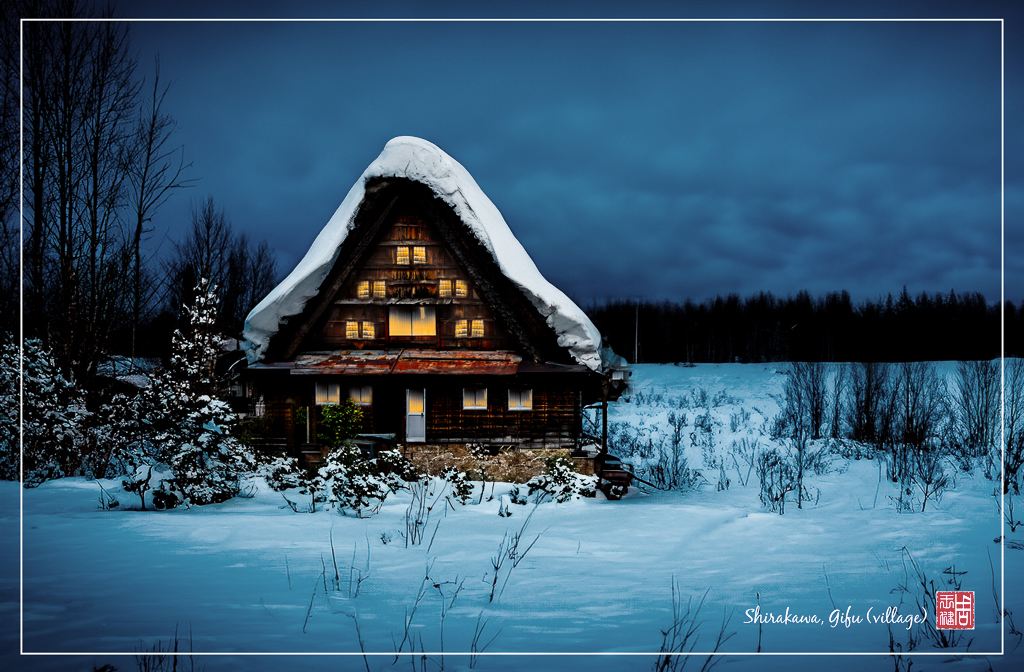
Hi Frans. This looks like a completely different place in Spring than in Winter. I like your treatments, your crop, the leading lines of the twigs in the foreground. The blueness seems just a bit unrealistic, so I played with the saturation. The warm color of the chalet became flat, so I used a mask to bring back that part of your image. For some reason the two black marks at the top of the roof peak looked like horns to my eye, so I used the Spot Healing Brush to get rid of them. The white border inside the edge works well, and I love the Japanese notation in the corner. Your vision for this location was inspired and definitely a huge upgrade from your original. So nice! |
May 8th |
 |
| 34 |
May 24 |
Comment |
Congratulations on getting your book published Steve; bravo! Is this image in it? This is an interesting composite showing all of the important and ancient landmarks in your area. I like your coloration and the way you made the cross appear as a translucent figure. Very nice "vibe" to the scene. |
May 7th |
| 34 |
May 24 |
Comment |
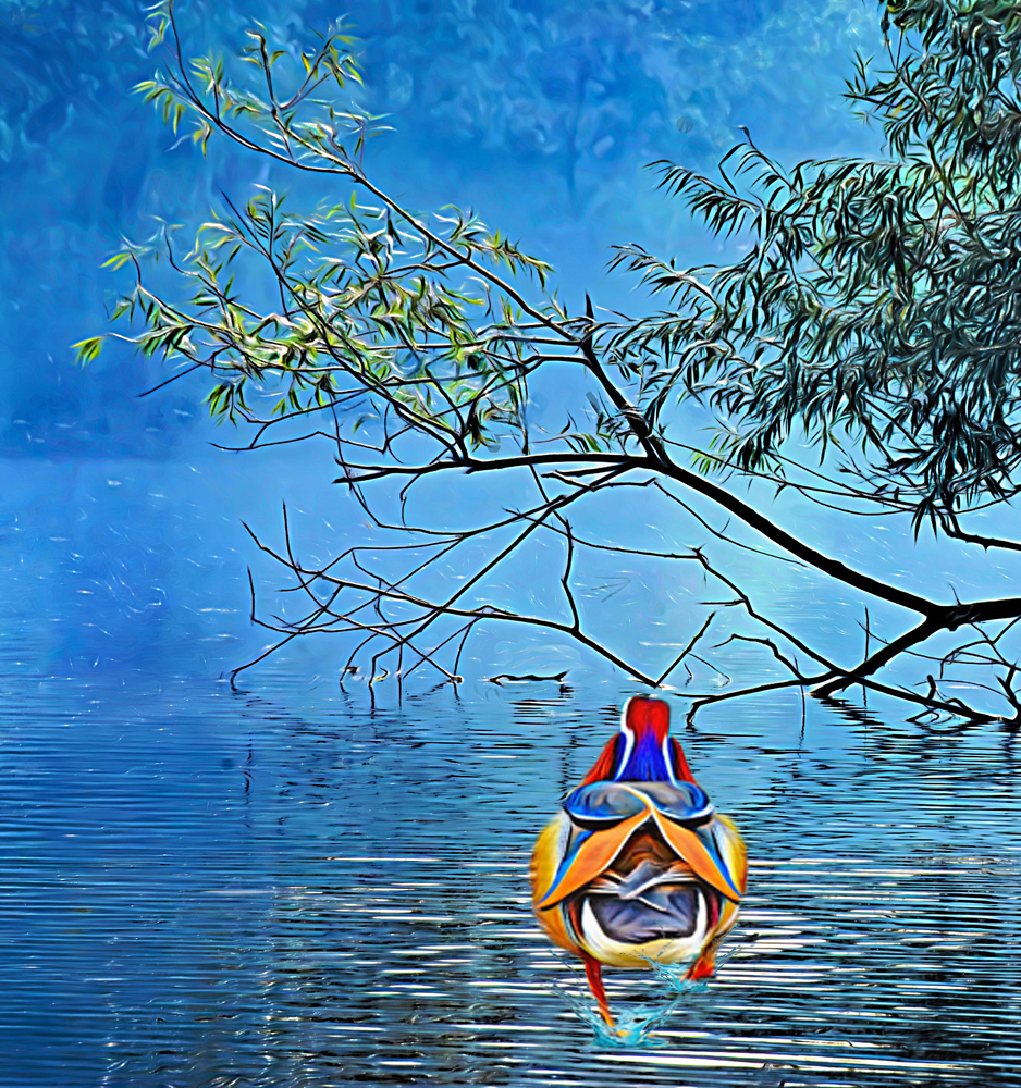
Hi Mike. You have such a knack for thinking up fun and imaginative images. This one is no exception. My only suggestion would be to increase the size of the bird so he's more noticeable. I played with doing that, and as I was doing so, it seemed like maybe some splashing would reinforce the concept of the bird walking on top of the water. Not a perfect technical edit, but you can see my drift. I like the painterly look you gave it. Cropping down the background was a good idea to simplify things. Very nicely done! |
May 7th |
 |
6 comments - 3 replies for Group 34
|
| 77 |
May 24 |
Comment |
I think your crop is perfect Denise. You kept the most interesting parts. When I first looked at it, I saw a face. I got a chuckle when it looked like the bolt in the center was a stud in its tongue :) Your processing choices all worked great, and I wouldn't change a thing. It did occur to me that it might also look good as a black and white, so I've included a version processed with Nik SilverFx for fun. But your color version is perfect as is. Well done! |
May 17th |
 |
| 77 |
May 24 |
Comment |
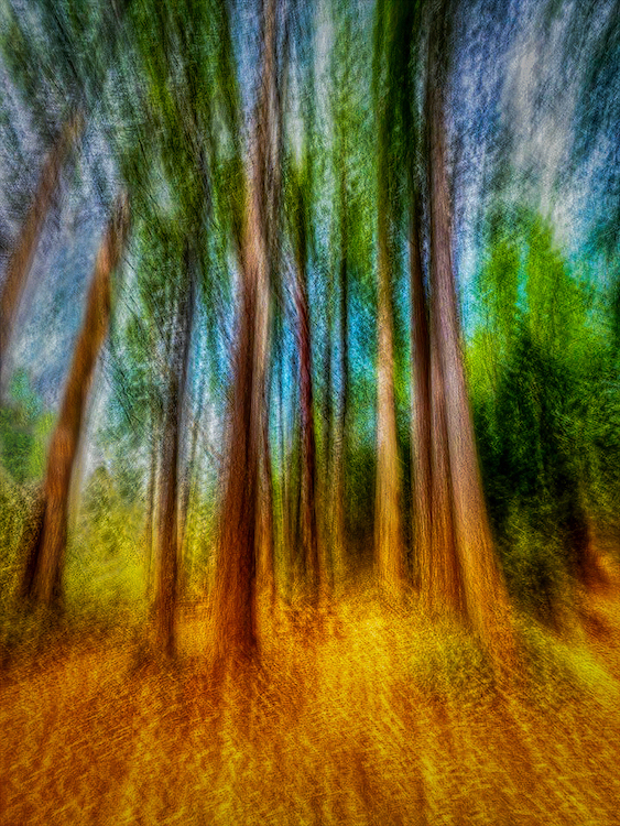
You've captured a lovely interpretation of being in a forest and looking upward. The texture your phone and processing accomplished is very nice. My only suggestion would be to deal with the area on the left side where a small branch coming off the tree created a "ladder" effect heading upwards with the ICM. That tree trunk is also more blurry than the others. My eye kept going there to the exclusion of the absolutely beautiful textures present in the other tree trunks. I took a stab at making a couple changes in PS; obviously I didn't spend a lot of time, but at least you can see my intent. I think this would be a great entry for a competition. I wish you success! |
May 17th |
 |
| 77 |
May 24 |
Comment |
I love the soft color of this, Mary. ICM is a fun technique to experiment with, and I think you've captured a very nice version. You did a good job of cropping in to the best part of the image so that the viewer doesn't get dizzy from the circular parts of the outer edges. I do like Connie's crop to place the main "cone" area off center in the rule of thirds space. This has a very serene vibe that is calming to view and contemplate. Nicely done! |
May 17th |
| 77 |
May 24 |
Comment |
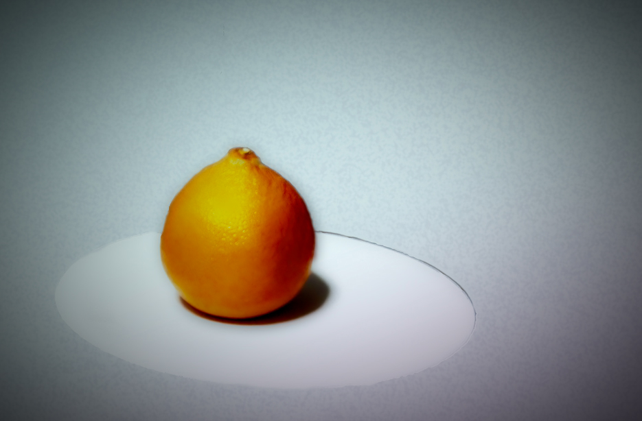
I enjoy photographing common objects also, I guess mostly because of the simplicity they usually evoke, which you captured nicely here. I like doing Google searches for common object photography and studying which ones appeal to me and trying to figure out why. Usually, for me, it involves some degree of managing to make something common appear more dramatic and special than just the object in itself. Dramatic shadows, interesting close-ups that create abstracts, very moody lighting. In your photo I see great potential for taking it further into the fine art realm. The cut out edges of the orange could be feathered more to get rid of the dark outlines that draw attention to the fact that it was lifted from a dark background. The blemishes on the orange could be taken out with the spot healing brush so that it had a more flawless (read: special) appearance. The plate is a good idea, but to my eye, it doesn't have enough of a contour to make it obvious it's a plate rather than a flat piece of paper or cardboard. The orange could also be elevated by including a stem and leaf; I tried doing that using AI and it didn't work at all for me (ended up looking like a bad cartoon rendition; obviously I need to practice that technique!). I've included a version I worked on to show a couple of other ideas: slightly closer crop, softer edges on the orange, bit of a vignette to bring the eye onto the orange more.
I certainly hope this doesn't all sound overly critical Georgianne. I think this is a really cool idea that has lovely potential that a bit more processing would bring out. |
May 12th |
 |
| 77 |
May 24 |
Comment |
This is a stunning image Carol. The fact that the flower petals are sort of helter skelter makes it very endearing. The little green bit is so lacy and enhances the scene beautifully. The curve of the stem is special. You did a great job creating the alcove, and the very subtle color of the background really reinforces the blossom's color. The high key treatment takes the original to a lovely new level. Bravo! |
May 12th |
| 77 |
May 24 |
Comment |
What a gorgeous Spring image Connie. Love the soft color and soft focus. You did a great job of bringing out more detail in the main blossom. I do kind of wish the two closest points of the blossom were in focus like the rest of it; I think it would stand out even more dramatically against the blurred background portions. I think your crop is perfect, and I like the fact that the blossoms are entering the scene at an angle. This does indeed have a dreamy quality that takes it into the realm of fine art. Well done! |
May 12th |
6 comments - 0 replies for Group 77
|
12 comments - 3 replies Total
|


