|
| Group |
Round |
C/R |
Comment |
Date |
Image |
| 34 |
Apr 24 |
Reply |
I agree with you completely about vignettes often being too noticeable; subtlety is the key. In my opinion, vignettes can bring a little bit of depth to images that appear a bit flat, rather than just drawing attention to one part. As I looked at your image again, I decided that perhaps dodging the highlights and burning the lowlights might accomplish more than a vignette. I've probably overdone it a bit, but I wanted to make sure you could tell a difference. The beautiful undulation of your image is a big part of what makes it work, but I think adding more depth to it would enhance that feeling even more. |
Apr 16th |
 |
| 34 |
Apr 24 |
Comment |
Great collection Mike! Each one is a work of art on its own, but the group is more than the sum of its parts. I like that you kept the color palette interesting but focused on a few main colors. It would have looked more like a hodge-podge of disconnected images, rather than a cohesive piece of art, if you had used too many colors. Very well done! |
Apr 15th |
| 34 |
Apr 24 |
Comment |
The cat looks pretty nervous in your original, so I guess I'm in the same camp as Gunter and Mike when it comes to the use of the filter. But it does take the piece into the "Steve Wessing Style" for sure! :-) |
Apr 15th |
| 34 |
Apr 24 |
Comment |
Love this image Frans. The softness of the tree, in contrast to the bird is very interesting. Putting your name in Chinese is a really nice touch. Am I correct in assuming that the small specks beneath the bird are a distant flock of birds? Perhaps making them just a bit larger would make them more recognizable. Beautiful composition and editing! |
Apr 15th |
| 34 |
Apr 24 |
Comment |
This is very serene, Gunter. It reminds me more of a quiet joy, rather than a celebratory joy, but I get your drift. The colors are calming too. I have no suggestions for improvement other than maybe a slight vignette to bring the viewer's eye into the inner area. Well done. |
Apr 15th |
4 comments - 1 reply for Group 34
|
| 77 |
Apr 24 |
Reply |
Thanks Connie. Graphic Pen and Poster Edges are a couple of my favorite PS filters. And as with most of the filters, keeping the settings very minimal and subtle seems to work best. |
Apr 23rd |
| 77 |
Apr 24 |
Reply |
Thanks Denise. I did actually consider whether to take out the big tree, but decided to leave it in because asymmetrical compositions almost always appeal to me more than symmetrical ones. Obviously, I didn't ponder the idea sufficiently enough to realize it became just a big, black blob up there in the corner. Perhaps I could have lightened it to a brighter green like the other vegetation in the background, but in really does look better without it. Thanks everyone! |
Apr 23rd |
| 77 |
Apr 24 |
Comment |
This is quintessential Spring Denise. I love the overlapped stems and the increased detail you brought out in the seed heads. I agree with the other comments about the white areas in the background, and I think Linda's more dramatic difference between foreground and background works well. Rotating the image ever so slightly so the stems are just off vertical might add an interesting angle. The fact that you saw these two dandelions among a whole field of them speaks to your compositional expertise. Very nice! |
Apr 14th |
| 77 |
Apr 24 |
Comment |
Very nice flower portrait Linda. I like the complementary color palette. To my eye, the shadows are a little too harsh. If it had been a cloudy day rather than a sunny one, or if you had shaded the subject from a couple of feet away, the lighting would have been more even. The slanted stem is nice. You did a great job with your focus stacking. I'm always too impatient to take the time to do that. Well done. |
Apr 14th |
| 77 |
Apr 24 |
Comment |
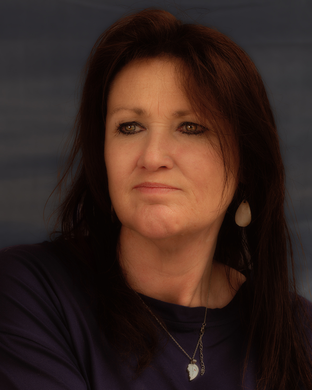
I love the detail you captured in her eyes, Mary. And you captured her nature. The fact that her eyes are looking away from the camera makes edits to the background more believable to show what she might be reacting to. I think the cloud idea is a good one, but maybe ramp up the drama to create a much more moody backdrop? I do agree with the others regarding the skin tones. Since you said you were unhappy with some aspects, I tried a couple of edits myself. I tried highlighting her eyes and shading the rest of her face, but it looked awful. I did try the PS liquefy tool (which has been improved greatly for working with portraits) to very slightly tweak her mouth. This is a "controversial" edit, of course, because now it's not reality. I'm only adding it here to illustrate the difference that could be achieved if desired. |
Apr 14th |
 |
| 77 |
Apr 24 |
Comment |
Very nice composition Connie. I love the ragged and well-worn look of the hat; it wouldn't have nearly as much panache if the hat looked new. The tools in the background add nicely to the story, but I agree with the other comments about needing to reduce the noise there. In my opinion, the border detracts a bit from the scene and isn't really necessary since the background of the photo isn't black. Or maybe if it weren't so bright and/or thick. This was a nice capture and evokes a sense of simpler bygone times. |
Apr 13th |
| 77 |
Apr 24 |
Comment |
Another nice still life Georgianne. I agree with the other comments about the original having more realistic and interesting colors. I think you did a great job of capturing the light, shadows, and ambience with your camera. The nice contrasts between the cool toned blue curtains and the warm toned fruit and bowl have been lost with the edits. This makes me want to sit down and enjoy a cup of coffee in this lovely nook. Well done! |
Apr 13th |
| 77 |
Apr 24 |
Comment |
What a lovely portrait Carol! You did a fantastic job of editing the subject so that she became so much more than a snapshot of a pretty young woman. I love the color changes you made and the way her skin, pearls, and bodice have a glow about them. I do agree with Denise about the background kind of looking like a painted backdrop instead of giving her a presence within the context of the scene. To me, the contrast between the grungy texture of the steps/bricks and the softness of her dress and face add a great deal to the story. I also like the blackness of the original doorway as a backdrop for her. I played with the background to simplify it a bit, but leave the interesting textures and context intact. Just another take on editing your wonderful capture of a moment in time. |
Apr 13th |
 |
6 comments - 2 replies for Group 77
|
10 comments - 3 replies Total
|


