|
| Group |
Round |
C/R |
Comment |
Date |
Image |
| 34 |
Mar 24 |
Reply |
Hi Frans. Sometimes I see other artwork that I like and use it as inspiration, but sometimes my ideas just come out of nowhere. I had taken the sun photo a couple of years ago and saved it because I knew at some time I would find some way to use it. Since we have had a lot of rain and gloomy weather, when I saw the sun image in my stash, I decided it was time to make a point of using it. The other images were just sort of random selections out of my stash that I thought would go well with the sun. Thank you for your kind words. |
Mar 12th |
| 34 |
Mar 24 |
Reply |
Thanks Steve. I frequently get comments about my images being too dark, so I think I need to finish a piece, and then as a final step, lighten it by 20% or so. I do tend to make even my camera settings on the dark side because they seem richer to me, but maybe my eyes are a bit wiggy, compared to everyone else's! |
Mar 10th |
| 34 |
Mar 24 |
Comment |
When I first looked at this, I thought the left side of the gentleman's moustache was a gondola in the water. Oops. I like the lighthouse in between the two faces and the overall composition. I think maybe leaving in more of their hats would add context and interest, especially the man's, which is charmingly punk. You always do such a great job of melding images into a fun image. You're a wizard at getting people to pose for you and strut their stuff. Well done! |
Mar 9th |
| 34 |
Mar 24 |
Comment |
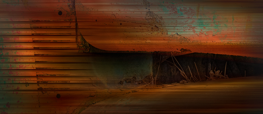
Great rusty patina here Candy. It looked like a fun image to play with, so I gave it a try. My favorite part from Original 2 was where the open hood revealed the pine needles and the horizontal lines to the left. I cropped in to that small part. You know me, I love motion blur, so I applied a horizontal one and used Darken blend mode so some of the rusty details showed through. The dark recess came out too black and empty, so I applied a mask and brought back some of the pine needles. Just a different take on your interpretation. Your treatment has given it an abstract look with such wonderful colors and textures. |
Mar 9th |
 |
| 34 |
Mar 24 |
Comment |
This is a stunning image Gunter. Phoenix's eyes are mesmerizing. You did a great job of creating a high key look without losing important detail. The tilted angle of her face is perfect, and I like the crop. Very nicely done! |
Mar 9th |
| 34 |
Mar 24 |
Comment |
This is a beautiful light painting image Frans. You did a wonderful job of ramping up the colors and details. The nice black background sets everything off nicely. My only suggestion would be to clone out (or paint over with black) the bright shoe (or foot?) of the far right dancer. It's a bright spot that my eye keeps getting pulled to, and away from the beautiful dancers. Great compositing! |
Mar 9th |
| 34 |
Mar 24 |
Comment |
I'm more partial to the effects achieved on the right side of the image, and I think it would be more impactful without the left side. To my eye, the bright white bottom area completely distracts from the cool colors and shapes above. The further back woman's facial features are badly distorted by the effects and could be softened so they aren't so "gruesome." I like the juxtaposition of the people and various metal posts and signs. You've accomplished a nice piece of psychedelic art with all your hard work. |
Mar 9th |
| 34 |
Mar 24 |
Comment |
This is a very cool image Mike. I really like the way you simplified the tower; the concept of the threatening eye is great. I prefer the color version over the monotone, so that the eye is more prominent and obvious. I couldn't resist the urge to play with it for fun. It sort of seemed to me that the outer part of the eye needed to be rotated a bit so that the "lashes" were on top. I liked Gunter's suggestion of making the eye a bit bigger too. After placing the revised eye over the tower, I used Nick ColorEfex, Midnight, and Vignette filters to make it a little more dark and threatening. I love your imagination in creating this. Well done! |
Mar 8th |
 |
| 34 |
Mar 24 |
Reply |
Thanks Gunter for your reply and encouraging words. I also hope to learn to make better images by participating in DD. Your perspectives are always appreciated. |
Mar 4th |
| 34 |
Mar 24 |
Reply |
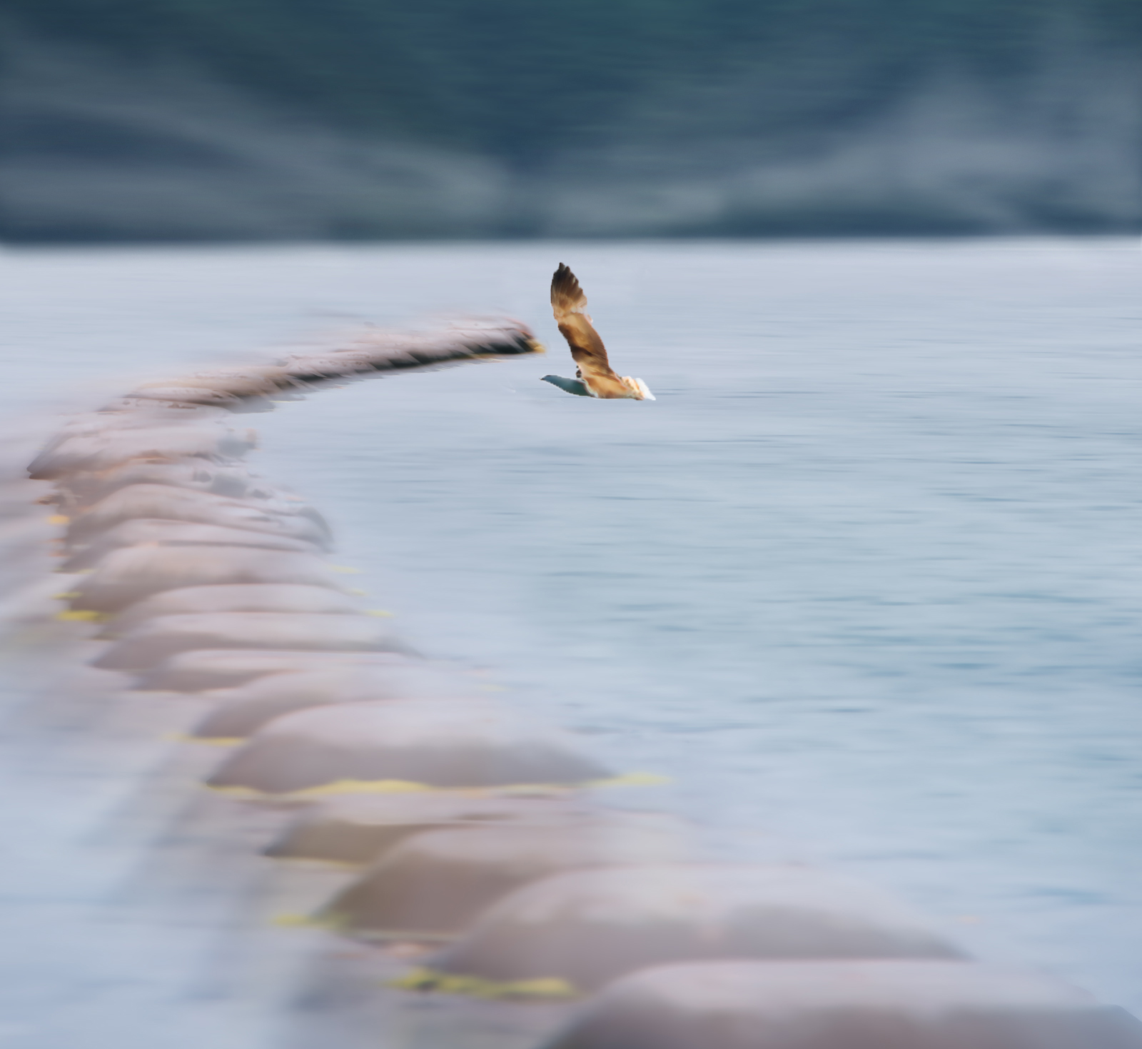
Well, the operative word is "prospect." It's still gloomy and rainy where I am, but it's March, so I'm hoping the sun will break through soon! The sun and stars are bright, compared to the rest of the image. In my mind, the bird is patiently waiting for the sun to "win out" at breaking through winter's darkness. I think I need to stop explaining my intent in creating images; perhaps it locks viewers into a preconceived idea of what it should look like and then taints their ability to interpret it however they want. To me, part of the fun of creating images is seeing how others interpret them. But I know you've said before you don't enjoy having to figure out an image, so perhaps it's just a matter of viewing what's presented and leaving it at that, which is fine in it's own right. |
Mar 3rd |
6 comments - 4 replies for Group 34
|
| 77 |
Mar 24 |
Reply |
Awww. Thanks Georgianne. Steve seems to be doing well. |
Mar 26th |
| 77 |
Mar 24 |
Reply |
Thanks Georgianne. Steve Estill is still a member of Group 34, but he needed to step back from administering it, so I took it over. |
Mar 24th |
| 77 |
Mar 24 |
Comment |
I hate to be of a contrary opinion, but it seemed to me there were more than enough petals to tell the story. Wondering if I was off base, I decided to see what I came up with in removing two of the loose petals and moving the third one to appear to still be attached to the stem. At that point it seemed a different crop was in order. Then, since I was having a great time working with your lovely piece, I took it into PS Filter Gallery for Poster Edges and Oil Paint. Then into On1 for a glow effect. And finally, a little dodging of the highlights and burning of the shadows. I also added a keyline border using the brown color from the flower. Your image is lovely and I didn't start out intending to change it so radically; I just couldn't stop myself. :) |
Mar 13th |
 |
| 77 |
Mar 24 |
Comment |
Stunning edit Linda. The warm tones and dark background greatly enhanced it. I love the feather details and the texture in the post. You managed to keep all the highlights looking very natural even though you completely changed the color profile. Well photographed and beautifully processed! |
Mar 13th |
| 77 |
Mar 24 |
Comment |
Nice image Mary. I like the high key effect; it makes the scene seem ethereal. It seems to me that the shoreline gives some context, but perhaps cropped a bit lower would bring more emphasis to the mussel pots and bird. To my eye, the bird is too close to the leading edge of the mussel pots, so I moved it a skosh. I liked Georgianne's version of the lower crop, and it made me think of a foggy shoreline, so I had a bit of a play to see how it would look. Your processing is lovely and it looks like a serene and amazing place to visit. |
Mar 13th |
 |
| 77 |
Mar 24 |
Comment |
I also like the darker background; it gives the flowers more drama. I don't know that you need to include the entire long stem, but I do think a bit more, perhaps on more of an angle too, could add a certain gracefulness to the context of the blossoms. These are such a lovely color, and you did a nice job of photographing them. I wish I had some of these in my yard! |
Mar 12th |
| 77 |
Mar 24 |
Comment |
Hi Georgianne. Didn't you used to be in Creative Group 34? So nice to see you here in this group! This is a lovely still life image, and I love what you've done to make it look painterly. The moodiness, nice shadows, and warm highlights are all beautiful. The lemon in the original image has great texture, color, and no blown out highlights, so maybe masking and bringing that back after whichever process made that happen would work to eliminate that problem. The other highlights seem fine to me. This is a very comforting tableau. Very well photographed and processed! |
Mar 12th |
| 77 |
Mar 24 |
Reply |
Thanks Connie. Both the lighter gray and darker gray areas are concrete; the lighter part was newer and overlapped the other with the ragged, rough edge that appealed to me. The yellow pods were from another photo. I just selected them with the quick selection tool in PS and then added them in as a new layer. Then I masked them and erased the parts where I wanted the blade of grass to be in front of them, so they didn't look like they were just pasted in on top. |
Mar 8th |
5 comments - 3 replies for Group 77
|
11 comments - 7 replies Total
|


