|
| Group |
Round |
C/R |
Comment |
Date |
Image |
| 34 |
Nov 23 |
Reply |
Thanks Steve! I do remember your Coda; super image. |
Nov 30th |
| 34 |
Nov 23 |
Reply |
Thanks Andrew. And thanks for visiting! |
Nov 30th |
| 34 |
Nov 23 |
Reply |
This was the first thing I created (generated) in AI. It was surprisingly easy to do. It feels like cheating to make new stuff, but I suppose it could have a creative application in some images (not for competitions though). I have used generative fill to add more background after expanding or rotating an image just to fill in more of the same, which usually works great. |
Nov 17th |
| 34 |
Nov 23 |
Reply |
This was the first thing I created (generated) in AI. It was surprisingly easy to do. It feels like cheating to make new stuff, but I suppose it could have a creative application in some images (not for competitions though). I have used generative fill to add more background after expanding or rotating an image just to fill in more of the same, which usually works great. |
Nov 16th |
| 34 |
Nov 23 |
Comment |
Hi Frans. You did a wonderful job of combining the two images into a beautiful tribute. The restoration and AI generation of your professor enhanced the frame from the YouTube video very well, much sharper, better color, and how cool that it was able to give him a nice suit to wear. Your framed final is beautiful and I'm sure his family and friends appreciated your kindness in producing it for his ceremony. |
Nov 10th |
| 34 |
Nov 23 |
Comment |
This is a great study in shapes and lines. So interesting to move your eyes around the image. I love the colors and the lines going every which way. I agree with Steve W. that the cut off blue edge in the upper left needs some kind of editing. I wonder if PS AI would generate a complete guitar from your original. As I typed the last sentence, I decided to try it. I generated a "blue guitar" from your original, copied the area where the corner was cut off, then pasted it into your final image. You can see where the overlap occurred and it's obviously not fine tuned, but it did generate something to work with. Your vision for taking your original to a new level worked beautifully. Well done! |
Nov 10th |
 |
| 34 |
Nov 23 |
Comment |
Your original photo has beautiful lighting and details, and I think that got lost with the textures/overlays that you applied. The textures are great for the background, but masking out and removing the them from the leaves would help, in my opinion. The colors and tones are perfect for an Autumn tableau; very nice. |
Nov 10th |
| 34 |
Nov 23 |
Comment |
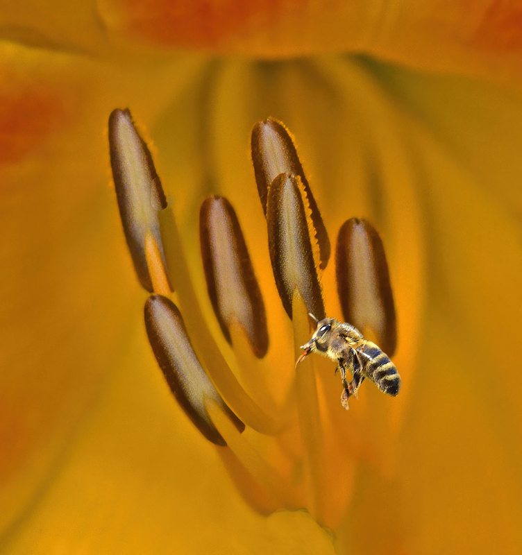
It was interesting to know your vision/intention from your reply to Steve W. A different title or perhaps a statement in your description would have helped the viewer understand better. My only suggestion would be to spend a bit more time isolating the bee. Since it's on a dark green background, there's a distinct green tinge around the outside that gives away the fact that it was from a different image. In your Original 2 photo, I used PS Select Subject from the Quick Selection tool, then Select and Mask, used Smart Radius, and played with the settings there and in Feather. It didn't eliminate all the small dark areas, so I used a mask and tiny brush to get rid of the few remaining areas. It sounds more complicated than it was and didn't take very long at all. I didn't do any further processing, so it doesn't have the same refined look as yours; just wanted to illustrate my point. I like the monochrome nature of your final image. It's a lovely view into a macro world. |
Nov 9th |
 |
| 34 |
Nov 23 |
Comment |
Autumn looks like a very sweet and vibrant lady. At first I thought the surrounding flora might have been better staying more saturated as in the originals, but then I decided it was a good move to tone them down so that the bright colors in her hat and face stand out. I do agree with Steve W. that a bit more of her jacket and dress might add a nice counterpoint to the colors in her hat. This is a really nice composite Steve. You've processed it beautifully, as usual. Bravo! |
Nov 9th |
5 comments - 4 replies for Group 34
|
| 77 |
Nov 23 |
Reply |
Thanks Connie. I didn't do anything specific with the branches on the upper left. They just morphed into what you see when I changed the perspective from crooked and skewed to the straight-on view. |
Nov 27th |
| 77 |
Nov 23 |
Reply |
Thanks Linda. I guess this image is to be viewed in total, rather than one thing. My eyes rest on the cozy lit room on the lower left and I imagine a warm gathering inside. I did consider adding a silhouette of a person inside, but decided it wasn't the look I was going for. |
Nov 27th |
| 77 |
Nov 23 |
Comment |
Beautiful image Carol. It must have been wonderful to be there. Personally, I like the people in the image because they give an accurate perspective. The two monuments could be any size, so in my opinion they could be left out. I've cropped out one and used the spot healing brush on the other. I also cropped up a bit to eliminate the lower right rock area. Some additional contrast was added for a tad more drama, but your final is lovely. It just looked like a fun image to play with a bit. The depth of the peaks into the distance is stunning. Well captured and processed. |
Nov 21st |
 |
| 77 |
Nov 23 |
Comment |
I really like the unique perspective and symmetry here. The bubbles were a nice capture. I agree with both Denise and Carol about the composition; either adding a bit of red brick below the stone ledge or cropping it off would work. This is a happy image that feels like there must be a child on the other side of the window with a nifty bubble blowing machine. :) |
Nov 21st |
| 77 |
Nov 23 |
Comment |
This certainly evokes a feeling of Autumn and the shapes of the leaves are interesting. I agree with Denise about the condition of the leaves; and I like her version. You did a good job blurring the background but still keeping enough details to put the leaves in a nice context. For me, the wide border detracts a bit from the rest of the image. This scene looks like a lovely place to go for a stroll. |
Nov 21st |
| 77 |
Nov 23 |
Comment |
Very nice post processing Mary. I agree with Linda and Carol regarding the crop. Your title is fun. I might have cloned out the telephone pole and whatever the rectangular shape is next to it on the lower left. My eye seemed to keep going back there once I noticed them. The depth you achieved is lovely and I really like the juxtaposition of the "hand of man" in the otherwise natural scene. |
Nov 20th |
| 77 |
Nov 23 |
Comment |
Lovely image Linda -- except that it makes me shiver just looking at it! ;) I know exactly where you took this photo; I have virtually the same shot from my visit to Yellowstone. I went in the summertime, so the mood of mine is different, but the trees are the same ones. The orange mineral deposits add a nice counterpoint to the otherwise monochrome image, for me. Your edits to ramp up the fog worked well. And I think your crop is perfect. Very nicely done! |
Nov 20th |
| 77 |
Nov 23 |
Comment |
Beautiful Autumn still life Denise. The pumpkin is so unique. I love the way you've led the viewer's gaze from one area to another. The textured background you've added is very nice; gives interest without overpowering the subjects. Personally, I kind of like the reflection of the pumpkin on the table in the original. The horizontal lines are a bit distracting, but I bet the Spot Healing Brush would take care of those handily. Adding the shadows under the pumpkin worked well to ground it in the space. Well processed! |
Nov 20th |
6 comments - 2 replies for Group 77
|
11 comments - 6 replies Total
|


