|
| Group |
Round |
C/R |
Comment |
Date |
Image |
| 34 |
Oct 23 |
Reply |
Thanks Steve. Love your description. :) |
Oct 28th |
| 34 |
Oct 23 |
Reply |
Thank you Frans. I completely agree! |
Oct 20th |
| 34 |
Oct 23 |
Reply |
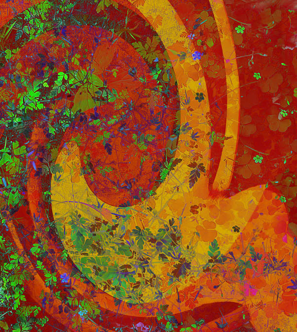
Thanks Steve. My vision was for the arched wall to gradually appear through the green wall so it wouldn't look like it was attached to it. But it's a pretty strange image, so I think your version works too! |
Oct 20th |
| 34 |
Oct 23 |
Reply |
Thanks Gunter. When I look at a piece of art, I often create my own story in order to enjoy it more fully. But everyone is different and I certainly respect your viewpoint. |
Oct 20th |
| 34 |
Oct 23 |
Reply |
Sometimes I hope the viewer will create their own story with the mage as presented. Perhaps the upper birds are guarding the portal entry so the goose and her gosling can make it through safely - after the gosling has a little worm snack first so it won't get hungry too soon. Just sayin'! :) |
Oct 12th |
| 34 |
Oct 23 |
Reply |
Good suggestion Mike. Thanks, I think you're right. |
Oct 11th |
| 34 |
Oct 23 |
Comment |
I like the colors and patterns of your final image, but I think it would be better without the bee at all. It then becomes a really interesting abstract, with nice textures and complementary colors. |
Oct 11th |
| 34 |
Oct 23 |
Comment |
Your combination of the two images worked well, and your final image is interesting to study in sections. The mirroring you did with the B/W was a nice way to create movement. My only thought upon first view was that the large white areas overpowered the rest of the image. I played with your two originals a bit just for fun. Since I didn't have the mirror program, I just distorted Original 1 in PS to get an approximation. Rather than leaving the image B/W, I created an orange overlay since that's complementary to the green image, and used linear light blend mode. Then I placed it over the foliage, using difference mode at 83%. It doesn't bear much resemblance to your final, so it's a long way from what you were aiming to create, but it eliminated the white areas and I had fun playing. Your final is creative and a nice study in shapes and patterns. |
Oct 11th |
 |
| 34 |
Oct 23 |
Comment |
Your final color palette is really nice Candy. I love the background texture you created using the lily -- genius! The blossom is nicely placed in the rule of thirds. I agree with Steve that a slight vignette would focus more attention on the flower. The elegant simplicity here is so lovely. Well done! |
Oct 10th |
| 34 |
Oct 23 |
Comment |
Another beautifully composited image, Steve. I really like the color palette. To my eye, the stone in the front provides the perfect leading line into the rest of the scene. I do agree with Gunter that the musicians are grouped a bit close together and the center is left a bit empty. Maybe if the tuba player was flipped the other way and placed next to the left-center stone? All of your various processing steps have given everything a nice consistent texture. I would say there's a lot of Satisfaction here! |
Oct 10th |
| 34 |
Oct 23 |
Comment |
A humorous and fun final result for sure, Mike. It made me chuckle each time I focused on a different component. The fantasy aspect of ducks swimming upstream in the rapids and butterflies landing on moving water takes it to another level. I did notice that James is not quite opaque enough; the darkest and lightest part of the waterfall behind him is visible. The turtle is placed nicely; I can imagine his little legs paddling madly to stay there. All of the components are a little too evenly spaced apart for my taste, and I think cropping off the left side a bit would place James not quite so much right in the middle of the scene. At any rate, it's a fun and well processed composite. Thank you for giving me a good chuckle. :-) |
Oct 10th |
| 34 |
Oct 23 |
Comment |
This is a stunning composite Frans. The expressions on all the animals' faces are wonderful and you have good catchlights in all their eyes. The hummingbird is blending in with the fern because the colors are so similar. You could move it (and the Heliconia) over to the right side in front of the darker, more simple leaves; or replace the bright ferns with the darker leaves to keep it on the left side. In my opinion, the frog on the monkey's nose would work in a more humorous image, but seems a bit forced here. I do like all of the various different plants and leaves, because they add to the rain forest concept. However, the leaves behind the monkeys are pulling attention away from them. Perhaps darkening the bright veins in the leaves would help that. This is a minor point, but the lower part of the tiger original has white sunlight which got transferred to the final; you could clone in the darker fur and stripe from above, or maybe add another leaf to cover it up. You did a wonderful job of isolating all the various animals, and I like the way you placed your animals better than Cunico's image. Your image is much less cluttered and more serene. Very nice job. I wish you well with your entry! |
Oct 1st |
6 comments - 6 replies for Group 34
|
| 77 |
Oct 23 |
Comment |
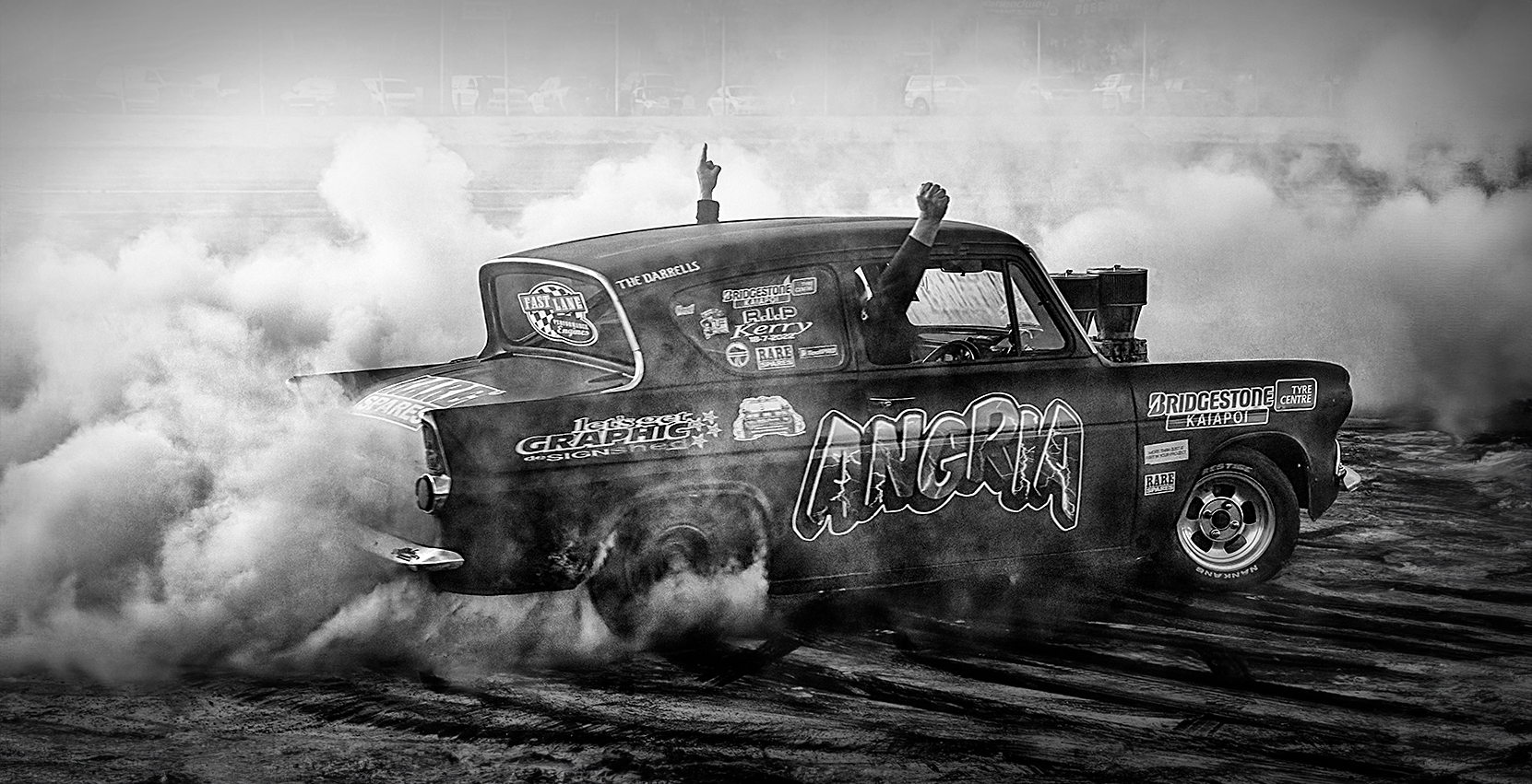
I guess I must take notice of horizon lines more than others, because it jumped out at me that the background cars were slanted. If you wanted to keep the main car at the original tilt, I would mask or clone out the light background cars. I like all of your edits and I think you did a great job of making the image gritty and arty. Since I decided to tweak a version to correct the horizon line, I also gave the car a little more room in front by generating a fill, used On1 Dynamic Contrast filter to amp up the grit, and then a 33% black brush to add a vignette to draw attention to the car and smoke. This is a nice homage to a fun memory for your friends. I would say the sacrifice of you and your lens getting dirty definitely paid off! Well done. |
Oct 21st |
 |
| 77 |
Oct 23 |
Comment |
Super image Linda. You really changed it from a pretty standard snapshot to a gorgeous piece of art. I love the enhanced yellows; nice complementary colors to the blues in the sky. The enhanced clouds are much more dramatic. Nicely processed! |
Oct 21st |
| 77 |
Oct 23 |
Comment |
Very nice image Denise, with lots of moodiness which I love. The generated background is pretty cool. I think AI used in the way you did is perfectly kosher for images that are not entered in competitions that ban it. It's just another artistic tool in PS's toolbox, in my view. I think all of your treatments work great -- the tangled weeds, the lovely texture of the mushrooms. I prefer the highlights in your version rather than toned down; they're not blown out and there's good texture there, so I think the contrast gives the mushrooms more depth. I kind of agree with Jodi about the thickness of the border, or maybe a darker green so it's not so different from the black background. You would never guess that this duo was found in a potted plant; you totally sold the idea of a forest find. Well done! |
Oct 21st |
| 77 |
Oct 23 |
Reply |
Thanks Linda. Your flip doesn't quite feel right to me; but you were not alone in your assessment. Please see my reply to Jodi below. |
Oct 20th |
| 77 |
Oct 23 |
Comment |
Since you titled the image as you did, and since there are no other window reflections visible, I was confused upon first looking at the image and wondered why that type of light was hanging from the tree. So I agree with the other comments to remove the lantern. This is a case of "less is more." But your processing of the rest of the image is beautifully done. The silhouetting of the foliage works perfectly against the wonderful colors of the sky. |
Oct 20th |
| 77 |
Oct 23 |
Comment |
What perfect timing in capturing this shot Jodi. I agree with everyone's previous comments. Love the increased drama in the clouds. That skraggy tree in the upper left has so much character. All of the elements help the viewer's eye move from one part to another. Sweet story; beautiful fine art image! |
Oct 20th |
| 77 |
Oct 23 |
Comment |
Lovely piece Carol. You really ramped up the drama with your edits. I especially love the interaction of their center hands together; that could almost be a piece of art on its own. For my taste, they appear a bit too posed and static; seems like it would be even more impactful if they were moving. But that's just my opinion. I completely agree with the other comments about how well you processed the image. |
Oct 20th |
| 77 |
Oct 23 |
Reply |
Thanks -- you too! |
Oct 20th |
| 77 |
Oct 23 |
Reply |
Thanks so much Jodi. I'm totally on the same page as you regarding the placement of the egg and thought maybe I was just liking it best as the original because I've looked at it only that way. It feels "off" and uncomfortable flipped; I think your assessment about how we read from left to right is why it feels so much more natural with the egg on the left. But that's what makes the world go round -- different strokes for different folks! |
Oct 20th |
| 77 |
Oct 23 |
Reply |
Thanks Carol. Please see my reply to Jodi below. |
Oct 20th |
| 77 |
Oct 23 |
Reply |
Thanks Denise. Minimalism is one of my favorite photo genres. Regarding the positioning of the egg, please see my reply to Jodi below. |
Oct 20th |
6 comments - 5 replies for Group 77
|
12 comments - 11 replies Total
|


