|
| Group |
Round |
C/R |
Comment |
Date |
Image |
| 34 |
Aug 23 |
Reply |
Hi Frans. Thank you for your kind words. And thank you for trying to look at my website. I haven't updated it in quite a long time, but I have it placed on a free website host for now, so the URL has changed. It is now:
https://jhandman61.wixsite.com/jhandmanphotography
I also updated it on my bio, so the link should now work. |
Aug 27th |
| 34 |
Aug 23 |
Reply |
Yes I am. Hi Darlene! Nice to hear from you. :-) |
Aug 17th |
| 34 |
Aug 23 |
Reply |
Thank you Gunter. The filter I used to make everything blend together caused the edges to blur, which in hindsight didn't really work for keeping the details in the clock movement. |
Aug 15th |
| 34 |
Aug 23 |
Reply |
Yes, you're probably right Mike. I was afraid to tone it down too much since his cap and pants are dark; I thought he might blend into the background and not get noticed. But I should have knocked the brightness back just a bit. Thanks! |
Aug 13th |
| 34 |
Aug 23 |
Reply |
Learning and growing as an artist is the goal. I very much appreciate the dialogue, and respect everyone's processes and artistic choices. |
Aug 12th |
| 34 |
Aug 23 |
Reply |
But in my opinion, the whole purpose of being in a creative group is to develop different objectives and perspectives from diverse subjects or themes. I'm not familiar with Gimp but solarize is a common filter, so it may have it too. |
Aug 12th |
| 34 |
Aug 23 |
Comment |
I can see why this poppy caught your eye Mike. The colors are amazing. Did you ramp up the saturation, or is this the way you found it? You did a great job of changing the blossom position each time to change it up. I love the way the stems wave back and forth through the image. The viewer's eye moves in an orderly way through it from front to back. The frame reins everything in. Nicely done! |
Aug 12th |
| 34 |
Aug 23 |
Comment |
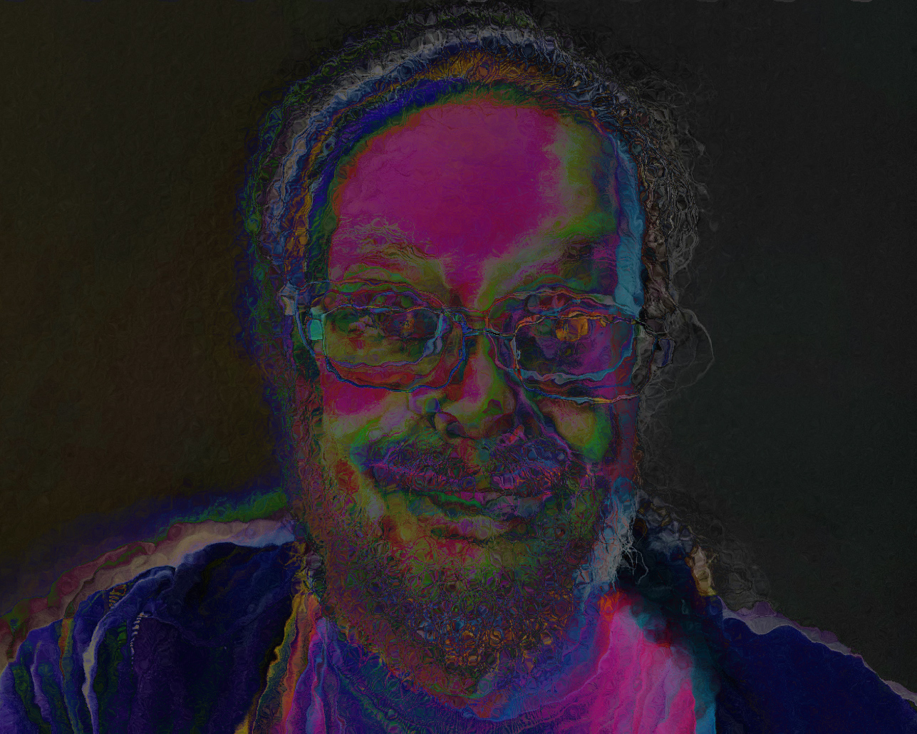
Another popping colors image. As charming as your selfie is, I would like to see you use a new photo going forward, since you have shown this same one in several past months. The large dark brown area in your forehead detracts from the other colors here, in my opinion. I know you've said you favor this style, so you might try the Solarize filter in PS for an alternate way of getting to the look you might be after. I've used it three times and changed the blend mode, hue, and saturation each time. Then I used the Glass filter to give it an additional bit of movement. Of course, this may not be to your liking at all, but my point is that there's joy to be found by experimenting with all the wonderful and diverse filters in PS. |
Aug 12th |
 |
| 34 |
Aug 23 |
Comment |
This is a very impactful image Frans. You've done a wonderful job of melding the masks into a nice background; keeping them dark made the dancer pop beautifully. I love the two little eyes peeking under the arc of the golden cloud. I agree with Steve about the footprints in the stage floor. The lighting on the dancer is so nice and you kept him in focus even though he was clearly moving quickly. Bravo! |
Aug 10th |
| 34 |
Aug 23 |
Reply |
Thanks Steve. Actually, I misspoke; I did use the healing brush rather than the magic eraser to get rid of the tourists. When you mention the blurring I used, I think that happened when I applied the Waterpaper filter to make all the elements have the same texture. Perhaps I should have done it with reduced opacity or used a different texture. I frequently use Oil Paint to give everything the same look, so I wanted to try something different here. |
Aug 8th |
| 34 |
Aug 23 |
Comment |
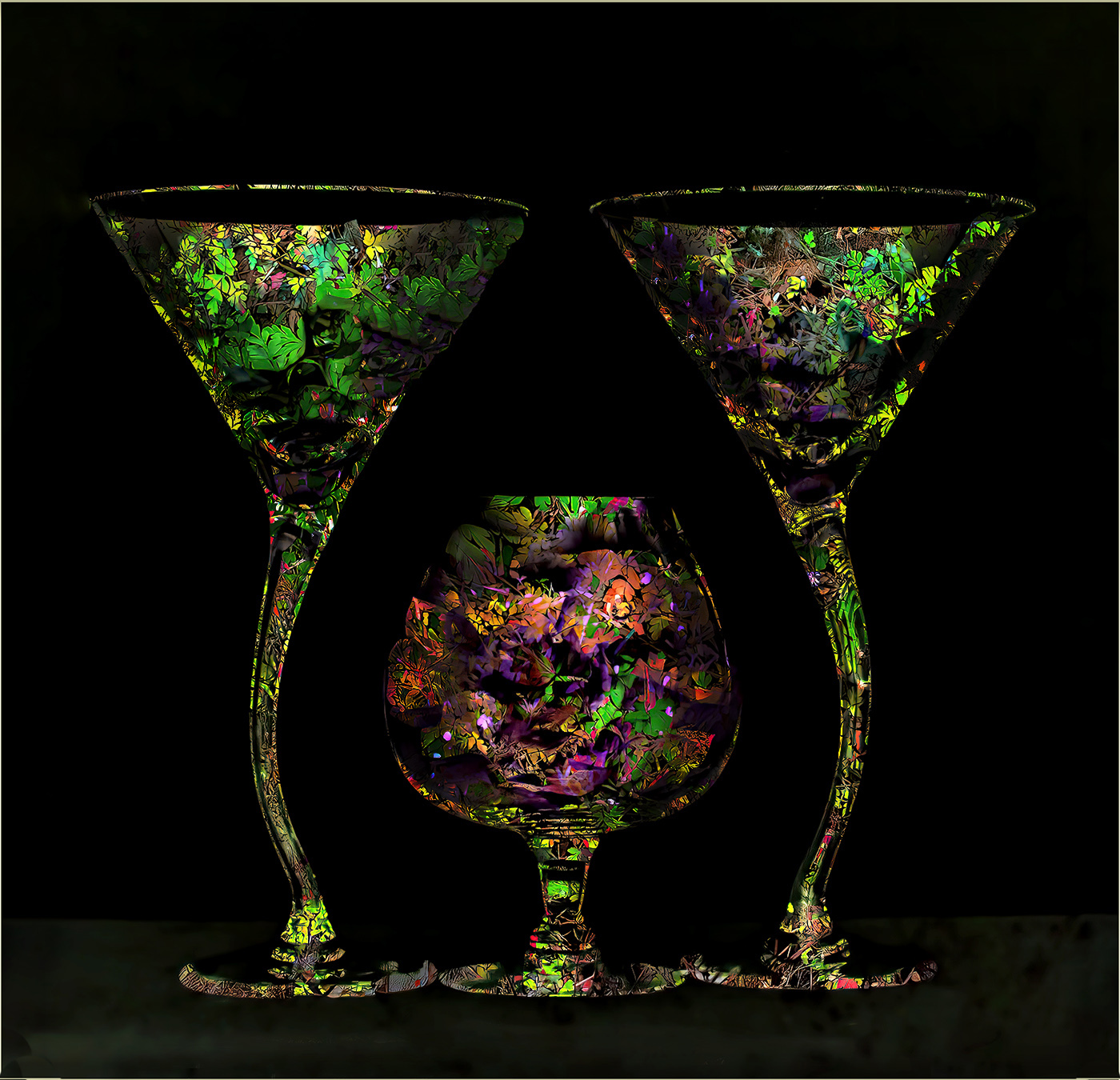
This is very cool Gunter. I love the contrast between the glasses and the black background. I agree with Steve that the glasses need a bit more depth, so I took the liberty of using the burn tool on the outside contours and the dodge tool on the center areas to make them look more rounded. This would make a very nice set of glassware. Nice concept. Pour me a drink! |
Aug 8th |
 |
| 34 |
Aug 23 |
Comment |
This is fun Candy. You did a fabulous job of blending everything together, and placing the alien as you did on the pattern of the sand really drew it all together. Your alien reminds me of the final scene in War of the Worlds (old version) when the dying alien's suction-cup hand is revealed. My only suggestion would be to eliminate the foam bubbles right next to the coral since they are out of focus and the coral is in focus. Great image; well done! |
Aug 8th |
5 comments - 7 replies for Group 34
|
| 77 |
Aug 23 |
Reply |
Thanks Carol. I felt like the birds acted as a counter balance to the tree, and I usually like to have a live element in my images. Maybe it would have worked better to have them teeny-tiny and flying out from the tree in the light part of the sky? I very much appreciate your assessment. Good suggestions. |
Aug 29th |
| 77 |
Aug 23 |
Reply |
I guess I should have mentioned it in my comment, but in my rework, I cloned out the plastic looking part of the hook so it's not quite so obvious it's plastic. I think keeping it hanging is part of the charm, especially with the curvy shepherd's hook as the support. |
Aug 20th |
| 77 |
Aug 23 |
Comment |
Nice capture Jodi! Fantastic detail. Since you didn't add stars to the entire black background, my only suggestion would be to more gradually reduce the number so the cutoff line is a bit less obvious. Or add some stars to the lower half too? At any rate, a great first "moon shot." The border does a good job of pulling the viewer's eye into the image. Well done! |
Aug 18th |
| 77 |
Aug 23 |
Comment |
Stunning image Carol. Lighting is lovely; details are nice and sharp. I especially love the dark stems as a counterbalance to the blossoms. Your enhancement to the background is so nice. Bravo! |
Aug 18th |
| 77 |
Aug 23 |
Comment |
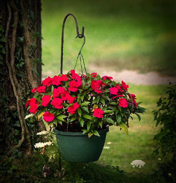
My sympathies for your computer struggles. I hope the learning curve evens out for you. Your image has nice color, and taking out the white garage was a good idea. For some reason, my eye kept going to the green plastic hanger and I felt like it detracted from the otherwise charming scene. I might have cropped off the bottom a bit to bring the plant out of the exact center. The tree is a lovely backdrop here. You have a very nice view out of your kitchen window. Nice capture! |
Aug 15th |
 |
| 77 |
Aug 23 |
Comment |
This is a lovely portrait Mary. I like all of the post processing decisions you made; I think they all brought out a lot of emotion for the viewer to experience. The glass overlay works in my opinion, and it might even look nice extending up higher on the left behind Sophia's face. You captured very nice skin texture in the original that got a bit blown out in the conversion to B/W. But that's a minor nitpick. Gorgeous image! |
Aug 14th |
| 77 |
Aug 23 |
Comment |
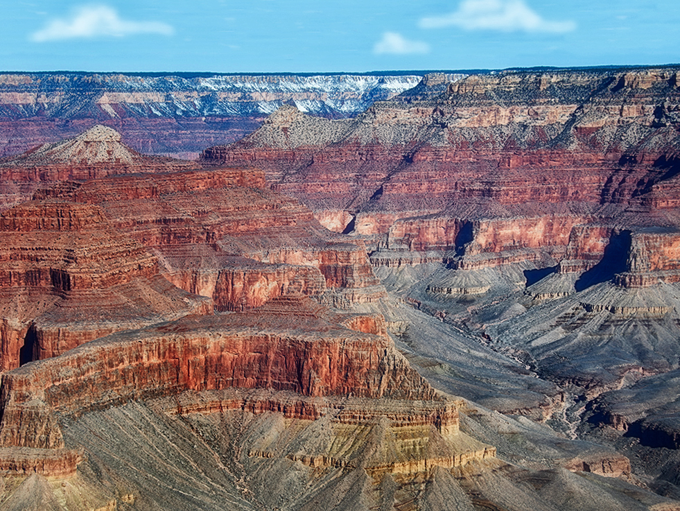
I like Denise's edits, which give the image a more realistic quality. I'm probably off base here, but I kind of like that green band of vegetation and some sky to bring more depth to the whole scene. There needs to be more sky though, so I enlarged the top and cloned in more blue. Then added some clouds (which, I admit, don't look realistic but you get the idea) to expand the horizon. I made some of the same edits as Denise -- contrast, exposure, clarity, vignette. Just a little different perspective on the beautiful scene you captured. |
Aug 13th |
 |
| 77 |
Aug 23 |
Comment |
Hard to believe this was a weed in a parking lot. Your edits all elevated it to something special. I love a glow filter, and it added an ethereal aspect to this image. I do like the blurred green background parts to give the piece depth. The lighter leaves around the flower provide nice leading lines, but perhaps burning the brightest one a bit would work nicely. Lovely post processing Denise! |
Aug 13th |
| 77 |
Aug 23 |
Reply |
Many thanks to you Denise. Glad you enjoyed it. |
Aug 13th |
| 77 |
Aug 23 |
Reply |
Hi Linda. Thanks! |
Aug 13th |
| 77 |
Aug 23 |
Reply |
Thanks Connie! |
Aug 13th |
6 comments - 5 replies for Group 77
|
11 comments - 12 replies Total
|


