|
| Group |
Round |
C/R |
Comment |
Date |
Image |
| 34 |
Jul 23 |
Reply |
Hi Frans. Thank you for your kind words. Original 1 isn't very recognizable because I used the Motion Blur filter on it and then changed it to black and white. At that point, it looked like Original 2. One of the reasons I love using Motion Blur is because it produces such interesting results that look nothing like the original except that the light and dark areas are streaked across the page. This particular blur was horizontal, but other wonderful effects can be obtained by changing the angle of the blur and/or number of pixels in the dialog box. My example here was not converted to B/W and the angle was changed to 19 degrees. |
Jul 18th |
 |
| 34 |
Jul 23 |
Comment |
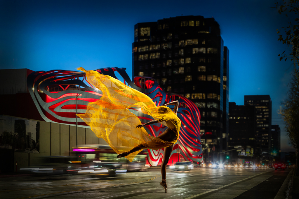
Gorgeous photography in both of your originals, Frans, and you did a fabulous job of combining them. The treatment of the sheer fabric is perfect. It did seem to me that there were several bright spots around the edges and in the building tower that pulled my eye away from the stunning dancer. I took the liberty of darkening them to see if that made her pop a bit more. I probably went a bit too far with it, but wanted to make enough of a difference to be noticeable. I love how you placed the dancer so that just the slightest bit of yellow fabric juts up into the sky. Nicely done! |
Jul 8th |
 |
| 34 |
Jul 23 |
Comment |
Very nice image Gunter. You did a great job of finding two images that worked together, in my opinion. I like that the "v" of the petals is not dead center. The light part of the petals on the right and left created nice arcs that lead the eye around the image. I did notice that there are some small artifacts in between the petals in the white area (perhaps camera lens dust or left-overs from erasing?) that made it look like my screen was dirty. Experimenting with blend modes is one of my favorite things to do in PS. Your "fiddling" produced a vibrant and stunning result. Bravo! |
Jul 8th |
| 34 |
Jul 23 |
Comment |
I love photographing palm fronds, but I hardly ever do anything with them afterwards. You've done a lovely job of creating a striking image out of yours. I love the heart concept. I think the sharpness and vibrancy of your originals are stronger than the final, which might have been a result of one of the filters. Gunter's version is nice too. Kudos to you for taking a common object into the realm of beautifully creative uniqueness! |
Jul 8th |
| 34 |
Jul 23 |
Reply |
Most of my PS journey has been self-taught also, so I completely agree that free exploration of the platform is fun and enlightening. I certainly didn't mean to sound preachy with my comments; since you said the isolation was difficult, I hoped another perspective would prove helpful. We all have to find what works best for our workflow as we expand our horizons. |
Jul 6th |
| 34 |
Jul 23 |
Comment |
Another eye-popping color palette here. Your images always seem to zap me with a jolt of energy! |
Jul 5th |
| 34 |
Jul 23 |
Comment |
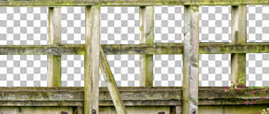
Hi Mike. This is a fun image. The highly detailed background and highly detailed birds really shouldn't work together in theory, but they absolutely do! You mentioned that the bridge was difficult to isolate and that you painted the rectangular areas white. A couple of suggestions that might have made it easier (assuming you use PS for editing)... First, the bridge is out of level, so using the Lens Correction filter would easily fix that. Then, use the square marquee selection tool to isolate each rectangle (you can use even the shift key to select them all at once). Now, just hit the backspace key (make sure the layer is unlocked) and you will see a checkerboard (transparent) layer where you deleted the background areas (see my sample). You would still need to use the polygon tool for the odd areas. Once you have the bridge isolated, you should be able to left-click and hold on your mouse and just drag the bridge onto your background/bird layers. I applaud you for moving outside your comfort zone and trying a technique you're unfamiliar with. Love your result with this one! |
Jul 5th |
 |
5 comments - 2 replies for Group 34
|
| 77 |
Jul 23 |
Reply |
You're absolutely right about needing a key line to separate the image from the background. I noticed that the first time I looked at it after posting. I was surprised no one else suggested that. Thanks! |
Jul 27th |
| 77 |
Jul 23 |
Reply |
Of course Carol; you did a beautiful job of processing your image. I wasn't suggesting a darker treatment would be better -- just curious to see what it would look like. |
Jul 27th |
| 77 |
Jul 23 |
Reply |
Thanks Jodi. I think Linda's edit does improve it a lot. I appreciate your comments! |
Jul 22nd |
| 77 |
Jul 23 |
Reply |
Thanks Denise. I agree that the flowers need more oomph. I appreciate your feedback! |
Jul 22nd |
| 77 |
Jul 23 |
Reply |
Thanks Linda. That does look better! |
Jul 22nd |
| 77 |
Jul 23 |
Reply |
Well then, you did a great job applying the creative touches and working with layers, Jodi. PS is a bit daunting at first, but so flexible when it comes to being creative. I've been using it for many years (mostly for creating composite images), but I learn something new almost every time I use it. Processing Fine Art pieces is new for me, so I'm starting something unfamiliar too. I wish you well on your PS journey. Happy creating! |
Jul 22nd |
| 77 |
Jul 23 |
Comment |
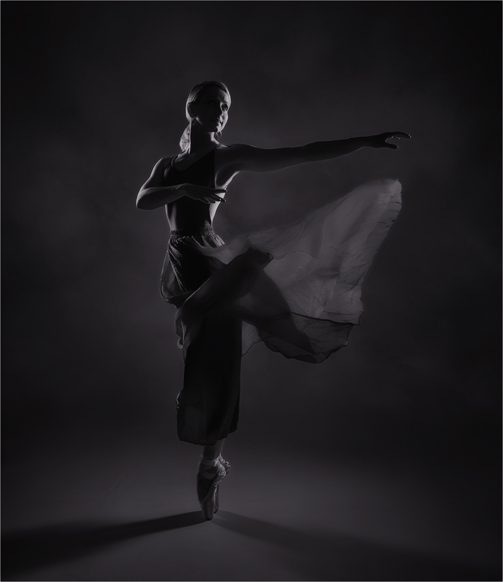
Converting to B/W worked well with this image Carol. I love the shadows on the floor going both directions. Adding the cloud texture to the background gave the image nice depth. Since you titled it as you did, I took the liberty of seeing what it would look like with less brightness and more contrast, just for fun. You did a great job capturing the moment during the photo shoot. Beautiful subject. |
Jul 21st |
 |
| 77 |
Jul 23 |
Comment |
The blossom in your original photo has lovely color and texture. Isolating it in your final image was a nice idea to give it importance. To my eye, the phlox texture on the petals distracts from the pristine, natural beauty of the flower, but that's just personal taste. I like the background textures you applied. Well done! |
Jul 21st |
| 77 |
Jul 23 |
Comment |
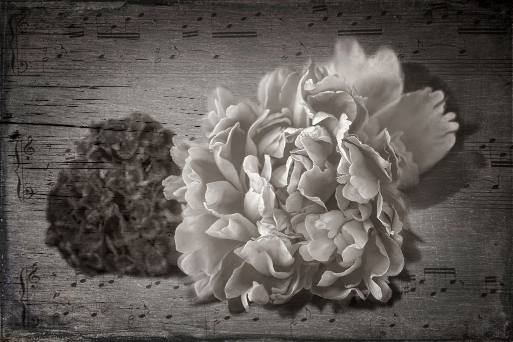
I love the addition of the music score Connie. And the front blossom is so pretty. The darker one being out of focus is a bit of a problem, but you could camouflage it somewhat by applying a couple of textures over it as I've done here. It's much darker than your version though, which isn't ideal. I like the ethereal, light mood of yours. And your conversion to monotone was a good move. |
Jul 21st |
 |
| 77 |
Jul 23 |
Comment |
The soft light on her face is gorgeous, Mary. You got such beautiful definition in her eyes. I agree with Denise that the light areas on the left draw the viewer's eye away from your subject. I like Linda's simplification of the composition; your idea of taking away some of the fly-away hair is a good one. Kudos on getting lovely shot of your camera shy granddaughter and creating a beautiful memory for you, her, and the rest of your family. Nice! |
Jul 16th |
| 77 |
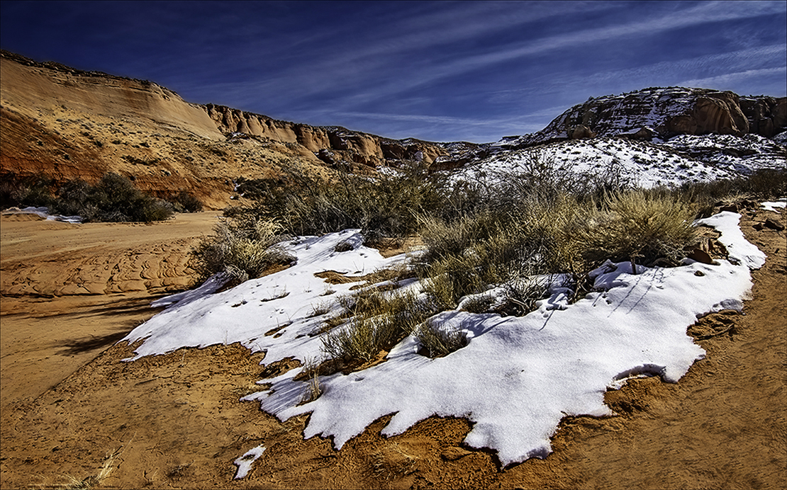
Jul 23 |
Comment |
I like the enhanced saturation in your final image Linda. The snow looks pristine and undisturbed, so all the various footprints in the sand in the right lower corner seemed to detract from the concept of unspoiled Mother Nature. I took the liberty of cloning them out, although I didn't spend the time to do it with finesse. I also applied HDR and vignette filters in On1 for a bit more depth. This looks like a lovely place to visit and photograph. So peaceful. |
Jul 16th |
 |
| 77 |
Jul 23 |
Comment |
Such a fun capture of your cat, Denise. I applaud you for being quick enough to get it before she moved! I very much like your edits, which elevated a snapshot into a piece of art. I agree with Linda regarding the crop. Since the black cabinet is ever so slightly crooked along the left edge, best to crop it off. The hand-drawn look was a perfect way to treat this image. Well done! |
Jul 16th |
6 comments - 6 replies for Group 77
|
11 comments - 8 replies Total
|


