|
| Group |
Round |
C/R |
Comment |
Date |
Image |
| 34 |
Jan 23 |
Reply |
Hi Frans. Thank you for your kind words. I had heard that it's the year of the rabbit, but I didn't consciously create the image with that in mind. Interesting coincidence that some of the symbolism applies though! :) |
Jan 31st |
| 34 |
Jan 23 |
Reply |
Thanks very much Mike for your kind assessment of my past and current images. I see what you mean about the angle of the rabbit and the sign, but I guess when I was in the process of creating it, I imagined that the rabbit had already read the sign and had, at that moment, decided to head "this way" rather than "that way." But maybe my title is misleading -- I should have called it "Decision" rather than "Dilemma"! :-) |
Jan 24th |
| 34 |
Jan 23 |
Reply |
Thanks Gunter; you are indeed correct. The relative sizes of the various elements are all a bit unrealistic here, but it was intentional, and in my own mind that creates a greater sense of fantasy, which is the mood I was aiming for. |
Jan 24th |
| 34 |
Jan 23 |
Reply |
Thanks for your response Gunter. Just personal preference on my part for sure, but you have your own reasons for liking it without a vignette, which are perfectly valid. Keeping the viewer's eyes within a piece of art, causing them to rove around and take in all the various elements is always desirable, in my opinion. Thanks for the dialog; it makes the DD experience much more rewarding. |
Jan 24th |
| 34 |
Jan 23 |
Comment |
Well done composite Mike. The liquefy treatment is fun and creates an unconventional aspect to the scene. Your grandson, butterfly, and heron create a nice trio on the background. But the ducks create an unnecessary distraction to my eye, especially since you used some liquefy on the clouds and they're interesting to look at on their own. You've created a fun image for sure. |
Jan 11th |
| 34 |
Jan 23 |
Comment |
This has a very retro sixties vibe. The background looks like it was a blast to create. I like the full saturated version. The outline on the hand is a bit funky, but that sort of suits the feel of the image as a whole. Experimenting with PS can lead to wonderfully unexpected results. Nicely processed! |
Jan 11th |
| 34 |
Jan 23 |
Comment |
The detail that you achieved in the fins is wonderful. The blue and orange fish is so beautiful. The black background creates dramatic contrast with the fish, but I agree with the other comments that it needs a little more texture or interest to relate to the fish. You did a great job photographing these beauties. |
Jan 11th |
| 34 |
Jan 23 |
Comment |
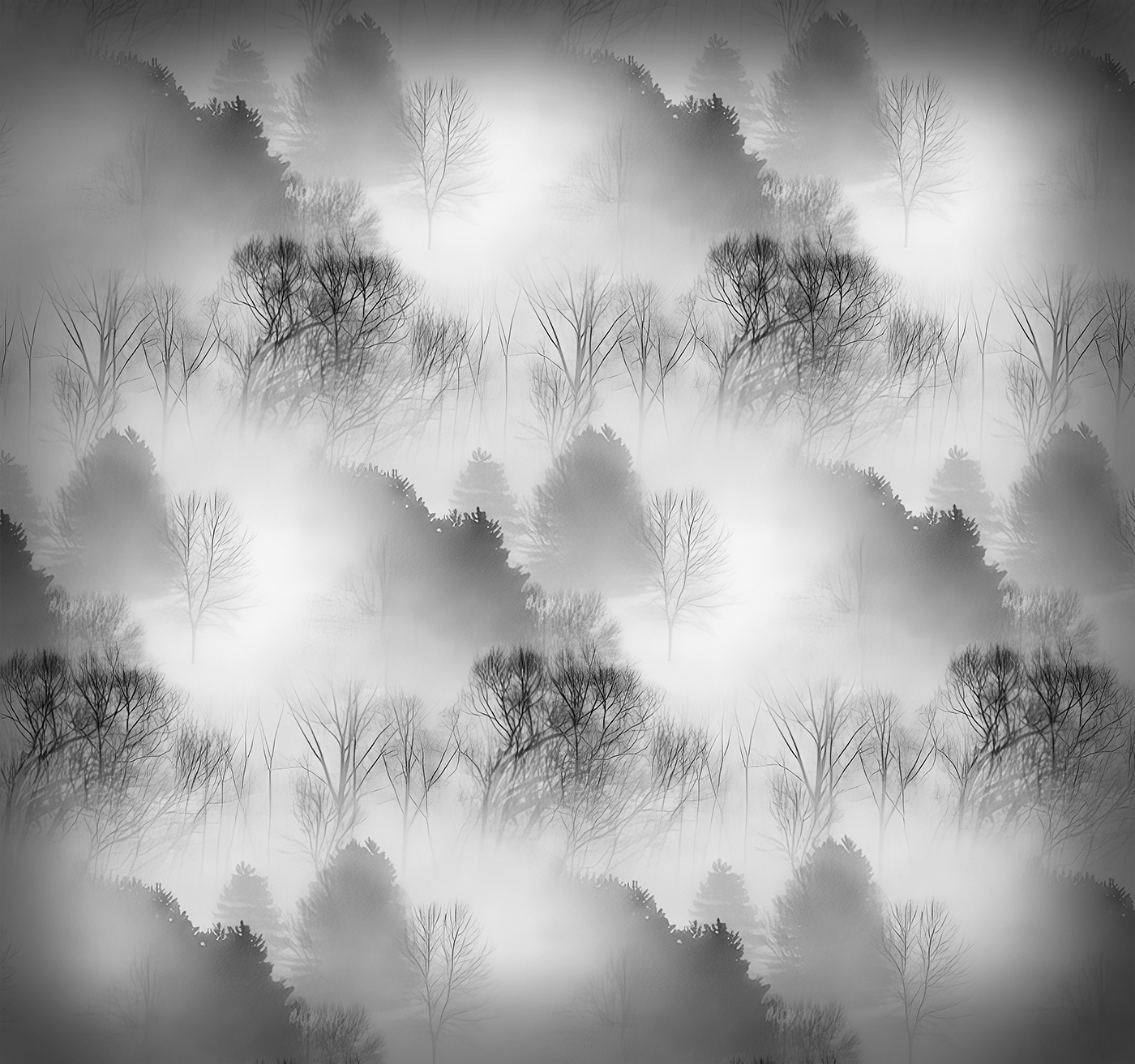
I like this a lot Gunter. You accomplished your aims very well. The fact that the repeated rows are off-set makes the concept work beautifully. The contrast is also really nice. My only suggestion would be to perhaps add a slight vignette to keep the eye from wandering off the edge. |
Jan 10th |
 |
| 34 |
Jan 23 |
Comment |
Another lovely composite Candy. I like the soft colors. The combination of the straight and ed elements makes it pleasing to the eye. Steve's increased definition to the center of the flower does appeal to me. The frog adds a nice bit of wildlife to the scene. Very nicely composed. |
Jan 10th |
| 34 |
Jan 23 |
Comment |
This is very cool Steve. Looks like you had a lot of fun creating this. You did a great job of making your brush strokes on the people and dog fit in with the rest of the piece. I like the slightly reduced saturation of your final image. Taking a stroll in this setting would make for a lovely afternoon. Well done. |
Jan 10th |
6 comments - 4 replies for Group 34
|
6 comments - 4 replies Total
|