|
| Group |
Round |
C/R |
Comment |
Date |
Image |
| 34 |
Oct 21 |
Reply |
I checked out your Group 54 image from last year. Very cool, except that I shudder to think what might happen to that beautiful horse... |
Oct 19th |
| 34 |
Oct 21 |
Reply |
We do indeed have informative discussions. I see from the comments and image below that your composite was fashioned after a Magritte painting that I was unfamiliar with. The feeling of discomfort I have as a viewer is similar with both, and it's clear that my taste in art is very different from yours. Experiencing discomfort isn't really my thing when I'm enjoying art. However, learning, exploring, and growing as I experience other artists work is important too. I appreciate the uncomfortable horizons you're pushing me toward, but I'll probably go along kicking and screaming. :)
|
Oct 19th |
| 34 |
Oct 21 |
Comment |
I like your choice of characters here Candy. You did a great job with the background stonework. I agree with most of the other comments about the lighting. My eye kept focusing on the mouth of the left man because I guess it's his mustache that's making it look like he's missing a tooth. Ramping down the saturation of the man on the right worked well to impart just a hint of color to the scene. Both gentlemen seem very wise and important. I couldn't help wondering if maybe they have some magic answers for all of us. Well done. |
Oct 13th |
| 34 |
Oct 21 |
Comment |
The techniques you used to create the ominous foreground, house light and street light all worked so well. The woman adds the element of fear and foreboding that you obviously were aiming for. I agree with the other comments about the sky. Please forgive me if this comment seems harsh Alan, but I feel that the untreated sky makes your image appear more amateurish than discomforting. The masterful effects you applied in the rest of the image seem to be overwhelmed by the elephant in the room of not dealing with the sky in a masterful way as well. If you didn't want to engage in a cliche by darkening the sky, I would like to see what your ever-flourishing imagination could have come up with as an alternative. Saying that you wanted it to contribute to the discomfort sort of feels like a cop out. Again, I offer this as my opinion only, but I felt strongly enough about it that I wanted to express my honest assessment of your otherwise excellent composite. |
Oct 13th |
| 34 |
Oct 21 |
Comment |
I agree that sometimes creativity is so darn elusive. Sometimes it's a fun pursuit, but sometimes it's a real chore to "come up with something." We all go through it, so just be patient with yourself. Your concept with this image is very creative. I think using the galaxy texture was a great idea and works well to ground all the elements. To my eye, the central figure having his arms wrapped around his legs makes him seem uninvolved with everything else; maybe a fatherly-looking figure with his arms outstretched or pointing? Your choice of life stage images is good. Nice job Georgianne! |
Oct 13th |
| 34 |
Oct 21 |
Comment |
I really like the pink and blue color ways here. When I first glanced at it, my thought was that the pigs needed wings but once I noticed the tree tops and the fact that the view angle is from beneath the pigs, I agree that they don't. I like your submitted image better than Original 3 because that one looks like maybe they're being buffeted by the wind rather than flying on their own. I agree with Brian's comment about the one pig heading away from the others, unless he was meant to be going rogue. Lots of fun and happiness in this image. Well done! |
Oct 13th |
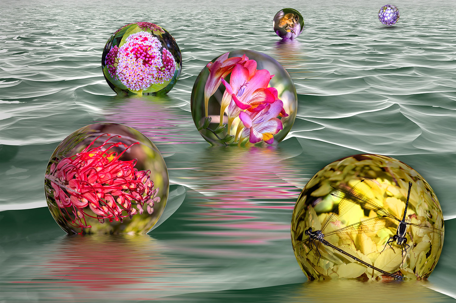
| 34 |
Oct 21 |
Comment |
Nice image Brian! It looks like a true testament to the power of persistence. I'm greatly impressed by your learning new software. The colors are very nice together and I like the way you positioned the spheres deeper in the water near the front and progressively less so as they got farther from the viewer. The reflections (and shadow on the farthest one) are really well done. One suggestion I might throw out is to make the orbs appear more spherical rather than flat by darkening the edges and lightening the centers. I gave it a try, though since I was working on a single layer, the shadows extended a bit into the water, but you get my "drift." :-) Love your concept and execution of this image! |
Oct 10th |
 |
| 34 |
Oct 21 |
Comment |
Great image Steve! The details are fabulous and you did a fantastic job of making all the different images match in lighting tone. You would never guess the dancers weren't actually climbing stairs, their foot placement looks totally "right." And you did a masterful job with your shadows. The fractalized face in the sky is very cool. Unlike Alan, I'm not sure I'd want to follow these characters up the hill; it looks like they might be heading to their demise. But a beautifully executed scene to be sure! |
Oct 10th |
| 34 |
Oct 21 |
Reply |
Thanks Alan. Actually the title was taken from Ray Bradbury's novel of the same name (but I assume he got his title from "Macbeth"). It's about two teenagers who were both born on Halloween and their adventures with a traveling carnival that comes to town. A strong message in the book is good vs evil. I wanted the two incongruous parts of my image to reflect the warm innocence of the house vs the dark wickedness of the approaching creature, so the viewer could decide which would win out in the end. |
Oct 7th |
6 comments - 3 replies for Group 34
|
6 comments - 3 replies Total
|


