|
| Group |
Round |
C/R |
Comment |
Date |
Image |
| 3 |
Aug 21 |
Comment |
Very cool image! |
Aug 10th |
1 comment - 0 replies for Group 3
|
| 34 |
Aug 21 |
Reply |
Incredibly kind words Georgianne. Sincere thanks. |
Aug 30th |
| 34 |
Aug 21 |
Reply |
Thanks so much Helen! And thanks for visiting -- nice to hear from you! :-) |
Aug 20th |
| 34 |
Aug 21 |
Comment |
You've produced a very nice treatment on this image Gwen. I like your rule of threes crop; your oil paint filter works nicely. The only place the oil paint filter doesn't work, in my opinion, is on the bird's eye. It's blurred to the point of being sort of lifeless and flat. A tiny detail, for sure, but maybe just masking it out and removing the filter from his eye would remedy that. I also like the more vibrant colors you pulled out on the bird. |
Aug 10th |
| 34 |
Aug 21 |
Comment |
This is lovely Georgianne! It totally reminds me of an old-fashioned botanical print. Your arrangement of the foliage on the light box is just right. Love the soft pink and greens. Thanks for your detailed explanation of how you got to your final version. Lots of work but it really paid off! |
Aug 10th |
| 34 |
Aug 21 |
Reply |
Thanks so much for visiting and for your kind comment, Witta! Much appreciated. :-) |
Aug 10th |
| 34 |
Aug 21 |
Comment |
You've done a great job of bringing depth and detail to your lovely blossom. When you applied the textures, did you mask out the blossom to texturize only the background? I like your choice of a green background as a nice color complement to the purple. I didn't notice the stem at first, but it is a nice subtle addition. Nicely processed! |
Aug 10th |
| 34 |
Aug 21 |
Reply |
Thanks Steve. Every time you refer to Flaming Pear Flood, I tell myself I'm going to check it out, but always get side tracked. Trying again! |
Aug 10th |
| 34 |
Aug 21 |
Reply |
You've created a pretty healthy dose of disequilibrium with the green and orange sky and the train barrelling towards the art patrons. To my eye, there's more disequilibrium created by shadows appearing without a light source than with one, but that's just personal opinion. When I think of sophisticated colors, I lean toward subdued versions rather than primary versions of a particular color, but again, just personal opinion. You had a good reason for putting the sun in the image and in the end that's all that matters. |
Aug 8th |
| 34 |
Aug 21 |
Comment |
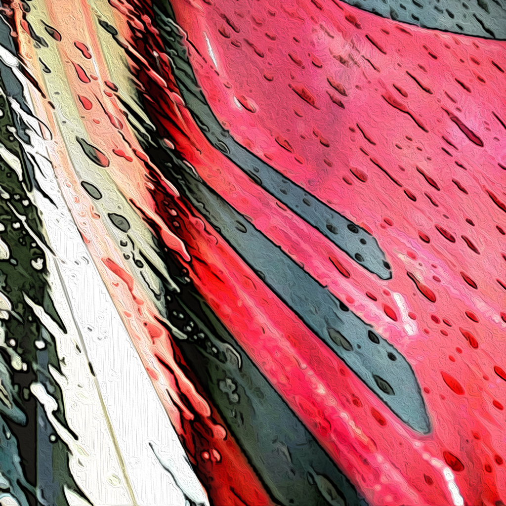
Love this Fran! Either one of your originals would make a cool abstract, minimalist Art Photography image. Combining them into one worked well too. I'm more drawn to the left side of the piece because it's more in focus than the right side. Sometimes I use PS Poster Edges to "sharpen" a blurry image, so for fun I gave it a try here. It was a little harsh, so I also gave it a subtle Oil Paint Filter. I like the way you made the direction of the water match the red/black lines. I would say you accomplished your goal very nicely! |
Aug 8th |
 |
| 34 |
Aug 21 |
Comment |
There's a lot to see in this composite Alan. Like Gwen, my eye was pulled to the orange sun and, in my humble opinion, the piece would be stronger and more sophisticated without it. There are plenty of other thought-provoking aspects to your image. I love the way you made the empty picture frame float by placing its shadow so far below it, but grounded the easel by placing that shadow next to it. However, you know me and my focus on shadows... all three people seemed to be floating above the floor and in need of deeper shadows directly under their feet, which I applied here. I also enjoyed the humor of the grown man viewing a prim and properly clothed woman, while the little boy is eyeing a nude. Nicely conceived and executed. |
Aug 8th |
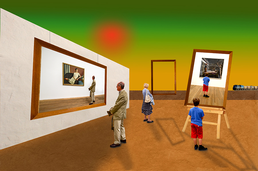 |
| 34 |
Aug 21 |
Comment |
Once again I'm blown away by the variety and lushness of your flower garden. I certainly hope you get time to relax and soak in the "fruits" of your labor here! It looks like it must take a lot of your time to grow such beauty. Your collage is lovely in its color palette. The Bird of Paradise blossoms are nicely welcoming the Iris birds into the scene, and the green and orange background sets a lovely backdrop. The texture you applied was just right -- noticeable but restrained. Well done! |
Aug 8th |
| 34 |
Aug 21 |
Reply |
Thank you for your kind words Alan. I love your image from your other DD group. It's wonderful to see how your interpretation of fish in the sky plays out. You're right about the fact that I frequently use roads or paths to lead the viewer into the scene -- must be time for a re-think on other devices I could use so I don't get into a rut! :-) |
Aug 8th |
6 comments - 6 replies for Group 34
|
7 comments - 6 replies Total
|


